
Atomic Form element

Last Update: May 26, 2026

Who can use this feature:
This article is for Editor 4.0 and above. If you’re using Editor 3.x, check out the Form widget article.

Add and delete the element

The Atomic Form icon

To access and use a widget:

  1. In Elementor Editor, click +.
    All available elements are displayed.

  2. Click or drag the element to the canvas. For more information, see Add elements to a page.

To delete the widget:

  1. On the canvas, select the element by clicking it.
  2. Press the delete key on your keyboard. For more information, see Delete elements from a page.

What is the Atomic Form element?

Forms allow visitors a way to communicate with you. The Atomic Forms elements gives you the flexibility to design forms to your exact specifications.

The Atomic form element is different from other elements. It essentially acts as a wrapper containing other atomic elements. These atomic elements are:

  • Label: A text-based element used to create the form’s labels.
  • Input: Used by visitors to submit information.
  • Text area: A type of input field, but designed for longer, text-based messages.
  • Checkbox: Used when visitors are asked to submit Yes or No type information.
  • Submit button: The button visitors click to send the form information to the site.

Common use case

Alex is building a webpage where people can respond to a wedding invitation. The form will collect the RSVP’s of all invitees.

Additional use cases 

  • Use a form to build a subscription list for a newsletter
  • Use a form to poll your customers about their favorite products or features.
  • Use a form to collect contact information of potential clients.

Add an Atomic Form: Step-by-step

  • Add the Atomic Form element to the canvas. For details, see Add elements to a page.
    A simple form is added to the canvas and the Atomic Form options appear in the left panel.
    For our form, we’re going to collect the following information:
    1. First Name
    2. Last Name
    3. Mailing Address
    4. email
    5. Attending?
    6. Special requests or needs.

The default form already contains fields for first and last name. Now let’s add a field for Mailing address.

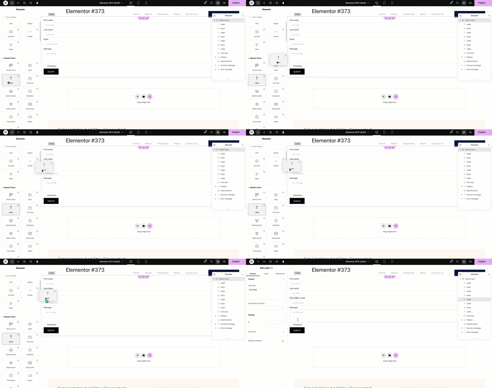
  1. Click the + icon in the top bar to open the Element panel and scroll down to the Atomic Form section.
  2. Drag a Label element into the form, placing it below the last name field.
    Note
    It can be difficult arranging the elements in a form. We suggest using the Structure window. For details, see Use page structure to navigate your page
    .
    Dragging the Label Atom to the form
  3. In the panel, change the label to Mailing address.
    Tip
    You can change the name of these elements in the Structure window to help keep things clear.
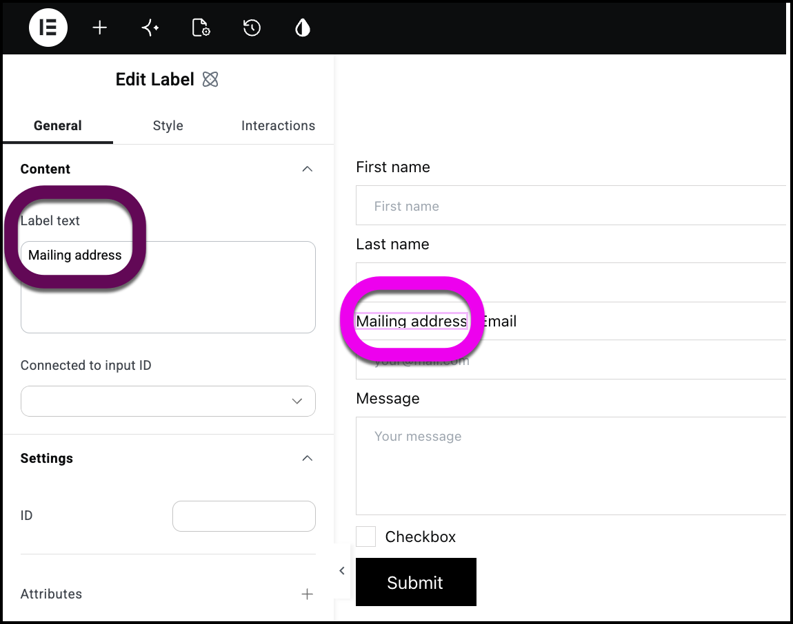
    The label for the mailing address field
  4. Drag an Input element to the form and place it under the label.
    {callout type=”tip”]Remember, if you have trouble placing the Input atom exactly where you want it, you can adjust the location using the Structure window.[/callout]
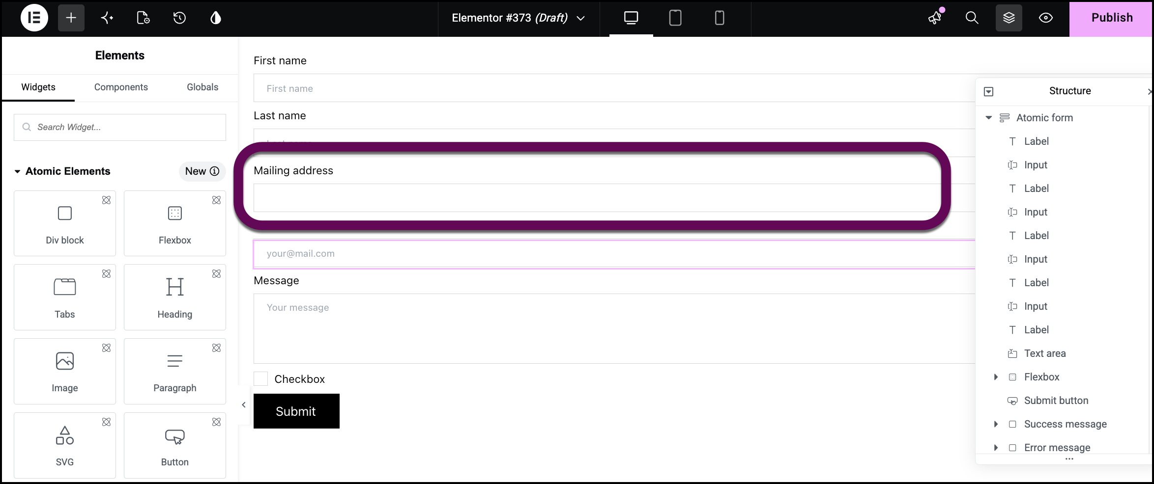
    The Mailing address input box
  5. From the panel, drag a Flexbox container underneath the email address field.
    Note
    Checkbox atoms and Radio button atoms are unique in that they need to be added to Flexbox containers inside the Atomic form.
     
  6. Make sure the container layout is set to Column.
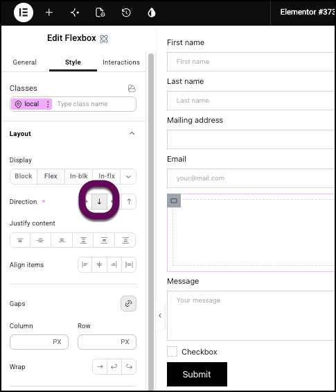
    The icon to set the container to column so the next elements will line up on top of one another.
  7. Add a Label atom to the container and name it Attending?
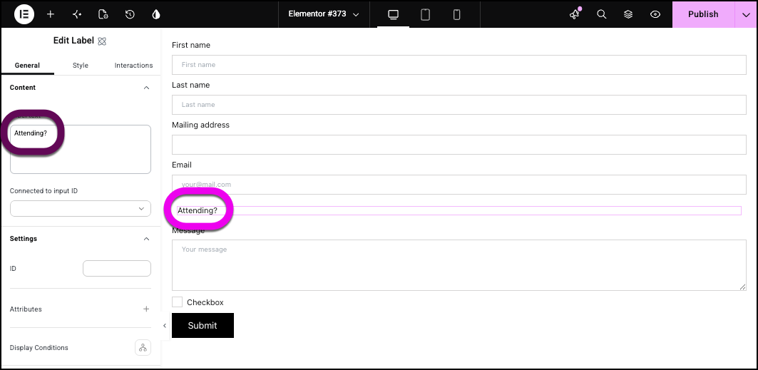
    Add a label that says Attending
  8. Add another Flexbox container under the label.
  9. Add a Label atom to the new container and name it Yes.
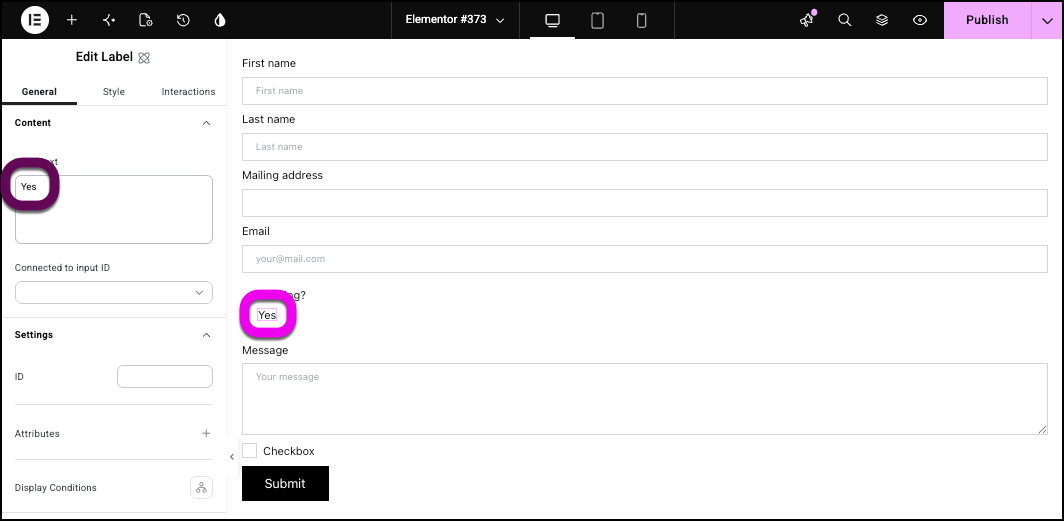
    Add a label called Yes
  10. Add a Radio button atom to the new container. It will appear to the right of the Yes label.
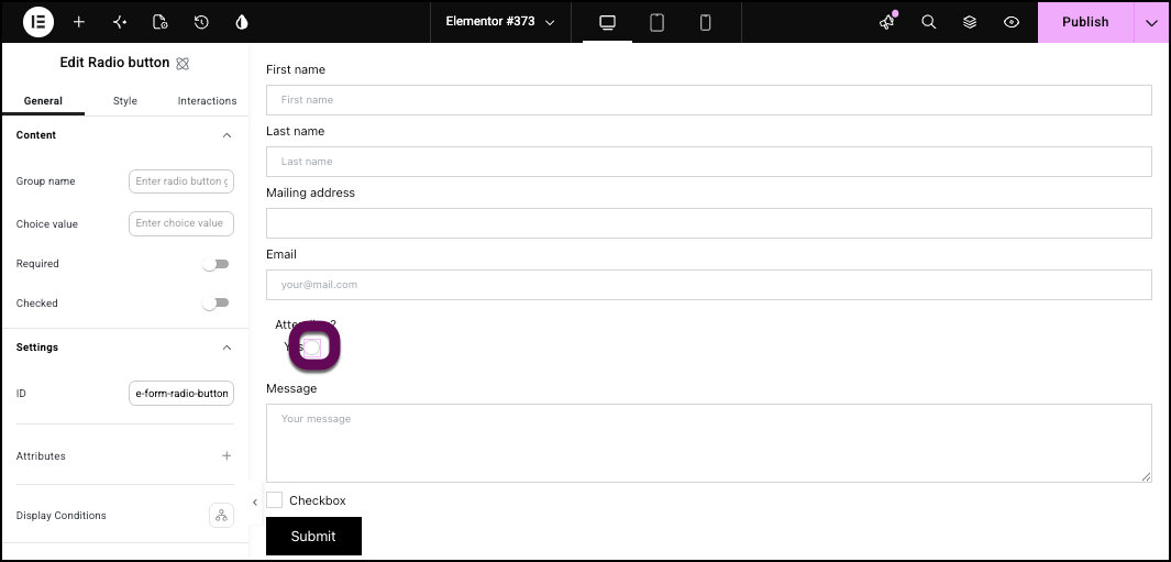
    The first radio button added to the form.
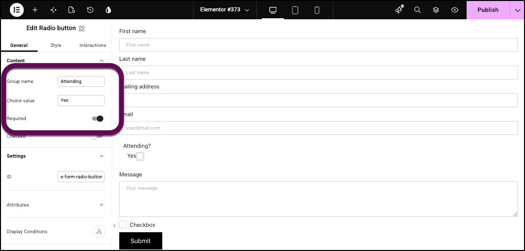
  11. Give the Radio button the Group name Attending and a Value of Yes.
  12. Toggle the Radio button to Required.
    The options for the Yes radio button.
  13. Add another label to the container and name it No.
  14. Add another Radio button to the container and give it the same Group name – Attending and a Value of No.
    Tip
    Radio buttons need the same group name so that only one can be selected.
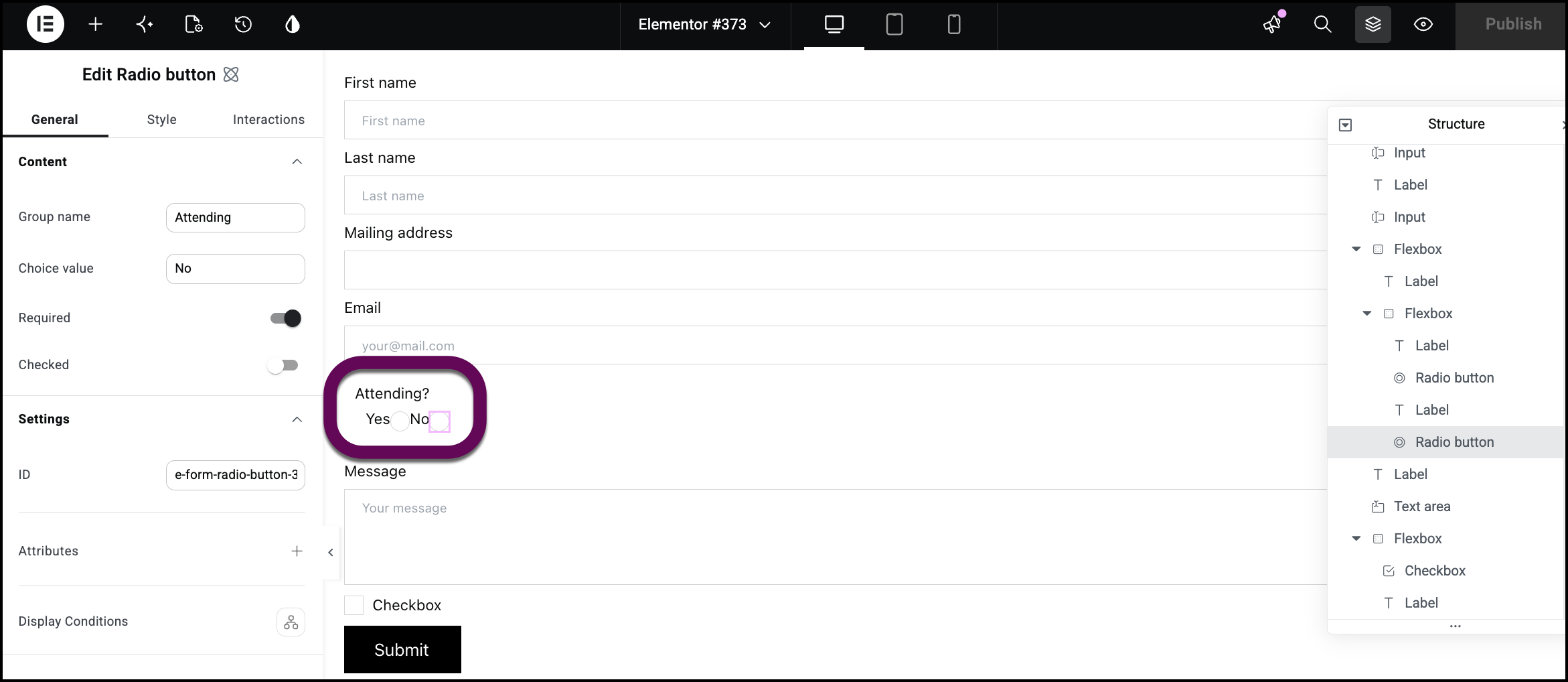
    The addition of the second radio button.
  15. Delete the Checkbox atom and its label.
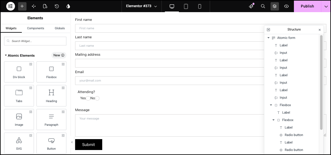
    The form without the checkbox.
  16. Select Atomic form.
    In the panel, open the Actions after submit field and select Collect submissions.
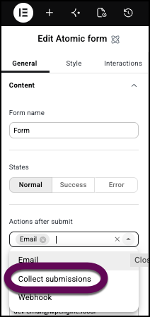
    Select Collect Submissions from the dropdown
  17. Under Email settings, enter the recipient’s email.
    With these settings, responses will be sent to the email address you enter and available from WP Admin. For details, see Manage form submissions.
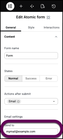
    Add an email address to receive the submissions by email.
    Every form must have a success message, for when the information is submitted correctly and a Fail message for when the submission did not work. Let’s customize these.
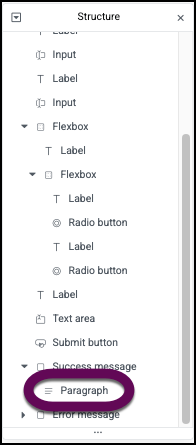
  18. In the Structure window, open the Success Message field.
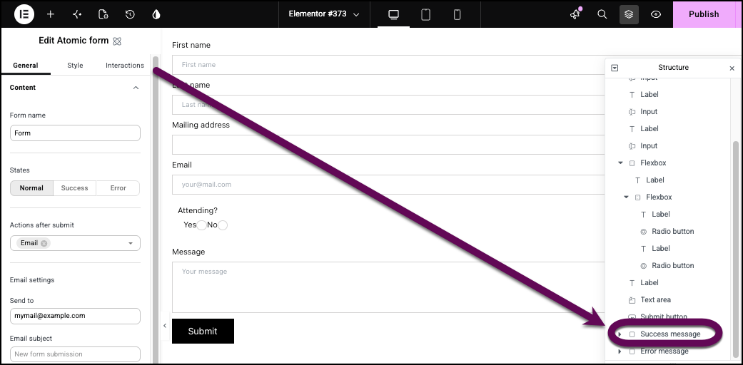
    Open the Success message field.
  19. Click Paragraph.
    Click the Paragraph section in the Structure window.
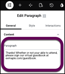
  20. You can now edit the success text.
    The edited success message
    The form is now ready for use.
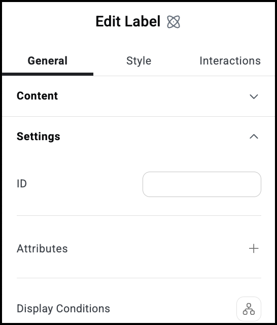
Settings for the Atomic Forms element

The settings for the Atomic Forms element focus on what happens when a visitor submits a form. The atoms that make up the form have their own settings which are detailed below.

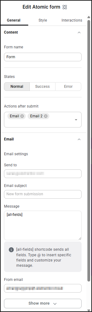
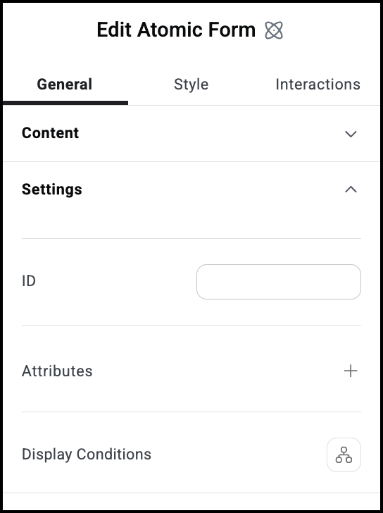
You can give the form a name to make it easier to identify.

Each form has three different appearances:

  • Normal: The default appearance, before the form has been submitted.
  • Success: How the form appears after it has successfully sent.
  • Error: How the form appears after it was unsuccessfully submitted.

Determines what happens after visitors successfully submit a form:

  • Email: Sends the submission information to a designated email address.
  • Collect submissions: Stores the information submitted by visitors in a database which you can access from WP Admin. For details, see Manage form submissions.

These settings only appear if you choose Email under Actions after submit.

  • Send to: The email address where the submissions will be received. 
  • Email subject: The subject line of the email that will be sent to the email address in the Send to setting.
  • Message: Any text and form information that will be sent in the email. The default setting is [all-fields], includes all the form information in the email.
  • From email: Add the email from which the email will be sent.
  • From name: Determine under what name the email will be sent. This may help you filter these emails later. 
  • Reply-to: Edit this email address if you want to reply to these emails and have these replies sent to a different address.
  • Cc: Send a copy of these emails to another address.
  • Bcc:Send a blind copy of these emails to another address.
  • Meta data: y default, the emails sent by the form includes metadata such as the Time, Date, Page URL, User Agent (Browser information), Remote IP (IP address of the person submitting the form), Credit (the software that created the form).
  • Send as: Use the dropdown menu to determine if the email sent by the form is in HTML or plain format.

Allows you to tag individual elements on a page. This way you can link to this specific element.

Attributes are used by developers to target certain elements in order to customize them. For details, see Add and delete attributes.


Show or hide elements depending on different conditions. For details, see Show and hide elements on a page.

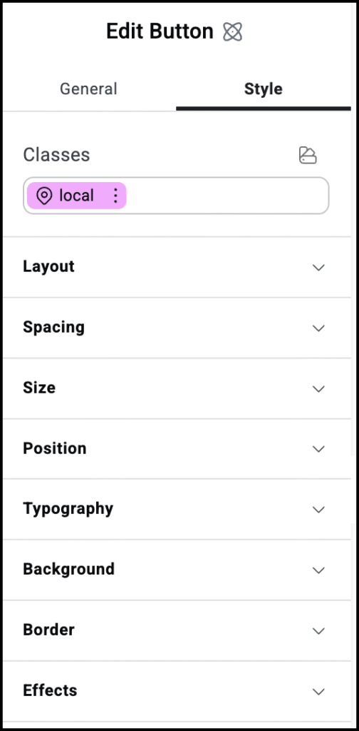
See the individual articles on Style options:


Settings for the Input atom

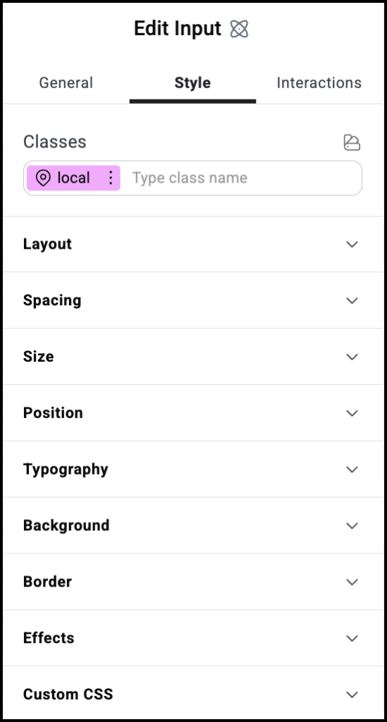
The Input atom is where visitors will add the information they’re submitting. 

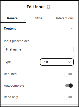
The text that appears in the unput box by default.

Set the type of information visitors can enter in the field:

  • Text
  • Email
  • Number
  • Tel: Telephone number
  • Password: Input is hidden

Use the toggle to mark this as a required field. If visitors don’t fill in this field, they won’t be able to submit their form.

Use the toggle to mark this as a Read only field. Visitors won’t be able to fill in this field.

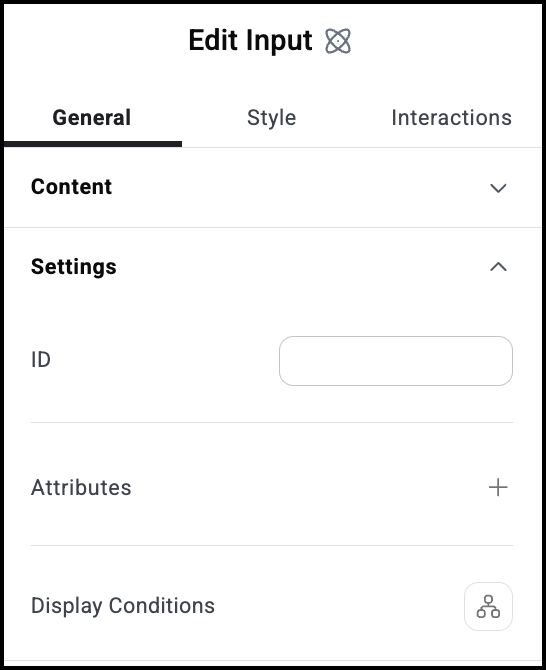
Allows you to tag individual elements on a page. This way you can link to this specific element.

Attributes are used by developers to target certain elements in order to customize them. For details, see Add and delete attributes.


Show or hide elements depending on different conditions. For details, see Show and hide elements on a page.

See the individual articles on Style options:


Settings for the Label atom

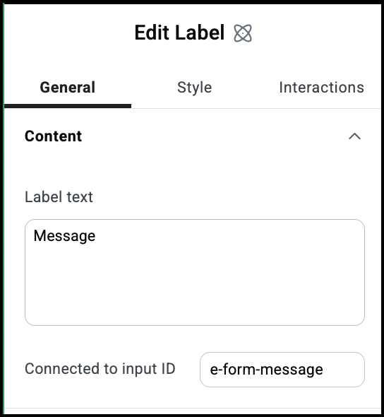
The Label atom is a text atom that is generally used to describe input fields.

The text of your label.

Labels are generally used to describe an input field. This is the the input field associated with the label.

Allows you to tag individual elements on a page. This way you can link to this specific element.

Attributes are used by developers to target certain elements in order to customize them. For details, see Add and delete attributes.


Show or hide elements depending on different conditions. For details, see Show and hide elements on a page.

See the individual articles on Style options:


Settings for the Text area atom

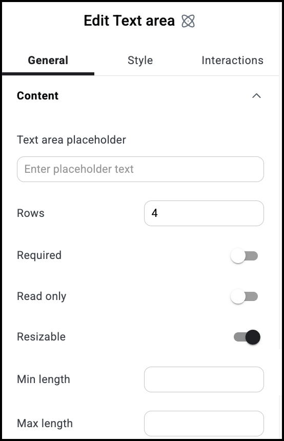
The Text area atom is a text atom that is generally used to describe an input field designed for longer text.

The text that appears by default in the text box.

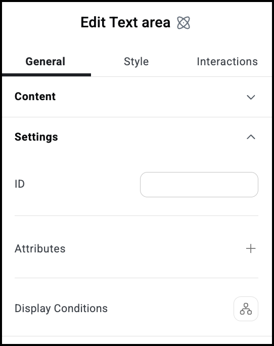
Determines the height of the  text box.

Use the toggle to mark this as a required field. If visitors don’t fill in this field, they won’t be able to submit their form.

Use the toggle to mark this as a Read only field. Visitors won’t be able to fill in this field.

Toggle on to allow visitors to expand the text box by dragging the right corner of the box.

The smallest number of characters a user must enter into the text box in order to submit the form.

The largest number of characters a visitor can enter into the text box.

Allows you to tag individual elements on a page. This way you can link to this specific element.

Attributes are used by developers to target certain elements in order to customize them. For details, see Add and delete attributes.


Show or hide elements depending on different conditions. For details, see Show and hide elements on a page.

See the individual articles on Style options:


Settings for the Submit button atom

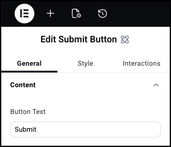
The Submit Button atom sets the text, look and feel of the button used to send and/or store the form information. 

The text that appears on the Submit button.

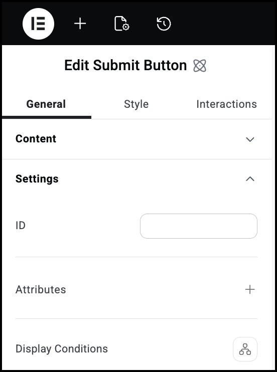
Allows you to tag individual elements on a page. This way you can link to this specific element.

Attributes are used by developers to target certain elements in order to customize them. For details, see Add and delete attributes.


Show or hide elements depending on different conditions. For details, see Show and hide elements on a page.

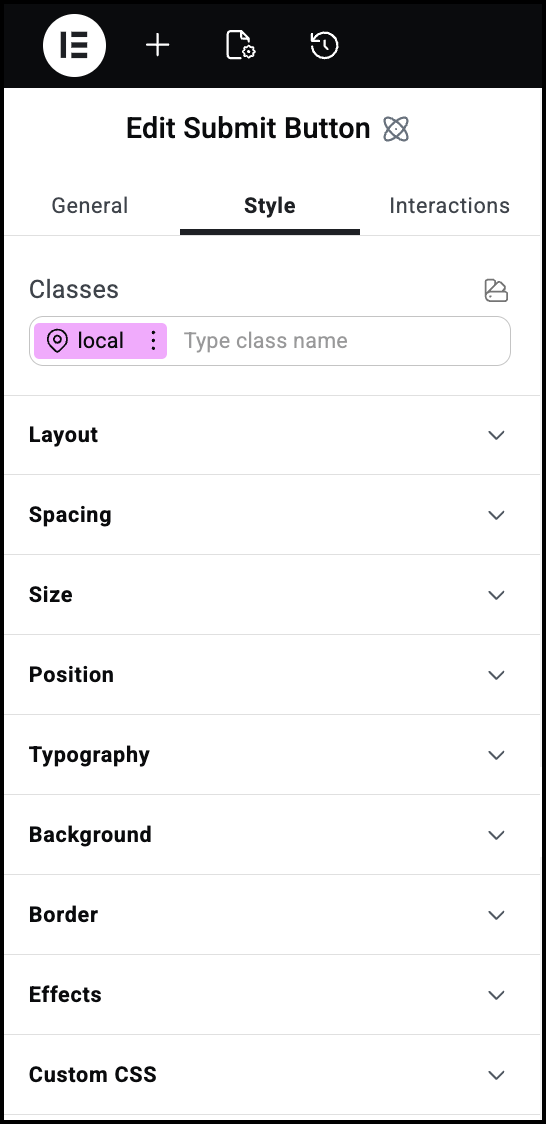
See the individual articles on Style options:


Settings for the Checkbox atom

The Checkbox atom is used when visitors need to submit Yes or No type information. 

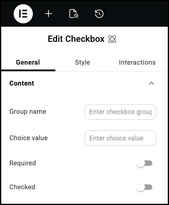
You can group multiple checkboxes as a set. 

Choice value is used when you want the submission text to differ from the checkbox label. For instance, if you had a checkbox labelled Color 1, but you want is to appear as Red in the submission, you could label the checkbox as Color 1 and enter Red as the Choice value.

Use the toggle to mark this as a required field. If visitors don’t fill in this field, they won’t be able to submit their form.

Use this toggle if you want the box to be checked by default.

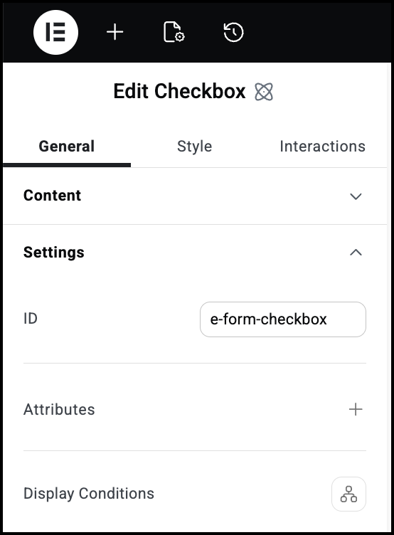
Allows you to tag individual elements on a page. This way you can link to this specific element.

Attributes are used by developers to target certain elements in order to customize them. For details, see Add and delete attributes.


Show or hide elements depending on different conditions. For details, see Show and hide elements on a page.

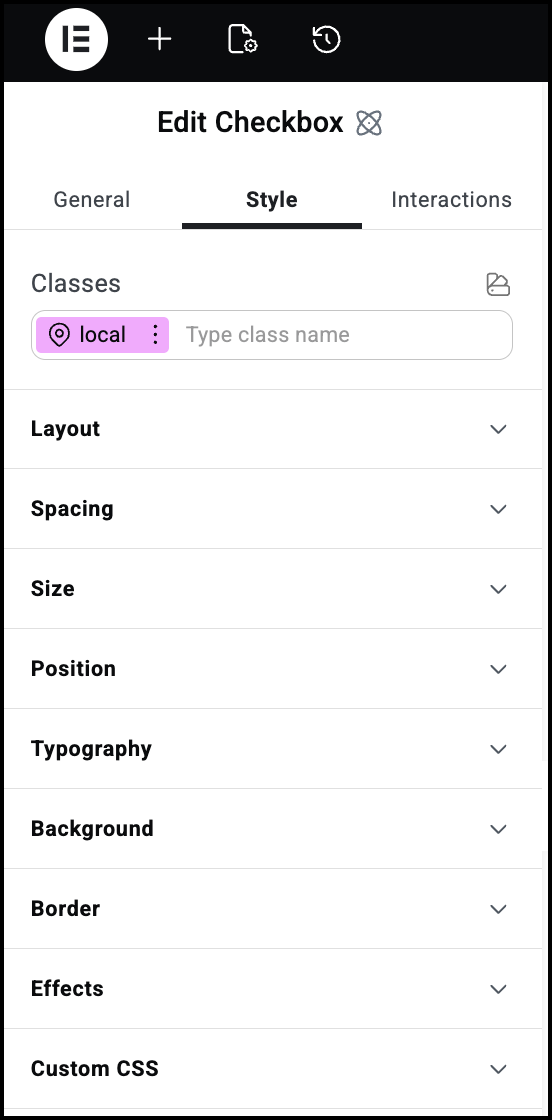
See the individual articles on Style options:


Settings for the Radio button atom

The Radio button atom is used when visitors need to choose one option from among a group of options. 

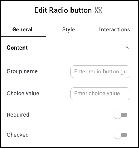
The Radio button General Content menu

Radio buttons are used to select one option from among several choices. All the choices from a group should have the same ID. For example, if visitors have to choose between Yes or No, the two answers must have the same Group name so that only one can be selected.

Choice value is used when you want the submission text to differ from the radio button label. For instance, if you had a radio button labelled Color 1, but you want is to appear as Red in the submission, you could label the button as Color 1 and enter Red as the Choice value.

Use the toggle to mark this as a required field. If visitors don’t fill in this field, they won’t be able to submit their form.

Use this toggle if you want the button to be checked by default. Remember, each group can only have one button selected.

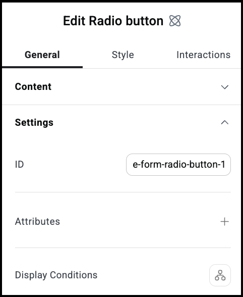
The Radio Button General Settings menu

Allows you to tag individual elements on a page. This way you can link to this specific element.

Attributes are used by developers to target certain elements in order to customize them. For details, see Add and delete attributes.


Show or hide elements depending on different conditions. For details, see Show and hide elements on a page.

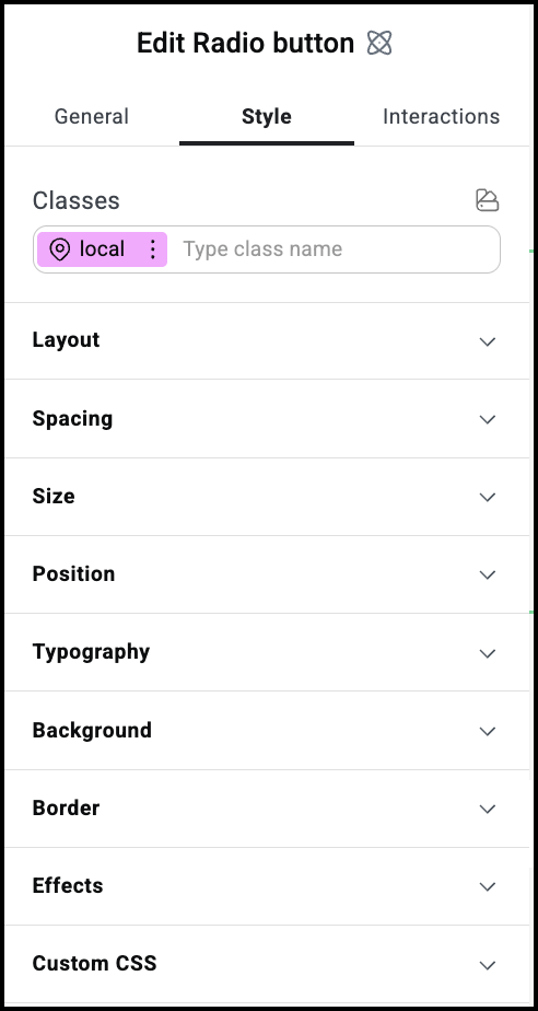
The Radio button Style menu

See the individual articles on Style options:


Settings for the Date picker atom

The Date picker atom lets visitors submit dates for their forms. For example, somebody attending a convention between May 1 and May 3. 

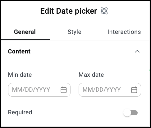
The Date Picker General Content menu

Usually used as the start or beginning date.

Usually the end or finish date.

Use the toggle to mark this as a required field. If visitors don’t fill in this field, they won’t be able to submit their form.

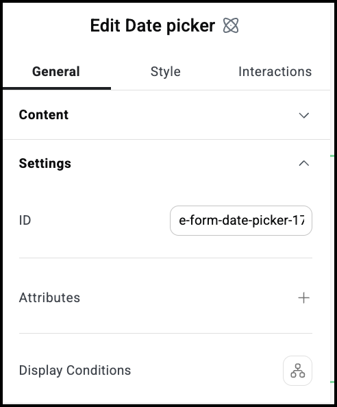
Allows you to tag individual elements on a page. This way you can link to this specific element.

Attributes are used by developers to target certain elements in order to customize them. For details, see Add and delete attributes.


Show or hide elements depending on different conditions. For details, see Show and hide elements on a page.

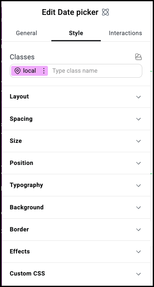
See the individual articles on Style options:


Settings for the Time picker atom

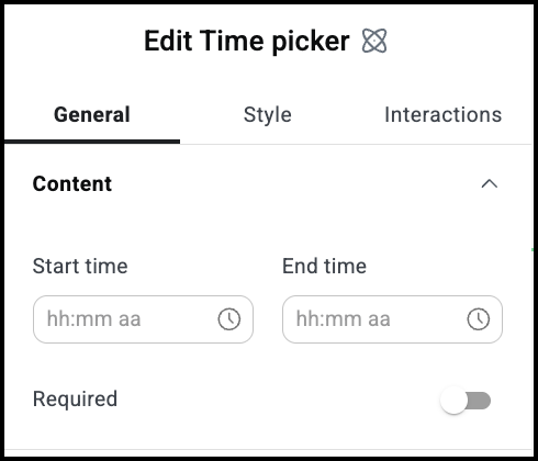
The Time picker atom lets visitors submit times for their forms. For example, somebody who wants a reservation between 7 PM and 10 PM.

The Time picker General Content menu

The beginning time.

The finish time.

Use the toggle to mark this as a required field. If visitors don’t fill in this field, they won’t be able to submit their form.

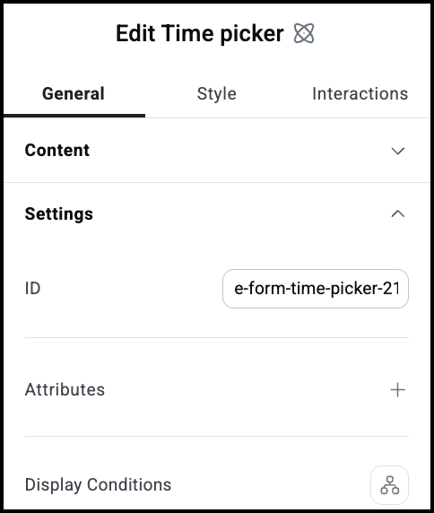
Allows you to tag individual elements on a page. This way you can link to this specific element.

Attributes are used by developers to target certain elements in order to customize them. For details, see Add and delete attributes.


Show or hide elements depending on different conditions. For details, see Show and hide elements on a page.

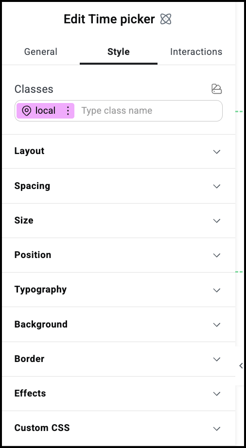
The Time Picker menu

See the individual articles on Style options:


Settings for the Select atom

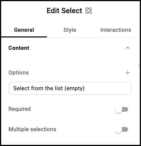
The Select atom lets visitors choose one or more choices using a dropdown menu.

The General Content menu

Click to add an entry to the dropdown menu. When you click you are presented with two text fields:

  • Select from list: The name you want to appear in the list.
  • Value: What will be submitted with the form.

Use the toggle to mark this as a required field. If visitors don’t fill in this field, they won’t be able to submit their form.

Toggle on if you want visitors to have the option of choosing more than one item from the dropdown menu.

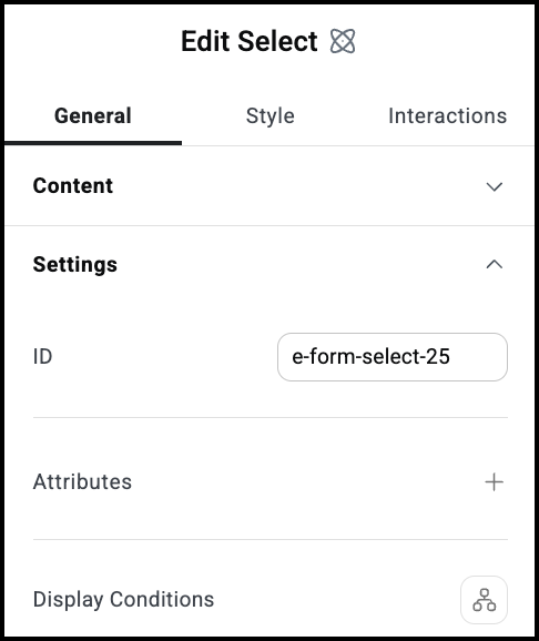
Allows you to tag individual elements on a page. This way you can link to this specific element.

Attributes are used by developers to target certain elements in order to customize them. For details, see Add and delete attributes.


Show or hide elements depending on different conditions. For details, see Show and hide elements on a page.

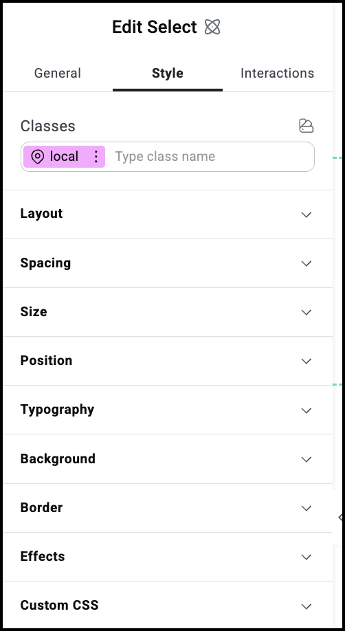
See the individual articles on Style options:


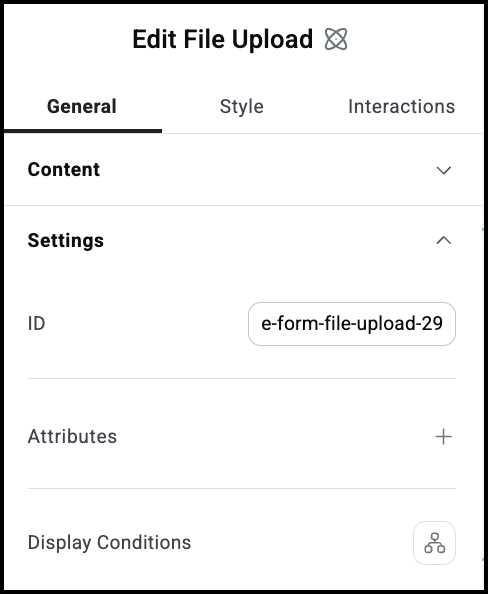
Settings for the File upload atom

The File upload atom lets visitors submit files to the website owner. For example a job applicant can submit their resume.

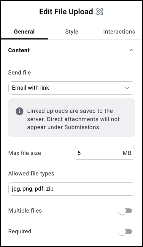
The File submit General Content menu.

Choose how the website owner will receive the file:

  • Email with link: The file(s) are uploaded to the website server and a link is mailed to the website owner. 
  • Email with attachment: The file(s) are emailed to the website owner as an attachement(s).
  • Email with both: The file(s) is uploaded to the server and the website owner receives the file(s) as an attachment(s).

Limit the size of attachments.

Limit the types of files visitors can support.

Toggle on if you want visitors to have the option of sending more than one file at a time.

Use the toggle to mark this as a required field. If visitors don’t fill in this field, they won’t be able to submit their form.

Allows you to tag individual elements on a page. This way you can link to this specific element.

Attributes are used by developers to target certain elements in order to customize them. For details, see Add and delete attributes.


Show or hide elements depending on different conditions. For details, see Show and hide elements on a page.

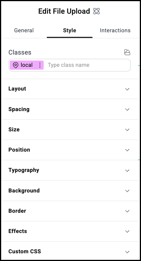
The File upload Style menu

See the individual articles on Style options:


Have more questions?

Can’t find the answers you’re looking for? We’re more than happy to assist.

Contact support

Related Articles

On this page

Share this article