Adding a background to elements is an important part of any web design. It can help the element stand out, be a way of layering text over images or simply making the page look better.
Element backgrounds can incorporate colors, gradients and images. These backgrounds can contain multiple layers, allowing you to create different effects such as layering text and images. For details, see Add a layered background.
Add a background to an element
To add a background:
- Open the Elementor Editor.
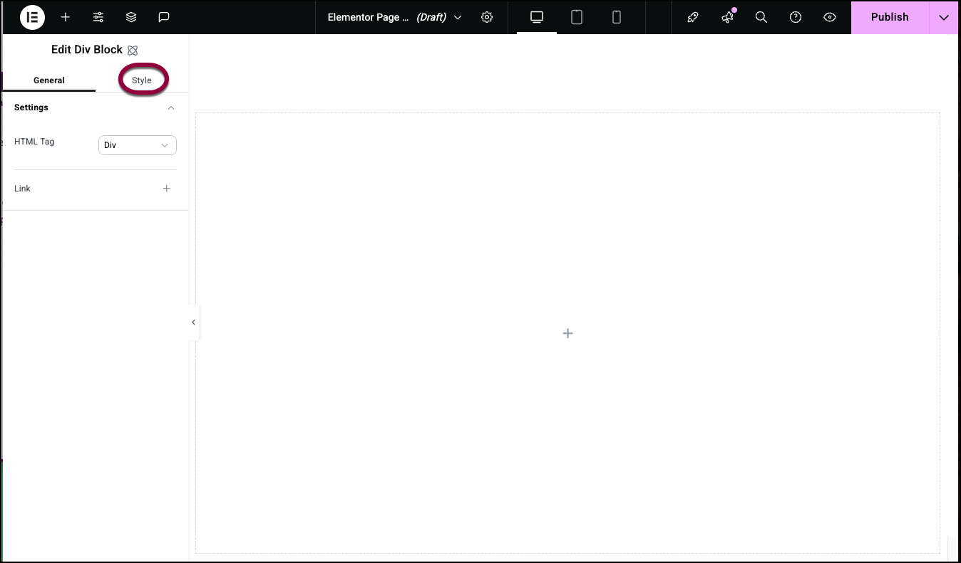
- Click the Style tab.
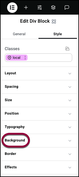
- Open the Background field.
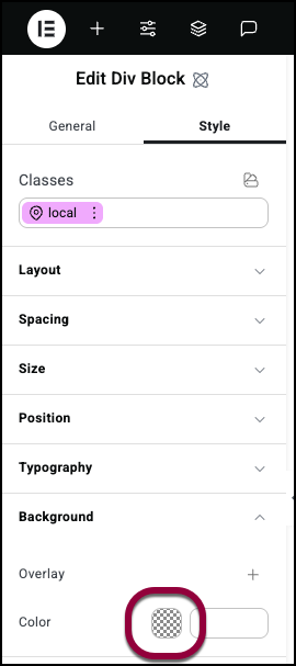
- To add a color, click the color swatch or add a code to the text box. For details, see Use the color picker.
- To add an image:
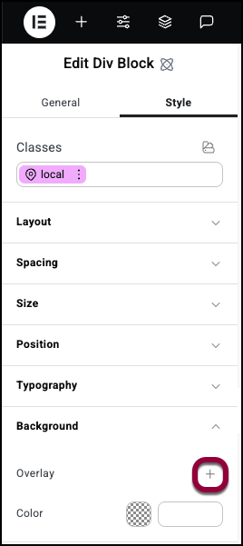
- Click the plus sign next to Overlay.
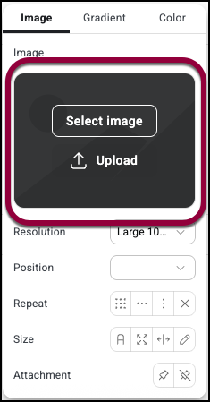
- Hover over the image field and choose to upload or select an image. For details, see Adding images and icons.

- Add options for the Image. See Image options below.
- Click the plus sign next to Overlay.
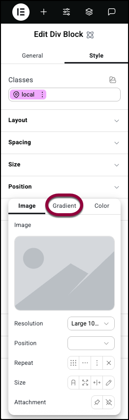
- To add a gradient, select Gradient from the top panel. See Gradient options below.
- (Optional) You can add more layers to the background. These layers can be colors, images and/or gradients. For details, see Add a layered background.
Image options
After selecting an image you have a number of options for how that image is displayed.
- Image resolution: Refers to the quality and clarity of an image, typically measured in pixels (e.g., 1920×1080). Some image sizes are named, such as Thumbnail, Medium, Medium Large, Large or Full. The resolution affects how sharp it appears on screens and, sometimes, its onscreen size.
- Position: Controls the placement of the image within the element. For details, see Positioning background images.

- Repeat: If the background image is smaller than the element, it can repeat itself so that it covers the entire element. Repeat options include:
- Repeat: The image repeats to fill the element.

- Repeat -x:The image repeats along a row.

- Repeat-y: The image repeats along a column.

- No repeat: The image only appears once.
- Repeat: The image repeats to fill the element.
- Size

- Auto: The background image is displayed in its original size.
- Cover: The image will fill the entire space of the element. If the image is too big it will automatically crop the image. If the image is too small it will use a larger version of the image or stretch the image to fit.

- Contain: The entire image will be fit within the element – keeping the same proportions. This often leads to “letterboxing” where there are blank spaces around the image.
- Custom: Use the number fields to set the height and the width of the image.
- Auto: The background image is displayed in its original size.
- Attachment
 Fixed – The background image remains in place as the visitor scrolls up and down the page.
 Scroll: The background image scrolls up and down with the page.
Gradient options
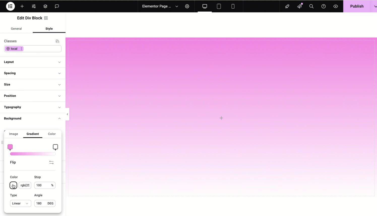
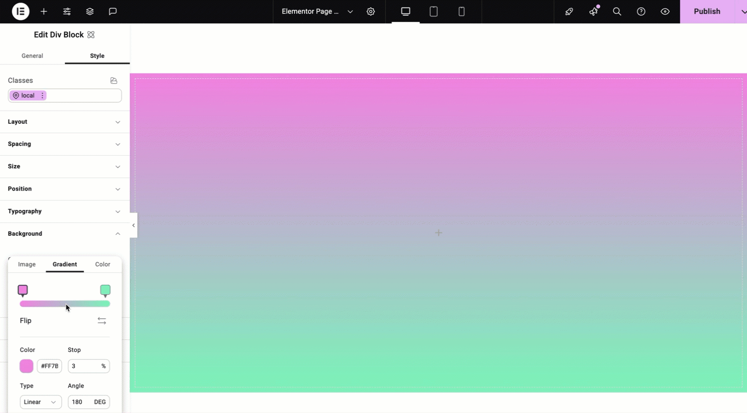
A gradient background contains colors which transition smoothly from one to another, creating a gradient effect. Instead of using a single, solid color, you can combine multiple colors and create a visually appealing blending effect in the background.
- Slider: The slider is used in several different ways:
- To set the colors of the gradient:

- Click one of the handles.

- Click the color swatch and select a color. For details, see Use the color picker.
- Repeat for the second handle.
- Click one of the handles.
- To control where the two colors meet:
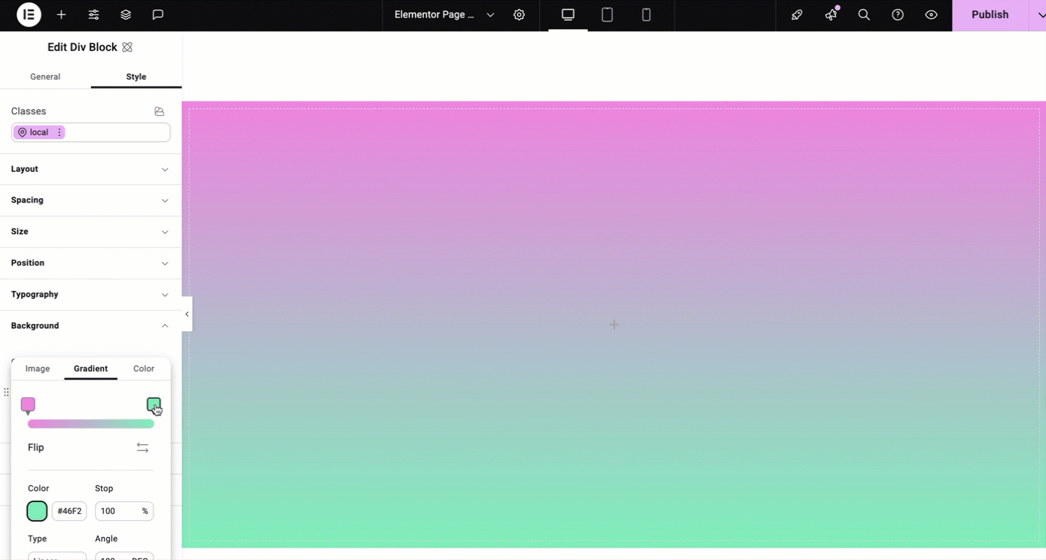
- Move the handles of the slider to determine where the two colors of the gradient meet.
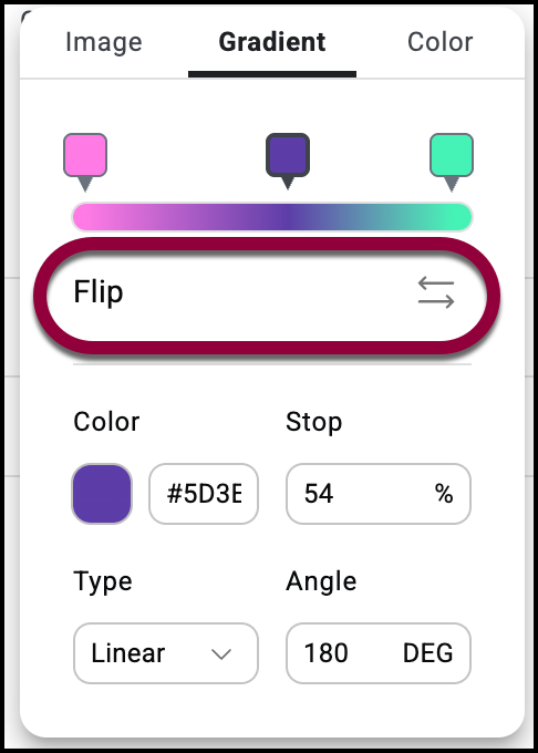
- To add more colors to your gradient, add more handles.
- Hover over the slider until you see a plus icon.
- Click the plus icon.
- To set the colors of the gradient:
- Flip: Click the button to switch the two colors of the gradient.
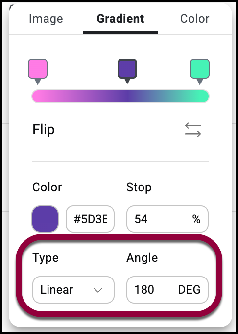
- Type: Choose a style of gradient:
- Linear: Divide the colors horizontally or vertically. The Angle determines whether the colors divide horizontally or vertically. The default setting is 180 which means the colors are divided by a straight line running horizontally across the element.
- Radial: One color radiates out and meets the second color. Position sets the point where the color radiates out from.
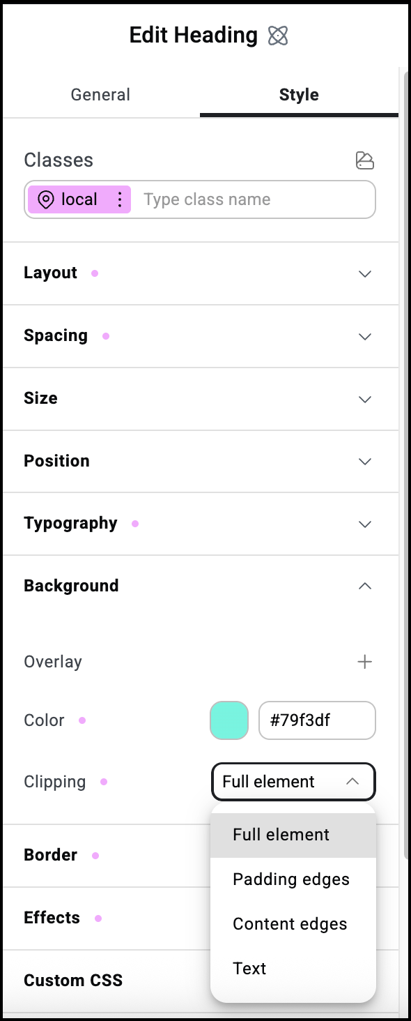
Background clipping
Background clipping lets you control the area of an element’s background. This clipping can be applied to any of four aspects of the background:
- Border edges: Only applicable to elements that contain a border. The clipping effect changes the element’s outer border.
- Padding edges: Only applicable to elements that contain padding. The clipping effect changes the background where the padding starts.
- Content edges: The clipping effect changes the background where the padding starts.
- Text: Only applicable to elements that contain text. The clipping effect changes the background around the element’s text.
To apply element clipping
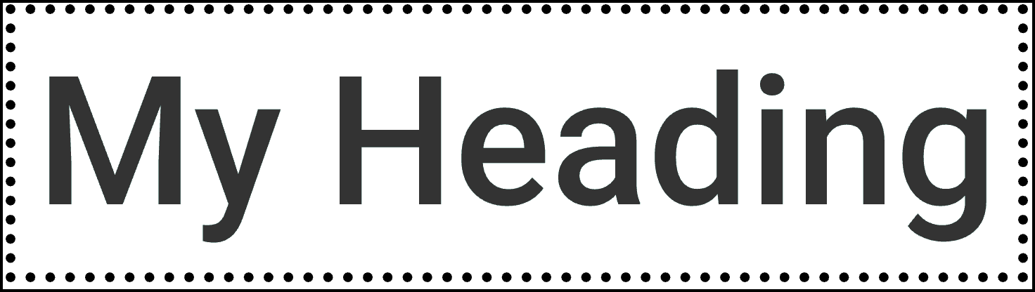
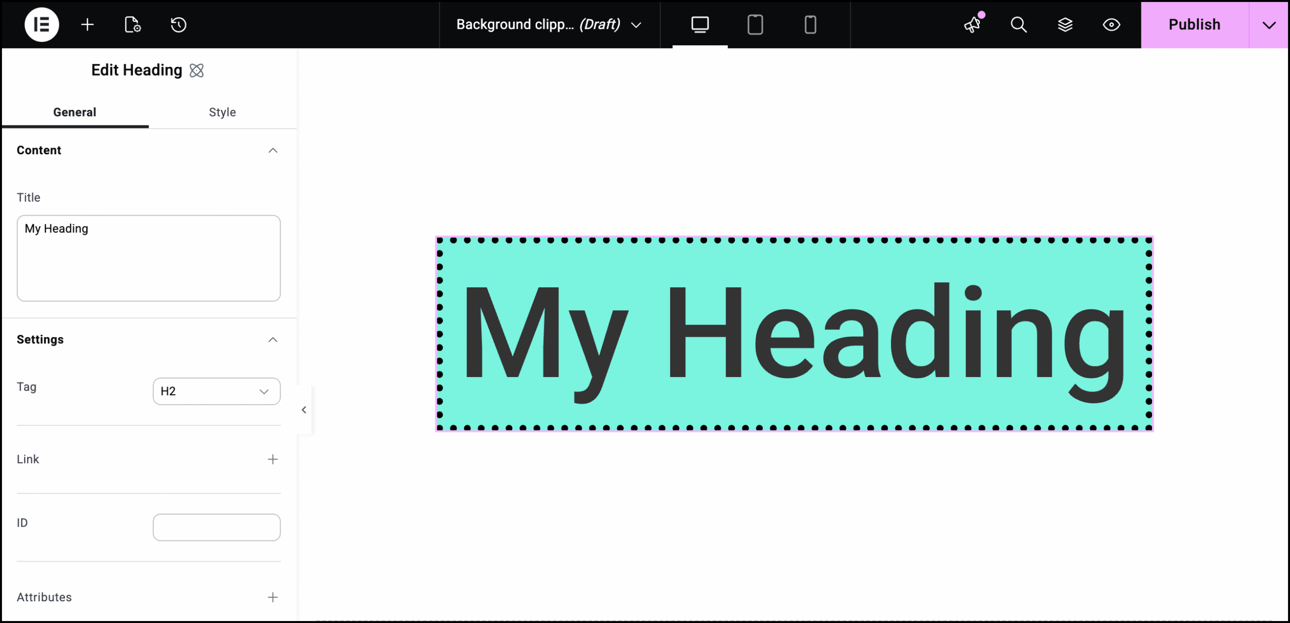
- Add an element to the canvas. For this example we’ll use a Heading element with a border and 15px padding.
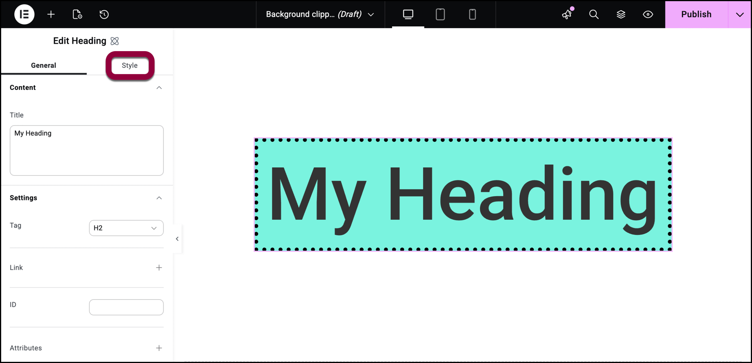
- Click the Style tab.
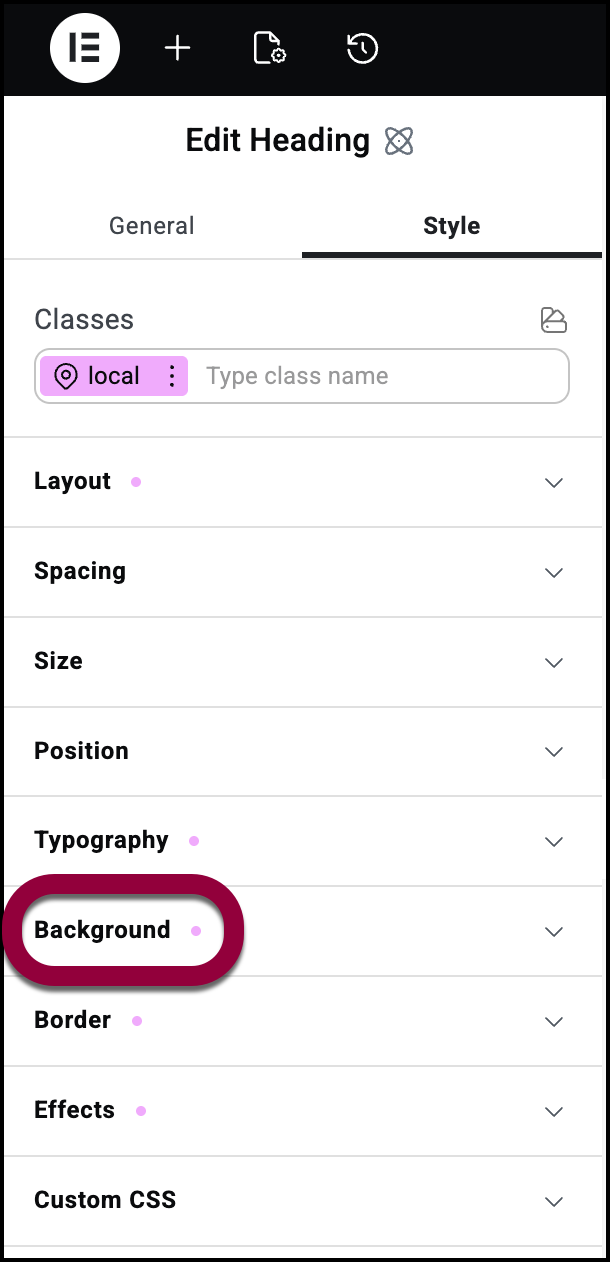
- Open the Background field.
- Use the Clipping dropdown menu to select an aspect for clipping.
Examples of Background clipping
This is how the element looks with the four different types of clipping:
Padding Edges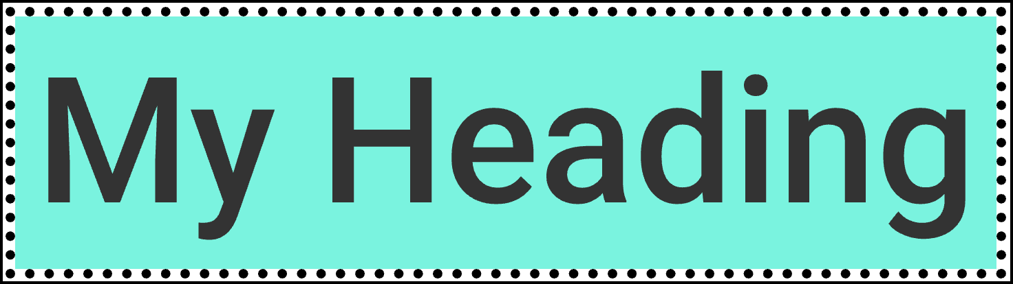
Content Edges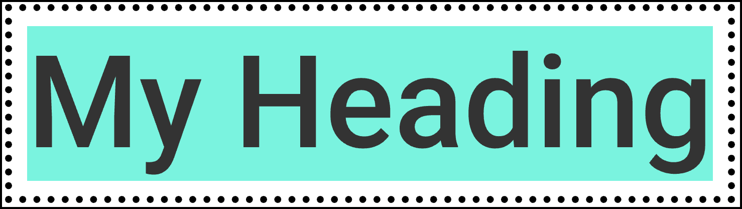
Text