Making images fit your design
Images are a key element to any website. These images can not only be used as elements themselves (using the Image widget), they can also be used as backgrounds,or as integral parts of other elements. Sometimes, however, it’s difficult to get your images to fit your design. The basic concepts outlined below should help you get a basic understanding of how Elementor works with images and how you can best fit them into your design .
Making images fit your design
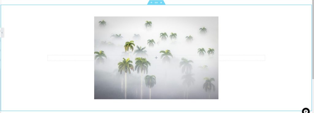
Think of the element where you want to place the image as a picture frame. In most cases, the image won”t fit exactly into the frame. Elementor offers you several options to help you determine how that image will be displayed or “fit” into the frame. There are four main options that work together to “fit’ the images into the frame.
Position – If the image is larger than the element, position determines which part of the image will be visible. Imagine you are sitting in a house with a small window and there is a large mural hanging up outside. Position will move the mural around, determining what part of it you can see.
If the image is smaller than the element, position determines where within the element the image will be located.
Position options are: Center Center, Center Left, Center Right, Top Center, Left Center, Right Center, Bottom Center, Bottom Left, Bottom Right and Custom. Choosing custom will open up sliders allowing you to change the x,y positions of the image for more exact placement.
Repeat – By default, if the image is too small for the element, the image will be repeated so that it takes up the entire element.
- No–repeat means the image will only appear once
- Repeat X – means the image will appear across a row
- Repeat Y means the image will repeat along a column
Size – Despite its name, this property has more to do with how the image fits into the element as opposed to the size if the image (although the two are related):
- Cover – The image will fill the entire space of the element. If the image is too big it will automatically crop the image. If the image is too small it will use a larger version of the image..
- Contain – The entire image will be fit within the element – keeping the same proportions. This often leads to “letterboxing” where there are blank spaces around the image.
- Custom – A slider will allow you set the width of the image (the height automatically scales with the width.
Note: Just as you can fit a square peg in a round hole with enough force, you can use these options to fit almost any image into your design, but you’ll get best results if you try to get images that best fit your design. For example, if you have a space that’s very wide, consider using a landscape image instead of trying to fit a portrait image in the space.
Note: To help speed up and fine-tune your pages. You can use different size background images for different devices.
Next steps
To get the most out of Elementor, check out the Knowledge hub for helpful learning resources.