Add Carousel widget: Step-by-step
- Add the Carousel widget to the canvas. For details, see Add elements to a page.
- By default, the carousel widget comes with three slides. Each slide has one container. You can add elements to these containers to build your own carousel. Learn how to work with containers.
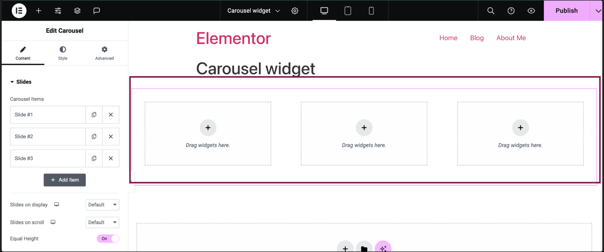
Note: Do not add a carousel inside a carousel, as it may affect the functionality. - You can also add or delete these default slides.
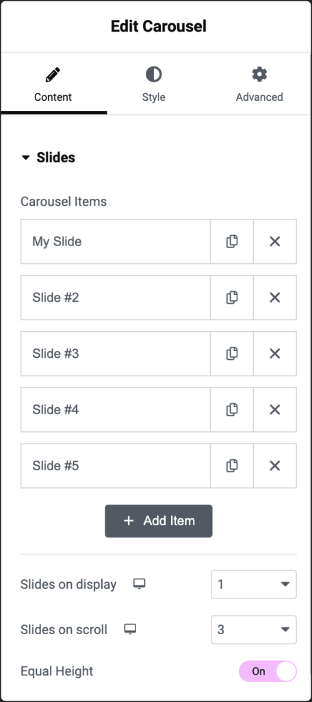
- To add a new slide, in the Content tab, under the Slides section, click the Add Item button. You can also create the exact copy of the existing slide by clicking the
 icon.
icon.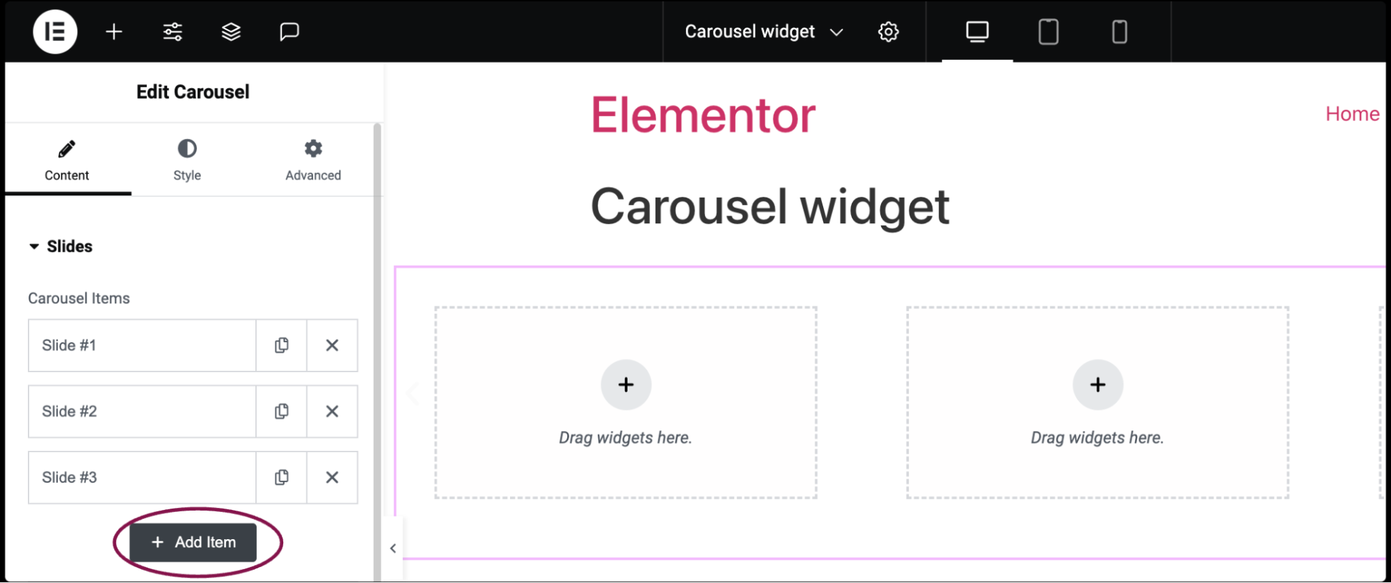
- Click the delete icon
 to delete a slide.
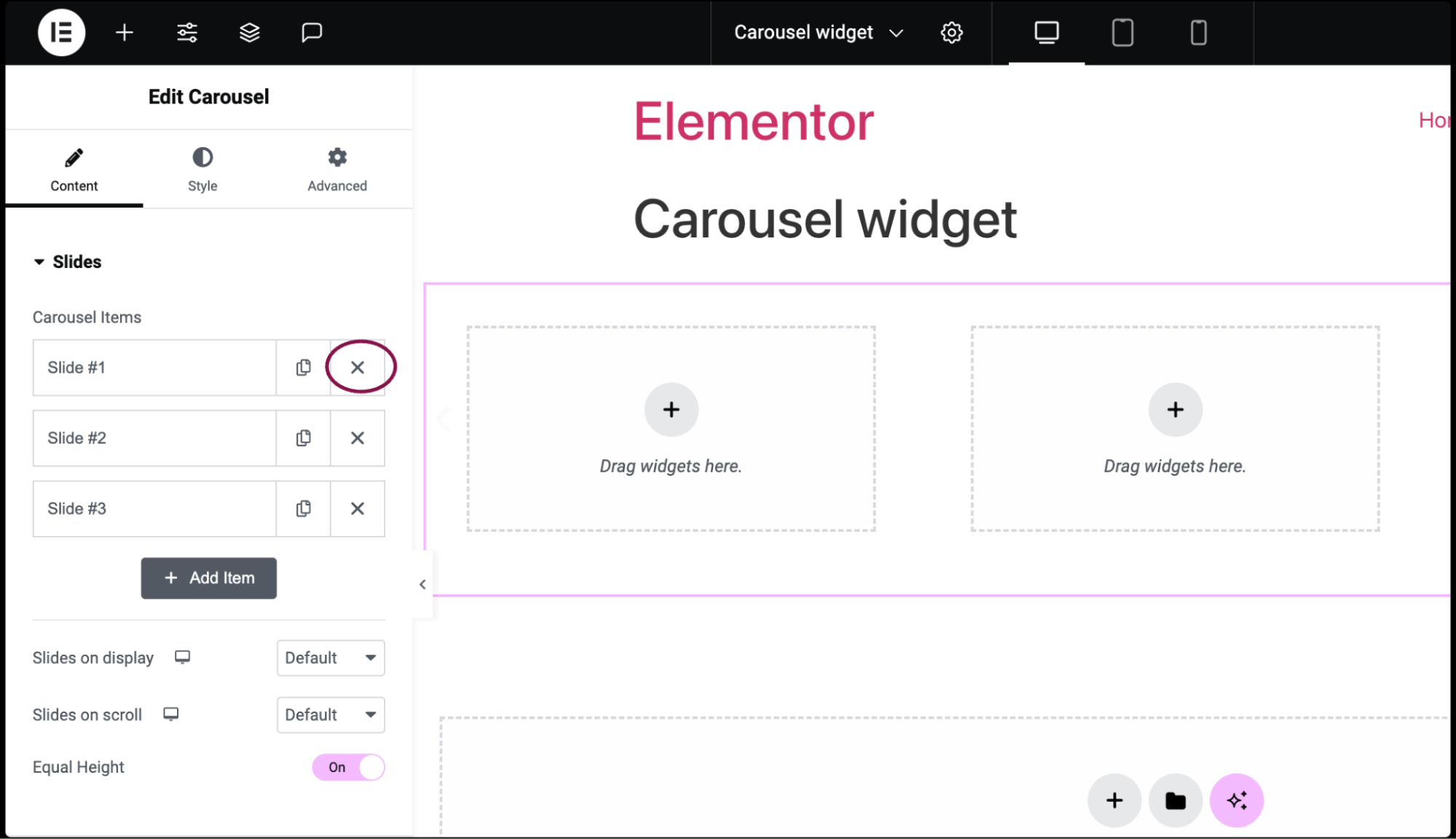
- To add a new slide, in the Content tab, under the Slides section, click the Add Item button. You can also create the exact copy of the existing slide by clicking the
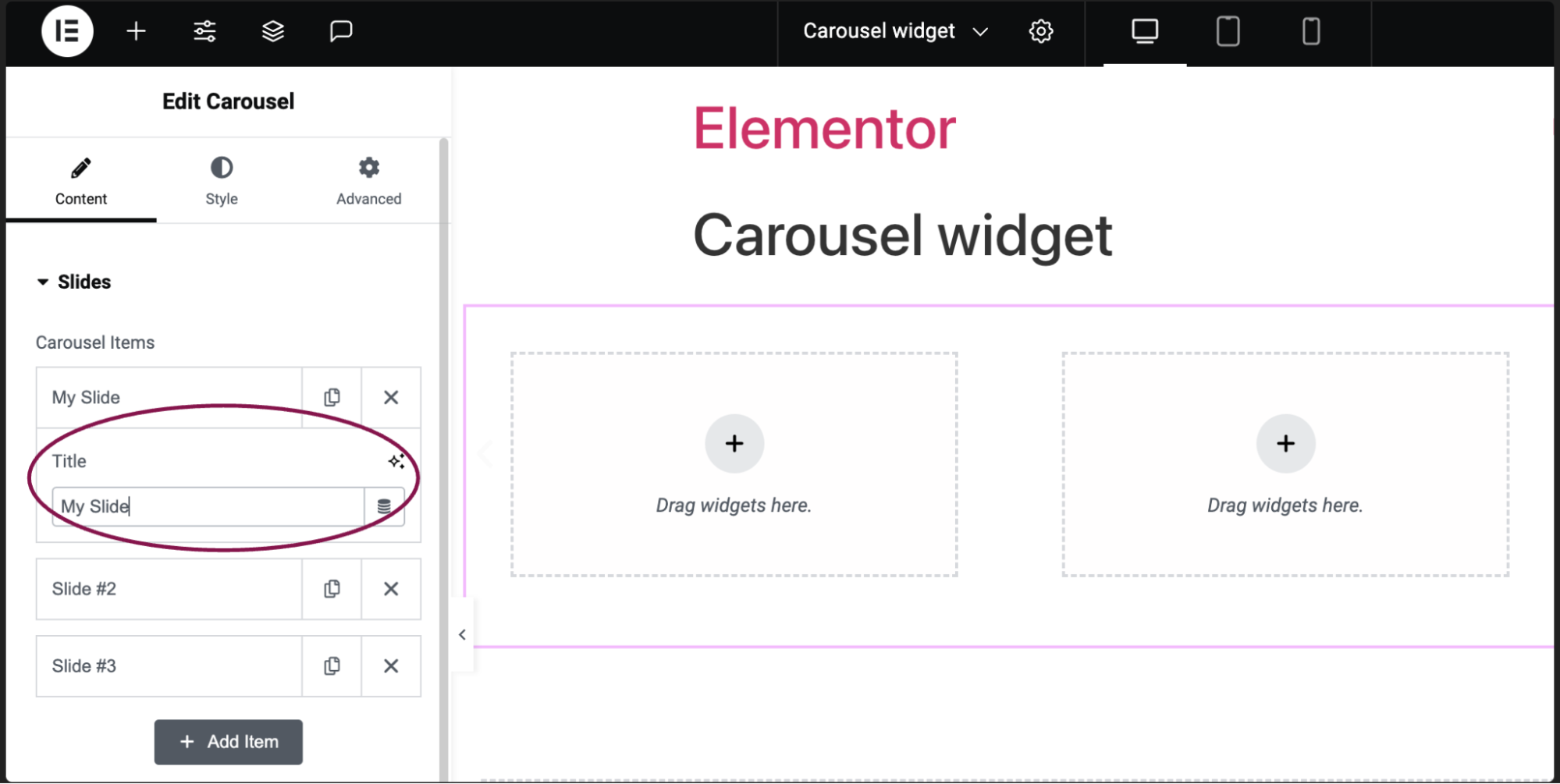
- (Optional) Click on the individual slide to change its Title.
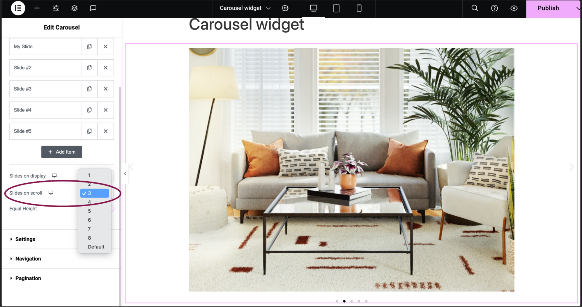
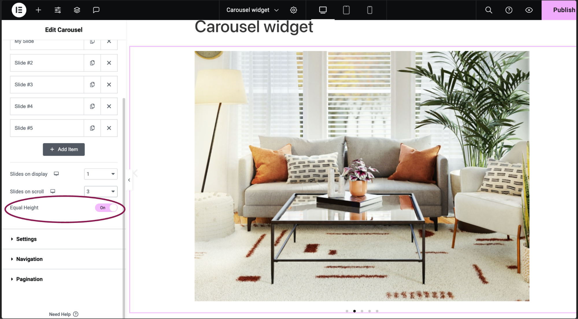
- In the Slides on display field, from the dropdown menu choose the number of slides visible.
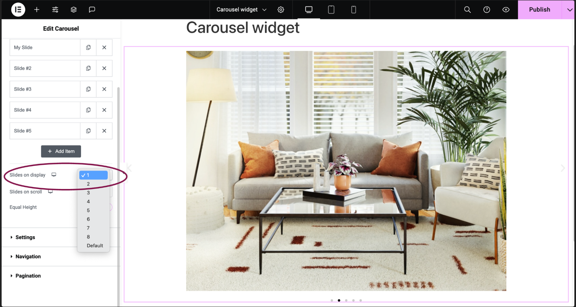
Note: The more slides you add, the smaller each slide will be. - In the Slides on scroll field, from the dropdown menu select the number of slides that will move when visitors click the navigation icon.
- Enable the Equal Height option to have all the slides the same height.
Carousel Items
Slides that make up the carousel.
- Click the icon to copy a slide.
- Click the icon to delete a slide.
Slides on display
Slides on scroll
Equal Height
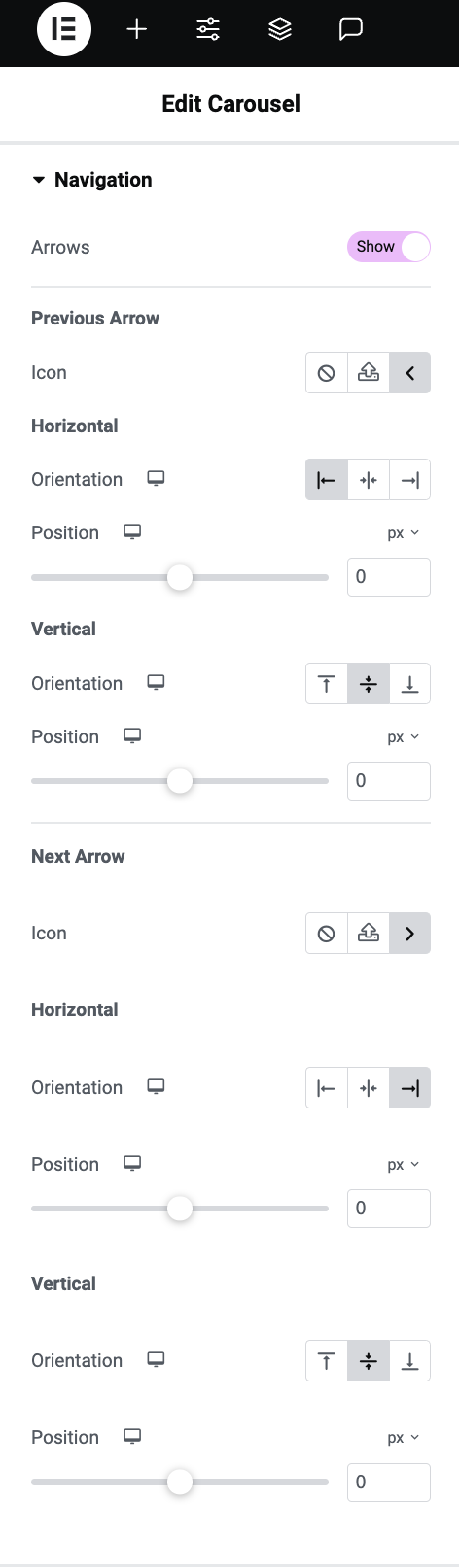
Arrows
Previous Arrow
Icon – Replace the arrow icon used to view the previous slide:
 Select not to display an icon
  Upload an SVG file to use as an icon. See Enable SVG support.
  Choose an icon from the icon library.
Horizontal
Vertical
Next Arrow
Icon – Replace the arrow icon used to view the next slide:
- Select not to display an icon
- Upload an SVG file to use as an icon. See Enable SVG support.
- Choose an icon from the icon library.
Horizontal
Vertical