When designing with Elementor, you may notice that some elements have options for sizing, allowing you to choose PX, EM, REM, %, VW, or VH. But what do those options actually mean, and when should you use one over another?
Let’s start with the basics.
In CSS, you can specify sizes or lengths of elements using various units of measure. The units of measure that you’ll find in some Elementor options include PX, EM, REM, %, VW, and VH, although there are several more available in CSS. Not every Elementor element will offer all of these units. Elementor only presents the options that make the most sense for the given element.
The most important aspect to learn about the different units is that some units, such as PX are absolute units, and some are relative units.
Absolute Units
PX: Pixels (px) are considered absolute units, although they are relative to the DPI and resolution of the viewing device. But on the device itself, the PX unit is fixed and does not change based on any other element. Using PX can be problematic for responsive sites, but they are useful for maintaining consistent sizing for some elements. If you have elements that should not be resized, then using PX is a good choice.
Relative Units
EM: Relative to the parent element
REM: Relative to the root element (HTML tag)
%: Relative to the parent element
VW: Relative to the viewport’s width
VH: Relative to the viewport’s height
Unlike PX, relative units like %, EM, and REM are better suited to responsive design and also help meet accessibility standards. Relative units scale better on different devices because they can scale up and down according to another element’s size.
Let’s look at a simple example.
In most browsers, the default font size is 16px. Relative units calculate the size from this base. If you change that base by setting a base size for the HTML tag via CSS, then that becomes the basis for calculating relative units throughout the rest of the page. Likewise, if a user adjusts her font size, that then becomes the basis for calculating relative units.
So what do these units mean when dealing with the default of 16px?
The number you specify will multiply that number times the default size.
1em = 16px (1 * 16)
2em = 32px (2 * 16)
.5em = 8px (.5 * 16)
1rem = 16px
2rem = 32px
.5rem = 8px
100% = 16px
200% = 32px
50% = 8px
Ok, great, but what if either you or the user changes the default size? Because these are relative units, the final size values will be based off of the new base size. Although the default is 16px, if you or the user changed it to 14px, then the calculated sizes would end up being:
1em = 14px (1 * 14)
2em = 28px (2 * 14)
.5em = 7px (.5 * 14)
1rem = 14px
2rem = 28px
.5rem = 7px
100% = 14px
200% = 28px
50% = 7px
This gives the user the freedom to adjust her default browser font size, while still maintaining the relative scale of each element that you’ve specified.
What is the difference between EM and REM?
Looking at the chart above, it shows EM and REM looking exactly the same. So how do they differ?
Simply put, they differ based on inheritance. As mentioned, REM is based on the root element (HTML). Every child element that uses REM will then use the HTML root size as its calculation point, regardless of whether or not a parent element has any different sizes specified.
EM on the other hand, is based on the font size of the parent element. If a parent element has a different size than the root element, the EM calculation will be based off of the parent element, and not the root element. This means that nested elements that use EM for sizing can sometimes end up being a size that you didn’t anticipate. On the other hand, it does give you more fine-grained control if you need it to specify the size for a particular area of a page.
%, VW, and VH
While PX, EM, and REM are primarily used for font sizing, %, VW, and VH are mostly used for margins, padding, spacing, and widths/heights.
To reiterate, VH stands for “viewport height”, which is the viewable screen’s height. 100VH would represent 100% of the viewport’s height, or the full height of the screen. And of course, VW stands for “viewport width”, which is the viewable screen’s width. 100VW would represent 100% of the viewport’s width, or the full width of the screen. % reflects a percentage of the parent element’s size, regardless of the viewport’s size.
Let’s look at some examples of where Elementor gives %, VW, and VH options.
Column Widths: If you edit the layout of an Elementor Column, you’ll notice that there is only one width sizing unit available – %. Column widths only work well and responsively when using percentages, so no other option is given.
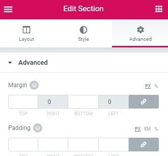
Margins: A section’s margins can be specified either in PX or %. Using % is usually preferable to ensure the margins don’t get larger than the content when scaling down for a mobile device for instance. By using a percentage of the width of the device, your margins will remain relative to the size of the content, which is almost always preferable.
Padding: A section’s padding can be specified either in PX, EM, or %. As with margins, it is often preferable to use either EM or % so the padding remains relative as the size of the page scales.
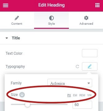
Font Size: If you edit the typography of an element, such as a Heading, you’ll see four choices: PX, EM, REM, and VH
Have you ever created a large heading and admired how great it looked on desktop, only to realize it was far too large on mobile? (Admission of guilt: I have, more than once).
The key to solving this elegantly is to use either EM, REM, or VW instead of PX. Which you choose is dependent upon your particular situation. I usually choose EM because I want the size to be relative to the Heading’s parent. But if you prefer to have the size be relative to the root (HTML) size, then choose REM instead. Or, you could set it to be relative to the viewport’s width (VW) if that works better for your case.
Note that you could also set specific font size PX values per device by using the Device Icons to specify a size for Desktop, Tablet, and Mobile. But that still places limits on responsiveness and accessibility, so keep that in mind if you choose PX.
More About VW and VH
Viewport units represent a percentage of the current browser viewport (current browser size). While similar to % units, there is a difference. Viewport units are calculated as a percentage of the browser’s current viewport size. Percentage units on the other hand are calculated as a percentage of the parent element, which may be different than the viewport size.
Let’s consider an example of a mobile screen viewport that is 480px x 800px.
1 VW = 1% of the viewport’s width (or 4.8px)
50 VW = 50% of the viewport’s width (or 240px)
1 VH = 1% of the viewport’s height (or 8px)
50 VH = 50% of the viewport’s height (or 400px)
If the viewport size changes, the element’s size changes respectively.
When Should You Use One Unit Over Another?
Ultimately, there isn’t a perfect answer for this question. In general, it is often best to choose one of the relative units over PX so that your web page has the best chance of rendering a beautifully responsive design. Choose PX however, if you need to ensure that an element never resizes at any breakpoint and remains the same regardless of whether a user has chosen a different default size. PX units ensure consistent results even if that’s not ideal.
EM is relative to the parent element’s font size, so if you wish to scale the element’s size based on its parent’s size, use EM.
REM is relative to the root (HTML) font size, so if you wish to scale the element’s size based on the root size, no matter what the parent size is, use REM. If you’ve used EM and are finding sizing issues due to lots of nested elements, REM will probably be the better choice.
VW is useful for creating full width elements (100%) that fill up the entire viewport’s width. Of course, you can use any percentage of the viewport’s width to achieve other goals, such as 50% for half the width, etc.
VH is useful for creating full height elements (100%) that fill up the entire viewport’s height. Of course, you can use any percentage of the viewport’s height to achieve other goals, such as 50% for half the height, etc.
% is similar to VW and VH but it is not a length that is relative to viewport’s width or height. Instead, it is a percentage of the parent element’s width or height. Percentage units are often useful to set the width of margins, as an example.
Elementor makes it easy to choose the option that is best suited for your design. Ultimately, it’s your choice.
Fractions
The introduction of Container Grids brought a new unit of measurement called fractions (FR). Fraction represents the amount of space taken by a column or row as measured by the percentage of overall space it takes up. For instance, a fraction setting of two means the column(s) will take up 50% of the available space. This means that if you’re using the default measurements, 2FR means you’ll have two columns, 3FR three columns etc.
Rows and FR
If you try to drag more widgets into a Grid than there are cells, a new row will be created. The new row will be given a minimal height without impacting the row above it even if they’re measured in fractions.