help center

On this page

Rating widget

Last Update: February 2, 2024

Add the widget

Rating widget icon Rating widget 193

To access and use a widget:

  1. In Elementor Editor, click +.
    All available widgets are displayed.

  2. Click or drag the widget to the canvas. For more information, see Add elements to a page.

What is the Rating widget?

Many websites either rate, or allow users to rate products, services and more. In fact, crowdsourced ratings are one of the great benefits websites can offer their visitors. The Ratings widget allows you to include these ratings in your site.

The Rating widget displays a visual representation of ranking. Most commonly stars are used for these rankings, but the Rating widget allows you to use icons from the icon library or uploaded SVG images.

info
Note
The Rating widget replaces the Star Rating widget. If you have websites that use the Star Rating widget, they are unaffected by this change and you can still edit existing Star Rating widgets. For more details, see Star Rating widget.

See all the options available with the Rating widget.  

Common use case

Jaime owns an online jewelry store. They want to introduce a new feature that will allow customers to rank each piece of jewelry according to how good a value the jewelry is and how the significant other reacted when they received the jewelry.  

Instead of using stars for their ratings, Jaime decides to use dollar signs for the value rating and hearts for their reaction rating. In addition, they decide to value will be ranked 1-5, while the reaction will be ranked 1-10.

Demo Rating widget 195

Additional use cases  

  • Sites that promote services
  • Sites that sell products
  • Sites for reviewing books, movies etc.

Add a Rating widget: Step-by-Step

  1. Add the rating widget to the canvas. For details, see Add elements to a page.
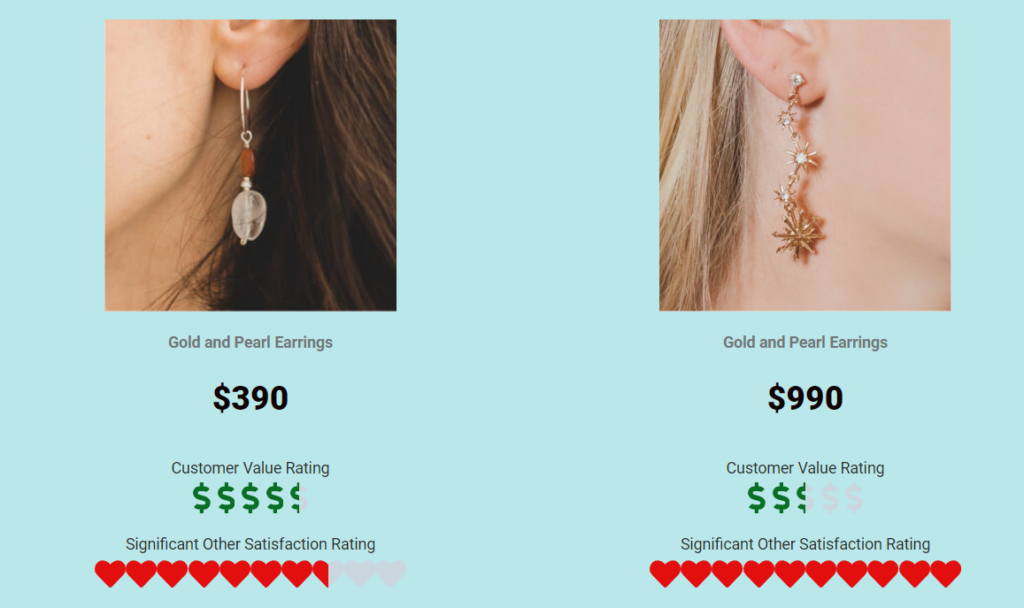
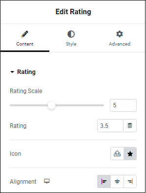
  2. In the Content tab, under Rating, use the Rating Scale slide to select a maximum number of symbols for your rating system. You can select any number you wish. Most rating systems have a maximum of either five or ten, but the Rating widget gives you the flexibility to use any rating system. For example, you can rate hot sauces from 1-100. You could even create a list of the top 500 places to visit in Japan and then rank them in importance. 
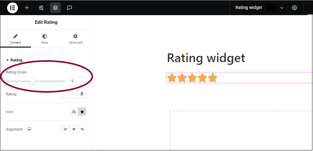
    1 Choose number of icons Rating widget 197
    info
    Note
    If you want to use more than ten symbols, enter the number of symbols in the text box next to the slider.

    2 Set the Rating 1 Rating widget 199
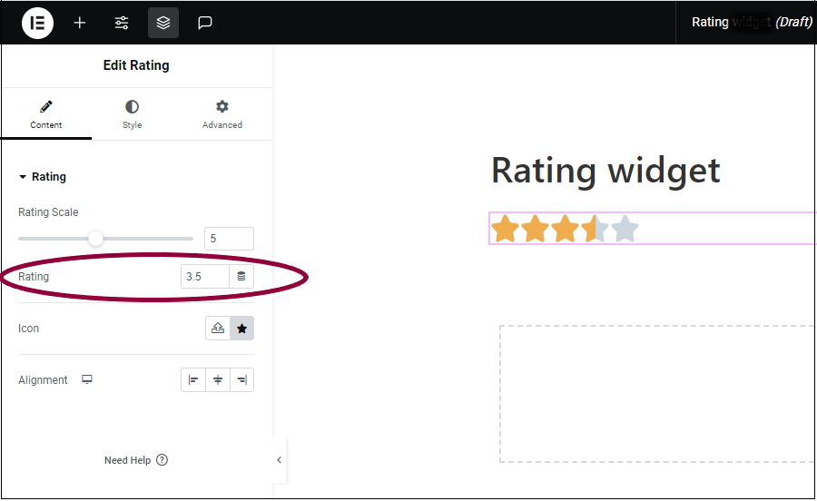
  3. In the Rating field, enter the number of rating icons you want to appear. This can be either whole numbers or halves, such as a rating of 3.5.

    3 Set the Icon Rating widget 201

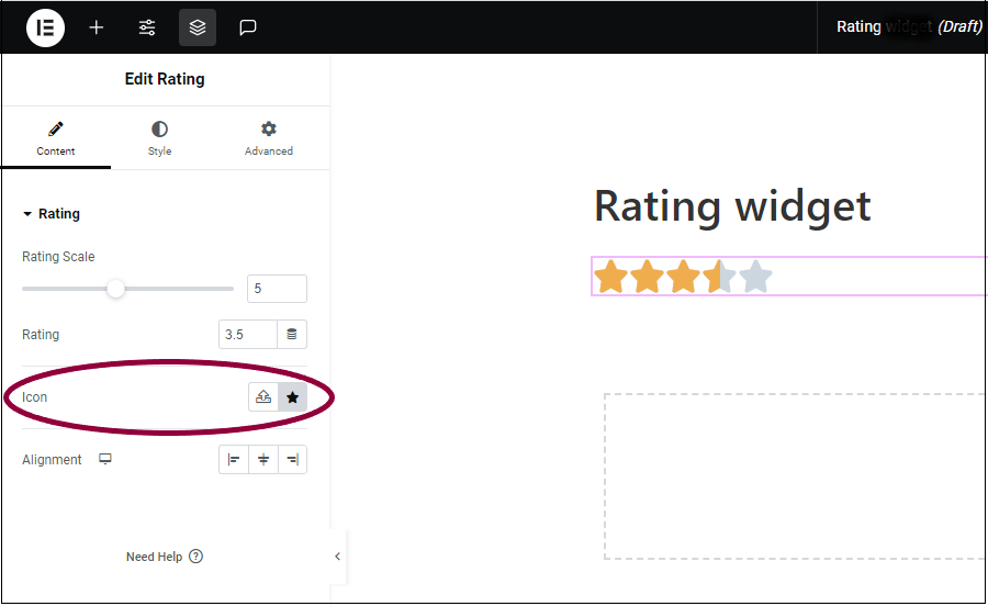
  4. (Optional) In the Icon field, replace the star image:
    1. Click the star button Star button Rating widget 203 to replace the star with an icon from the icon library.
    2. Click the SVG button SVG symbol Rating widget 205 to replace the star with an uploaded SVG image. For more details, see Enable SVG Support in Elementor.

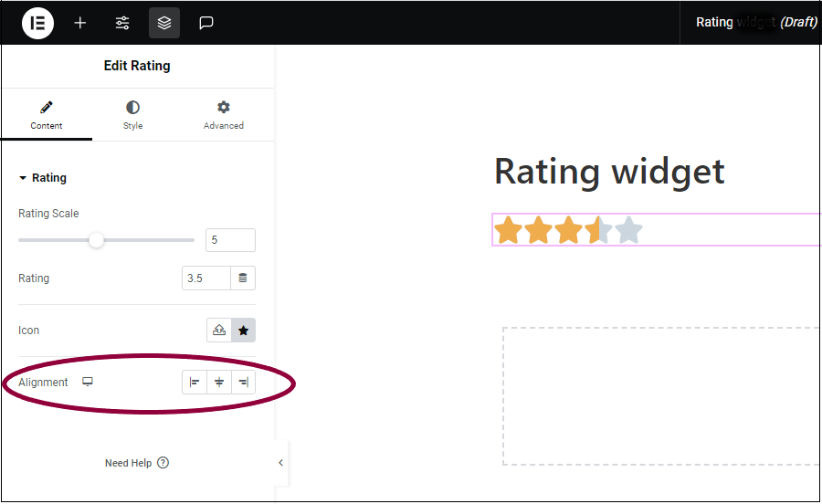
  5. In the Alignment field, set the alignment so the rating symbols will appear on the left edge, right edge or center of the widget.
    4 Set the Alignment Rating widget 207
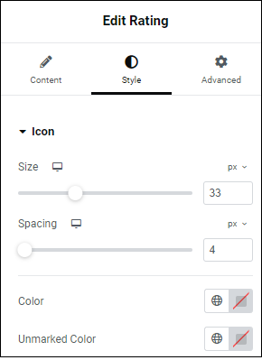
  6. Click the Style tab.
    5 Set the Size Rating widget 209
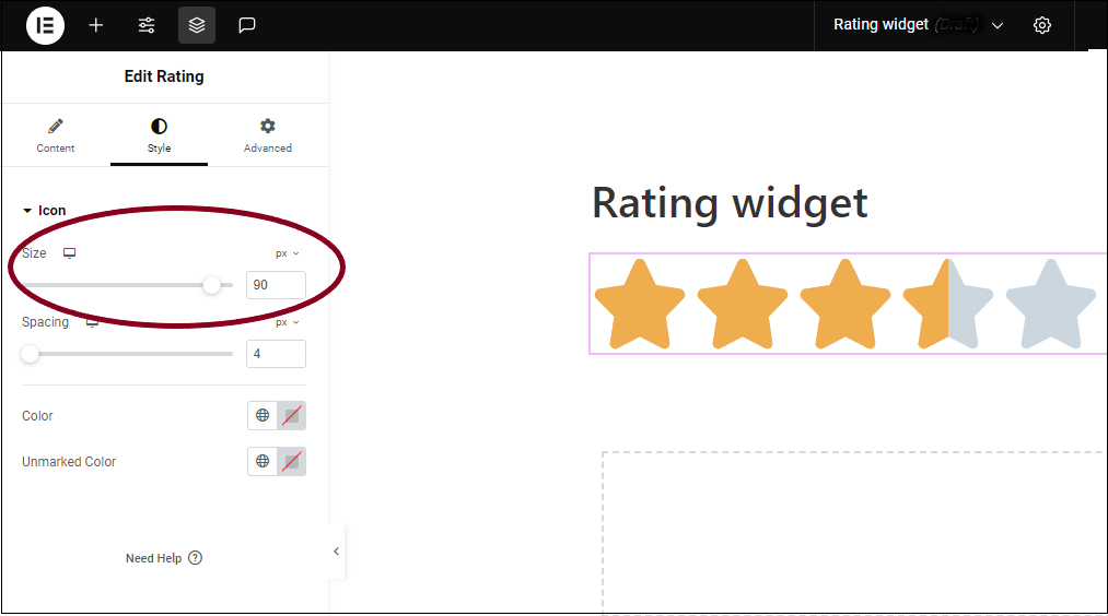
  7. In the Size field, use the slider to set the size of the symbols.
    5 set the Spacing Rating widget 211
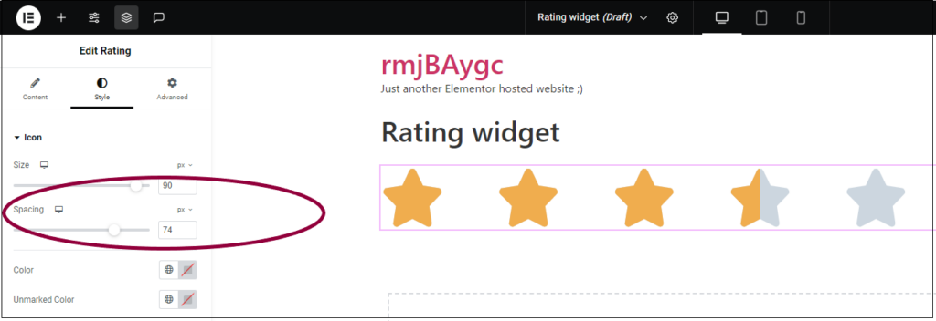
  8. In the Spacing field, use the slider to set the distance between the symbols.
    6 Set the color of the symbols Rating widget 213
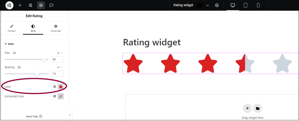
  9. In the Color field, set the color of the symbols when they are filled.  Symbols are filled to represent the rating. In this example, the three-and-a-half red stars signify a rating of three-and-a-half.  For more details, see Choose a color or Use global fonts and colors
    7 Set the color of non slected symbols Rating widget 215
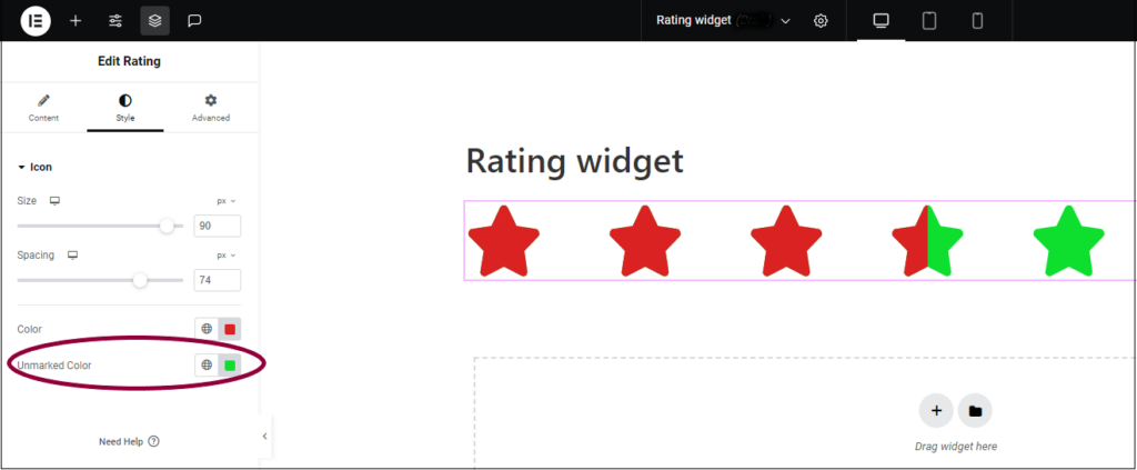
  10. Set the color of the symbols when they are not filled in. Unfilled symbols represent the difference between the rating and the maximum rating. For instance, the one-and-a-half unfilled starts indicate a rating of three-and-a-half out of five. For more details, see Choose a color or Use global fonts and colors

Settings for the Rating Widget

You can customize your widgets using content, style, and other advanced parameters, offering you great flexibility in tailoring them to your needs. Click the tabs below to see all the settings available for this widget.

Content tab Rating widget 217

Set the number of symbols for your rating system. Most rating system allows only up to a maximum of five or ten, but the Rating widget allows you to choose any number of rating icons. 

Enter the number of symbols you want to represent the rating. For example, enter 3 to display the possibility of a 3 star rating.

Icon allows you to switch out the star symbol for another symbol. Click the star Star button Rating widget 203  to choose a symbol from the icon library. Click the SVG button SVG symbol Rating widget 205  to upload an SVG image. 

Set the alignment so the rating symbols will appear on the left edge, right edge or center of the widget.

The Style tab Rating widget 223

Use the slider to set the size of the symbols. For more information about units, see  Units of Measurement.

Use the slider to set the distance between the symbols.

Set the color of the symbols when they are filled. For more details, see Choose a color or Use global fonts and colors

Set the color of the symbols when they are not filled. For more details, see Choose a color or Use global fonts and colors

Advanced tab Rating widget 225

To learn more about advanced settings, see Advanced Tab.

Have more questions? We’re more than happy to assist.

Link is copied to clipboard!
On this page

Is this article helpful?

Share this article