The Advanced tab provides additional settings and customization options. It’s a tab where you can fine-tune the appearance, add custom CSS, control responsiveness, and configure advanced features specific to the selected widget or container.
Want to learn faster? Book a 1-on-1 expert session today.
The options in the Advanced tab are designed for users who want greater control over the design and functionality of their widgets and containers.
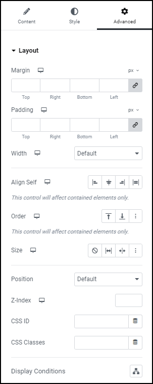
Margin
Set the Margin of the selected element in PX, EM, REM, or %. You can set values for top, right, bottom, and left margins. Positive values increase space, while negative values decrease space.
Padding
Set the Padding of the selected element in PX, EM, REM, or %. Similar to margin, you can set values for top, right, bottom, and left padding. Padding affects the space between the content and the element’s border.
Width
Select the width of the widget, choosing from Full Width (100%), Inline (auto), or Custom.
- Auto: Width is automatically determined by the content.
- Full Width: Spans the full width of the container.
- Inline (Auto): Inline elements automatically adjust their width based on content.
- Custom: Allows you to set a specific width value.
- Custom Width: Only available if Custom is chosen. Use the slider or enter a value in PX, %, or VW to adjust the element’s width within the column.
Align Self
Aligns the element within its container. Options include start, center, end, baseline, and stretch. This is particularly useful in a flex container to control the alignment of individual items.
Order
Specifies the order of the widget within a flex container. Allows you to change the order of the widget relative to other items in a flex container. Lower values appear first.
Size
The flex grow/shrink property specifies how the item will behave relative to the rest of the flexible items inside the same container. You may select between:
- None
- Grow
- Shrink
- Custom – If this option is enabled, the following options will appear:
- Custom Flex Grow – Enter value.
- Custom Flex Shrink – Enter value.
Learn more about the Size property.
Position
This option allows you to select absolute or fixed positioning for your element. If using the absolute or fixed positioning, you may manually enter the numeric X and Y positions in the Horizontal and Vertical Offset scales.
- Default Position: The element is in its natural state, positioned merely by the natural flow of the page. This is the default position of all elements.
- Absolute Position: The element is positioned based on its first parent element that has a specified position. You can manually set the exact X and Y positions (horizontal and vertical) for precise placement.
- Fixed Position: The element is fixed in a custom position even when the page is scrolled. It stays in place relative to the user’s viewport (what they can see on their screen).
- Additional Controls: If either Absolute or Fixed are selected, the following options become available:
- Horizontal Orientation: Sets the horizontal reference point for the absolute positioning, with either Start or End choices.
- Offset: Changes the horizontal reference point by the amount of the offset
- Vertical Orientation: Sets the vertical reference point for the absolute positioning, with choices of either Start or End.
- Offset: Changes the vertical reference point by the amount of the offset
- Horizontal Orientation: Sets the horizontal reference point for the absolute positioning, with either Start or End choices.
Z-Index
Specifies the stacking order of the widget. A higher z-index brings the widget forward in the stacking order, potentially overlapping others with lower z-index values. Learn more about Z-Index.
CSS ID
Assigns a custom CSS ID to the widget. Allows you to target the widget with custom CSS rules.
CSS Classes
Assigns custom CSS classes to the widget. You can add multiple classes, enabling advanced styling through custom CSS rules.
Display Conditions
Allows you to control the visibility of your content based on various parameters.
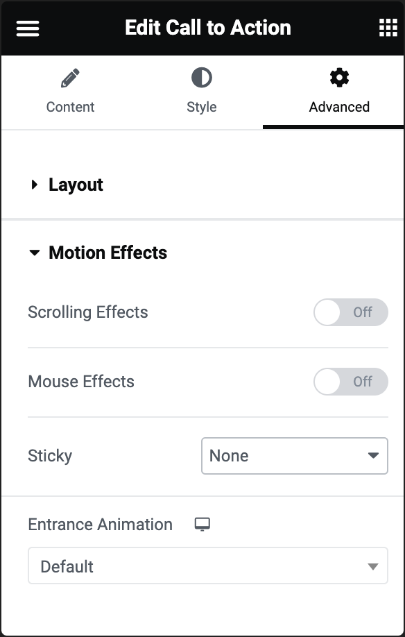
Scrolling Effects (Pro Only)
Set Scrolling Effects to On to choose from a variety of animations and interactions that can occur when the user scrolls through the page. Learn more about Scrolling Effects.
Mouse Effects
Allows you to add effects based on mouse movement. Options include tilt, and track. These effects create an interactive experience as users move their mouse over or across the widget.
Sticky (Pro only)
Makes the widget sticky during scrolling. This is useful for creating headers, footers, or sidebars that stay visible while the rest of the page scrolls. Learn more about Scrolling Effects.
Entrance Animation
Adds an animation effect when the widget comes into view. You can choose from various entrance animations such as fade in, zoom in, bounce, flip, and more. The animation triggers when the widget becomes visible on the user’s screen. Learn more about Entrance Animation.
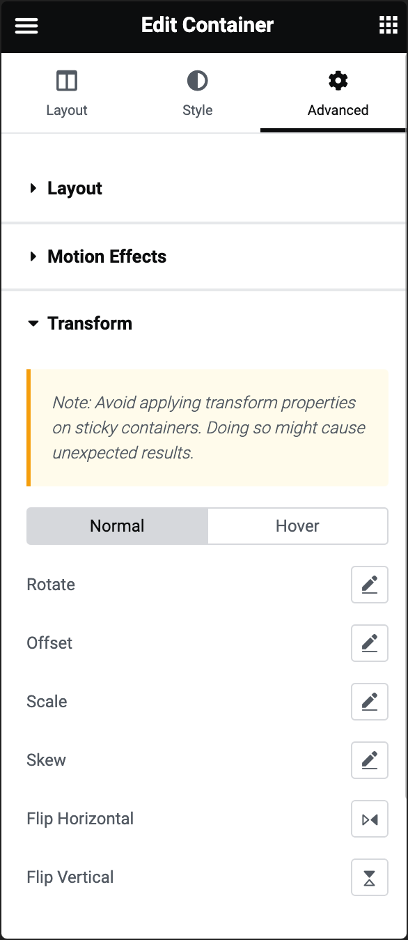
Rotate
Rotates the element around its center. You can specify the degree of rotation. Positive values rotate clockwise, while negative values rotate counterclockwise.
Offset
Shifts the element from its normal position. Allows you to move the element horizontally and vertically by specifying offset values.
Scale
Adjusts the size of the element. You can increase or decrease the size of the element by specifying scale values. A value of 1 represents the normal size.
Skew
Tilts the element along the horizontal and vertical axes. Specify skew values for the X and Y axes. Positive values skew in one direction, while negative values skew in the opposite direction.
Flip Horizontal
Mirrors the element horizontally. Flips the element as if viewing it in a mirror along the vertical axis.
Flip Vertical
Mirrors the element vertically. Flips the element as if viewing it in a mirror along the horizontal axis.
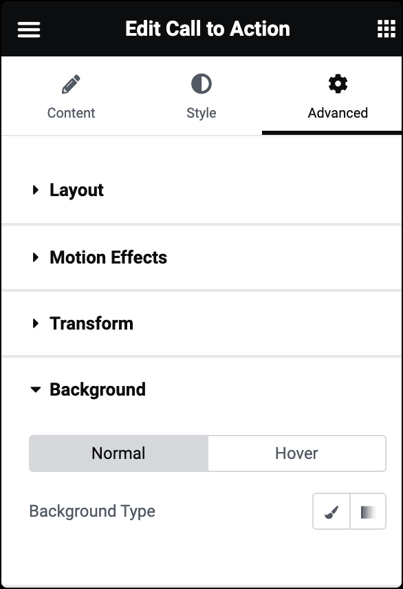
Normal/Hover
Allows you to customize the background of your widgets in both their normal state and when hovered over.
Background Type
You can choose between Classic or Gradient.
-
Classic: Uses a solid color as the background. You can choose a color for the background from the color picker.
-
Gradient: Applies a gradient as the background. You can define a gradient by selecting two or more colors and adjusting the gradient type, angle, and position.
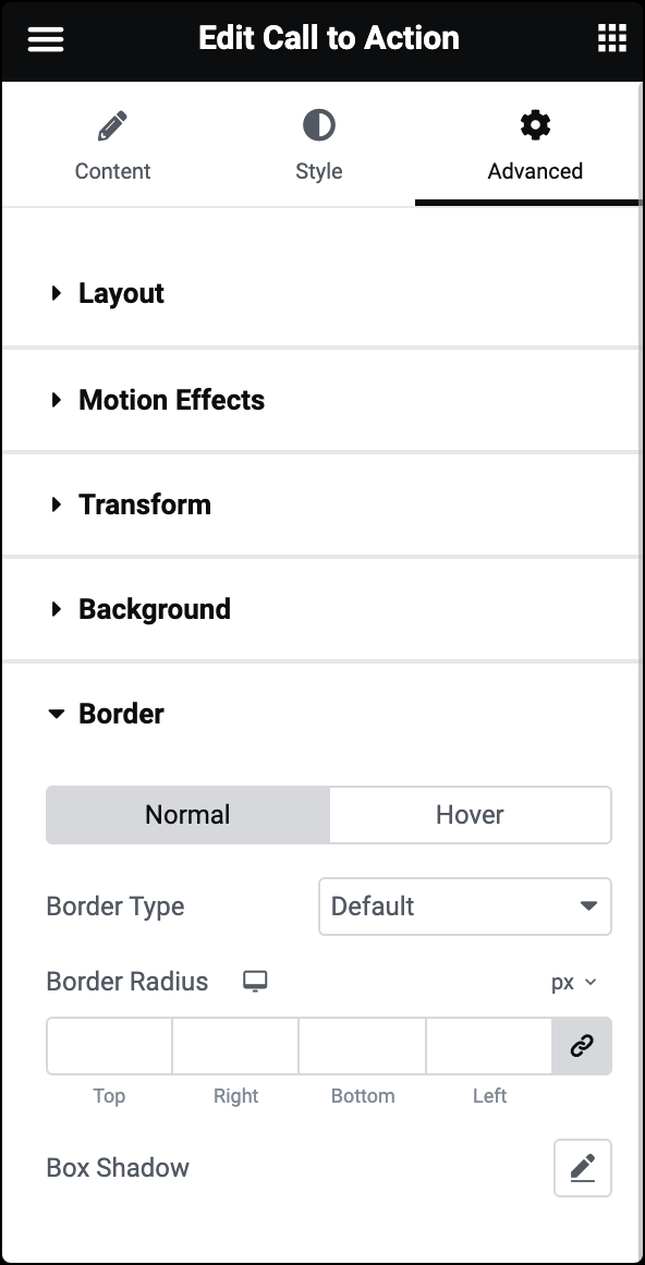
Normal/Hover
Allows you to customize the border of your widgets in both their normal state and when hovered over. The following options can be set independently for both states:
Border Type
Select the style of the border, choosing from none, solid, double, dotted, dashed, or grooved.
Border Radius
Rounds the corners of the widget. You can set a value for the border radius to create rounded corners. Higher values result in more rounded corners.
Box Shadow
Adds a shadow effect to the widget. You can set values for box shadow parameters like color, blur, spread, and position to create a shadow effect around the widget.
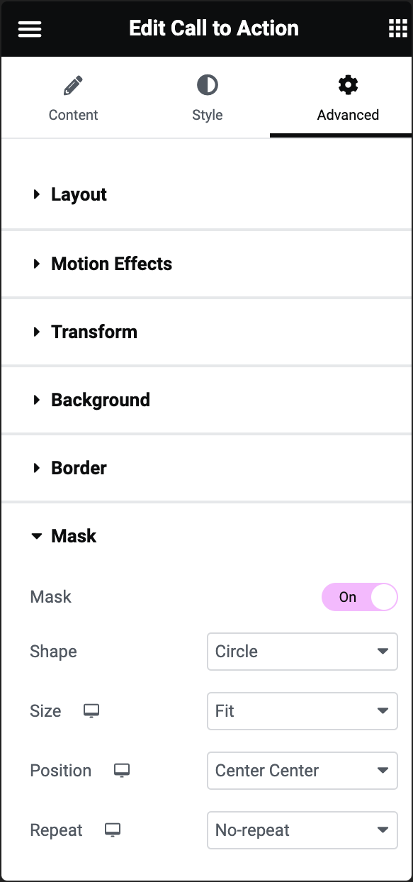
Mask
If you enable the Mask toggle, you’ll be presented with additional options to define a mask for your widget:
Shape
Select the shape of your mask from the dropdown list. Choose one of the preset shapes or upload a custom SVG shape.
Size
Select Fit, Fill, or Custom for the size of your mask.
Position
Determines the position of the mask within the widget. Top, Right, Bottom, Left, and Center options are available.
Repeat
Choose the repeat option to determine if and how the mask pattern should repeat.
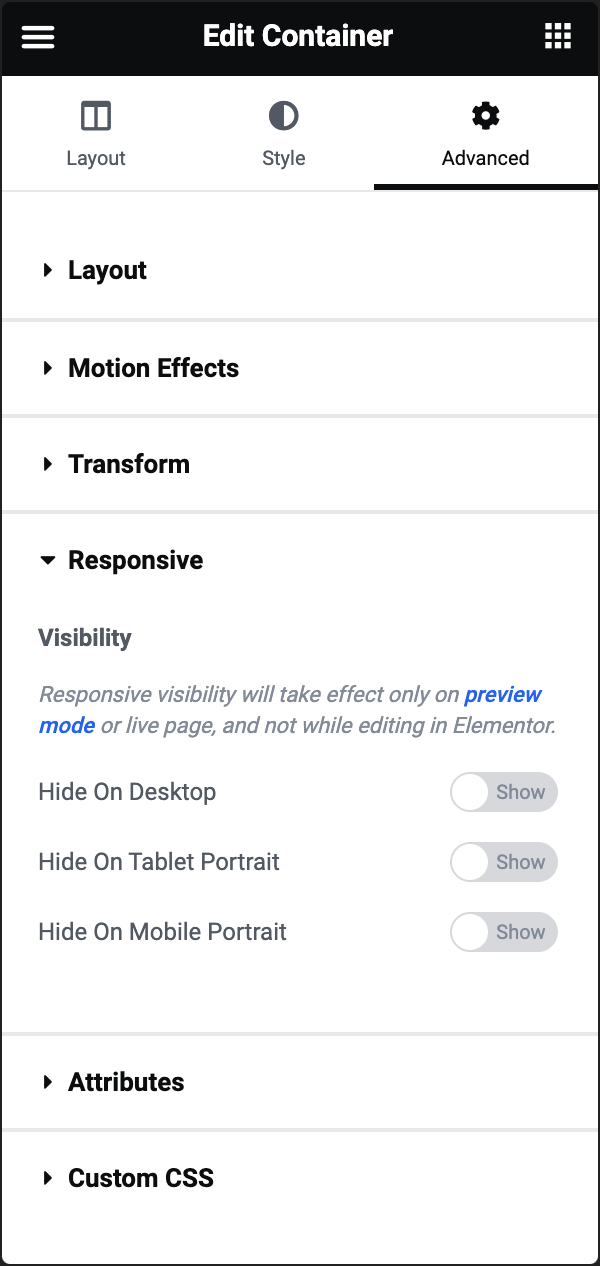
Hide On Desktop
When enabled, the element will not be visible to users accessing your website on desktop devices.
Hide On Tablet Portrait
When enabled, the element will not be visible to users accessing your website on tablets in portrait orientation.
Hide On Mobile Portrait
When enabled, the element will not be visible to users accessing your website on mobile devices in portrait orientation.
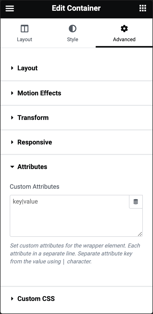
Custom Attributes
Enables you to add custom HTML attributes to the element. You can add attributes and values in the format “attribute=value”. For example, you might add data attributes or other custom attributes that you want to include in the HTML output of the widget.
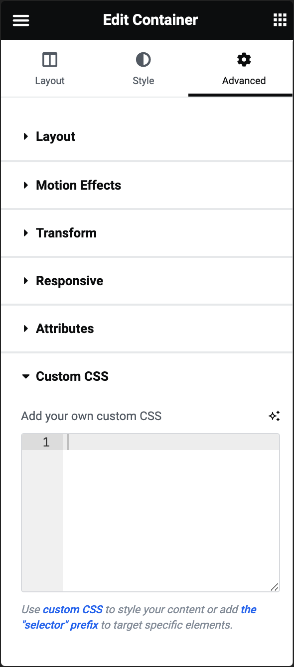
Add your own custom CSS
Enables you to add custom CSS code to the element. You can input CSS rules directly into this field to override or extend the default styles applied by Elementor. This can include styling for colors, fonts, sizes, margins, padding, and more.