Introduction
The Size option in Elementor uses the Flex CSS properties of flex-grow and flex-shrink. The flex grow/shrink property specifies how the item will behave relative to the rest of the flexible items inside the same container when the window is resized.
Using the Size function
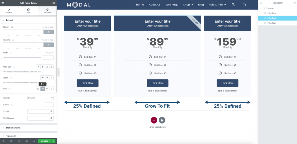
When using the Size option, the element’s Width property must be left at the default or blank value. If a Width property is defined, the Grow, and Shrink Size properties will not function.
Auto Size
If you wish to use the Auto Size property, select the Grow or Shrink icon in the editor panel. This automatically applies the property to best suit your layout.
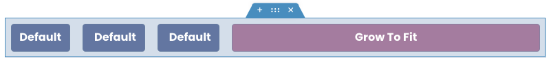
Grow
If the Grow property is used, the item will attempt to use the remaining space in the container by growing to fit. The default value is 1.
Shrink
Similar, but in the reverse. If all the items in the container are too large to naturally fit, the Shrink property may be used. The default shrink value is 1.
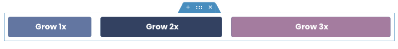
Custom Size
A custom value of each may also be applied to each. For example, when you wish one or more elements to occupy a specific amount of the available space when allowed.
Locating the Size property
You can find the Size property in the Advanced Tab of any Container or widget.
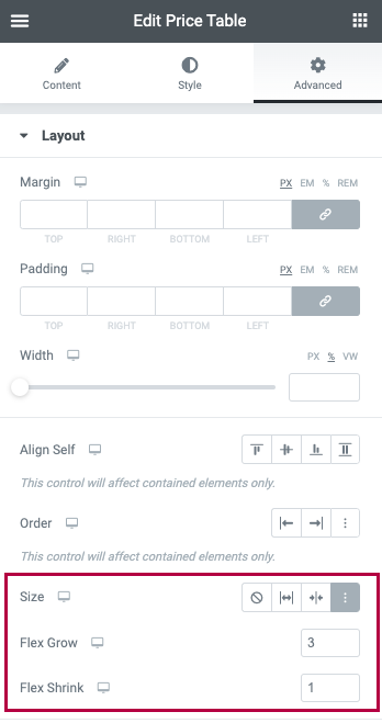
Size Options
Select between from the icons:
- None
- Grow
- Shrink
- Custom – If this option is enabled, the following options will appear:
- Custom Flex Grow – Enter value
- Custom Flex Shrink – Enter value