What is the Media Carousel widget?
The Media Carousel widget is a slider tool that adds multiple videos and images to your website in a variety of beautiful styles. You can choose from three skins (options) – carousel, slideshow, or cover flow – and edit the look and feel of your content to attract attention, create a mood, or match your overall design. You can also add links to your images and create overlays for your images featuring text from your image captions, titles, or descriptions.
Why use the Media Carousel widget?
They say a picture is worth a thousand words, so a whole carousel of images should be worth even more! The Media Carousel widget is a terrific tool for attracting your users’ eyes, engaging their interest, and steering them to more information about your products, services, and options. It also breaks up text blocks and provides a more interesting visual experience than a single image or video.
When should I use the Media Carousel widget?
Use the Media Carousel widget when you want to:
- Break up text blocks with a set of engaging images or videos
- Present multiple images, graphics, or infographics without using too much space
- Tell a visual story
- Combine images and videos
Here are some ideas for putting the Media Carousel widget to work:
- Create a slideshow to feature a number of images one at a time
- Use the carousel to impress your visitors with features, options, or possibilities
- Use sliding image covers to provide extra information about your images without using extra space
- Encourage your visitors to learn more with a carousel full of informational videos
The Media Carousel examples below highlights some of the interesting ways you can use the tool to get visitors excited about what you have to offer.
Common use cases
The Media Carousel widget is versatile enough to have a wide range of uses. Here are some of the most popular:
Show off your portfolio of art, videos, music, or other creative endeavors.
Display your entire collection of product options, one after another, all in the same space. What does this shirt look like in plaid? Stripes? Solids?
Use the overlay option to add text so you can show and tell about services, destinations, or products quickly and efficiently.
Interesting use cases
Of course, your Media Carousel is a great way to present images and videos. But with a little creativity you can do much more!
Tell a story:
Use images that move automatically to tell a compelling before, during, and after story about your products. How did that woman’s hair look before using your product? How is the product used? What is the result?
Use parts to create a whole:
Break up panoramic images of a location or experience into multiple parts, and allow the parts to appear one after another to form a whole picture.
Create multiple calls to action:
Post a series of clickable images that lead to various different discounts and buying opportunities.
What can I edit in my Media Carousel widget?
The Media Carousel widget is highly customizable, providing users with a number of different options for presenting images, videos, and text.
Start by selecting a slideshow, carousel, or coverflow skin. Slideshows show a set of thumbnails beneath a single large image, while the carousel shows a series of images that are all the same size and shape. Cover flow presents three images at a time, with the outer two images angled toward the center highlighted image.
Next, you can add as many images or videos as you like to the widget. You can edit overall image height, width, borders, padding, and more to customize the look. Select the number of slides to be viewed at the same time, and the number of slides that will move at the same time. You can also select animation effects.
Choose the style of animation you prefer, and set your images to pause on hover, play in an infinite loop, and more.
If you want an overlay with text that will display when users hover over an image, you can choose to overlay either text or an icon. Then go into your media library to add text to the title, description, or caption of the image or video.
If you’re using the media in the carousel as a “call to action”, you can make them clickable by adding a link.
These editing options are just a start! Select any tool to learn more about its function and customize your widget to make it your own.
Adding a media item
To add a media item:
- Click on an Item#.
- Select either image or video.
If you selected Image:
- Choose an image.
- Add a link if desired. Media file will link to the file of the image in the slide. Custom URL will link to any URL. Learn more about link options.
You’ll find other image options in the Additional Options section.
If you selected video:
- Select an image to represent your video
- Add a YouTube or Vimeo link.
What can I edit with the Content tab?
What can I edit with the Style tab?
What can I edit with the Advanced tab?
The Content tab - Slides
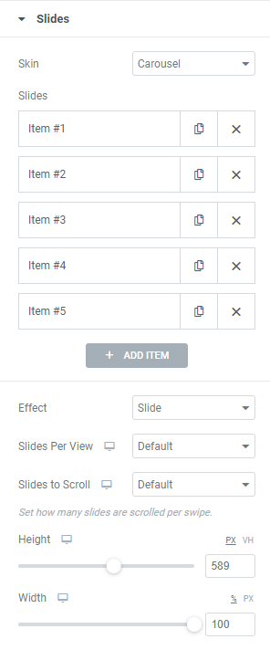
Skin determines the type of media carousel:
- Carousel displays the number of slides you select rotating them at a set interval.
- Slideshow show a set of thumbnails beneath a single large image
- Coverflow presents three images at a time, with the outer two images angled toward the center image.
Slides is where you’ll select the media to put in the carousel.
Learn more about adding graphic elements.
This is also where you can add links to the slides. There are two types of links you can use:
- External URL: Links to another webpage.
- Media File: Clicking the image will open a lightbox. All the images containing a Media link will appear in the lightbox.
Add more slides with the ADD ITEM button.
Effect defines how one slide will replace another.
Slide moves images from right to left.
Fade slowly erases the image, replacing it with the next. Choosing Fade means you can only display the images one at a time.
Cube presents the slides as if they the sides of a polygon. Choosing Cube means you can only display the images one at a time.
Allows you to select how many slides at a time visitors will see. Some configurations will only allow you to display one slide at a time.
Allows you to determine how many slides will go by when the media carousel advances. Some configurations will not allow you to edit this setting.
Set the size of the media carousel
The Content tab - Additional Options
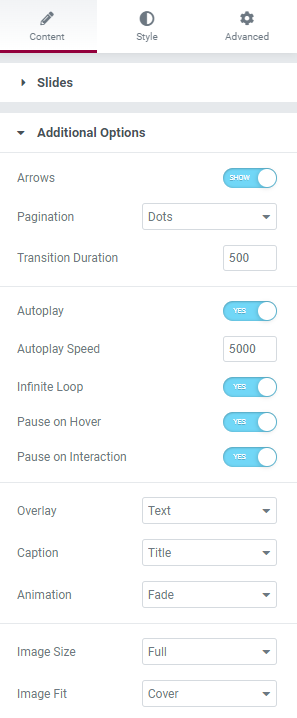
Carousels advance automatically, but arrows on the right and left sides of the carousel can allow visitors to manually scroll through the carousel.
Progress through the media carousel can be tracked in one of three ways:
- Dots at the bottom of the carousel (each dot represents one slide). Visitors can also use these dots to manually page through the carousel.
- Fraction, which shows you which slide you’re on, and how many slides are in the carousel.
- Progress, which is a visual representation of the percentage of slides a visitor has viewed.
- You also have the option of turning Pagination off.
Determines how long it takes to move from one slide to the next.
Determines whether or not the media carousel will start moving as soon as a visitor arrives on the page.
Autoplay speed measures how long the carousel stays on one slide.
Measurements are in milliseconds.
Determines whether or not the media carousel will stop after one playthrough.
Determines whether or not the media carousel will stop when visitors mouse over.
Determines whether or not the media carousel will stop when visitors click on it.
Give visitors more information by overlaying the media with text or icons. These overlays only appears when visitors mouse over the media.
If you choose a Text overlay, this text can be either the image’s Title (name), Caption or Description.
If you choose an icon overlay you can choose between:
- Magnifying glass – this is usually used when the link is to the slide’s media file.
- Plus sign – this is usually used when going to a URL.
- Eye – this is usually used when the link is to the slide’s media file.
- Link – this is usually used when going to a URL.
Overlays have a number of animation options setting how the overlays enter the slide – Fade, Slide Up, Slide Down, Slide Right, Slide Left and Zoom In.
The size and other properties of the images in the media carousel. All the images in the carousel will have the same properties so it’s best if they have similar proportions (e.g. Mixing landscape and portrait images is generally not a good idea).
The Style tab - Slides
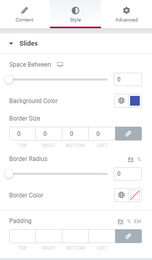
Sets the distance between the individual slides.
Sets the color of the individual slides. This color will only be visible if the image does not take up the entire slide.
To choose a color, either use the color picker or use a global color.
You can surround the individual slides with a border using the Border Size counter. By default the values of all the borders are linked, so they will be equal, unlink them if you want the sides to have different thicknesses.
Border Radius let’s you round the corners of the border.
Padding will add or subtract space between the border of the slide and the image.
The Style tab - Navigation
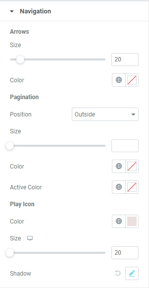
Controls the size and color of the arrows on the left and right of the media carousel. These arrows allow users to manually page through the carousel.
To choose a color, either use the color picker or use a global color.
These settings only apply if Arrows are turned on in the Content tab.
Pagination can appear either Inside or Outside of the slides.
You can control the size of the pagination symbols with the slider.
If you choose to paginate with dots, Active Color determines the color representing the slide currently being viewed, while Color determines the color of the other dots. Otherwise Active Color determines the color of the pagination.
These settings only apply if Pagination is turned on in the Content tab.
Slides representing videos have a play icon indicating a click will play the video.
You can control the Size of the icon with the slider.
To choose a Color, either use the color picker or use a global color.
Add a Shadow to the icon by clicking the pencil icon and selecting a color and offset for the shadow.
The Style tab - Overlay
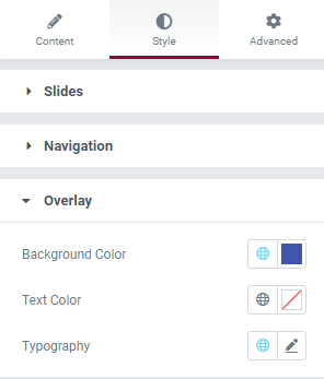
If you chose to include an overlay here is where you’ll choose a background color, text color (if you are using a text overlay), typography (if you are using a text overlay) and icon size (if you are using an icon overlay) for the overlay.
To choose a color, either use the color picker or use a global color.
The Style tab - Lightbox
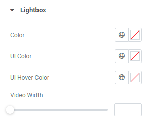
If you choose to link slides as media files, they will display as a lightbox.
Here you set the choose:
The background Color of the lightbox.
The color of the lightbox arrow, the lightbox navigation tools and the close button (UI Color)
The color of the lightbox arrow, the lightbox navigation tools and the close button when a visitor mouses over the element (UI Hover Color).
If your slide contains a video, you can customize it’s size in a lightbox with Video Width.
Next steps
To get the most out of Elementor, check out the Knowledge hub for helpful learning resources.