The Elementor Lightbox opens images, galleries, carousels, and videos in a 100% mobile responsive lightbox popup window
The lightbox feature is turned on by default. You can switch it off by going to its settings, and adjusting the toggles.
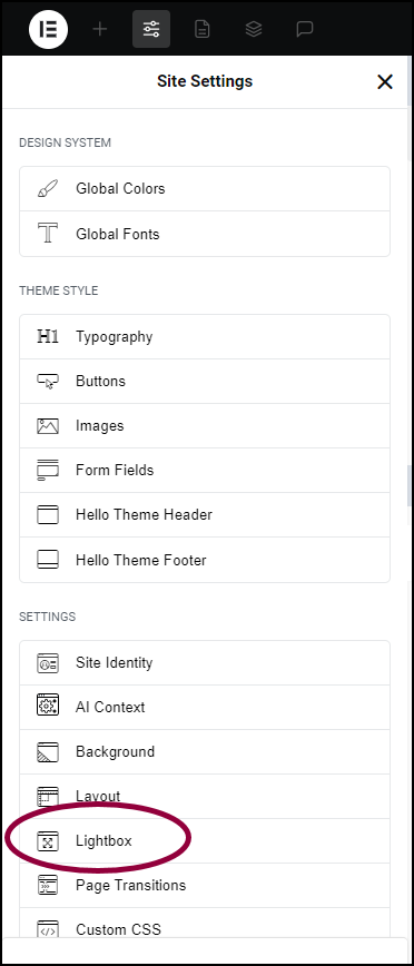
To access the Lightbox settings:
- From the Editor top bar, click the Elementor logo.

- Select Site Settings from the dropdown menu.

This opens the settings that affect the entire site. - In the left panel, click Lightbox.
The Lightbox options appear.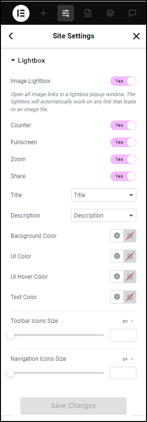
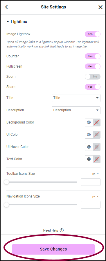
- Make any desired changes and click Save Changes.
Lightbox options
The Lightbox tab enables you to adjust the following global Lightbox settings:
| Image Lightbox | Toggle to enable or disable the lightbox globally. If toggled to Yes, any image element linked to a media file will become a lightbox. |
| Counter | For multi-image galleries only. If toggled on, adds an image count to the upper left corner of the lightbox. For example, if the gallery contains 6 images, the counter will display 1/6, 2/6, etc. to indicate “First of 6 images”, “Second of 6 images”, etc. |
| Fullscreen | Toggle to Yes to add a clickable icon allowing visitors to open the image in a full screen lightbox. |
| Zoom | Toggle to Yes, to add a clickable icon to allowing visitors to zoom in on the image in the lightbox. Once you zoom into an image, you’ll be able to pan the view and scroll across the different areas of the image. |
| Share | Toggle to Yes to allow visitors to share images on social media, or download it to their computer. |
| Title | Optionally display a title under the image in the lightbox. Select from None, Title, Caption, Alt, or Description. |
| Description | Optionally display a description under the image in the lightbox. Select from None, Title, Caption, Alt, or Description. |
| Background Color | Choose the background color and opacity of the lightbox. For more details, see Choose a color or Use global fonts and colors. |
| UI Color | Choose the default color of the lightbox arrow and dot navigations, the Close button, and other user interface elements.. For more details, see Choose a color or Use global fonts and colors. |
| UI Hover Color | Choose the color of the lightbox arrow and dot navigations, the Close button, and other user interface elements. When visitors hover over them.. For more details, see Choose a color or Use global fonts and colors. |
| Text Color | Choose the color of the text appearing in the lightbox. For more details, see Choose a color or Use global fonts and colors. |
| Toolbar Icons Size | Set the size of the toolbar icons representing functions such Zoom, Share, Fullscreen and Close. For more details, see, Units of measurement. |
| Navigation Icons Size | For Lightboxes containing more than one image. Set the size of the icons that move to the next or previous image. For more details, see, Units of measurement. |
Note
All of the above functionality is mobile responsive. Visitors can zoom, open images and videos in full screen, and share the images from their mobile phones.