Add the widget

Add the widget to the canvas
To access and use a widget:
In Elementor Editor, click +.
All available widgets are displayed.Click or drag the widget to the canvas. For more information, see Add elements to a page.
What is the Search Form widget?
A search bar helps users find information on your website. This is especially important as your website grows and incorporates more content.
Existing Search Form widgets are not affected by this change. You can still use and edit existing Search Form widgets as described in this article.
Common use case
Rowan is webmaster of a large law firm Their site is quite large with a blog, lists of lawyers, Press Center and other content. They decide to add a search widget to the website header to make it easier for visitors to find the information they’re looking for.

Additional use case
- Create a full page Search page.
Video
See a video demonstrating the widget in action.
Adding a Search Form widget: Step-by-step
Hunter is building a website for his company. While the search form widget is normally added to the header of a website, they decide they want to create a full page search form.
Create a full page search form
- Open your website and create a page.

- Add the Search Form widget to the page.

- In the panel, in the Skin field, use the dropdown menu to select Full.
The search box turns into a search toggle.
- In the Placeholder field, enter, What are you looking for?
- In the right corner of the top bar, save the page by selecting Publish or Save Draft.
- In the right corner of the top bar, click the view icon
 .
.
- Click the search toggle.
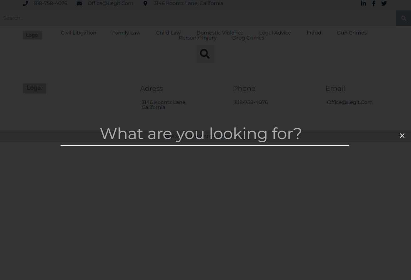
A full page search opens up.
Settings for the Search form widget
You can customize your widgets using content, style, and other advanced parameters, offering you great flexibility in tailoring them to your needs. Click the tabs below to see all the settings available for this widget.
Content tab
Add, delete, and edit menu items and controls.
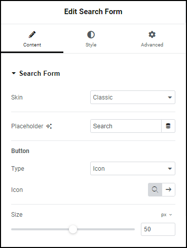
Skin
Search forms can have three skins:
- Classic – A search box with a search button
- Minimal – A search box
- Full Screen – a toggle that when clicked turns into a full page search form.
Placeholder
Text that will appear in the Search box.
Button (Classic Skin)
Determines the size and content of the search button. Does not appear if you select a Minimal skin and is replaced by a Toggle section if Full Screen skin is selected. Options include:
Type: The classic search bar has a button that triggers the search. Use the dropdown menu to determine if the button will be represented by:
- Icon: If you choose to represent the button with an icon, use this field to choose an icon. For details, see Adding images and icons.
- Text: If you choose to represent the button with text, use the box to enter the text.
Size: Use the slider to increase and decrease the button size.
Toggle (Full Screen Skin)
Determines the size and content of the search toggle. Does not appear if you select a Minimal skin and is replaced by a Button section if Classic skin is selected.
Options include:
- Alignment: Set the toggle to appear on the right, left or center of the search box.
- Size: Use the slider to increase and decrease the toggle size.
Style tab
Determine the look and feel of menu items and controls.
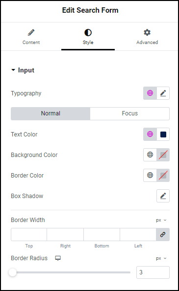
Input
Control the look and feel of the text visitors enter in the text box:
- Typography – Choose the font and size of the text in the search box. For details, see Typography.
- Normal: How the text appears by default
- Focus: How the text appears when the search box is selected.
- Background Color: Select a color for the search box. For details, see Create a Background.
- Border Color: Select a color for the border of the search box. For details, see Choose a color or Use global fonts and colors.
- Box Shadow: Give the search box more depth by adding a shadow. For details, see, What is Shadow?
- Border width: Determine the width of the four borders around the search box.
- Border Radius: Round the edges of the text box by adding a border radius. For details, see Border radius tools.
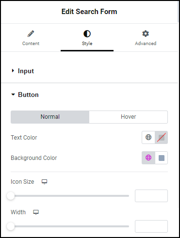
Button
Control the look and feel of the search button:
- Normal: The default setting for the icon or text
- Hover: The settings for the icon or text when a visitors mouses over them.
- Text Color (for buttons that contain text): Set a color for the text in the button.
- Icon Size: (for buttons that use icons): Set the size for search icon.
- Width: Set the width of the search button. A larger button may help users find the button.
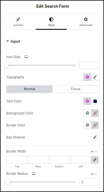
Input
Set the look and feel of the icon in the search box, the placeholder text and the text entered in the search box:
- Icon Size: Set a size for the icon in the search box.
- Typography: Set the font and size of the placeholder text and the text entered in the search box. For details, see Typography.
- Text Color: Set the color of the icon, placeholder text and the text entered in the search box. For details, see Choose a color or Use global fonts and colors.
- Background Color: Select a color for the search box. For details, see Create a Background.
- Border Color: Select a color for the border of the search box. For details, see Choose a color or Use global fonts and colors.
- Box Shadow: Give the search box more depth by adding a shadow. For details, see, What is Shadow?
- Border Width: Determine the width of the four borders around the search box.
- Border Radius: Round the edges of the text box by adding a border radius. For details, see Border radius tools.
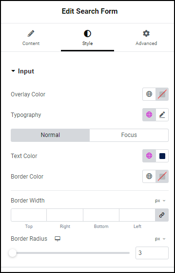
Input
Control the look and feel of the text visitors enter in the text box:
- Overlay Color: When visitors open a full page search form it fills with a color. This is called the overlay color. Use this field to set the overlay color.
- Typography: Set the font and size of the placeholder text and the text entered in the search box. For details, see Typography.
- Normal: How the text appears by default
- Focus: How the text appears when the search box is selected.
- Text Color: Set the color of the placeholder text and the text entered in the search box. For details, see Choose a color or Use global fonts and colors.
- Border Color: Select a color for the border of the search box. For details, see Choose a color or Use global fonts and colors.
- Border Width: Determine the width of the four borders around the search box.
- Border Radius: Round the edges of the text box by adding a border radius. For details, see Border radius tools.
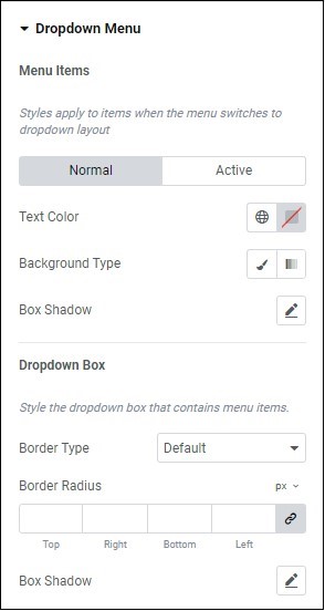
Toggle
Set the look and feel of the toggle that will open the full screen search form:
Normal: How the toggle will appear by default.
Hover : How the toggle will appear when visitors mouse over it.
Color: Set the color for the toggle. For details, see Choose a color or Use global fonts and colors.
Background Color: Set a background color for the toggle. For details, see Create a Background.
Icon Size: Control the size of the toggle
Border Width: Set the width of the border around the toggle.
- Border Radius: Round the corners of the border around the toggle. For details, see Border radius tools.
Advanced tab
Control the placement of your widget, insert links, add custom code and more.
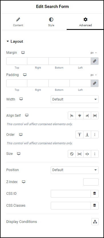
Advanced
Learn more about the Advanced tab settings.