help center

On this page

Tabs widget with nested elements

Last Update: March 12, 2024

Tabs with nested elements widget is an experimental feature and must be activated. To learn more about activating experimental features, see Elementor Features.

Add the widget

Tabs widget
  1. In Elementor Editor, click +.
    All available widgets are displayed.
  2. Click or drag the widget to the canvas. For more information, see Add elements to a page.

What is the Tabs widget with nested elements?

Tabs with nested elements allow you to add additional or extra layers of content within each tab. You can include multiple elements inside a tab, such as text, images, buttons, and even other widgets, creating a hierarchical content structure.

In easy terms, you can organize your content into tabs. Within each tab, you can have smaller sections (nested elements) that provide more detailed information or subcategories related to the main tab topic.

This feature provides flexibility in designing complex layouts and presenting comprehensive information in a structured and organized manner.ments

Common use case

Ken is building a website for a newly opened furniture store. They have organized a wooden workshop to promote the shop and attract locals. On the About Us page of the website, Ken decides to use the tabs widget with nested elements to organize the information effectively.

Ken created four tabs: “Our Workshops,” “Total Workshop,” “What You Get,” and “Pricing.”

In the first tab, Ken listed the various woodworking workshops, each with descriptions and project images. They also include photos of finished projects from each workshop to give visitors an idea of what they can create.

The second tab included details about the frequency and availability of workshops. They also add a Learn More button within this tab, directing visitors to a single blog page to learn about past workshops. 

In the third tab, Ken highlights the benefits of attending his workshops. 

Lastly, in the pricing tab, Ken created different pricing tables and outlined the cost of each workshop type.

Tabs widget with nested containers 1

Additional use cases

  • Use tabs with nested elements to showcase property listings, with each tab containing details such as property features, location information, pricing, virtual tours, and contact forms for inquiries.
  • Create tabs with nested elements to organize event packages, with each tab containing details about venue options, catering menus, entertainment services, and customizable add-ons.
  • Showcase tabs with nested elements to categorize articles by topics such as nutrition, fitness, mental health, and self-care, with each tab featuring articles, infographics, videos, and recommended resources.

Video

See a video demonstrating the widget in action.

Tabs widget with nested elements

If you’ve activated the container and nested elements experiments, the Tabs widget has become far more powerful with three major upgrades:

  • Nested elements – Tabs can hold widgets and other elements, allowing you to build complex layouts within an individual tab.
  • Improved tab styling – adjust the layout, positioning, and styling of tabs, including the use of icons in tabs.
  • Improved responsive settings – Choose at which breakpoint the tabs’ display will turn to accordion style.
Note
This change does not affect the existing Tabs widget on your website. You can still edit them using the previous options, and they will continue to work as they did before.

Create tabs with nested elements

  1. Add the Tabs widget to the canvas. For details, see Add elements to a page.
  2. By default, the Tabs widget comes with three tab items. Every item has a container already built in. You can add and customize elements to the empty container.
    Tabs widget with nested containers 16
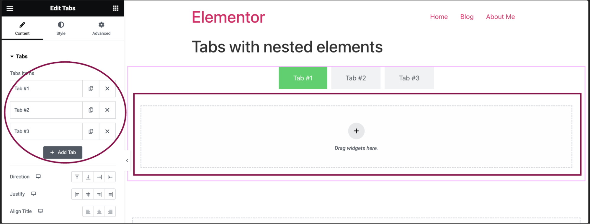
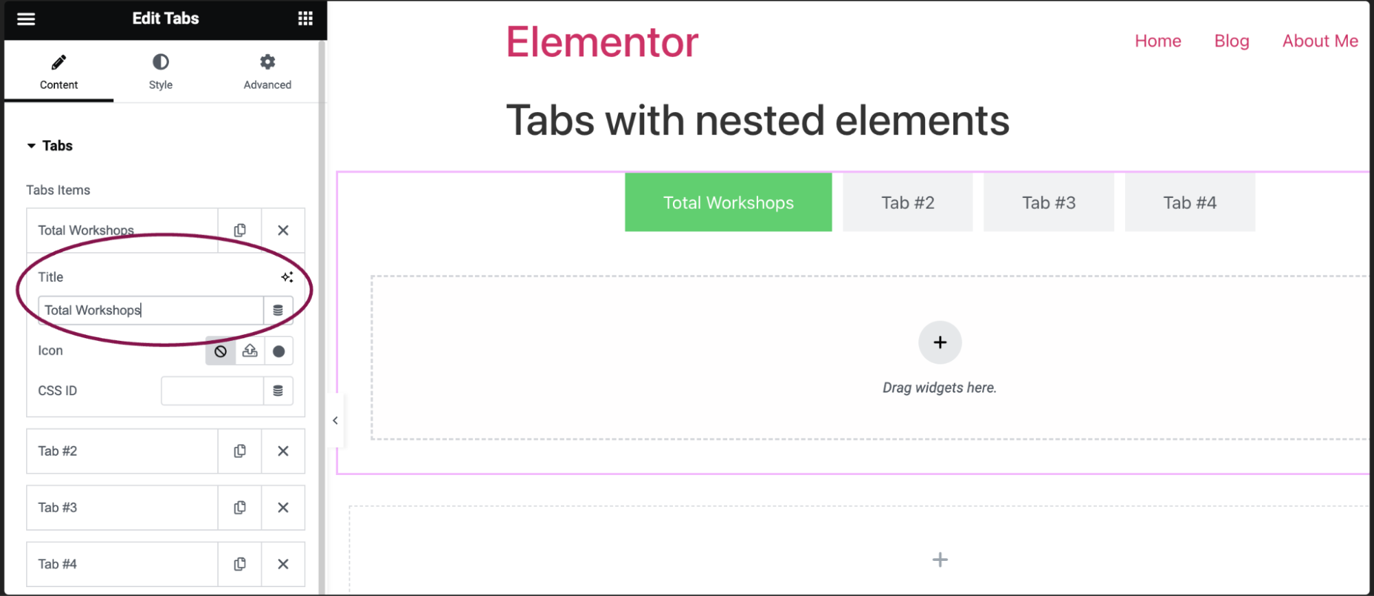
  3. In the Content tab, under the Tabs section, click an item to edit it.
    Tabs widget with nested containers 22
  4. In the Title field, add the tab name and give the tab a CSS ID. For more details, see CSS selectors in Elementor.
    Tabs widget with nested containers 12
  5. In the Icon field, choose icons for your tab. You can opt for None, Upload your own SVG file as an icon, or pick an Icon from the icon library.
    Tabs widget with nested containers 18
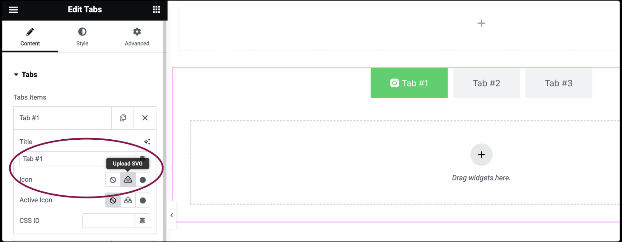
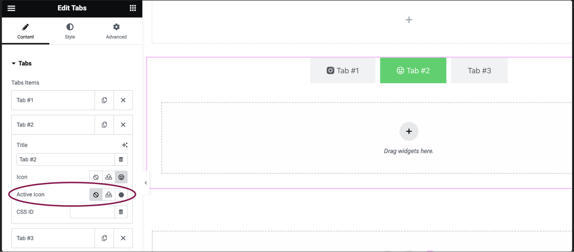
  6. In the Active Icon field, choose the icon for the currently active tab.
    Tabs widget with nested containers 3
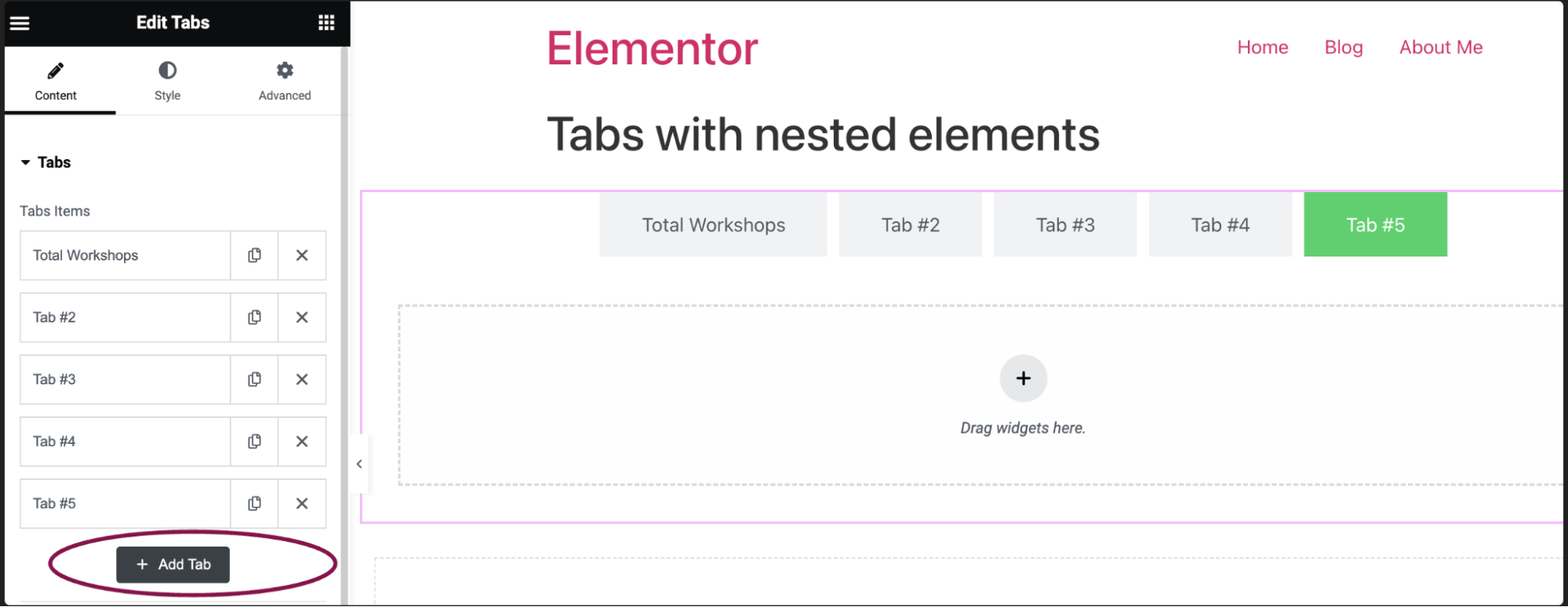
  7. Click the Add Item button to add a new tab.
    Tabs widget with nested containers 14

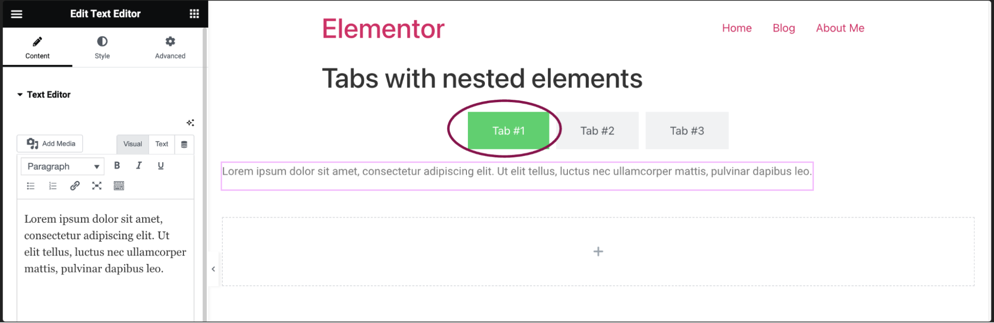
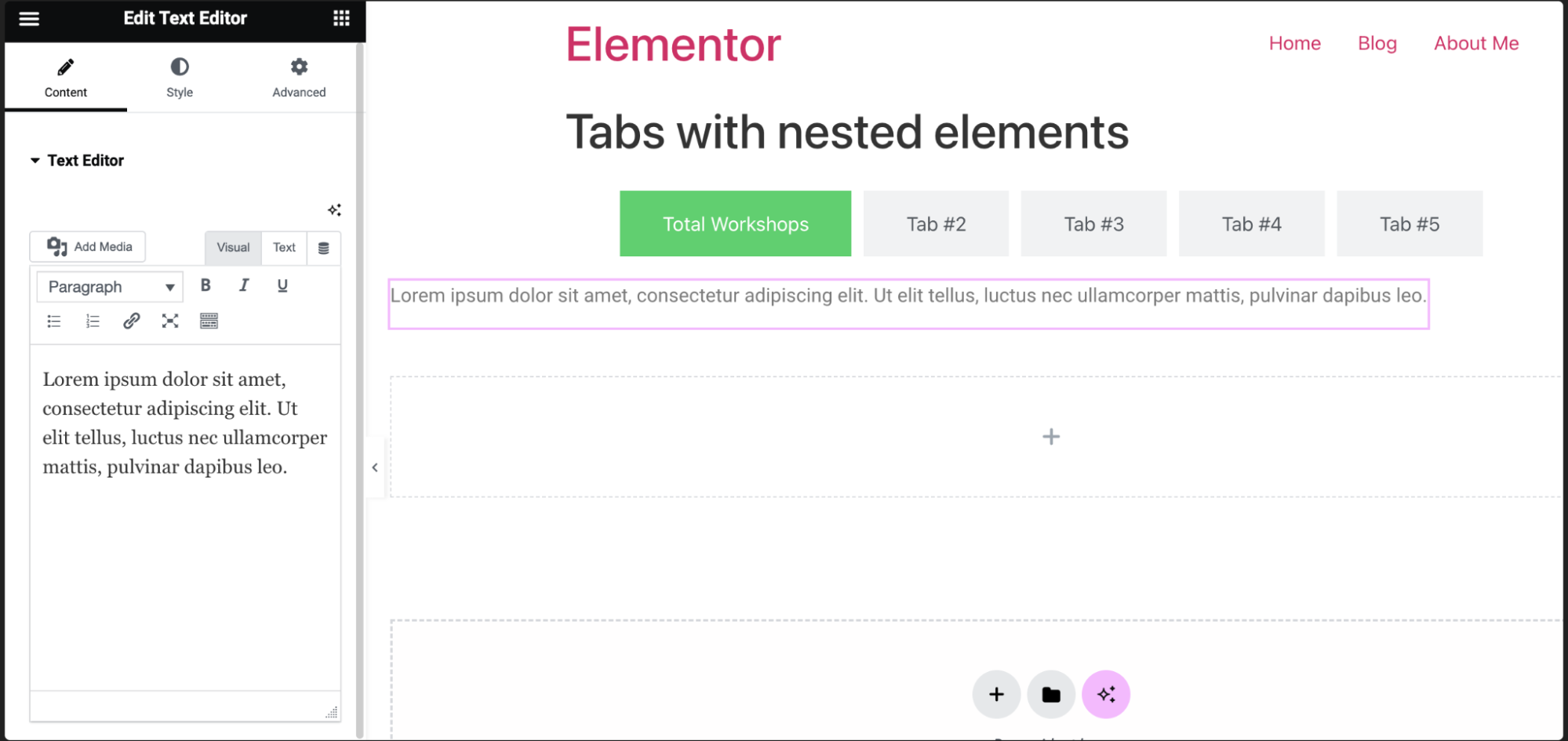
To use nested elements in tabs:

  1. Select any element or widget and drag it to the tab – in this example we’ll place a Text Editor widget in a tab.
    Tabs widget with nested containers 17
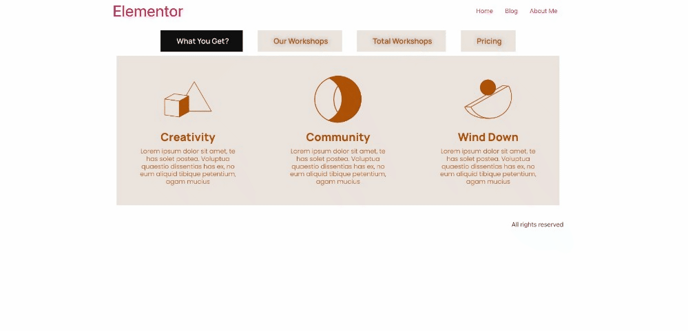
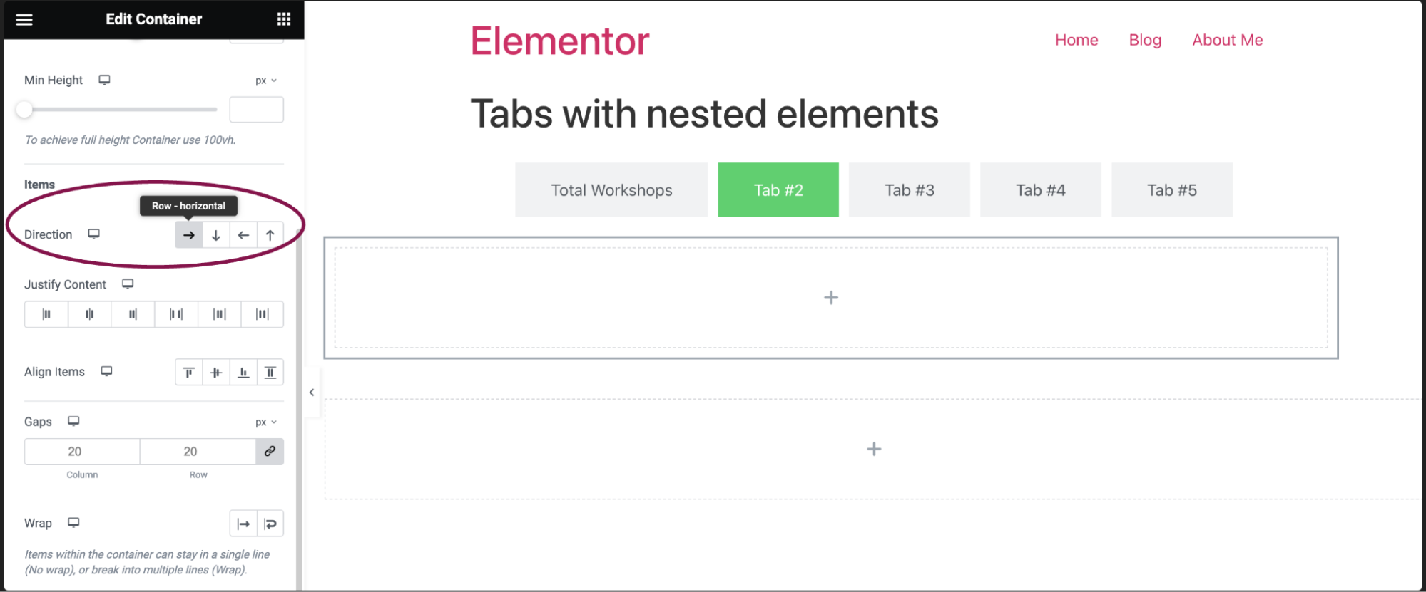
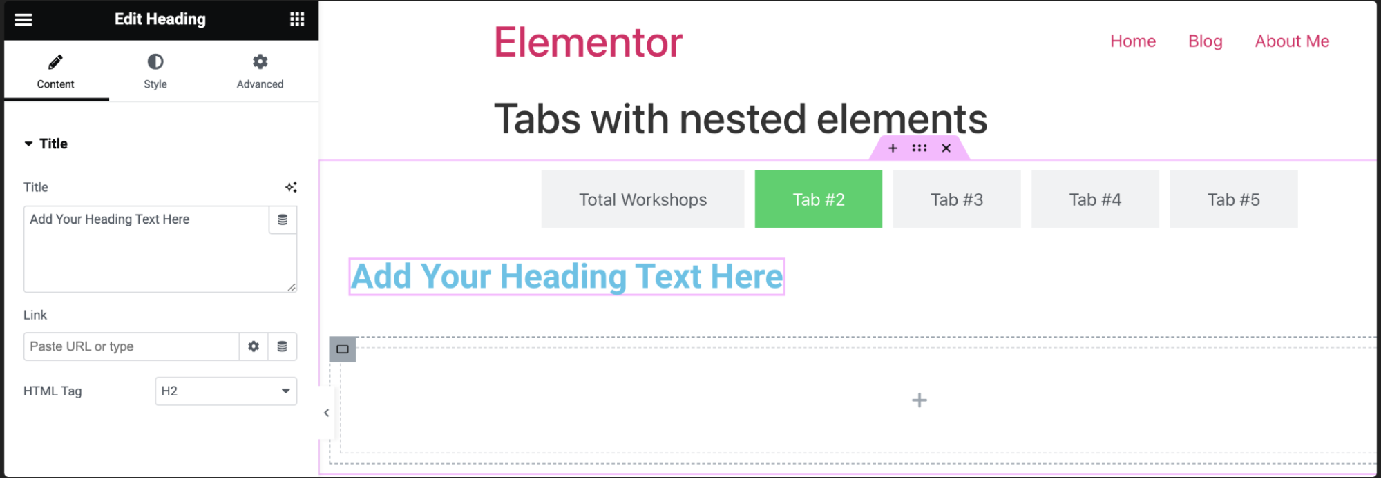
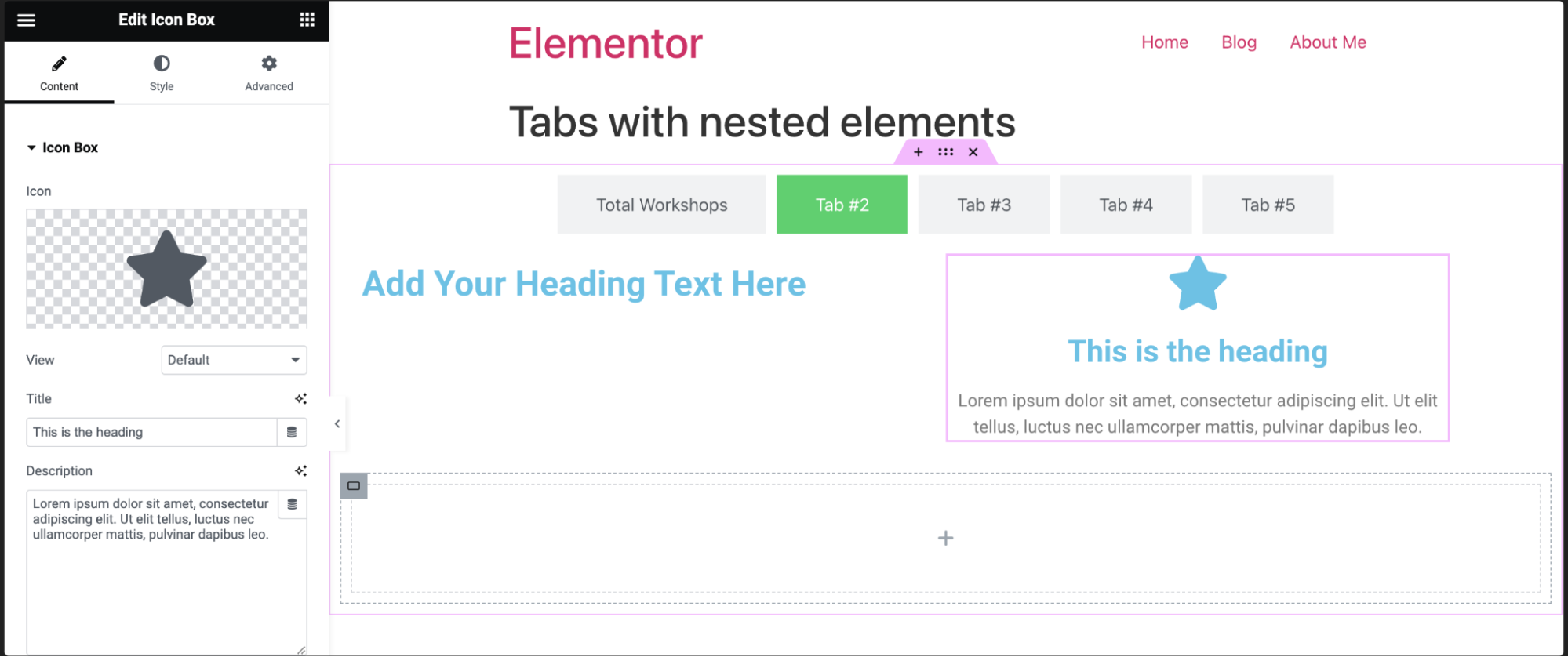
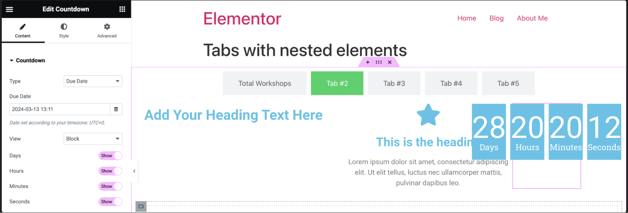
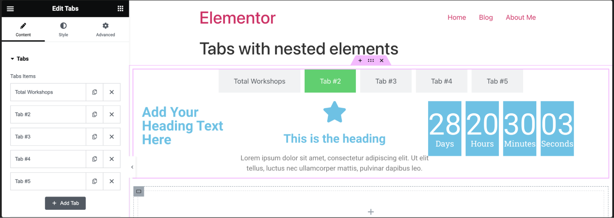
You can also create a complex layout. For example, for tab #2, we’ll create a tab with a heading, an icon box, and a countdown- aligned in a row. 
  2. Click Tab #2.
    1. Drag a container into tab #2.
    2. In the container settings, change the direction to row.
      Tabs widget with nested containers 13
  3. Drag the Heading widget to the tab’s container.
    Tabs widget with nested containers 19
  4. Click the widget button and drag the Icon Box widget to the container within the tab.
    Tabs widget with nested containers 11
  5. Click the widget button again, and drag the Countdown widget to the container within the tab.
    Tabs widget with nested containers 8
  6. Your tab should look something like this (you might need to resize the widgets if necessary).
    Tabs widget with nested containers 23

Learn here: How many containers should my page contain?
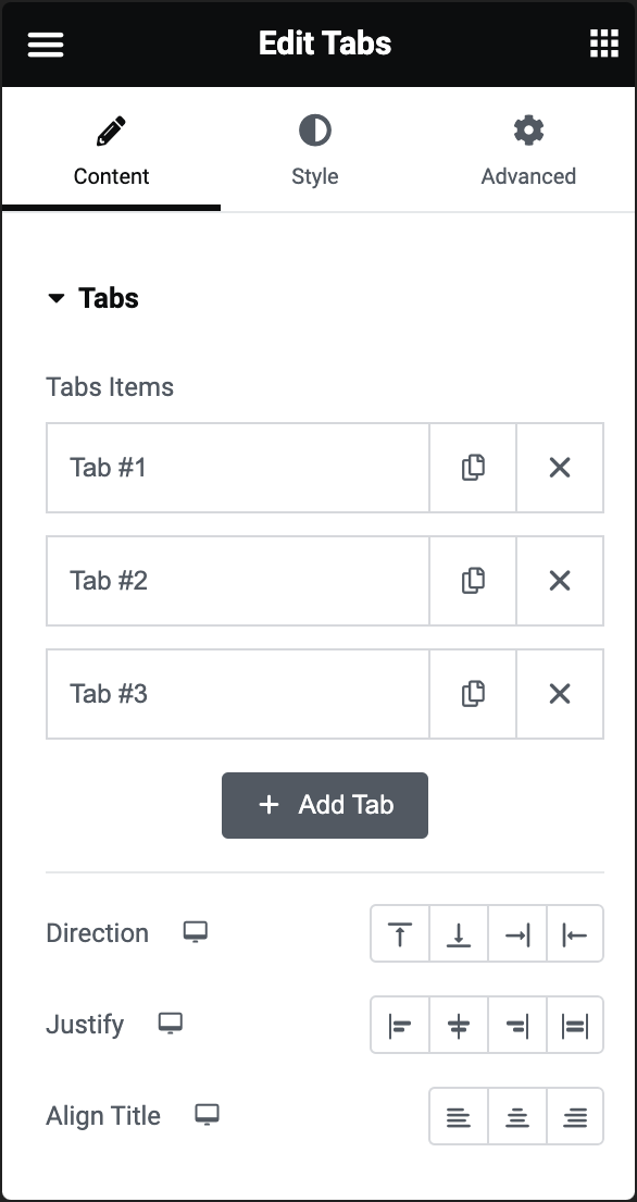
Settings for Tabs with nested elements

You can customize your widgets using content, style, and other advanced parameters, offering you great flexibility in tailoring them to your needs. Click the tabs below to see all the settings available for this widget.

Content tab

Using the options in the content tab, you can control the layout and content of the tabs.

Tabs widget with nested containers 5

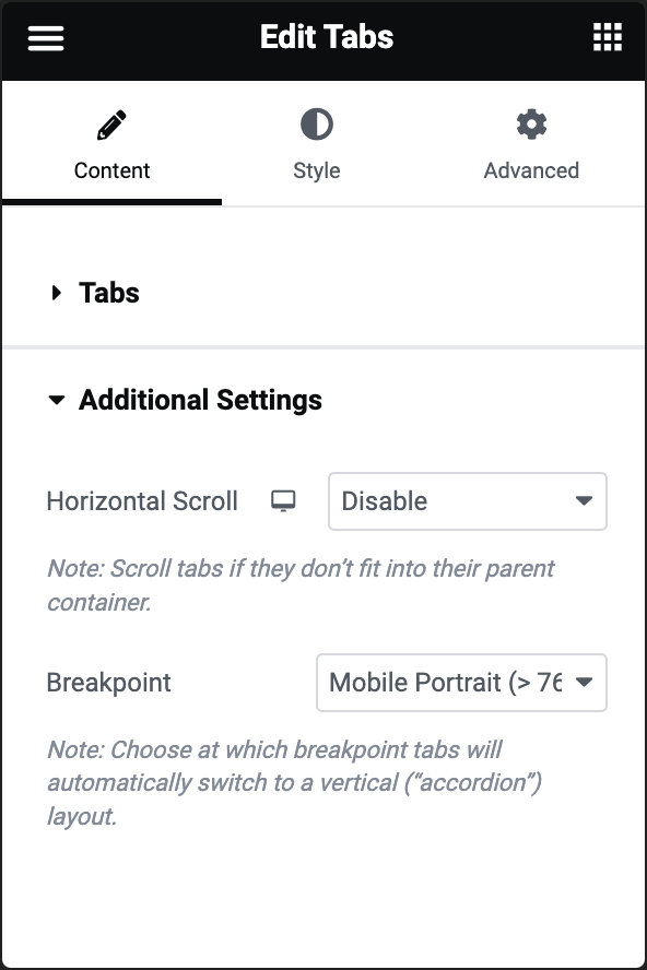
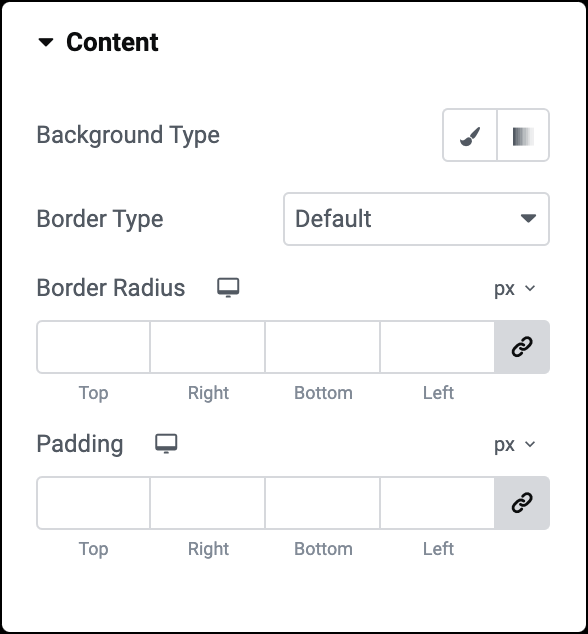
In the Content tab, expand the Tabs section to determine the number of tabs and their additional customization options.

Tab Items: Each tab of the tab is an item. Click an item to edit it. Editing the item allows you to:

  • Title: Enter the tab name here.
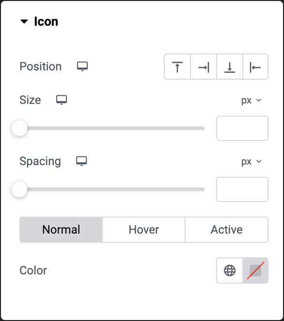
  • Icon: Add icons to the title of your tab.  You get three options to choose from
    • Tabs widget with nested containers 9 Opt for no icon by selecting the none option.
    • Tabs widget with nested containers 2 Upload your own SVG file as an icon. For more details, see Enable SVG support.
    • Tabs widget with nested containers 6 Pick an icon from the icon library.
  • Active Icon: Choose icon for the currently active tab.
  • CSS ID: Tag individual elements on a page. This allows you to link to this specific element.

Set the direction of the tabs to either column or row.

Note: If you set the direction to row, a slider appears, allowing you to adjust the width of the tabs in either PX or %.

Determines the spacing between items in the container and the items’ distance from the container’s border.

Places the tab title at the right, left or center of the tab.

Tabs widget with nested containers 21 Tabs widget with nested elements 191

When you add more tabs than are visible on the screen, the new tabs are added below the existing tabs.

Enable Horizontal Scroll to place these additional tabs next to the existing tabs and not below them. Visitors must scroll horizontally in order to access these tabs.

In mobile and tablet view, by default, if using a smaller screen, tabs automatically appear vertically to accommodate the smaller screen. 

From the Breakpoint menu, select either the breakpoint for when the visitor is using a mobile (less than 767 pixel wide screen) or for a tablet (less than 1024 pixel wide screen).  

Choose None to disable this feature. This means that visitors will scroll horizontally to see all the tabs (not recommended).

Style tab

In the Style tab, you can control the overall style of the tabs.

Tabs widget with nested containers 10 Tabs widget with nested elements 193

Use the slider or the number field to adjust the distance between tabs. For details, see System Measurements.

Use the slider or the number field to adjust the space between the title of the tab and the contents of the tab. For details, see System Measurements.

Choose the background. For more details, see Create a Background.

You get three styles to choose for:

  • Normal – The default style.
  • Hover – The style when users mouse over the tab.
  • Active – The style when the tab is open.

If you select Hover, an additional setting appears called Transition Duration. In this setting, determine how long it takes for the color of the tab to gradually change.

Choose the border type. For more details, see Border type.

You get three styles to choose for:

  • Normal – The default style.
  • Hover – The style when users mouse over the tab.
  • Active – The style when the tab is open.

Add texture to your text with shadow. For details, see Shadows.

Choose the border radius. For more details, see Border radius tools.

Set the inner spacing between the content’s edge and the tabs’ edge. Learn how to create space with padding and margins.

Tabs widget with nested containers 15

Choose how your text will appear to visitors. For details, see Typography.

Choose a color: either use the color picker or a global color.

The titles’ color can have three different styles:

  • Normal – The default style.
  • Hover – The style when users mouse over the tab.
  • Active – The style when the tab is open.

Click the 🖋️ icon to add a shadow to the title. Learn more about shadows.

Click the 🖋️ icon to apply a stroke effect to the title. Learn more about Text Stroke.

Tabs widget with nested containers 20

Determines whether the tab’s icon will be above, under, to the right or left of the tab title.

Use the slider to determine the size of the icon next to the tab title. For more details, see Units of measurement.

Use the slider to determine the amount of room between the tabs’ title and the icon.

Choose an icon color: either use the color picker or a global color.

You get three styles to choose for:

  • Normal – The default style.
  • Hover – The style when users mouse over the tab.
  • Active – The style when the tab is open.
Tabs widget with nested containers 4

Choose the background. For more details, see Create a Background.

Choose the border type. For more details, see Border type.

Choose the border radius. For more details, see Border radius tools.

Set the inner spacing between the content’s edge and the individual tabs’ edge. Learn how to create space with padding and margins.

Advanced tab

The Advanced tab provides options to control the widget position, adjust the spacing, add custom code, and more.

Tabs widget with nested containers 7 Tabs widget with nested elements 198

Learn more about the Advanced tab settings.

Have more questions? We’re more than happy to assist.

Link is copied to clipboard!
On this page

Is this article helpful?

Share this article