help center

On this page

Button Widget

Last Update: March 14, 2024

Add the widget

button widget icon

To access and use a widget:

  1. In Elementor Editor, click +.
    All available widgets are displayed.

  2. Click or drag the widget to the canvas. For more information, see Add elements to a page.

What is the Button widget?

Buttons on a website are crucial in guiding user actions, providing clear calls to action, and enhancing overall user engagement. The Button widget lets you add interactive and visually appealing buttons on your site.

The Button widget offers a range of customization options, enabling you to easily control the button’s appearance, behavior, and link destinations.

Common use case

Sara manages the website of a popular magazine, where they publish daily blogs to attract new visitors. They place a Button widget to create a clear and engaging Subscribe Now button. This button is strategically placed at the end of each article, encouraging readers to subscribe to the newsletter for updates.

button widget example

Additional use cases 

  • Websites offering free trials can use a prominent Start Your Free Trial button directing users to the registration page.
  • Blog platforms can include social media buttons (e.g., Facebook, Twitter) at the end of each post.
  • Software companies may utilize a Download Now button on the product page for software downloads.

Add a Button widget: Step-by-step

  1. Add the Button widget to the canvas. For details, see Add elements to a page.

    1 Select Type Button Widget 3
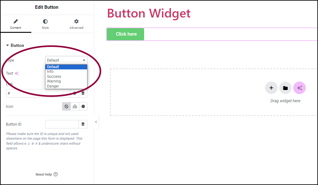
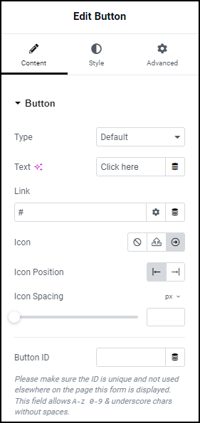
  2. In the Content tab, under the Button section, use the Type option to select from five design styles: Default, Info, Success, Warning, or Danger.
    2 Text field Button Widget 5
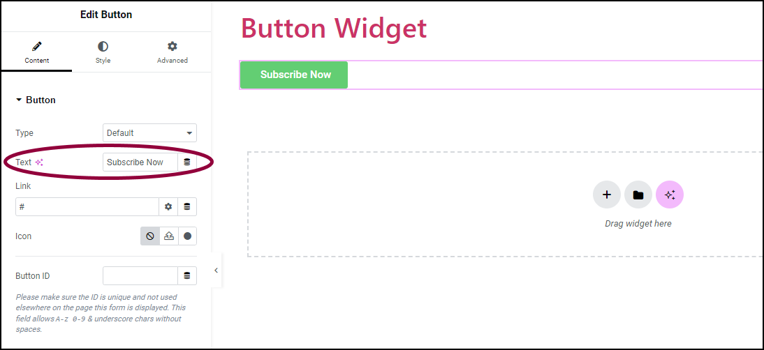
  3. In the Text field, enter the button’s text.
    3 Link field Button Widget 7
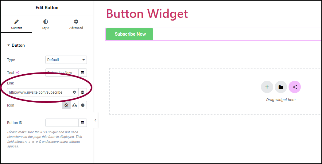
  4. In the Link field, add the URL for the button’s link.
    4 Gear Button Widget 9
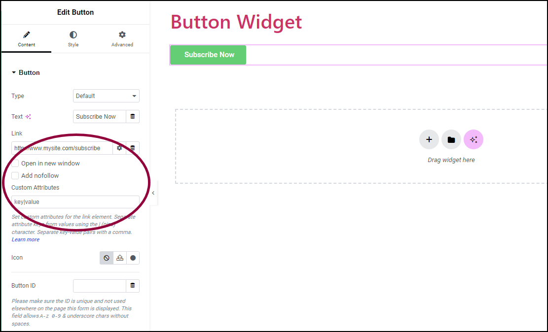
    1. Click the ⚙️ to set the link to either Open in a new window or to Add nofollow to the link.
      5 Icon Button Widget 11
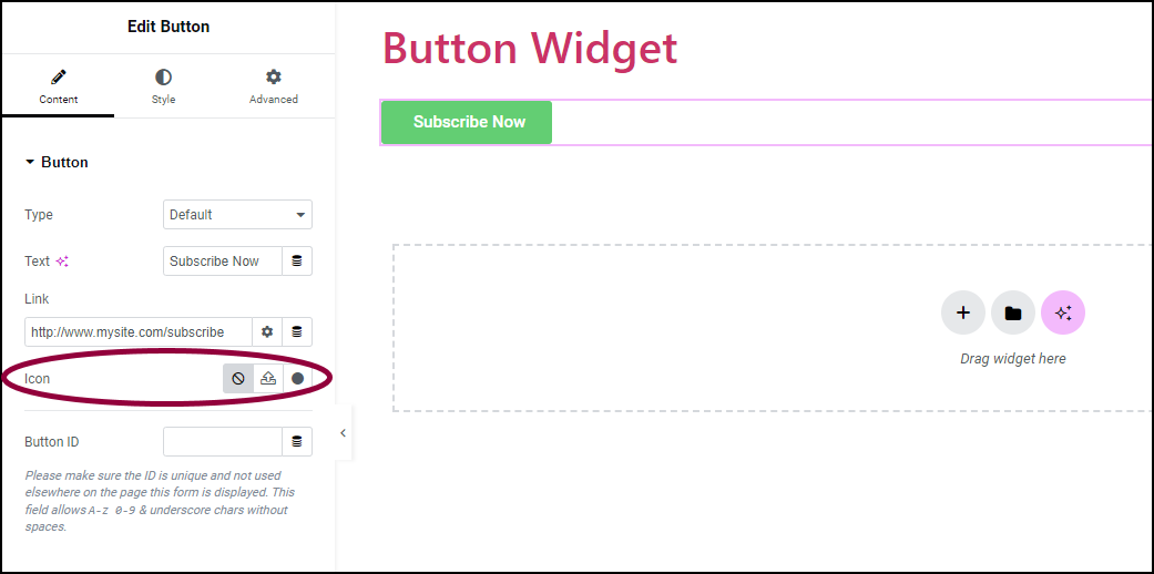
  5. (Optional) In the Icon field, add the button icon:
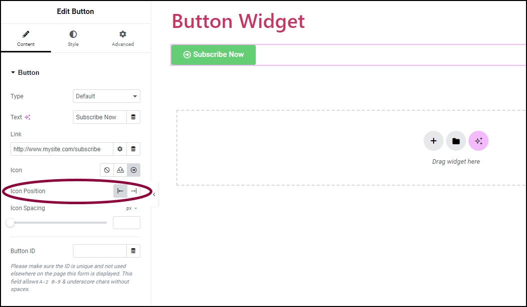
    1. Click the SVG button  svg icon Button Widget 13 to add an uploaded SVG image as a button icon. For more details, see Enable SVG Support in Elementor.
    2. Click the Icon button dot icon Button Widget 15 to add an icon from the icon library.
      6 Icon Position Button Widget 17
  6. In the Icon Position field, set the icon to appear to the right or left of button text.
    7 Icon spacing Button Widget 19
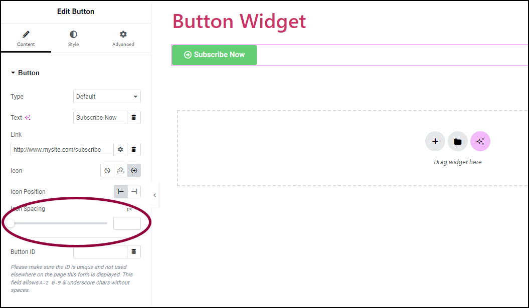
  7. In the Icon Spacing field, define the amount of space between the icon and the button text.
    8 Button ID Button Widget 21
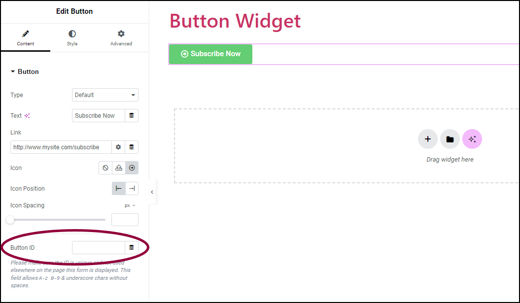
  8. (Optional) In the Button ID field, assign a unique button ID for specific situations, such as Google Analytics events, Meta Pixel, and more.

Change the button size

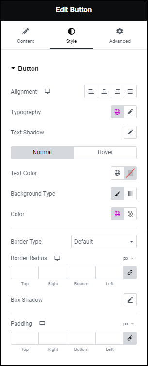
  1. Click the Style tab.
    Article update Button Widget 23
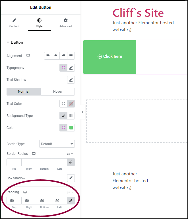
  2. In the panel, change the Padding measurements to control the button size.

Actions you can perform with Button

Settings for the Button Widget

You can customize your widgets using content, style, and other advanced parameters, offering you great flexibility in tailoring them to your needs. Click the tabs below to see all the settings available for this widget.

The Content tab Button Widget 25

Choose from five button styles: Default, Info, Success, Warning, or Danger.

Enter the text you want on the button.

Set the URL for the button’s link. Click the Settings icon ⚙️ to select:

  • Open in new window to open the link in a separate window. This keeps the user on your site even after they click the button.
  • Add nofollow prevents search engines from associating your site with the linked site. This can help prevent your site from being associated with bad actors, lowering your SEO score.

Choose a FontAwesome icon to display on the button.

Set whether the icon should appear before or after the button text.


Use the slider to adjust the space between the icon and the button text.

Icon spacing is not visible if no icon is chosen.

(Optional) Assign a unique button ID, which is helpful for situations like Google Analytics events.

Style tab Button Widget 27

Align the button to the left, center, right, or justified in relation to its column.

Choose the font style and size for the text on the button. For more details, see Typography.

Add a shadow and blur effect to the text on the button. For more details, see Shadow, Text Shadow and Boxed Shadow.

Determine how the button appears by default.

  • Text Color: Set the color of the button’s text.
  • Background Color: Add a background color to the button. For more details, see Create a Background.

Determine how the button appears when moused over.

  • Text Color: Decide the color of the text on the button when the mouse is over it.
  • Background Color: Give the button a different color in the background when you hover over it.
  • Hover Animation: Displays an animation to occur when the mouse is over the button.

Hover mode lets you set a transition duration. This is the length of time it takes for the button to change its appearance when visitors mouse over it.

Choose the border type to use around the button. For more details, see Border type.

Set the thickness of the border around the button.

Set the color of the button. For more details, see Choose a color or Use global fonts and colors.

Set the border radius to control corner roundness. For more details, check out Border radius tools.

Set to apply a box shadow on the button. Learn more about shadows.

Adjust the space between the text and the edges of the button. Learn how to create space with padding and margins.

advanced tab button Button Widget 29

To learn more about advanced settings, see Advanced Tab.

Have more questions? We’re more than happy to assist.

Link is copied to clipboard!
On this page

Is this article helpful?

Share this article