- Add the image widget to the canvas. For details, see Add elements to a page.
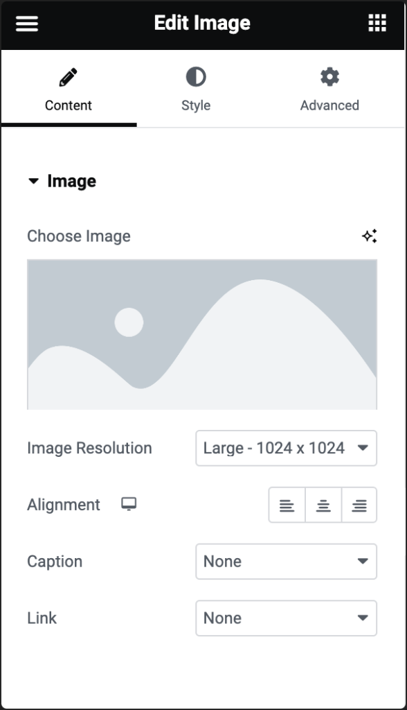
- In the Content tab, under Image, click the Choose Image option.
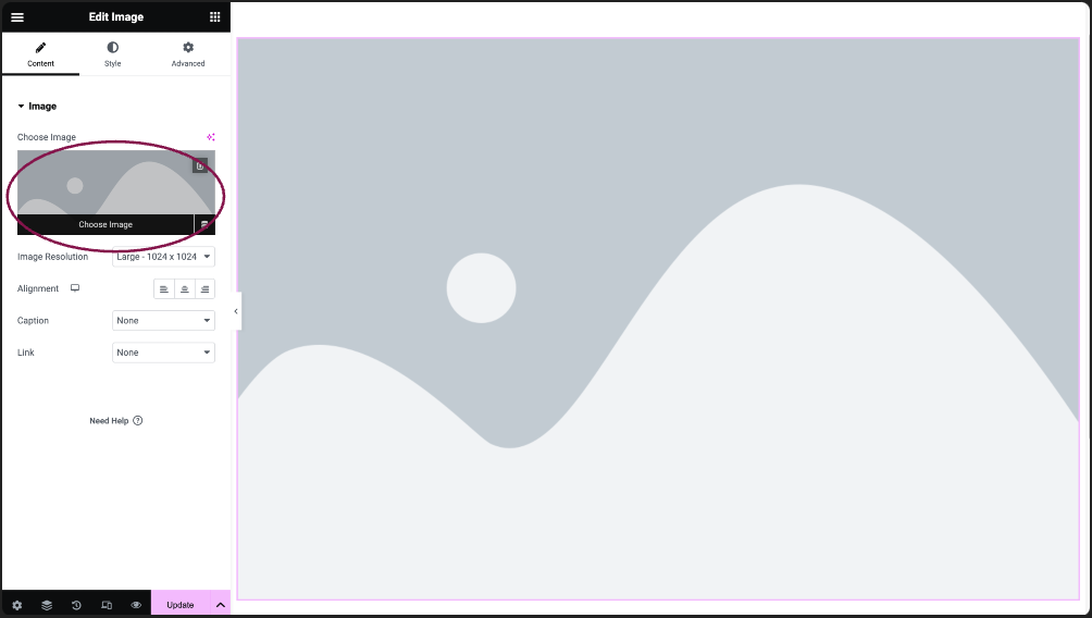
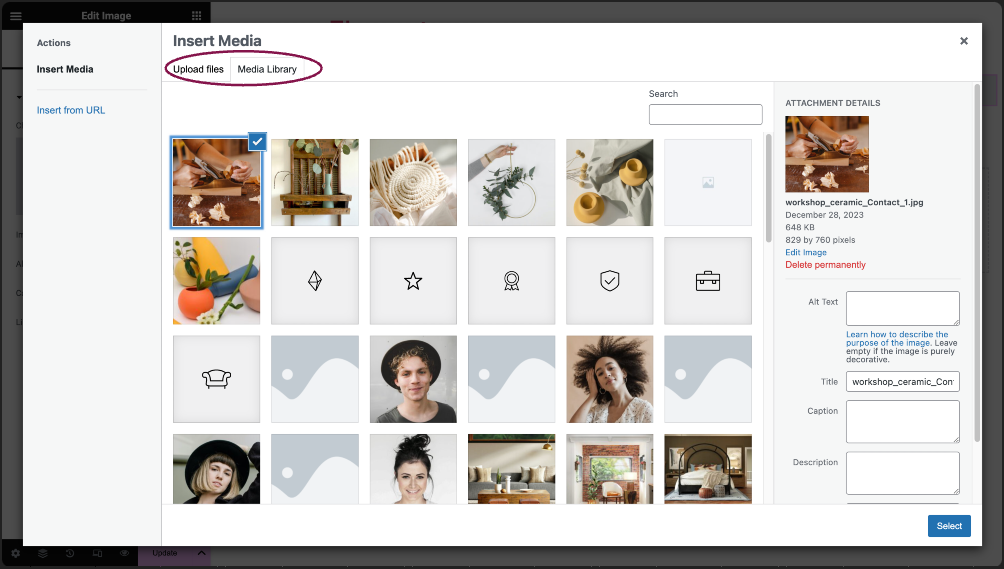
- Upload an image from your computer or select an image from your Media Library.
 Tip: If you don’t want to add an image manually, you can use the Dynamic option. This feature automatically pulls images from posts (like featured images), your site’s logo, or the author’s profile picture.Best PracticeGiving your image an Alt Text description in the Media Library will help boost your SEO and increase accessibility for your site. For more details, see Make your website accessible.
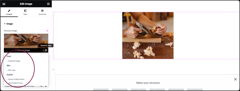
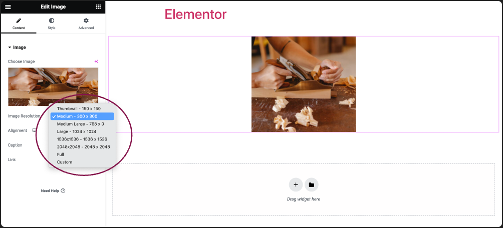
- In the Image Resolution field, adjust the image size: choose from thumbnail, full size, or specify a custom size.
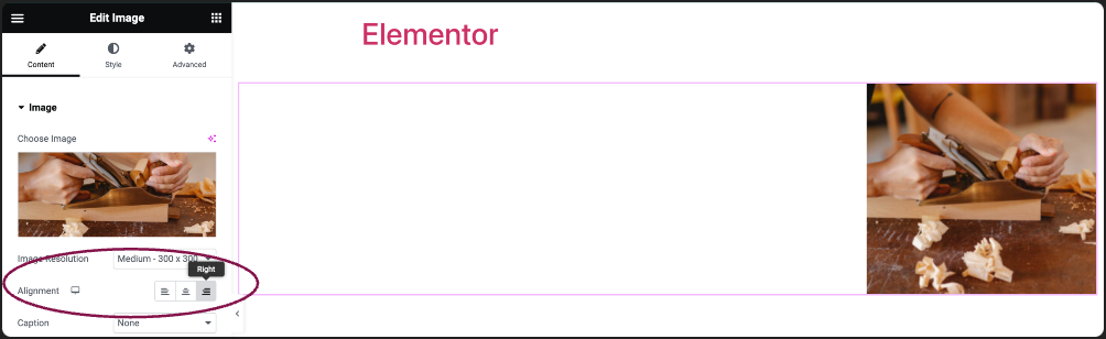
- Use the Alignment field to set the alignment of the image (left, center, right).
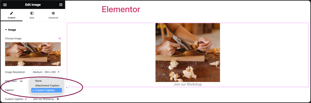
- (Optional) In the Caption field, choose None, Attachment Caption or Custom Caption.
- Attachment Caption: Uses the existing caption from the WordPress Media Library.
- Custom Caption: You can add a unique caption to your image directly from the Elementor editor.
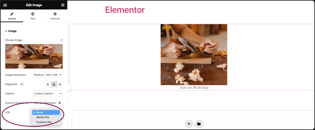
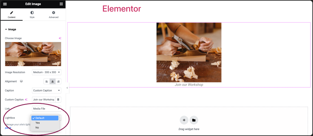
- Use the Link field to make your image clickable. Set the link destination to Media Files, add Custom URLs, or choose None.
- If you choose Media Files, you get an option to open image in a Lightbox:
- You can choose whether to show images in a lightbox. Selecting Yes or No will override the default lightbox setting.
- If you’re adding a Custom URL:
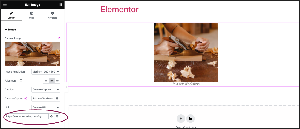
- Click the ⚙️ to set the link to either open in a new window or to add rel=nofollow to the link.
- Use the Custom Attributes option to assign custom attributes to the link element. Use the | (pipe) for key-value separation and commas to separate pairs.
- You can choose whether to show images in a lightbox. Selecting Yes or No will override the default lightbox setting.
There are two ways to delete the image in the image widget.
To delete the image:
- In the panel, hover over the image and click the trash icon
 .
.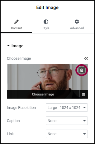
The image is deleted.
- In the panel, click the image. This will open the media library Where you can select a different image.