The Taxonomy widget gives you a powerful way to control the items appearing in a Loop Grid, filtering them by categories and tags. This increases website usability and visitor engagement.
Prerequisite:
The Taxonomy widget can only be used as part of a Loop Grid. Therefore, in order to use the Taxonomy widget, make sure the Loop Grid is active.
Create a Taxonomy filter
You can add more than one Taxonomy Filter widget to a Loop Grid, allowing visitors to filter by multiple characteristics (For example, all posts categorized as How-to with the tag of Important.
To create a taxonomy filter:
- Create a Loop Grid. For more details, see Build a Loop Grid.
- Add the Taxonomy widget to the Loop Grid. For more details, see Add elements to a page.
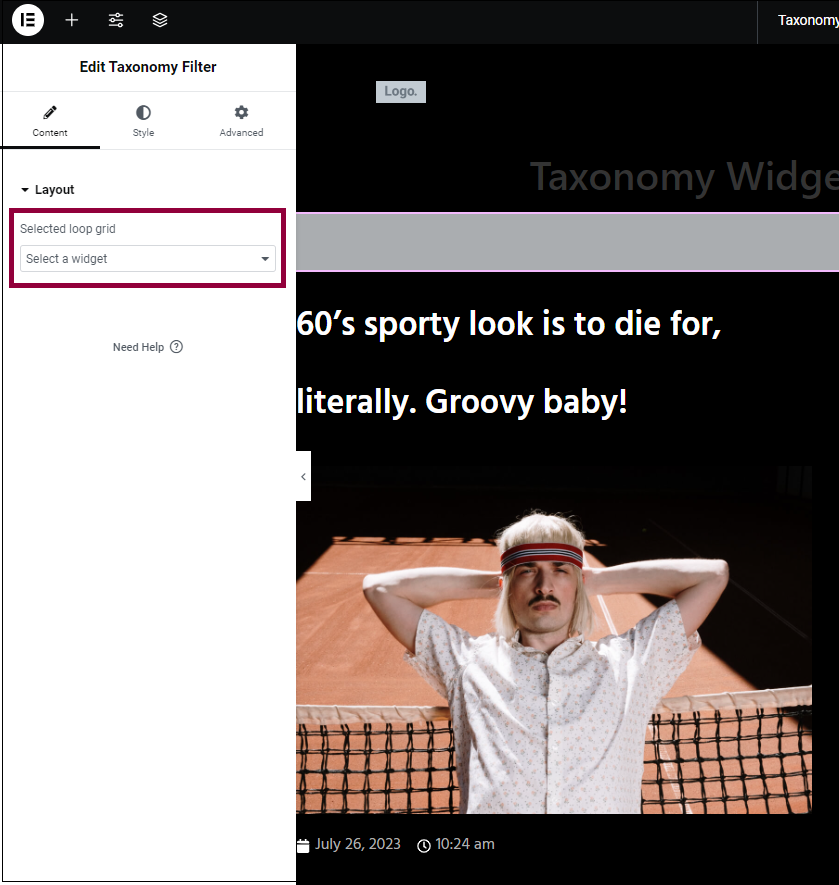
- In the panel, under the Contents tab, expand Layout.
- From the Selected Loop Grid dropdown menu, select the Loop Grid you want to filter.
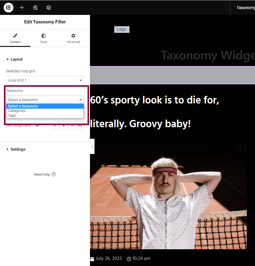
- From the Taxonomy dropdown menu, filter by category or tags. A menu of categories or tabs appears in your Loop Grid.
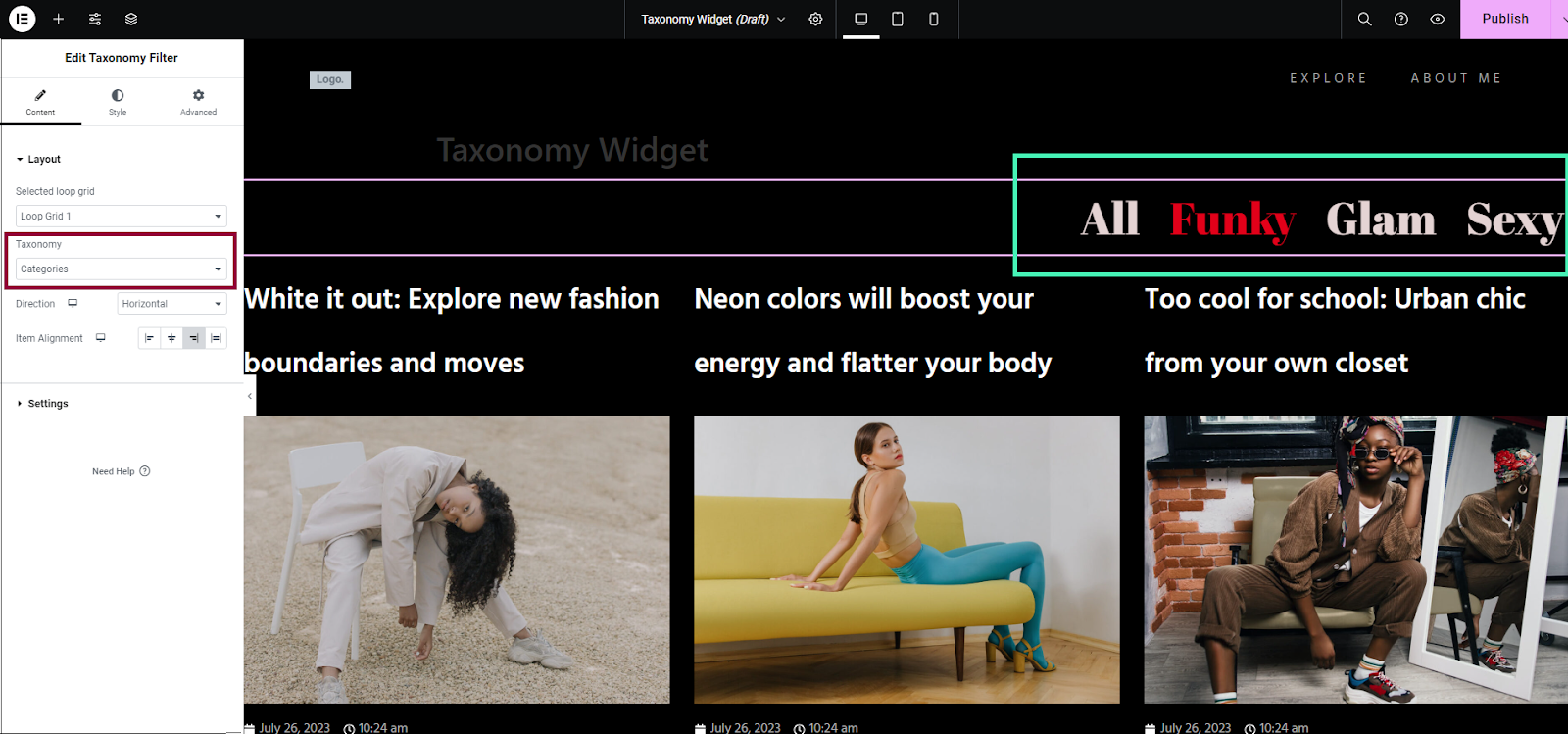
When visitors click on a category or tag in the menu, only posts related to that category or tag will be shown in the Loop Grid. After filtering, they can click All to see all posts again. For example, if they want to see only Funky posts, they can click on Funky. To see all posts again, they should click All.
Excluding categories and tags from a filter
Taxonomy filter settings
Control and style how you filter the items in the Loop Grid.
Content tab – Layout
Choose which Loop Grid to filter, and what options are used for filtering.
Go to the Content tab, and expand the Layout section.
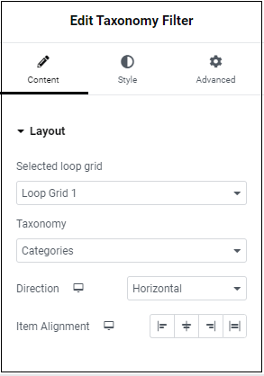
Select which Loop Grid you are filtering.
Choose between filtering by category or tag.
Which direction the taxonomy menu appears: horizontally or vertically.
Choose the position for the taxonomy menu:
- Start – Appears at the beginning of the Loop Grid
- Center -Appears in the middle of the Loop Grid
- End – Appears at the end of the Loop Grid
- Stretch – Appears along the length of the Loop Grid
Content tab – Settings
Control what appears in the Taxonomy menu.
Go to the Content tab, and expand the Settings section.
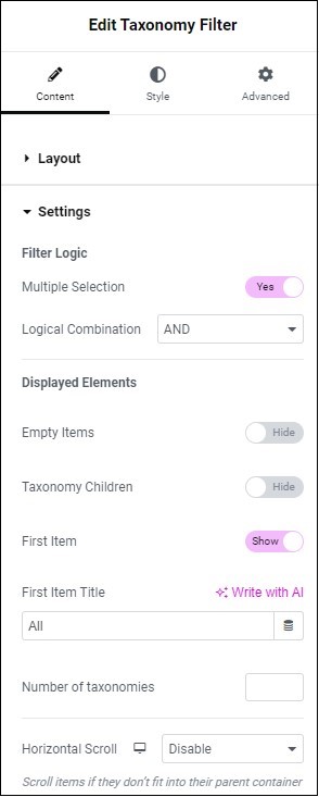
Filter Logic
Multiple Selection – Toggle to allow visitors to filter items by more than one category. If toggled to Yes a dropdown menu allows you to choose between And & Or. Selecting And means only items that are associated with all selected categories will be displayed while selecting Or means items that are associated with at least one category will be displayed.
For example, if multiple selection is set to And, a visiting selecting “blue” and “pants” will see all the blue pants in the loop. If multiple selection is set to Or, the visitor will see all the pants and all the blue items in the loop.
Displayed Elements
Define what appears in the taxonomy menu.
Empty Items
Toggle to Show or Hide categories/tags. If you select Hide, if no items have the filtered classification it will not appear. , For example, the category Funky will not appear if no posts are categorized as Funky.
Taxonomy Children
Toggle to Show or Hide to display subcategories in the taxonomy menu.
First Item
After filtering, a new menu item, All appears. This is known as the First Item. Click this to see all posts again.
Toggle to Show or Hide the First Item
First item title
By default, the name of the first item is All. In the text box, you can change the name of the first item.
Number of taxonomies
Limit the number of taxonomy items shown in the menu by entering a number in the text box. For example, entering 4 will display 4 out of the 25 items.
Horizontal Scroll
This setting determines how the screen handles an excess of taxonomy items. For example, if there are 25 categories, they will either wrap and appear on the next line or only be available by scrolling horizontally.
- Disable: This forces items to wrap to the next line.
- Enable: Visitors will need to scroll horizontally to see all items.
Style tab – Items
Control the appearance of items in the taxonomy menu by clicking the Style tab. Go to the Style tab, and expand the Items section.
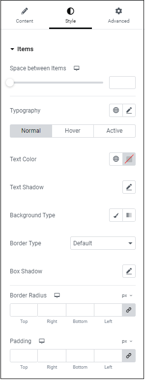
Space between items
Use the slider to set the distance between the text in the taxonomy menu.
Typography
Determine the font of the text in the taxonomy menu. For more details, see typography.
Normal, Hover, Active
Configure how taxonomy text appears according to its state:
- Normal – default state
- Hover – when moused over
- Active– when selected
Select a state, and define the text color, shadow, background type, border type, and box shadow for that state.
Text color
Determine the color of the text in the taxonomy menu. For more details, see Choose a color or Use global fonts and colors.
Text Shadow
Give the text in the taxonomy menu more depth by adding shadow. For more details, see What is Shadow?
Background type
Create a background for the taxonomy menu. For more details, see Create a Background.
Border type
Add a border to the taxonomy menu. For more details, see Border type.
Box Shadow
Give the space surrounding menu items depth by adding shadow. For more details, see What is Shadow?
Border Radius
Round the corners of the border. For more details, see Border radius tools.
Padding
Add or subtract space around the taxonomy menu. For more details, see Padding and margins.