The Login Widget makes it easy to create a custom login page, instead of the default WordPress login page.
How to add a login page to WordPress
Create a New Page, and add the Login Widget
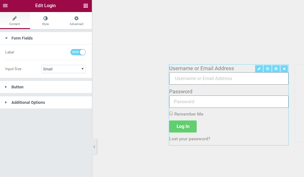
Form fields
- Label: Show or Hide the form Label
- Input size: Choose the Form Fields input size.
Button
- Text: Type the button’s text. You may also use the Dynamic Tags feature to call from the site’s metadata or custom field
- Size: Choose the size of the button
- Alignment: Set the button’s alignment
Additional options
- Redirect After Login: Set to ON or OFF.
- Lost Your Password: Choose whether or not to display the “Lost Your Password” link
- Remember me: Choose whether or not to display the “Remember Me” checkbox
- Logged in message: Choose whether or not to display the a Logged In user a message
- Custom label: Change the default form label and placeholder text
- Username Label: If Custom is selected, enter a text value or use dynamic tags in the field
- Password Label: If Custom is selected, enter a text value or use dynamic tags in the field
Style
Form
- Rows Gap: Set the exact gap between each row
- Links Color: Choose the color of the links
- Links Hover Color: Choose the color of the links when hovered over
Label
- Spacing: Set the exact gap between the label and its corresponding field
- Text Color: Choose the color of the label text
- Typography: Set the typography options for the label text
Fields
- Text Color: Choose the color of the text within the fields
- Typography: Set the typography options for the text within the fields
- Background Color: Choose the background color of the fields
- Border Color: Choose the border color of the fields
- Border Width: Set the thickness of the border around the fields
- Border Radius: Set the border radius to control corner roundness of the fields
Button
Normal | Hover
The following options can be set independently for both the normal and hover states.
- Text Color: Choose the color of the button’s text
- Typography: Set the typography options for the button’s text
- Background Color: Choose the background color of the button
Hover mode lets you set a transition duration. This is the length of time it takes for the button to change its appearance.
- Border Type: Select the type of border, choosing from none, solid, double, dotted, dashed, or grooved
- Border Radius: Set the border radius to control corner roundness of the button
- Text Padding: Set the amount of padding around each side of the text in the button
Logged in Message
If Logged in Message is toggled off, style controls for these messages will not appear.
- Text Color: Choose the color of the logged in message
- Typography: Set the typography options for the logged in message
Advanced
Set the Advanced options that are applicable to this widget
Note: Use your regular WordPress login credentials with the Login Widget