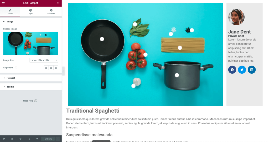
The Hotspot Widget focuses on helping you create interactive images that can help you highlight relevant information, boost engagement and increase conversions for your website.
Warning
The Hotspot widget cannot use shortcodes or Elementor templates inside the widget’s tooltip. The tooltip field only supports plain text or simple HTML.
Controls
Background

- Image – Chose the background image of the viewport
- Image Resolution – Choose the appropriate size based on width and height of wrapper
- Alignment – Choose between left, center, or right alignment
Hotspot
Content

- Label – Enter text to display a label rather than a icon indicator
- Link – Enter a URL link for the hotspot. Dynamic Options may be applied
- Icon – Chose the icon of your hotspot from the library or upload your own in SVG format
- Custom HotSpot Size – Toggle this to enable a custom size for the Label
- Min Width – Adjust the width of the Label
- Min Height – Adjust the height of the Label
- Tooltip Content – Using the text editor, enter the content you wish to display in the tooltip content HTML is allowed
Tip: You can use the Dynamic Options in the Link to open an Elementor Popup rather than a tooltip.
Position

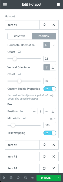
- Horizontal Orientation – Choose the starting position of your hotpot between left or right
- Offset – Use the slider to adjust the horizontal position of the hotspot in %
- Vertical Orientation – Choose the starting position of your hotpot between Top or Bottom
- Offset – Use the slider to adjust the vertical position of the hotspot in %
- Custom Tooltip Position – Provides additional options for display for only the current hotspot
- Position – Choose between Left, Top, Right, or Bottom
- Width – Adjust the width of the box in PX or %
- Text Wrapping – Toggle this to enable text wrapping in your Hotspot
- Animation – Select the animation of your icon
- Sequenced Animation – Toggle to select the use of a sequenced animation effect
- Sequence Duration – If sequenced animation is selected, determine the duration of the animation sequence in ms
Tooltip

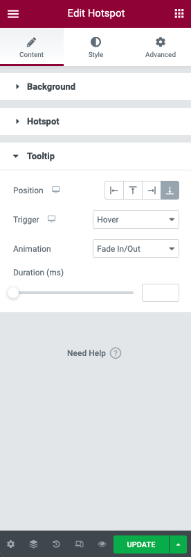
- Position – Chose the position of the tooltip content between Left, Top, Right, or Bottom
- Trigger – Select between Hover or Click
- Animation – Select the animation for your tooltip to appear
- Duration – Adjust the time of the animation in ms
Note: If the Custom Tooltip Position is enabled, the Custom Box Position will be used, rather than the general Tooltip Position.
Style
Background
- Width – Adjust the width of your background image in px, %, or vw
- Height – Adjust the height of your background image in px, %, or vh
- Opacity – Adjust the opacity of your background image
Hotspot
- Color – Use the color picker to choose your hotspot color
- Size – Adjust the size of your hotspot
- Typography – Select the font properties of the hotspot label
- Width – Adjust the width of the hotspot label area in px or %
- Box Color – Use the color picker to choose the label background color
- Padding – Adjust the padding of the label
- Border Radius – Set the border radius of the label
- Box Shadow – Create a shadow effect for the label box
Tooltip
- Text Color – Use the color picker to choose your tooltip content text color
- Typography – Select the font properties of the tooltip
- Alignment – Choose left, right, justified text alignment of the tooltip
Box
- Width – Adjust the width of the tooltip box in px or %
- Padding – Set the padding of the tooltip box in px, em, or %
- Color – Use the color picker to choose your tooltip background color
- Border Radius – Set the border radius of the tooltip box
- Box Shadow – Create a shadow effect for the tooltip box
Advanced
There are no additional options specific to this widget in the Advanced tab.

