Elementor’s new Flexbox Containers are quickly becoming a popular alternative to traditional section columns. Containers allow you to quickly create web page layouts and group widgets. This enables you to control how your content is displayed and streamline your web building workflows.
By using Flexbox Containers, you can improve page speed through leaner code, gain finer control over responsiveness, and more easily create complex layouts. With container templates, you can create templates to use on other parts of your website.
Containers are active by default on new sites or you can activate them for existing sites from the WordPress dashboard.
In this article, you’ll learn about the key differences between traditional section column layouts and containers.
First, let’s take a look at how Containers improve web page responsiveness.
Responsiveness
As you’re designing your web page, you’ll need to consider how well your content loads in the user’s browser as well as how the content is optimized for different screen sizes and devices. Containers allow you to group elements so you can more easily define responsiveness. You can also define how you want your content to be displayed across devices, screen sizes, and which order they’re displayed. Using containers enables you to avoid stacking hidden elements across platform types, and improve the overall user experience.
Layout control
You can achieve better design optimization and define more complex layouts when you use containers. This is because they aren’t constrained by columns and rows, which gives you finer control over your layout.
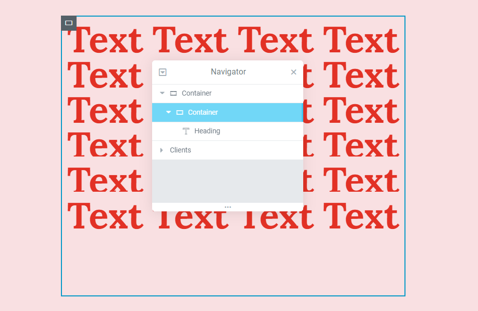
Containers allow you to customize their width and height, and you can nest one Container inside another. Doing so allows you to quickly create feature-rich, complex templates. This enables you to create recurring design features and achieve design continuity across your website. Simply put, working with containers gives you more flexibility than with traditional layouts, which only allow you to divide widgets into sections and columns.
Page speed
You can increase your page’s loading speed by using containers for page design. Containers improve page speed by minimizing the number of dividers used. Sections often contain more for columns and inner sections unlike containers. The fewer dividers in the backend code means a smaller document object model (DOM) which decreases page loading times. This is because less data requests are made for constructing the web page in the browser.
To speed up your page, take a look at the Structure window, and remove unnecessary containers.
Hyperlinking
You can also make containers clickable. Doing so allows you to add hyperlinks so the whole Container acts as a button. This is useful if the content of a Container is an image acting as a call-to-action. Previously, the only way to link an entire column was to use custom code. Containers, on the other hand, solve this problem by allowing you to use an “a” HTML tag to create a link.
More to come
Elementor is constantly developing new, powerful features, many of which are designed to take advantage of the flexbox container design.
Caveat
Containers aren’t always suitable in every use-case and you’ll need to consider that when converting sections to containers. Once you’ve converted a section to a container, it’s irreversible.
Next steps
Now that you understand more about the benefits containers have over the traditional section and column; check out how to convert pages using sections into pages using containers.
To get the most out of Elementor, check out the Knowledge hub for helpful learning resources.