Grid containers are a fast way to build containers neatly divided into columns and rows.
Note
In this example, some element alignment has been changed, so your results may not look exactly like the example.
To create a Grid container:
- Open a page in Elementor Editor.
- Click the “+” sign on the canvas.
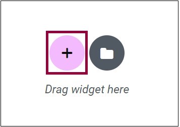
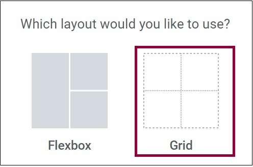
- Select Grid.
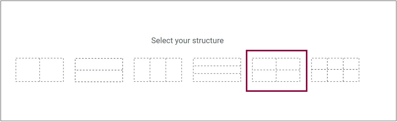
- Select one of the grid layout options. For this demonstration, we’ll select a 4×4 grid.
 NoteA cell in a Grid Container can only contain one element, but there is a trick you can use to get around this limitation (discussed below).
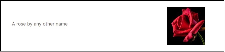
To keep the design tight, change the height of the rows. - Drag a Text Editor widget into the first cell and enter the text, “A rose by any other name”.
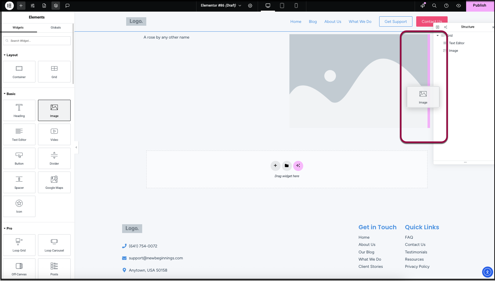
- Drag an Image widget into the second cell.
- Add a picture of a rose to the Image widget. NoteThe Grid Container will automatically adjust the cell size to accommodate the Image widget. You can change the cell size by adjusting the size of the image.
- Drag a Text Editor widget into the third cell and enter the text, “Would cost more anywhere else”.
For the fourth cell we want to add two Text Editor widgets and two image widgets. Since a cell can only hold one element, we’ll add a container element to the cell and then add widgets to the container. - Drag a container element to cell 4.
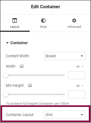
- In order to keep our orderly design, we’ll make this child container a Grid Container. Because containers default to Flexbox, we’ll have to change the setting in the layout tab to Grid.
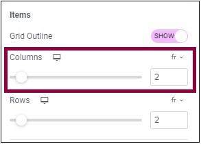
- By default, switching a Flexbox container to a Grid will default to a 3×2 layout. Our design calls for a 2×2 layout. This can be done by changing the settings in the Layout tab.
At this point you should have a four cell Grid Container, with cell 4 containing another four cell Grid Container.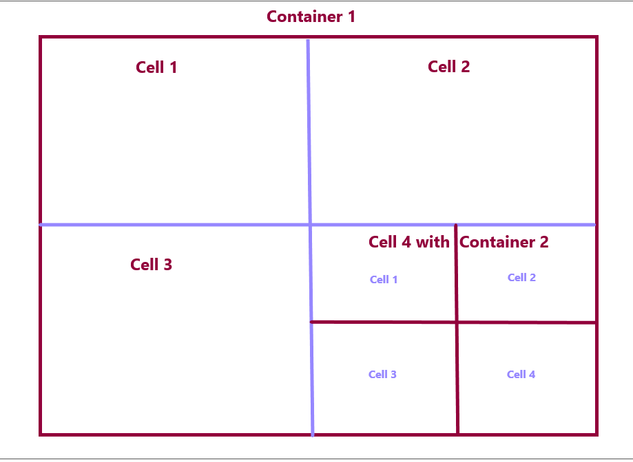
- Drag a Text Editor widget into cell 1 of this new container and enter the text “Small Bouquet $10”.
- Drag a Text Editor widget into cell 2 of the new container and enter the text “Large Bouquet $20”.
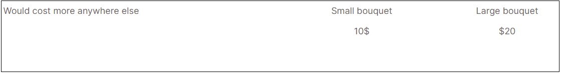
- Drag Image widgets to cells 3 and 4 with images of a small bouquet and large bouquet respectively.
Your entire grid should look like this: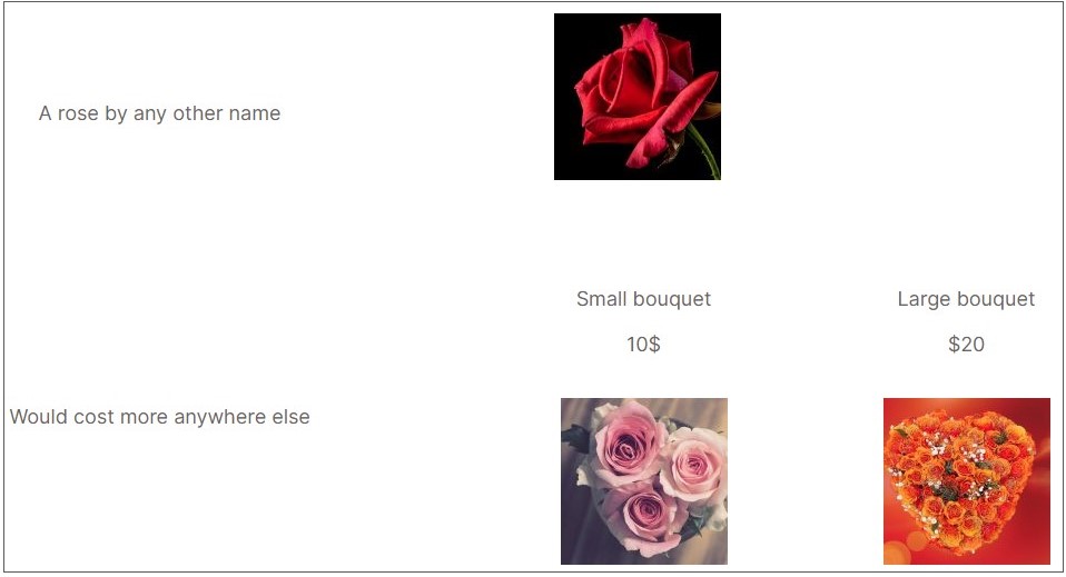


Next steps
Learn more about the Layout options and Style options available with Grid containers.