Introduction
The Grid Container allows you to quickly align the elements on your page but contains enough options to keep your designs fresh and interesting. Click on the hotspots below to explore the Grid Container’s layout options.
Layout tab – Container
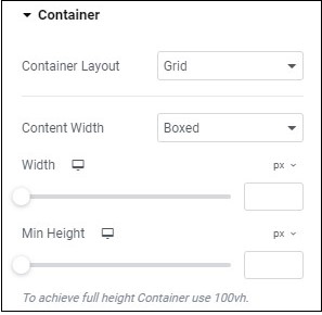
Container Type – Use the dropdown menu to select:
Grid: A Grid Container is created with an equal number of symmetric rows and columns.
Flexbox: A Flexbox Container contains rows and columns in a pattern chosen by the user.
Container Width: A dropdown menu with two choices:
- Boxed – Allows you to set the width of the Grid Container using the Width slider. Whatever value you choose, the container will remain centered.
- Full Width – Sets the container to take up the full screen width. This setting disables the Width slider.
Minimum Height – Use the slide to adjust the minimum height of the container. Learn more about measurement units.
Layout tab – Items
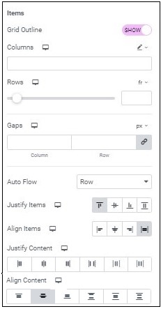
Grid Outline – By default, set to Show which will allow you to see the outline of the cells in a grid. Hide will make the cell lines invisible.
Columns – Use the slider to change the number of columns. By default, column width is measured in fractions (FR), but that can be changed with the measurement dropdown menu. Learn more about fractions as a unit of measurement.
Rows– Use the slider to set the number of rows in your grid. By default row height is measured in fractions (FR), but that can be changed with the measurement dropdown menu. Learn more about fractions as a unit of measurement.
Measurement dropdown menu ( ): Use the dropdown to toggle between measuring rows in fractions (FR) and in custom measurements. Custom measurement allows you to set row height by standard units of measurement (e.g. pixels(PX), EM, REM etc.) or as CSS properties. Custom measurement is also used to create different size rows. This is done by selecting custom measurement and entering a value for each row. For example, for three rows you could enter the values “200PX 1FR 400PX”. This would create three rows of these respective heights.
Gaps – Create empty spaces between the cells in a Grid Container. Learn more about units of measurement.
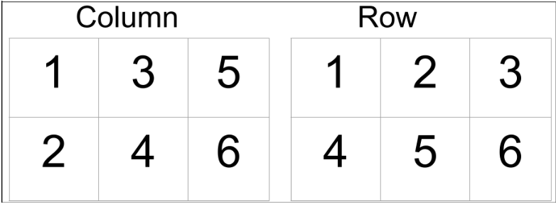
Autoflow – Use the dropdown to choose either Row or Column. If you choose Row, widgets are added to cells from left to row until the end of the row is reached when widgets are added to the next row down. If you choose Column, widgets are added to the next cell down until you reach the bottommost cell and then the next widget will be added to the top of the next column.
Justify Items – Adjusts the contents of the cells. Learn more about aligning and justifying items in a container.
Align Items – Adjusts the contents of the cells. Learn more about aligning and justifying items in a container.
Justify Content – Adjusts the positioning of the cells within the grid. This only appears if you’re using custom sizes for your columns and the sum width of your columns is less than the width of the container (otherwise there is no room for the contents to shift). Learn more about aligning and justifying items in a container.
Align Content – Adjusts the positioning of the cells within the grid. This only appears if you’re using custom sizes for your rows and the sum height of your rows is less than the height of the container (otherwise there is no room for the contents to shift).Learn more about aligning and justifying items in a container.
Next steps
Check out the style options for Grid Containers.