Last Update: March 7, 2024
Click on the hotspots below to explore the Grid Container’s style options.
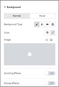
Learn more about backgrounds.
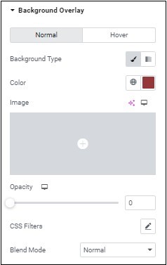
Normal: What the overlay will look like by default.
Hover: What the overlay will look like when visitors mouse over it.
Color: For more details, see Choose a color or Use global fonts and colors.
Image: Learn how to add graphic elements.
Scrolling Effects – Use the toggle to change the screen when visitors scroll up and down your page. For more information on scrolling effects see:
You can also list the device sizes this effects will occur on (e.g. desktop, tablet, mobile)
Mouse effects – Have the container’s items move relative to a visitor’s mouse movement. Learn more about mouse tracking.
A partially transparent layer that covers the background to give it extra depth and texture.
Normal – What the overlay will look like by default.
Hover – What the overlay will look like when visitors mouse over it.
Background type – Choose between a solid color or image (Classic) or a mix of two colors Gradient. Learn more about classic and gradient backgrounds.
Blend Mode – Learn more about Blend Mode.
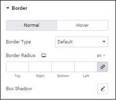
Normal – What the border will look like by default.
Hover – What the border will look like when visitors mouse over it.
Border types – Border type – Learn more about border types.
Border Radius – For more details, see Border radius tools.
Box Shadow – Learn more about shadows.
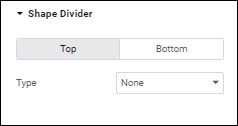
Shape Divider – Learn more about how to create custom borders for your container.
Check out the layout options for Grid Containers.
Can’t find the answers you’re looking for? We’re more than happy to assist.