Want to learn faster? Book a 1-on-1 expert session today.
Introduction
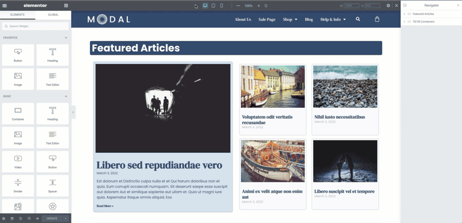
Containers make the best use of available space within them. This means your designs will look great across all devices with less need for additional breakpoints. The ability to resize and reorder individual elements within a section was only possible before with a lot of custom CSS or third party add-ons.
Direction
The direction of Containers may be set to Row or Column independently based on breakpoint. This allows widgets to stack easily on mobile view.
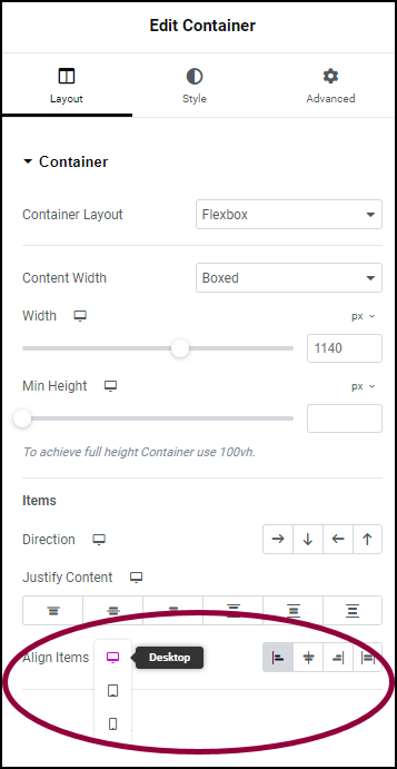
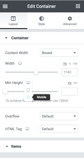
Responsive Width and Height properties
The Container allows you to alter the heights and widths of each element according to the breakpoint. By adapting your designs to be based on flexbox, you can use fewer custom breakpoints than previously needed.
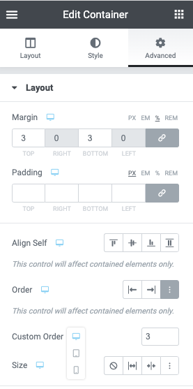
Responsive Ordering
By using Custom Order, you may set the order of widgets and containers per breakpoint. This provides a much more optimized way to manage responsiveness in your designs. You may now avoid creating additional sections that are hidden per device.
Next steps
Now that you’ve seen how containers can help with responsive design, let’s look at how you can create some basic designs with containers.
To get the most out of Elementor, check out the Knowledge hub for helpful learning resources.