Introduction
By using containers, you can achieve more optimized layouts in your design. Below are a few basic layouts. You may learn how to create each of these using our tutorials.
Intro Container
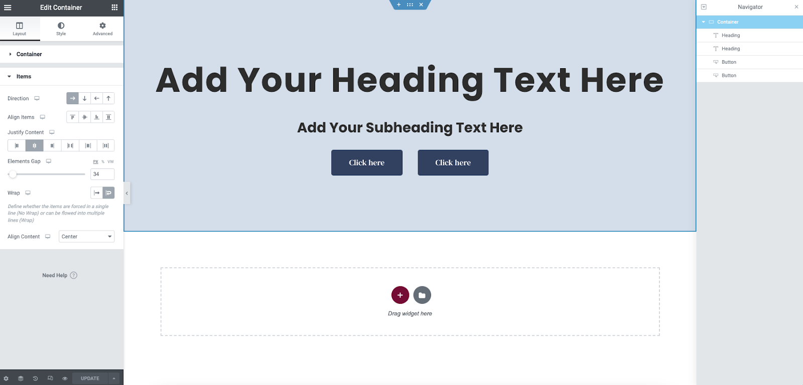
One of the most fundamental sections on websites is an intro/splash section. This is generally a welcoming title with a tagline. It is also a good place to start interacting with the user by adding buttons to direct them to additional information or a purchase. Learn to create this here.
Hero
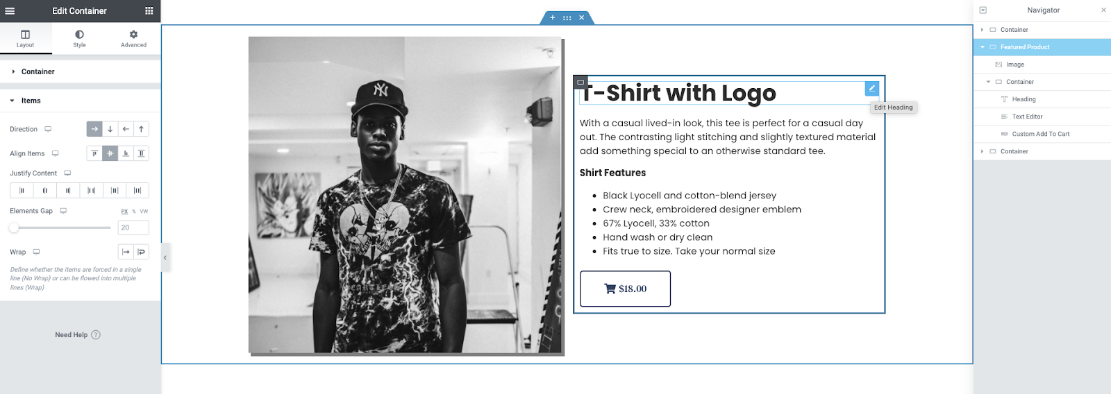
A hero is generally composed of an image, and descriptive text. A button may also be used as a call to action. This could be a link to a bio, or a product in your shop. A parent container is created and set to the direction of row and center aligned/justified. The image is placed in the container with a custom width (example: 40%-60%) A container is then placed to the left or right with a direction of column. Headings, text, and buttons are placed in the container and spaced to best fit the design. Learn how to make this here.
Hero with image gallery
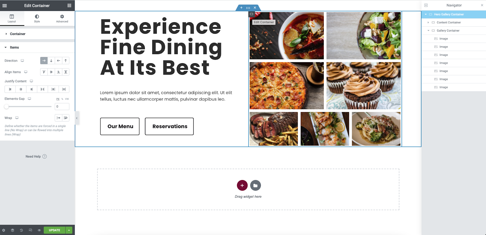
A hero may also feature descriptive text along with a gallery of images. Here, a child-container is used along with a Text Editor widget inside a large parent container. The child-container is used to display the images. Each image can then be adjusted to fit using the flex controls. Learn how to make this here.
Call To Action
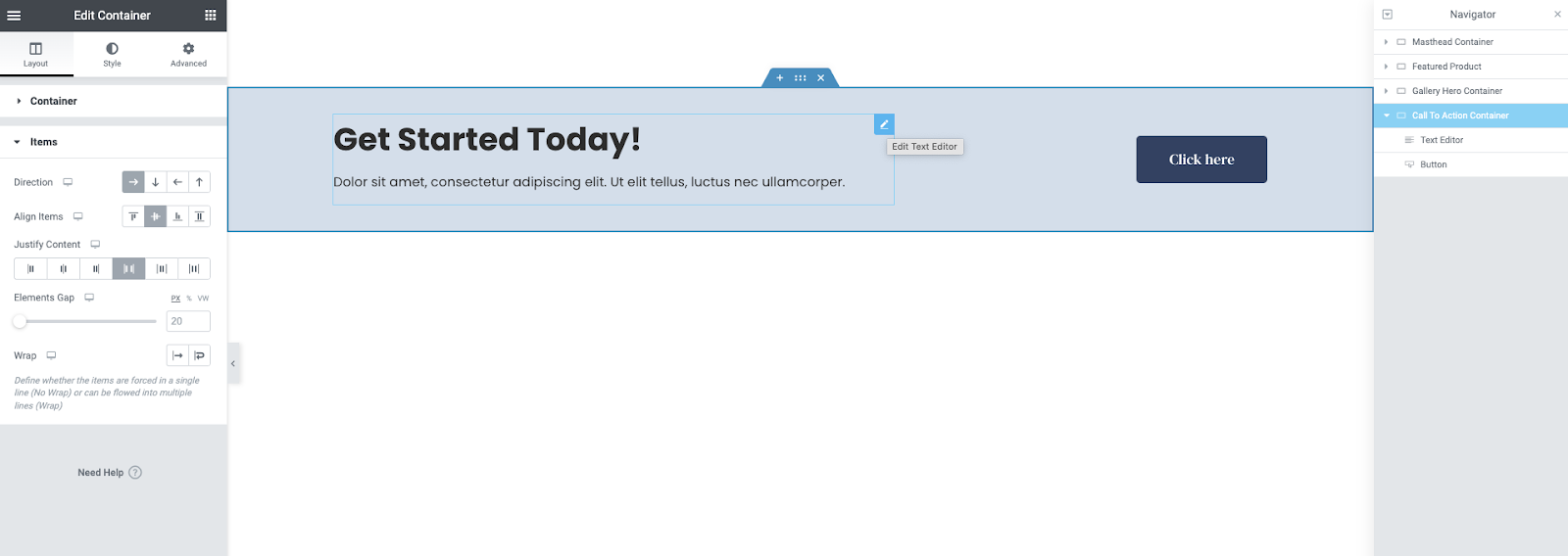
A call to action is generally composed of text and a button that invites the user to interact with it. These can be used to fire a contact form popup, offer a subscription, or directed to a pricing page.
Here a parent container is set to the direction of row, the items are aligned vertically, and the content is justified to space-between. a Text Editor, and a Button widget is placed within it. By adjusting the width of the text editor, the proper padding may be achieved (example: the text editor is set to 60% width) Learn how to create this here.
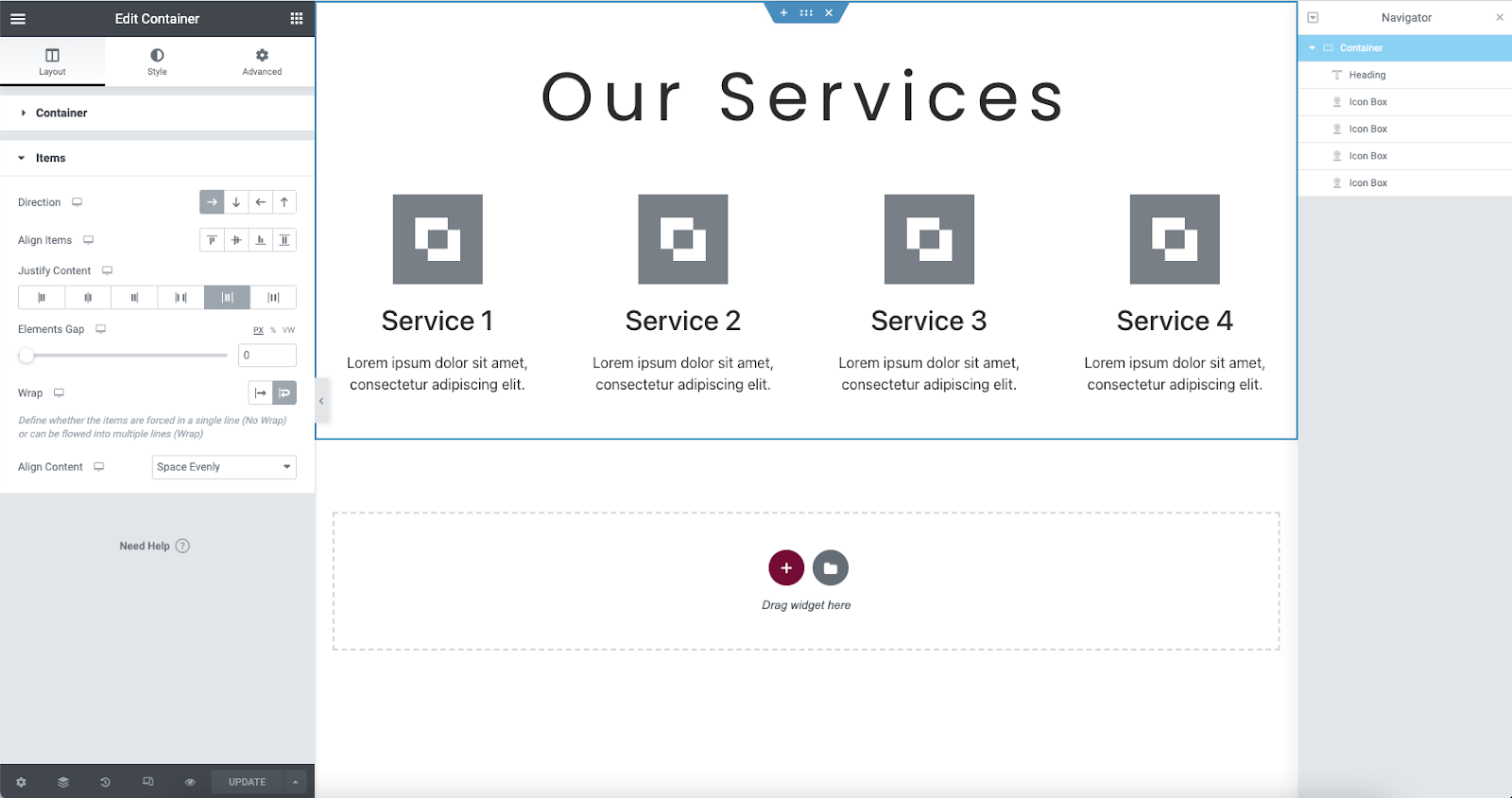
Services
This is a rather basic design but still used frequently. The Heading widget, and the Icon Box widgets are used in the parent container. By adding the wrap property to the parent container, the child elements can be nested within by using their individual width properties. You may also use the Image Box widget in the same fashion. Learn more about how to make this section here.
Next steps
After you’ve checked how to build these layouts using containers, learn how you can use containers to create templates for your website parts such as headers.
To get the most out of Elementor, check out the Knowledge hub for helpful learning resources.