Introduction
Here you will learn how to create a “services” container. This is a rather basic design but still used frequently. The traditional method of using sections/inner-sections/columns can be optimized by using containers. While it may seem challenging at first, once you familiarize yourself with the container and its properties, you will be able to create these designs quickly and more efficiently for page performance.
Getting started
For this tutorial you will only need two widgets, and a container. The Heading widget, and the Icon Box widget. These items have been added to the favorites section of the editor panel so they may be easily accessed.
Creating the Container
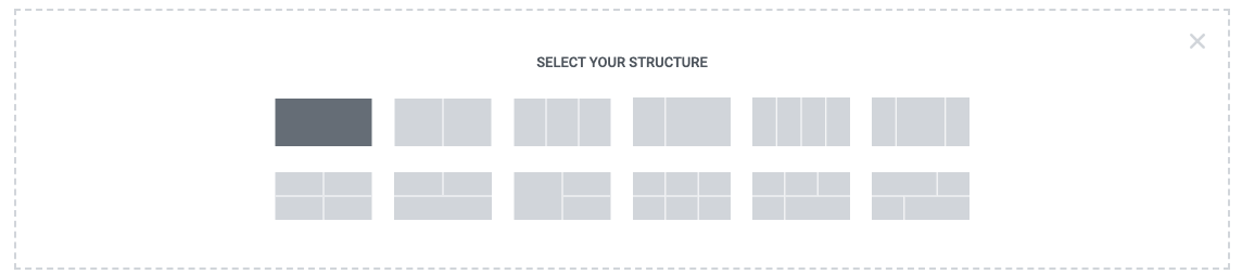
Begin by creating a new container element. Do this by clicking on the + icon in the main editor window. For this example you will only need the single container. Select it in the container layout options shown.
Container settings
The container is set to boxed at the default 1140 px width, and a viewport height of 55 VH in the editor settings. Additionally the overflow is hidden and the HTML tag set as section.
The Items tab can be skipped for now in this tutorial but we will return to it once the widgets have been added.
At this stage your container should look something like this.
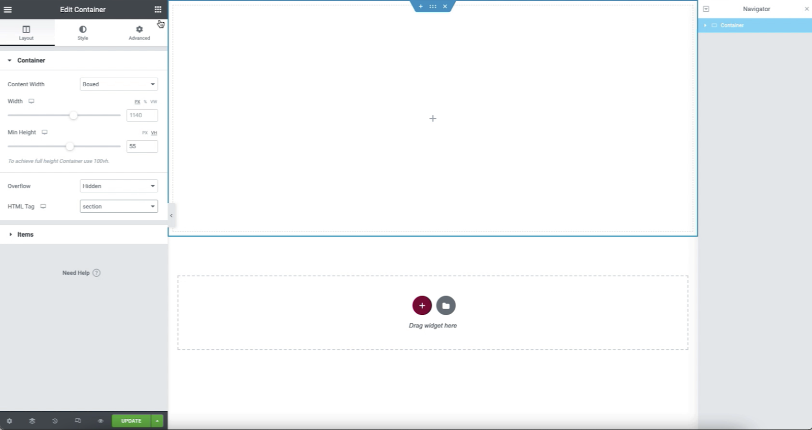
Review the Container settings
- Container Width: Boxed (1140px default)
- Minimum Height: 55VH
- Overflow: Hidden
- HTML Tag: Section
Adding the Heading
Since there are no items in the container yet, it is now time to add them. Begin by adding the Heading widget. Enter the text you wish for your heading. In this example, “Our Services” is entered into the value. Since this is a heading of a new section, the value of H2 is left in the HTML tag. You may then choose the center alignment to center the heading within its wrapper.
Styling the Heading
From the Style Tab > Typography a pre-set global font style is used to define the font size (Example used: 4.768 REM). Colors and other styling can be edited as desired once the design layout has been completed.
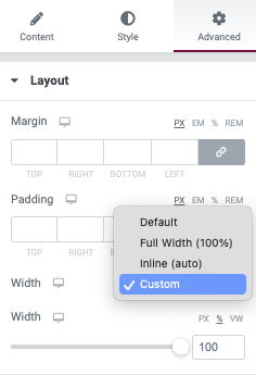
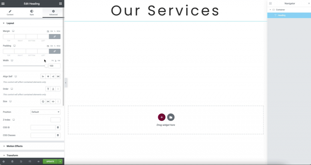
Advanced Tab options
For the final result, the Heading will occupy 100% of the width of the container. We will define this value now in the Custom Width property. There are other ways to achieve this using more advanced methods, but for this tutorial, this method is the most simple to learn.
You should now see the following design in your container.
Adding an Icon Box
You may now add an Icon box to the container. Change the default star icon, to any of the available Font-Awesome icon options, or use an SVG file of your own. The icon will be given a stacked view to make it stand out more visually. For the title text, a value of “Service 1” is used. The description text may be edited. For this example, it is just shortened to one sentence. You may add a link in this step if desired.
Styling the Icon Box
For this tutorial, additional styling is not required but you may return to this once completed and add your personal touch.
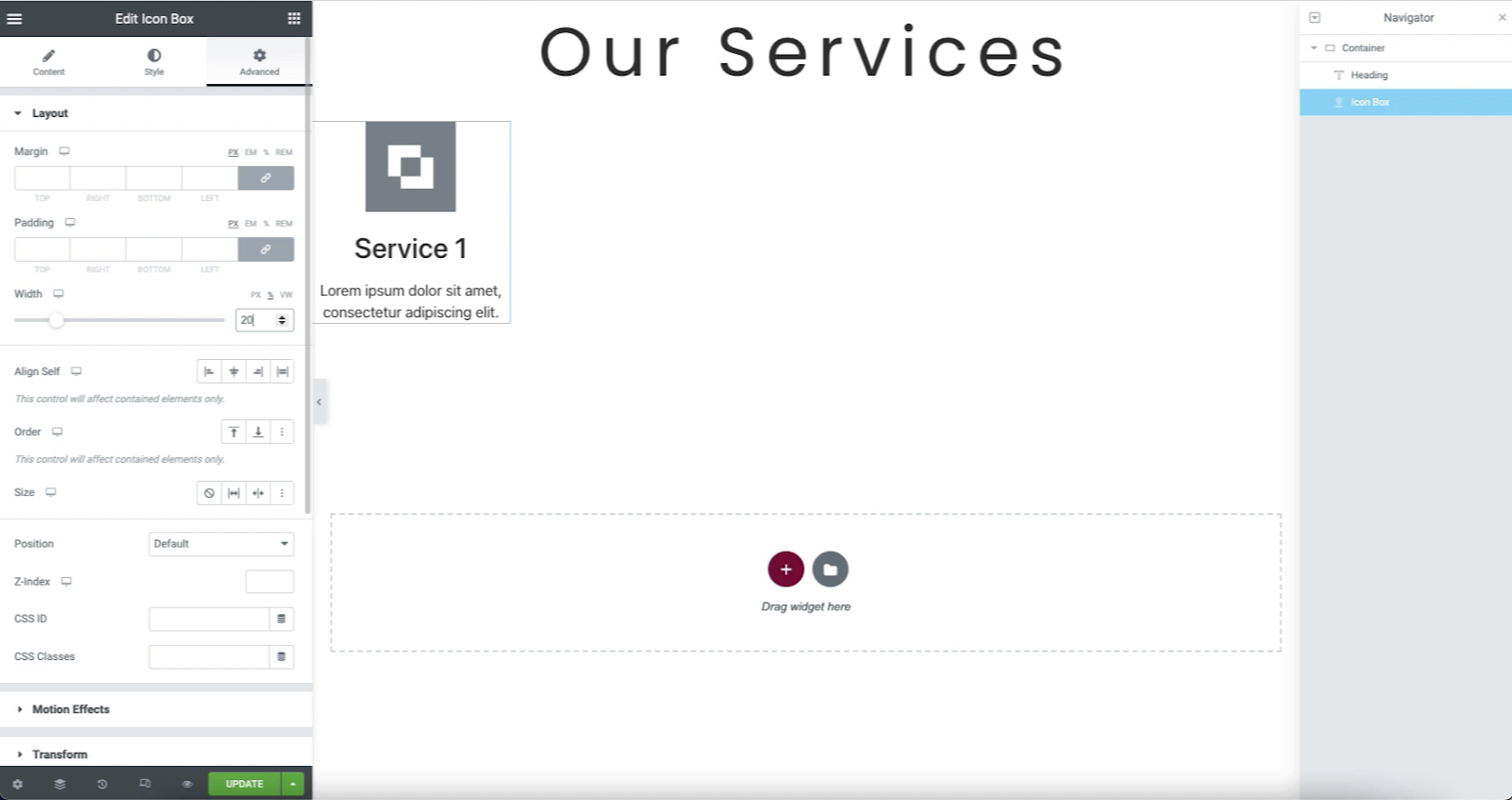
Advanced Tab options
In this step, a few more flex options are demonstrated. For this tutorial, we will manually define a Custom Width value of 20% width. This will result in the four Icon Box widgets taking up 80% of the container width in the completed desktop view.

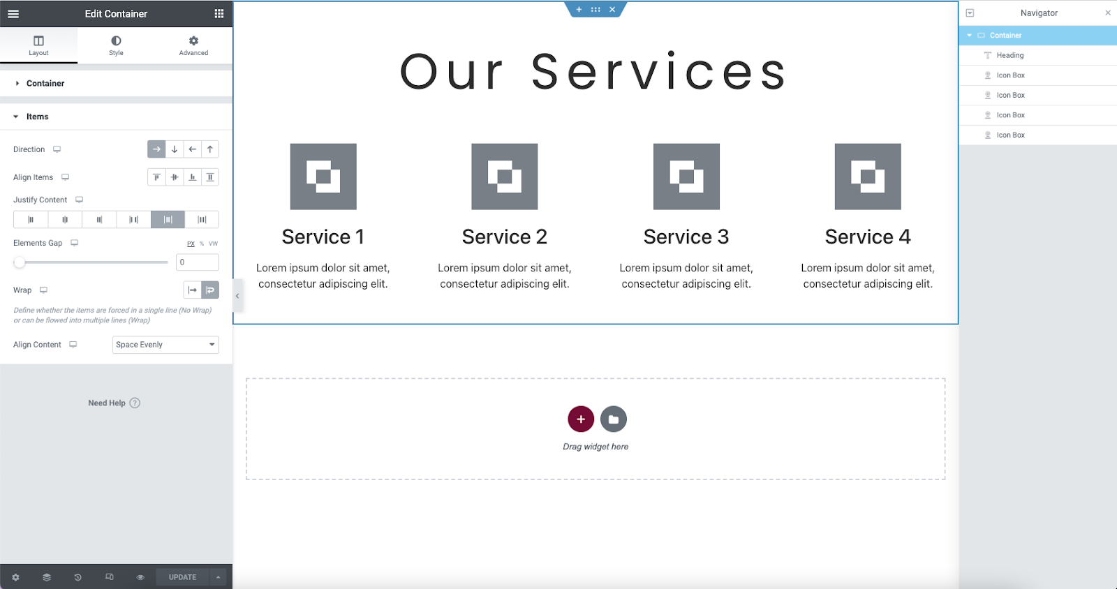
The container should now appear like the following.
Duplicate the Icon Box x3
In the next step you will be duplicating the Icon Box widget to result in four total. You may do this by right clicking the widget and selecting duplicate. The title of each is edited. At this point you will have all the widgets needed aligned vertically as shown below.
Review the widget properties
- Heading widget: H2, center aligned, sized at 4.768EM, and with a 100% width defined in the advanced tab
- Icon boxes (4): Each with a defined width of 20% in the advanced tab.
Container items flex properties
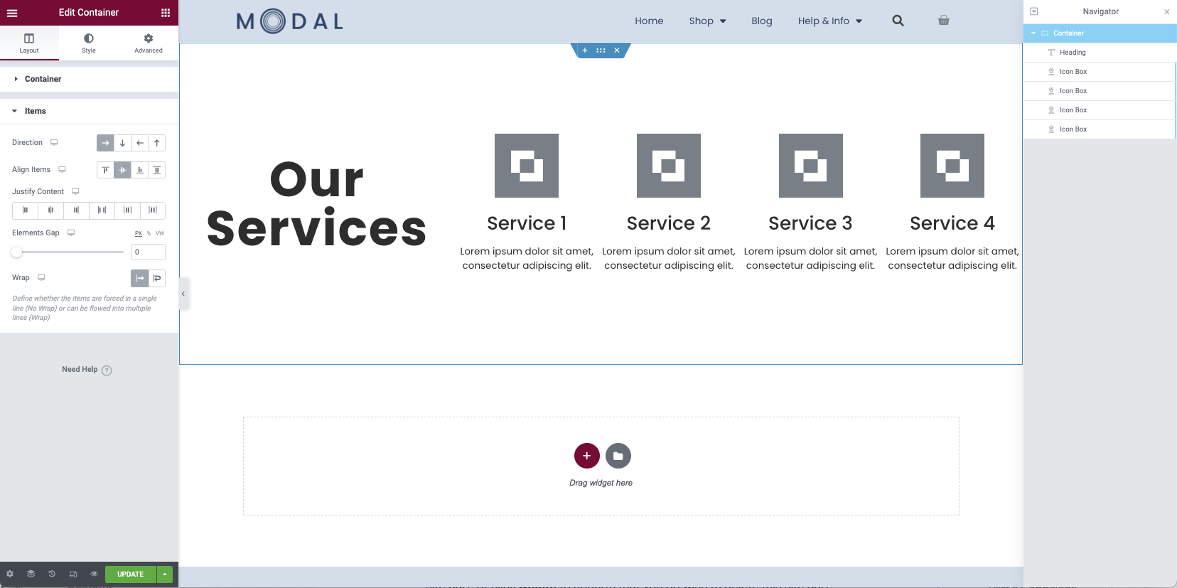
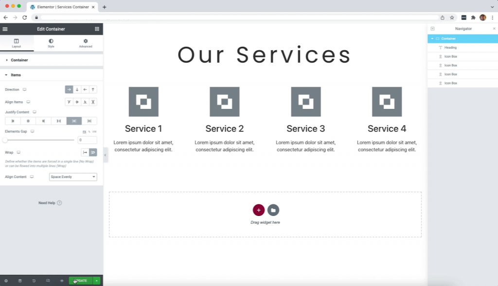
Since the items are all vertically aligned, you now need to edit the container layout once again. Right click on the container to return to the layout editor. Select the Items tab to open the options. From this section, you will define the container direction, alignment, and wrap properties. Below you will see the final property settings used for this design.
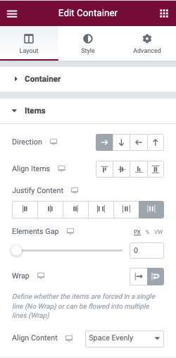
Direction
The direction of the column may be set to row (horizontal), column (vertical), reversed row, or revered column. For this tutorial, you will define the direction as row. The Custom width property of the Heading widget will be overridden until the Wrap property has been applied.
Align Items
If the Align Items property is set to Center it will vertically center the row of widgets in the container. This will be further controlled in the Align Content and may not apply to your final design.
Elements Gap
This may be used to provide a gap between the objects. This will be used more once the responsive viewports are edited. A value of zero is used in this example at this time.
Wrap
You will now need to apply the Wrap property. This will allow the items to use the defined widths, rather than bunching together; and instead wrap to the next line. The heading will now appear above the four icon boxes. However, the icon boxes will still all be bunched together to the left.
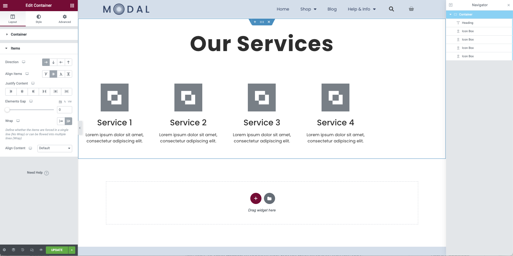
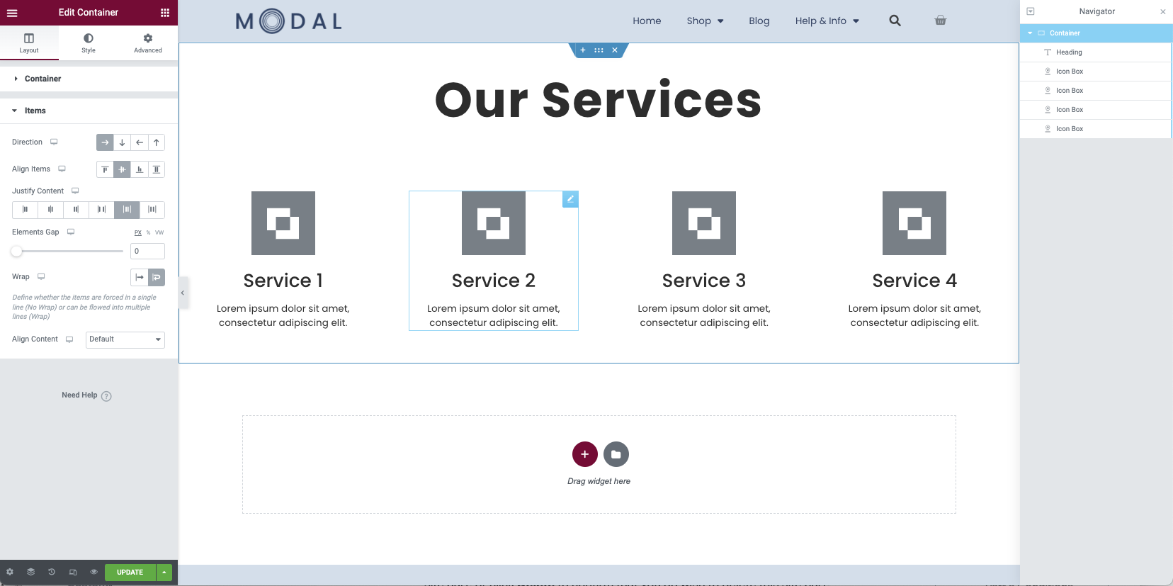
Justify Content
When a container is set to row, the justify content property is used to align and space the container objects horizontally. You may set this property to flex-start, center, flex-end space-between, space-around, and space-evenly. In this example a value of space-around is used to create equal spacing between the items and the container.
Align Content
In order to vertically align and space all the items within the container, the Align Content property is used. This option will only appear if the wrap property is enabled. Once again you may select between the flex-start, center, flex-end, space-between, space-around, and space evenly. For this example, you will use the space evenly option.
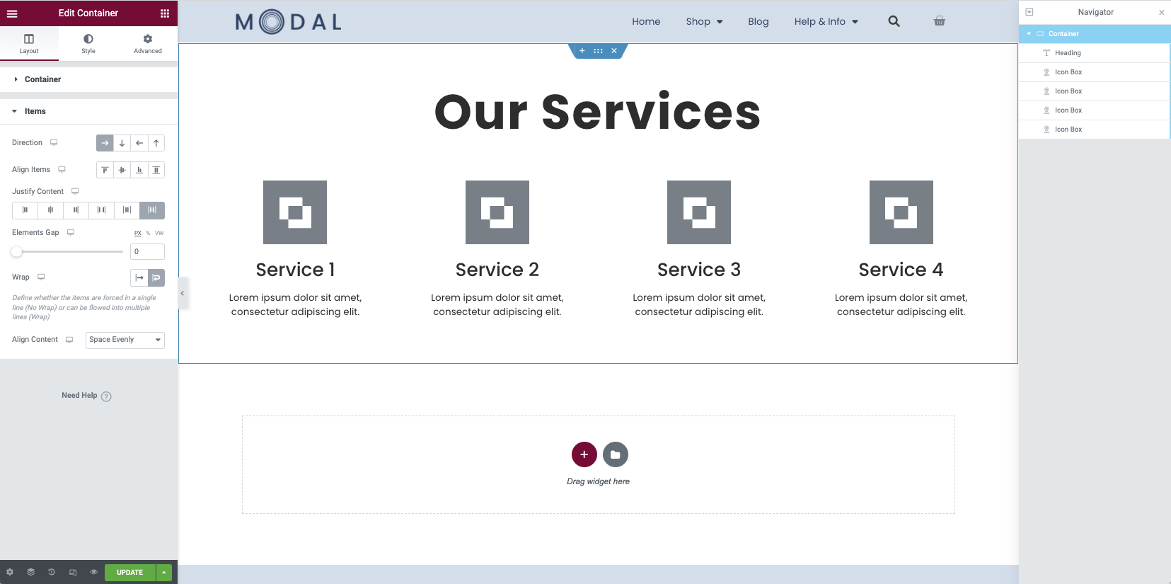
Note: Once the Align Content property has been applied, the Align Items setting will be over-ridden. It may be unticked.
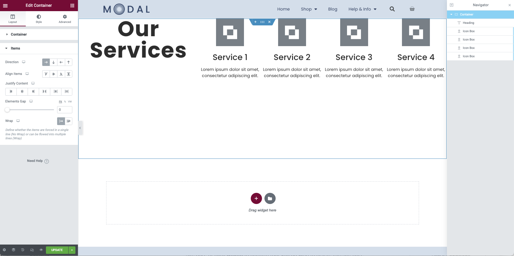
Review the Container settings
Below are the settings for the container you should be using for this design.
- Direction: Row
- Justify Content: Space Around
- Wrap: Wrap
- Align Content: Space Evenly
Take a breather
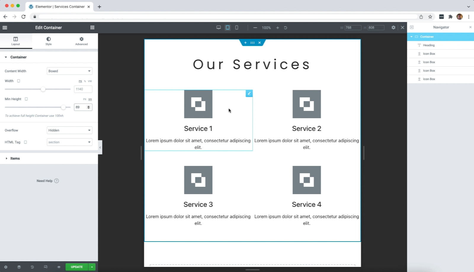
Your desktop design is now completed and should appear as below. You should publish your changes, and preview in a new browser tab.
Responsive Settings
To finish the design process, you now need to make it responsive on tablet and mobile devices. This can be achieved by simply adjusting the width of the icon boxes and container height.
Tablet Settings
For the tablet, you may choose to leave the icon boxes as four across, or you may find that they look better at 50% width each. This is defined once again in the Advanced Tab of each widget. The height of the container is also increased to accommodate the items. A value of 89VH is used in this example.
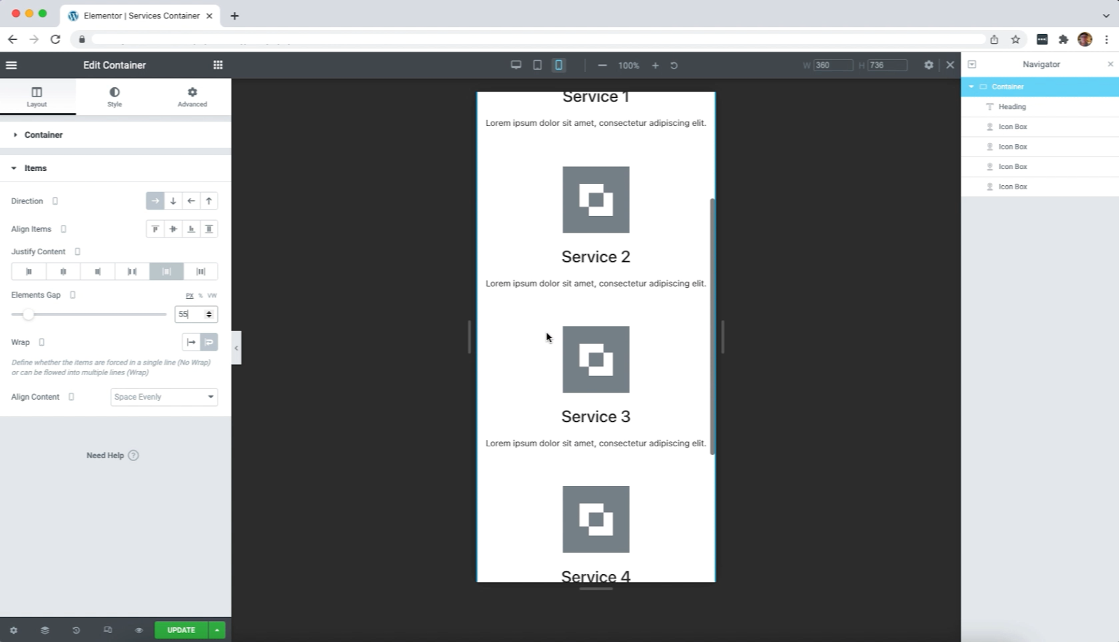
Mobile Settings
For the mobile view, a width of 100% for each Icon Box is used in the advanced tab. The Elements Gap option is now used to provide a gap between the widgets. This should result in the following design.
Congratulations
Your services container is now completed. Preview the responsive settings once again to make sure all display properly.
You may now add your own personal styling for colors and backgrounds as well as edit the text of the items. Additional padding and other fine tuning may be done to achieve your desired goals.
Next steps
Check out some other layouts you can create with containers: