One of the most fundamental sections on a website is an intro/splash section. This is generally a welcoming title with a tagline. It is also a good place to start interacting with the user by adding buttons to direct them to additional information or a purchase. In this tutorial, we will teach you how to create this using containers.
Get Started
To get started, first create a new page on your website and begin editing with Elementor.
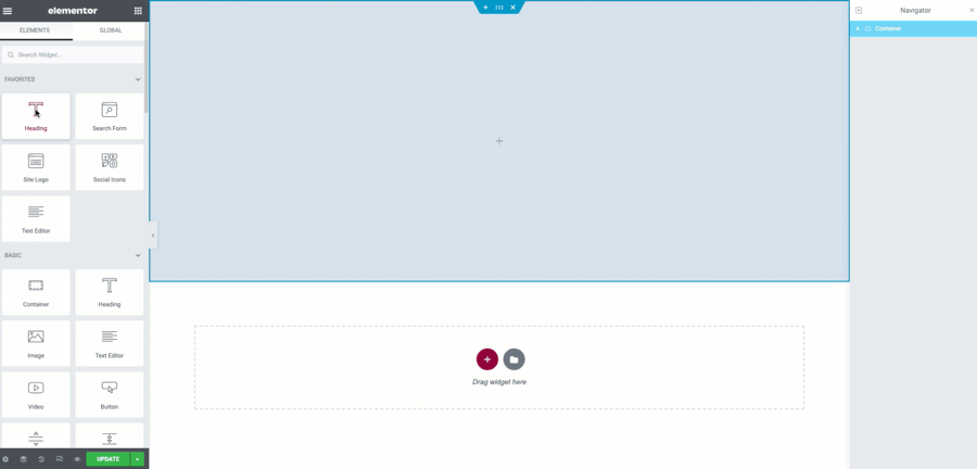
Add a Container
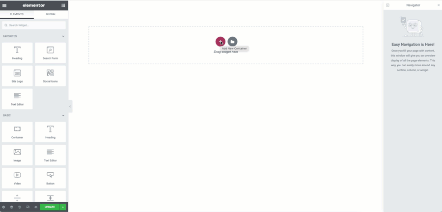
- Add a container to the page by clicking the + icon
- Select the single container layout
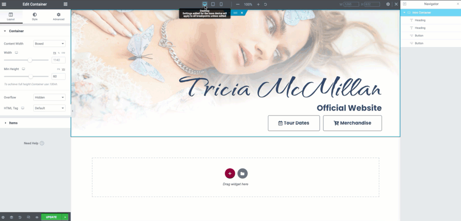
- From the Container Width dropdown, select Full Width
- Set the Minimum Height of the container to a desired value (example 60VH)
- From the Style Tab, give your container a color or background image. You may save time by selecting a global color as we demonstrate in the example
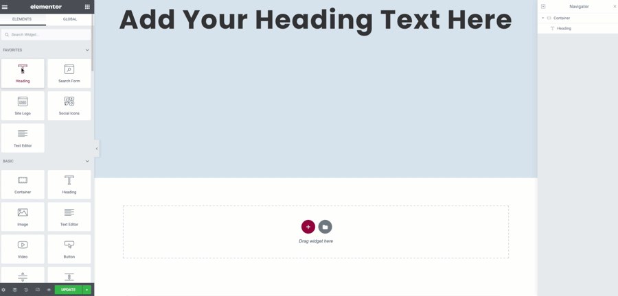
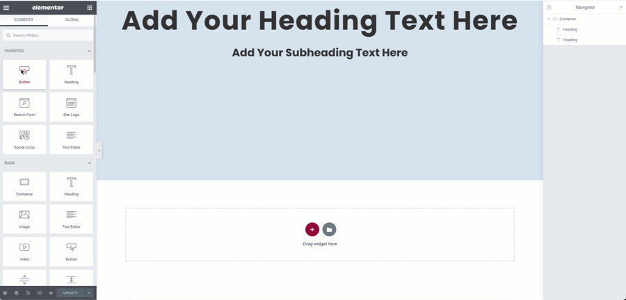
Add a welcome heading
- From the Panel, drag and drop a Heading widget into your container.
- In the HTML tag you may leave set at the default H2
- In the alignment, select the Center option by clicking the icon
- From the Style Tab, you may style the heading manually, or chose a global as shown
- In the Advanced Tab, give the Heading a value of 100% to allow it to be able to use up to the full width of the container. You will use this in the later steps*
Add a tagline message
You will now add a subheading to your welcome message. This could be a mission statement or branding tagline.
- From the Panel, drag another Heading widget to the container
- In the HTML tag, select the H3 option
- Choose Center alignment by clicking the icon
- You may style the heading from the Style Tab or use your preset Global Styles as show here
- From the Advanced Tab, once again set the Width value to 100%
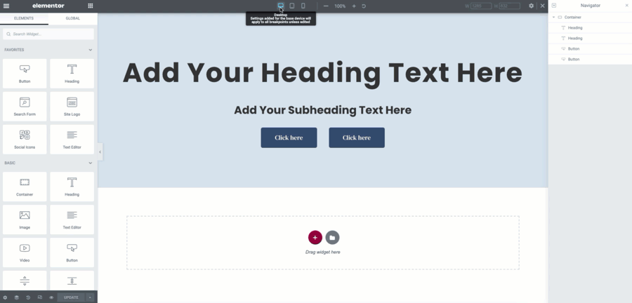
Add the Button(s)
You will now add the button(s) to the container. You may add additional ones if needed or none at all. For this tutorial you will be using two.
- From the Panel, drag and drop a Button widget to the container
- Set the Size option to Large in the dropdown selector
- You may link your button(s) at this time but for the example it will be left blank
- Duplicate the button by right clicking and selecting the option.
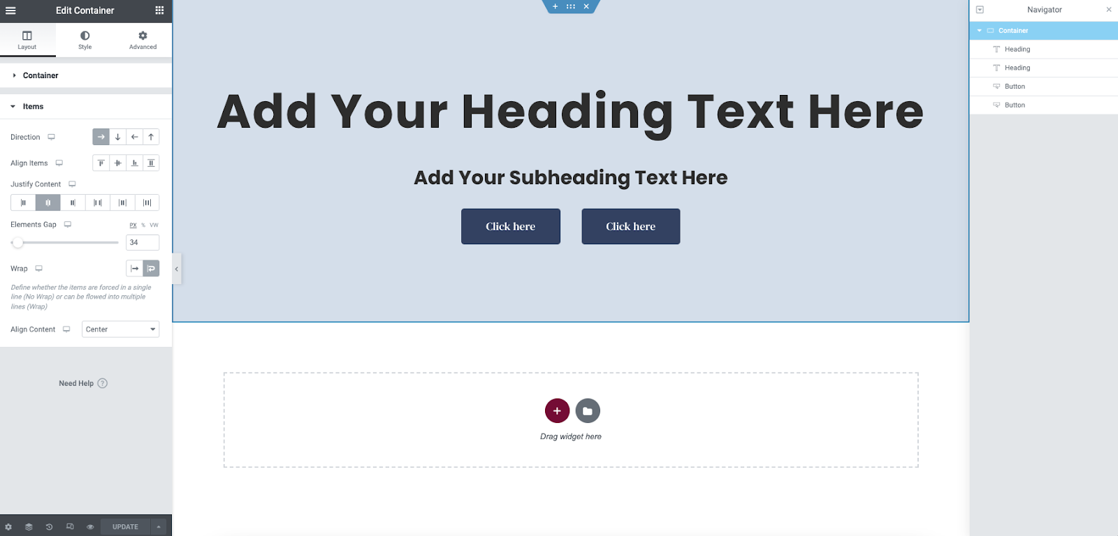
Setting the container flex properties
In this step you will finally use the power of the flex properties in the container. The widgets are all in place but now need to be positioned within the container properly. Begin by editing your container. Then navigate to the Items accordion of the Layout Tab.
- Change the Direction of the container to row. This will force the items to all be bunched together horizontally. Do not worry as we will correct this next.
- Set the Wrap property to Wrap. This will now allow the larger Heading widgets to use their 100% full width (*This is why the heading Widths were set previously)
- Set the Justify Content property to Center. This will align the items equally in the container horizontally. The buttons will align correctly under the headings
- From the Justify Items dropdown located below the Wrap select the Center option (Wrap must be enabled for this property to show)
- You may now increase the gap of the items to a desired value (example: 34PX)
Check the responsive modes
You may now check the responsive views and make the minor adjustments needed. If you have used Global Settings for your fonts and buttons, you may only need to adjust the Height of the container and the Gaps.

Get Creative
Now that you have learned the basic structure, let your imagination run wild. By changing the flex properties in various combinations, you can create endless possibilities. By simply adding a background image and positioning the content to the lower right, this simple layout takes on a much more polished look.
Next steps
Check out some other layouts you can create with containers:
Creating a Hero Section using Flexbox Containers
Creating a Call to Action Section using Flexbox Containers