
- Add the Toggle widget to the canvas. For details, see Add elements to a page.
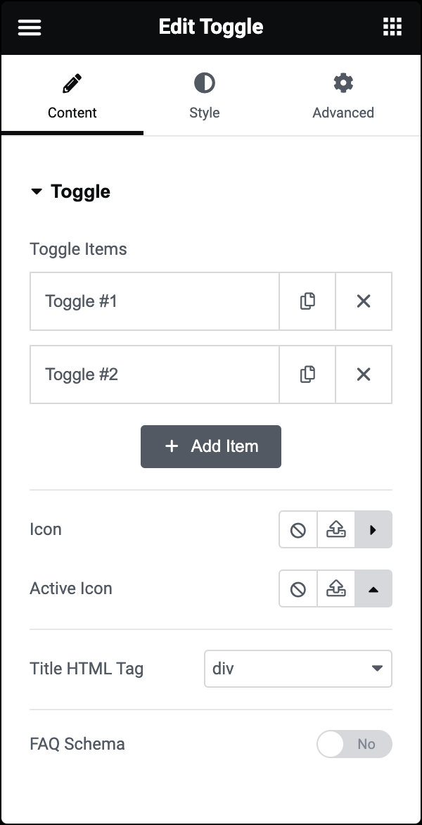
- In the Content tab, under Toggle, use the Toggle Items to add content to your toggle.
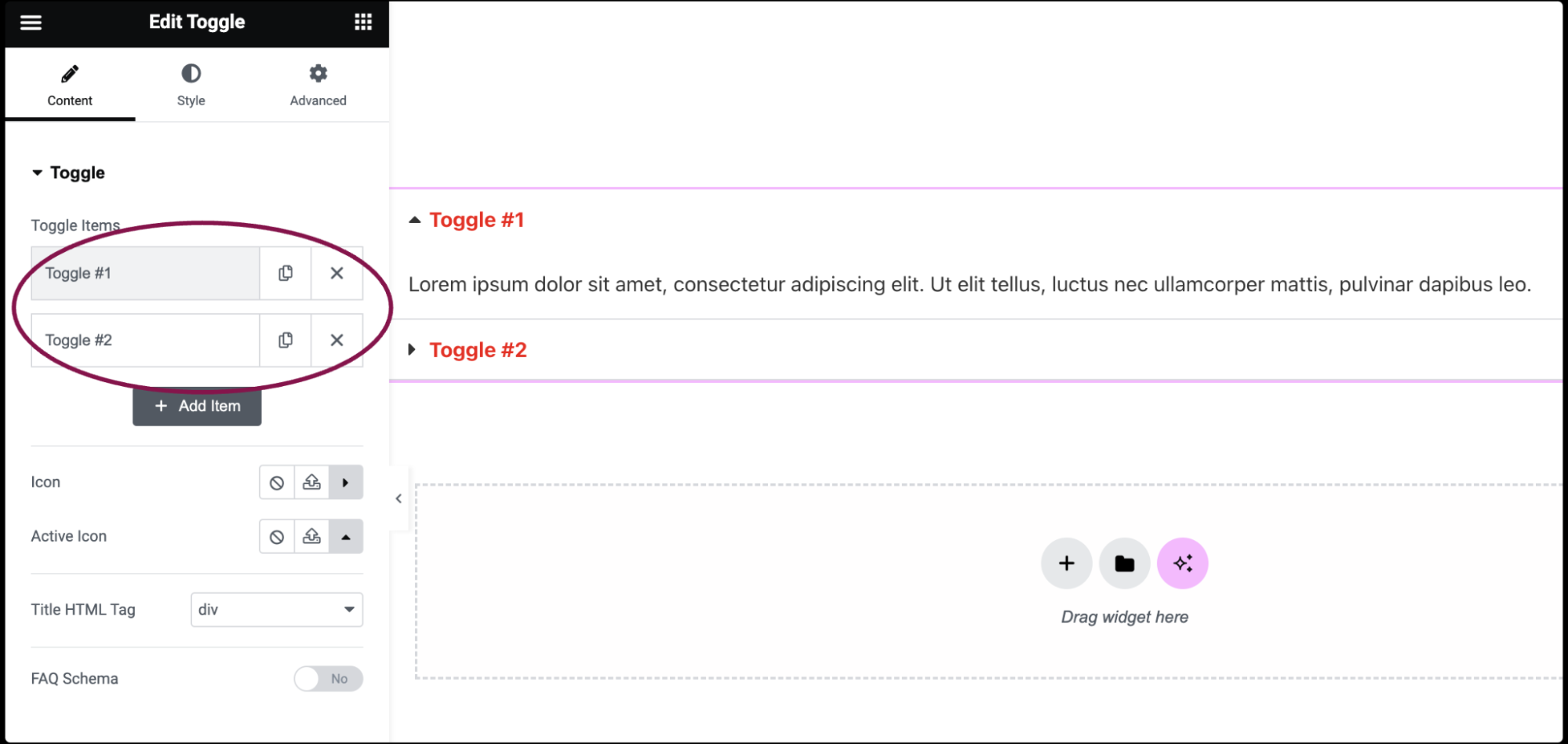
- By default, the toggle widget comes with two default accordions: Toggle #1, and Toggle #2. You can add content, delete the accordion, and add a new one.
- To add content, click on the toggle item.
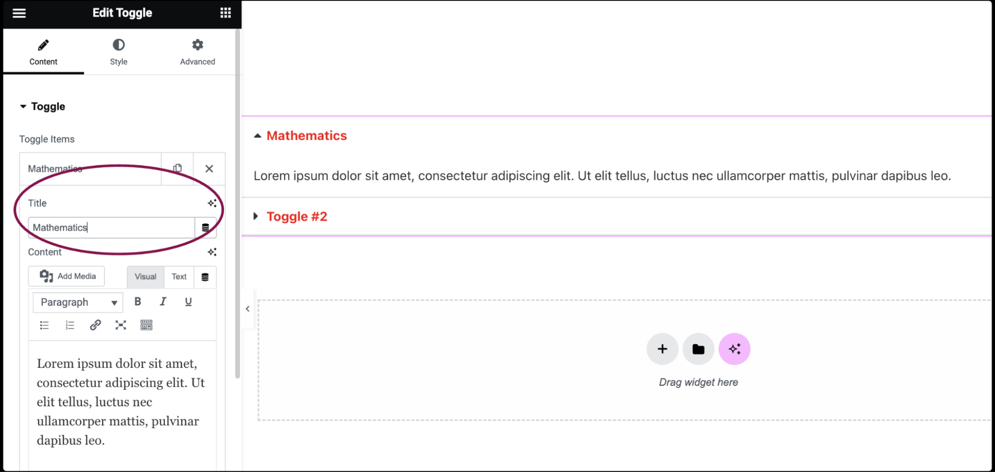
- In the Title field, add title of the toggle item.
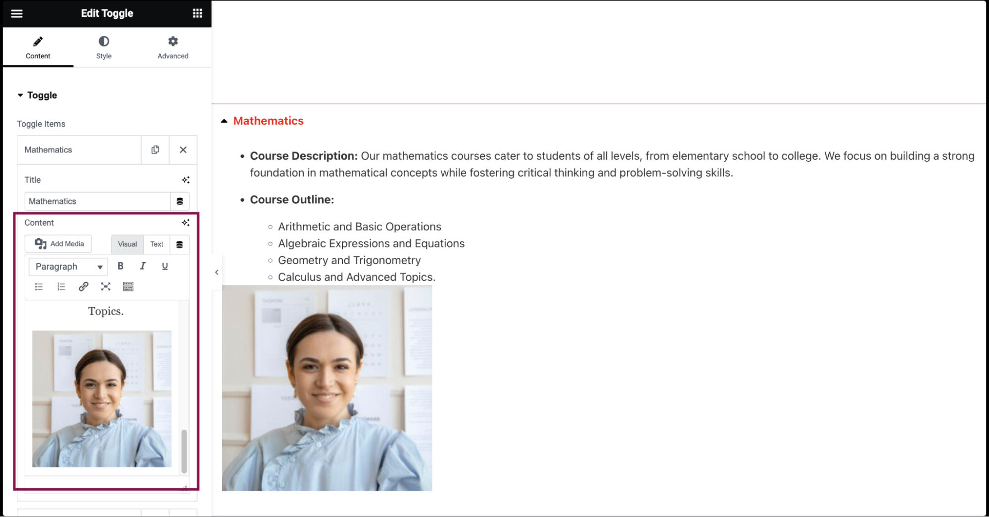
- In the Content field, add a description of the toggle item. You can also include images and make text clickable by adding links.
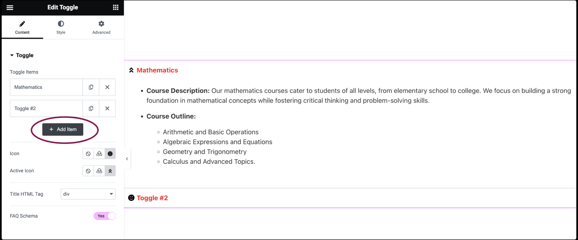
- Use the Add Item button to add more toggle items to the list.
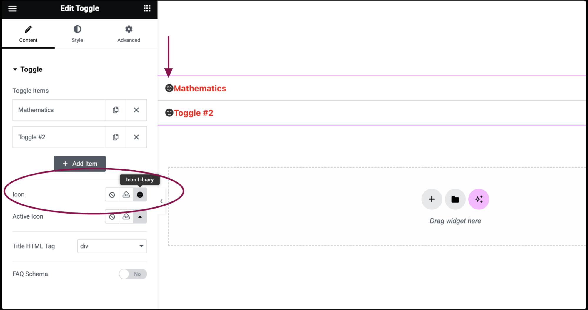
- In the Icon field, select the icon to represent the action of expanding an item. Choose either None, Upload SVG, or select an icon from the Icon Library. If Icon Library is chosen, a Recommended tab is shown in the Library which shows recommended icons to represent the expanding concept.
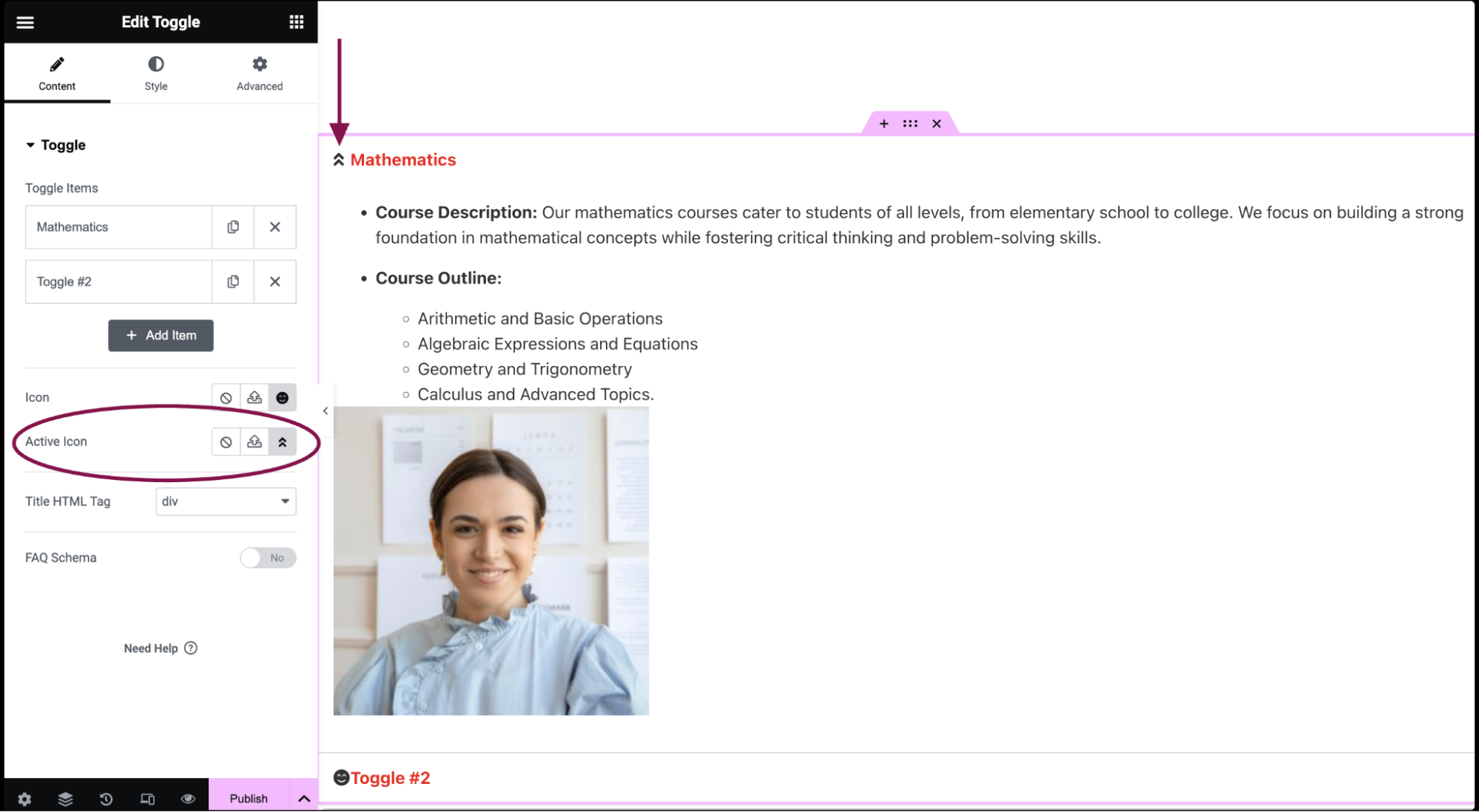
- In the Active Icon field, select the icon to represent the action of collapsing the active item. Choose either None, Upload SVG, or select an icon from the Icon Library. If Icon Library is chosen, a Recommended tab will be shown in the Library, showing recommended icons to represent the expanding concept.
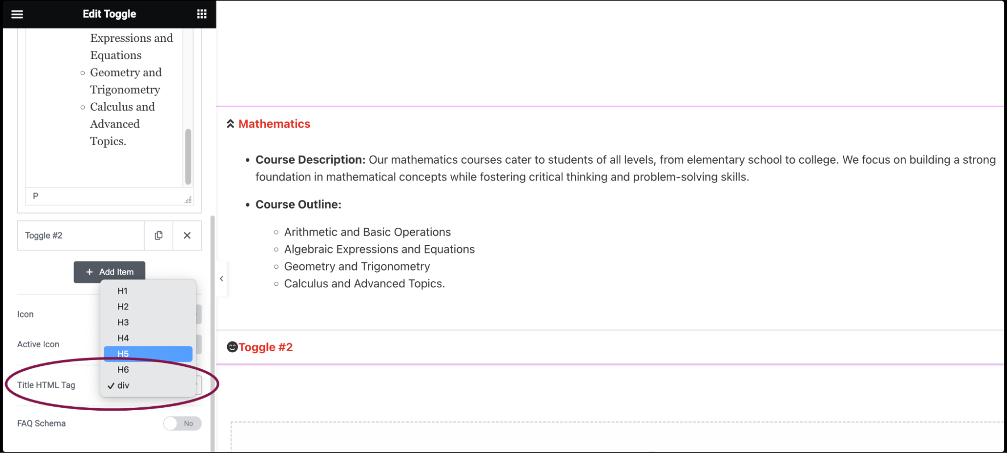
- In the Title HTML Tag field, set the HTML tag used for the title to H1- H6 or DIV.
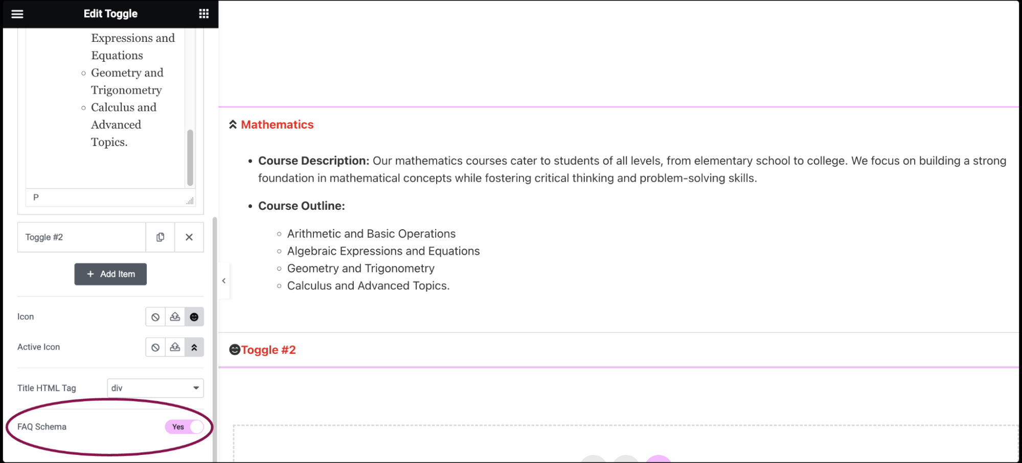
- Toggle the FAQ Schema option to enable or disable schema usage.
Note
Only one widget per page can have this option enabled.