help center

On this page

Image Box widget

Last Update: March 10, 2024

Add the widget

image box icon Image Box widget 1

To access and use a widget:

  1. In Elementor Editor, click +.
    All available widgets are displayed.

  2. Click or drag the widget to the canvas. For more information, see Add elements to a page.

What is the Image Box widget?

The Image Box widget is a design element used to combine images with text creatively. The widget allows you to display an image alongside text. This combination effectively showcases features, services, or any other content where you need visual and text content.

You can customize the size, alignment, and spacing of the image and the text. Additionally, there are options to add overlays, hover effects, and animations for enhanced interactivity.

Common use case

Harry is creating a website and looking for a design feature to highlight their online services.

They then used image boxes on the homepage to showcase different features with accompanying titles & descriptions.

common use case image Image Box widget 3

Additional use cases

  • Use image boxes for a company’s About page to introduce team members. Each box shows a person’s photo, job title, and a quick bio.
  • Event companies can show upcoming or past events with image boxes. Each box has an event picture, date, and short info.
  • Display customer testimonials or reviews with photos, names, and feedback to build trust and credibility.

Add an Image Box widget: Step-by-step

To add an Image Box widget:

  1. Add the Image Box widget to the canvas. For details, see Add elements to a page.
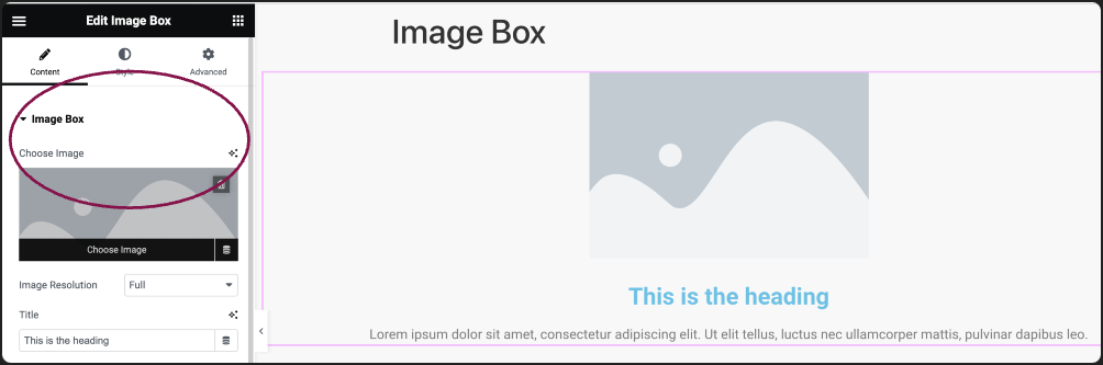
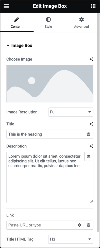
  2. In the Content tab, under the Image Box field, use the Choose Image option to add an image from the media library or upload a new image.
    choose image Image Box widget 5
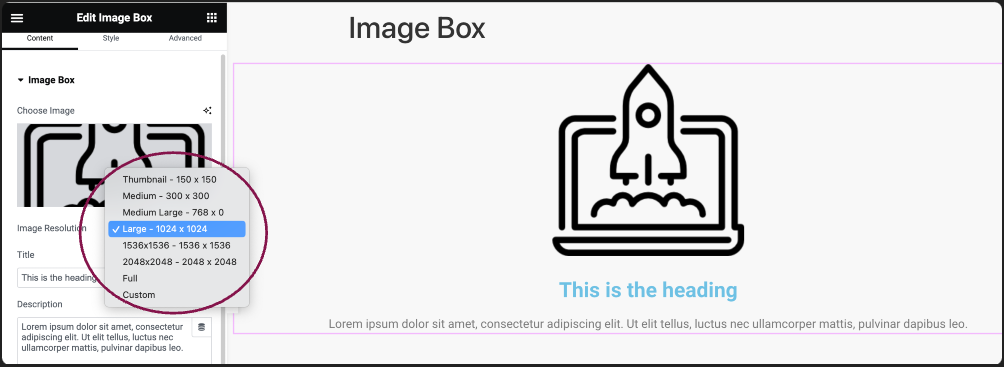
  3. Use the Image Resolution field to adjust the image size, from thumbnail to full, or set a custom size.
    image size Image Box widget 7
  4. In the Title field, add the name that will appear in the image box.
    image title Image Box widget 9
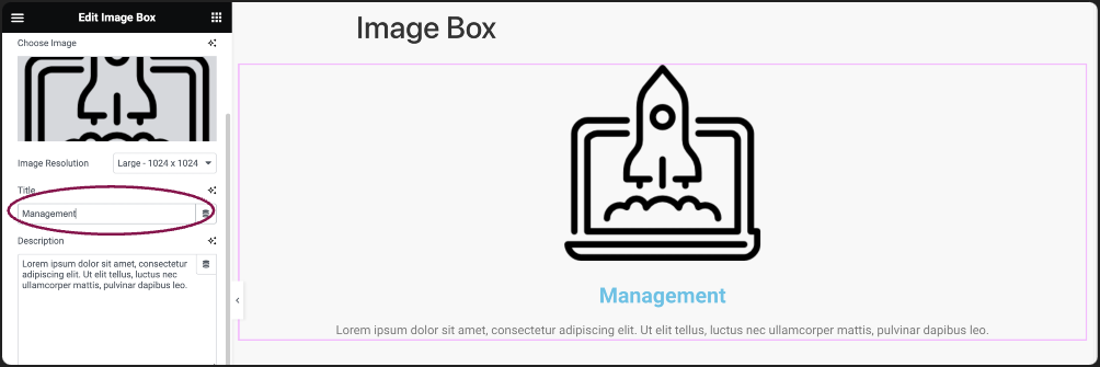
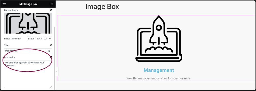
  5. In the Description field, add the text content that will appear in the image box.
    image description Image Box widget 11
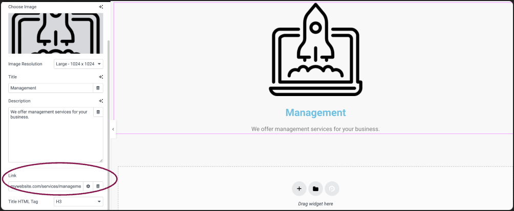
  6. (Optional) In the Link field, add URL for the image box content.
    image link 1 Image Box widget 13
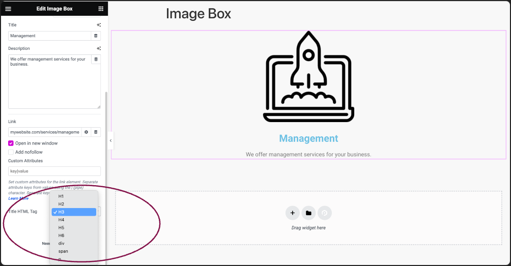
    1. Click the ⚙️ to set the link to either open in a new window or to add rel=nofollow to the link.
    2. Use the Custom Attributes option to assign custom attributes to the link element. Use the | (pipe) for key-value separation and commas to separate pairs.
  7. Use the Title HTML Tag field to choose the title’s HTML tag, such as H1 to H6, div, span, or paragraph.
    html title tag Image Box widget 15

Settings for the Image Box Widget

You can customize your widgets using content, style, and other advanced parameters, offering you great flexibility in tailoring them to your needs. Click the tabs below to see all the settings available for this widget.

Content tab

Add, delete, and edit image box content and other controls.

content tab of image box widget Image Box widget 17

Click the default image to select an image from the media library or upload a new one. 

Adjust image size: thumbnail, full, or your custom size.

Does not appear if no image is chosen.

Enter a title for the image box.

Does not appear if no image is chosen.

Add a description for the image box.

Does not appear if no image is chosen.

Set the URL for the image box’s content link. Click the Settings icon ⚙️ to select:

  • Open in new window to open the link in a separate window. This keeps the user on your site even after they click the button.
  • Add nofollow prevents search engines from associating your site with the linked site. This can help prevent your site from being associated with bad actors, lowering your SEO score.

Does not appear if no image is chosen.

Choose the format for the title, like H1, H2, etc., or other HTML tags.

Does not appear if no image is chosen.

Style tab

Style color, change the font style, and enhance the appearance of the image box.

Style Image Box widget 19

Adjust the image’s alignment to the left, top, or right in relation to the title and description. On mobile devices, the image will remain centered.

Position the image box to the left, right, center, or justified.

Use the slider to determine the distance between the image and the title.

Use the slider to determine the distance between the title and the description.

Style Image Image Box widget 21

Use the slider to adjust the image width from 0% to 100%.

Choose the border type to use around the image. For more details, see Border type.

To create rounded corners, increase the border radius. For more details, see Border radius tools.

Determine how the image appears by default.

Determine how the image appears when moused over.

Modify the image appearance using filters like Blur, Brightness, Contrast, Saturation, and Hue for both normal and hover modes.

Manage the transparency of the image for normal and hover states.

Define the time for each image transition, measured in milliseconds (e.g., 1000 ms = 1 second).

style tab image box content Image Box widget 23
  • Spacing: Use the slider to adjust the gap between the title and the description.
  • Color: Define the color of the title.
  • Typography: Choose the font and adjust the size of the title. For more details, see Typography.
  • Text Stroke: Click the 🖋️ icon icon to apply a stroke effect to the title. Learn more about Text Stroke.
  • Text Shadow: Click the 🖋️ icon to add a shadow to the title. Learn more about Shadows.
  • Color: Change the color of the description text.
  • Typography: Customize the font and adjust the size for the description.
  • Text Shadow: Click on the 🖋️icon to apply a shadow effect to the description. For more details see, Shadows.

Advanced tab

The Advanced tab provides options to control image box position, adjust spacing, add custom code, and
more.

advanced tab of image box Image Box widget 25

Learn more about the Advanced tab settings.

Have more questions? We’re more than happy to assist.

Link is copied to clipboard!
On this page

Is this article helpful?

Share this article