- Add the Icon List widget to the canvas. For details, see Add elements to a page.
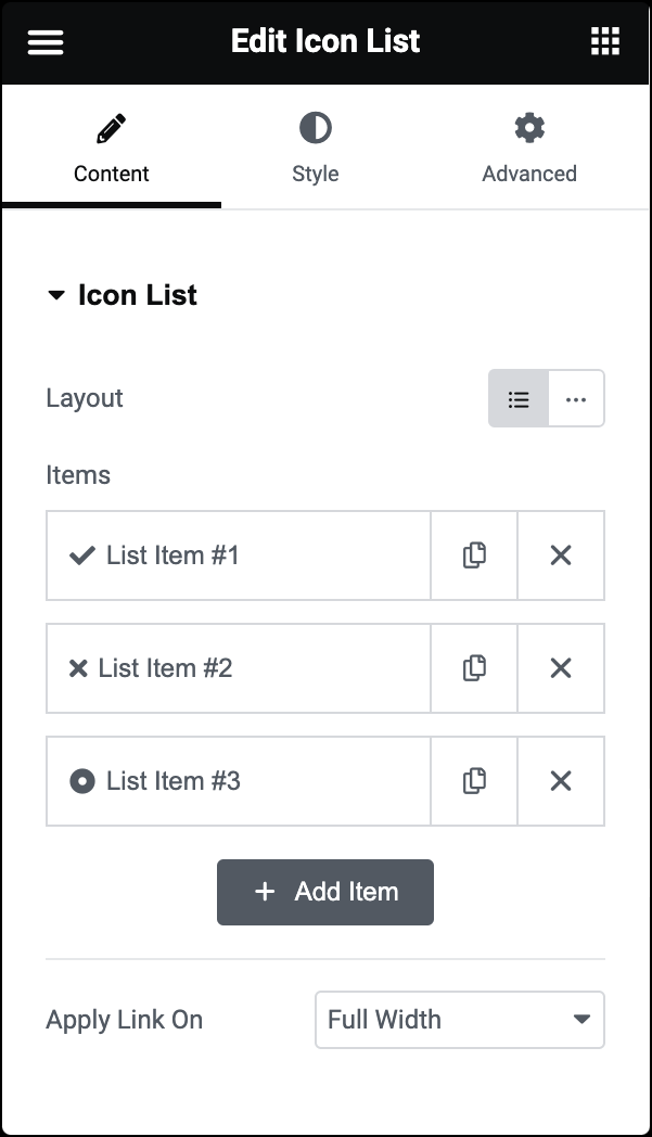
- In the Content tab, under Icon List, from the Layout option, choose Default or Inline layout. Default displays items in a vertical list, while Inline displays items horizontally.
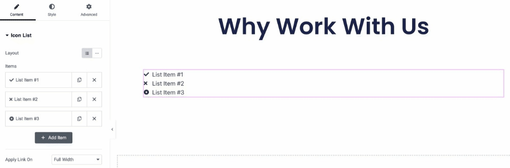
- The Icon List widget comes with three default list items. You can delete default items and add additional items to the list.
- Click on the Add Item button to add an item to the list.
- To duplicate or delete items, click on the item’s Duplicate or Delete
 icon.
icon.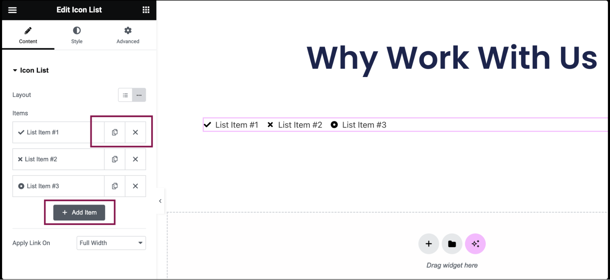
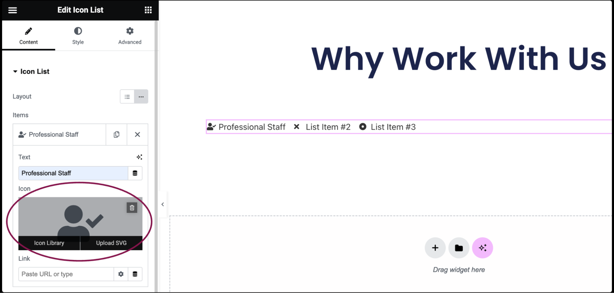
- Click on the individual item to open its customization settings.
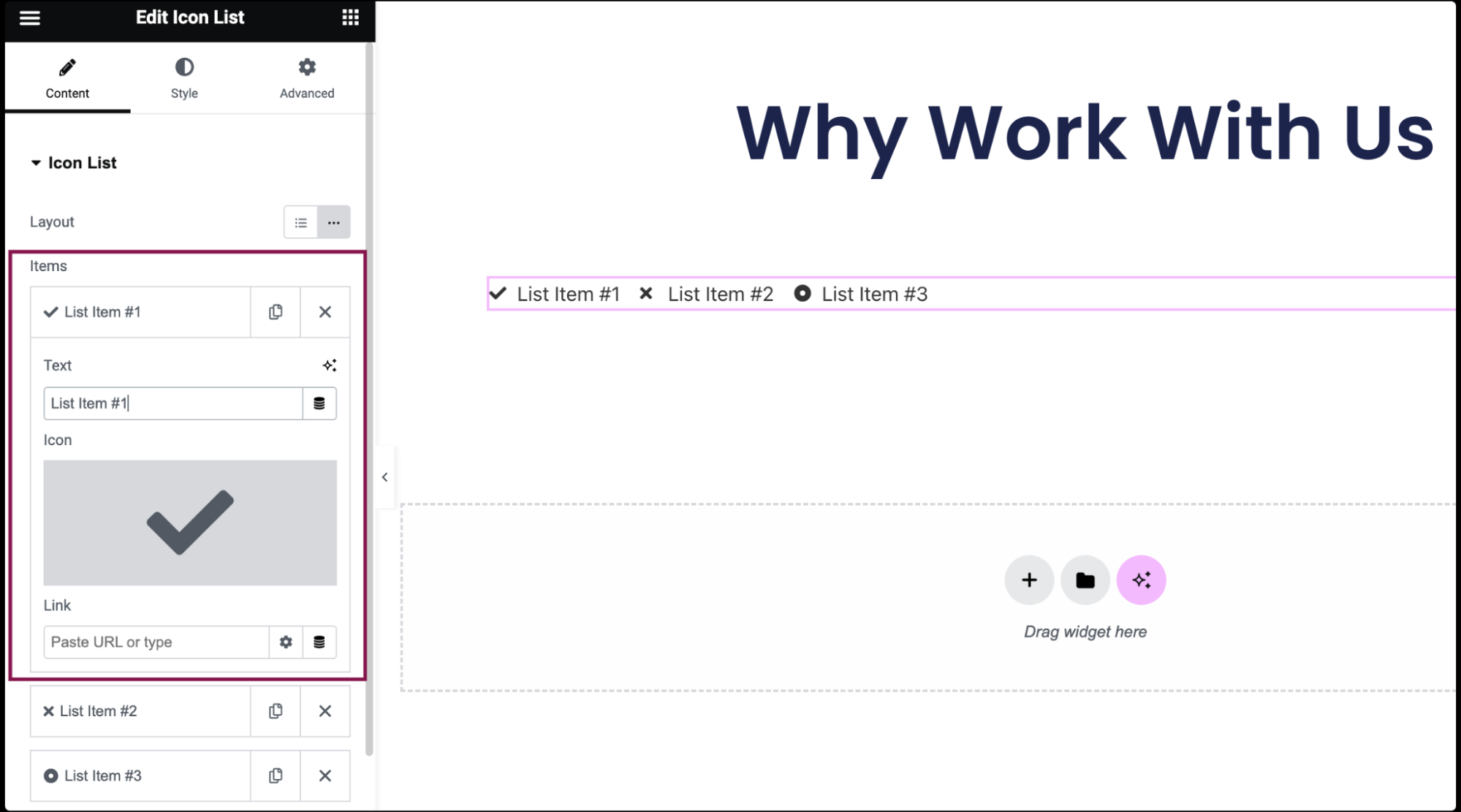
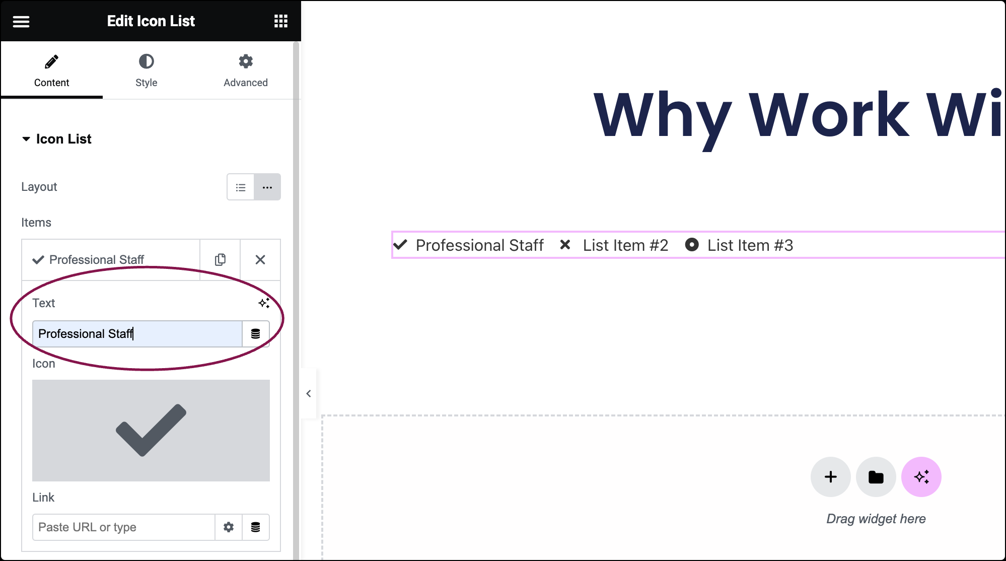
- In the Text field, enter the list item’s text.
- In the Icon field, select the icon for the item. You can choose an icon from the Icon Library or upload an SVG. For more details, see Enable SVG Support in Elementor.
- (Optional) In the Link field, add the URL for the icon list.
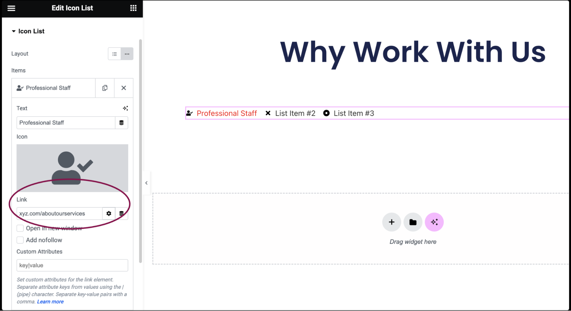
- Click the ⚙️ to set the link to either open in a new window or to add rel=nofollow to the link.
- Use the Custom Attributes option to assign custom attributes to the link element. Use the | (pipe) for key-value separation and commas to separate pairs.NoteBoth the text and the link of the Icon List items can be generated dynamically by clicking the Dynamic icon next to each and choosing the source of the data.
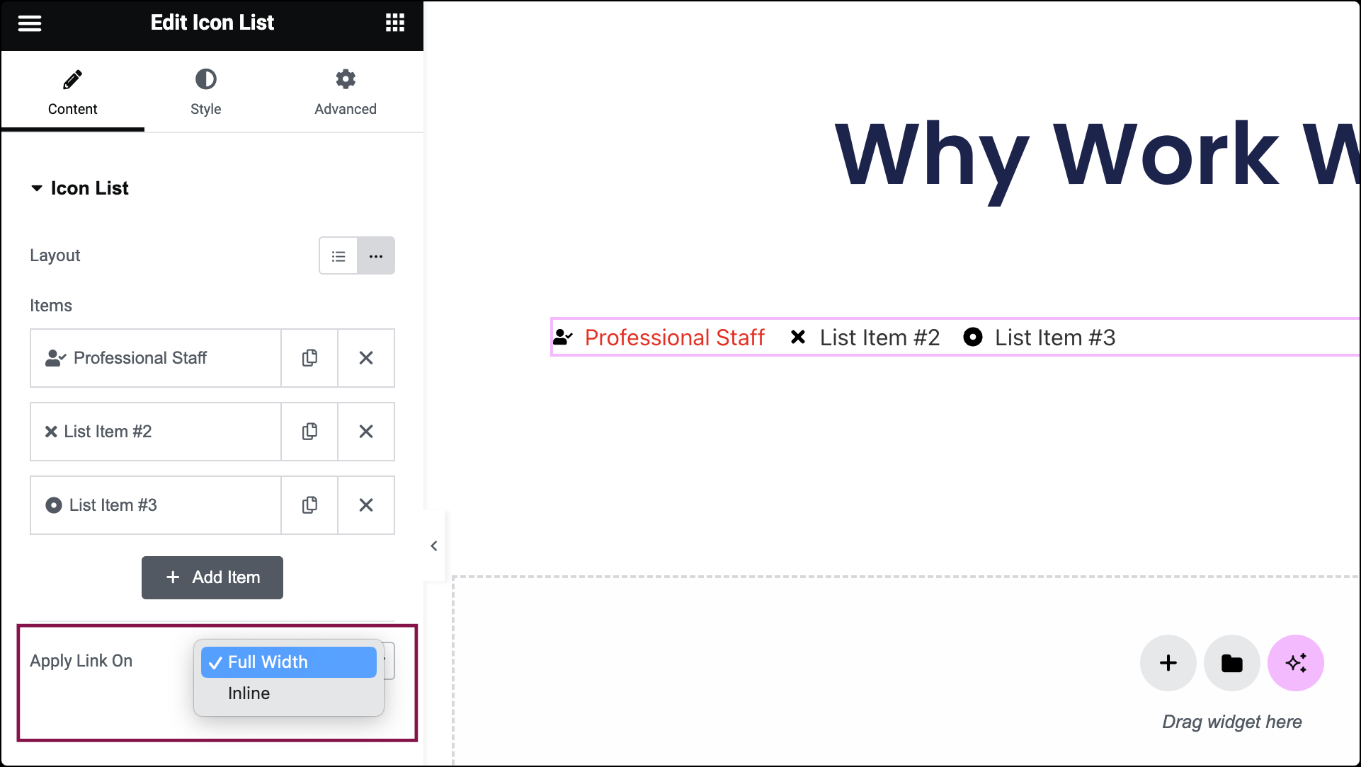
- In the Apply Link On field, specify whether you want the link to be applied as Full Width or Inline.