help center

On this page

Tabs widget

Last Update: March 12, 2024

Add the widget

Tabs widget
  1. In Elementor Editor, click +.
    All available widgets are displayed.
  2. Click or drag the widget to the canvas. For more information, see Add elements to a page.

What is the Tabs widget?

The Tabs widget allows you to organize and divide content into tabs horizontally or vertically. This feature makes it easier for users to navigate through different sections of your webpage. You can customize the tabs’ appearance, add text, and even images.

Note
If you activate the nested elements experimental feature, the default Tabs widget is replaced with the new Tabs widget, which can include nested elements. For more details, see Tabs widget with nested containers.

Common use case

Tom is designing a product page for an online store and is looking for a creative and unique way to showcase product details. 

They then use tabs to organize information about the product into different sections such as “Product Description,” “Features,” “Specifications,” and “Reviews”. Each tab contains relevant details about the product, including its description, key features, technical specifications, and customer reviews. 

This approach allows users to easily navigate between different aspects of the product without feeling overwhelmed by too much information all at once. It provides a clean and organized layout, enhancing the user experience and increasing the likelihood of converting visitors into customers.

Tabs widget 8 Tabs widget 2

Additional use cases

  • Provide step-by-step guides or tutorials with each step contained within a separate tab for clarity and organization.
  • Present different services offered by a company in a clean and accessible format on their website.
  • Display various categories of blog posts or articles for easy navigation on a content-heavy website.

Add a Tabs widget: Step-by-step

  1. Add the Tabs widget to the canvas. For details, see Add elements to a page.
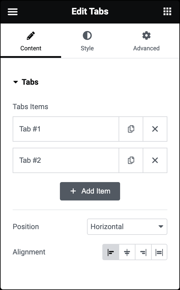
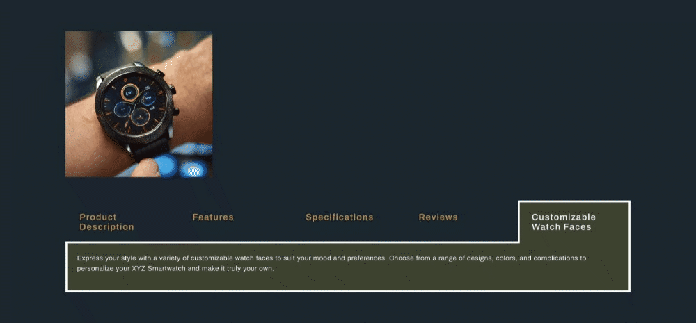
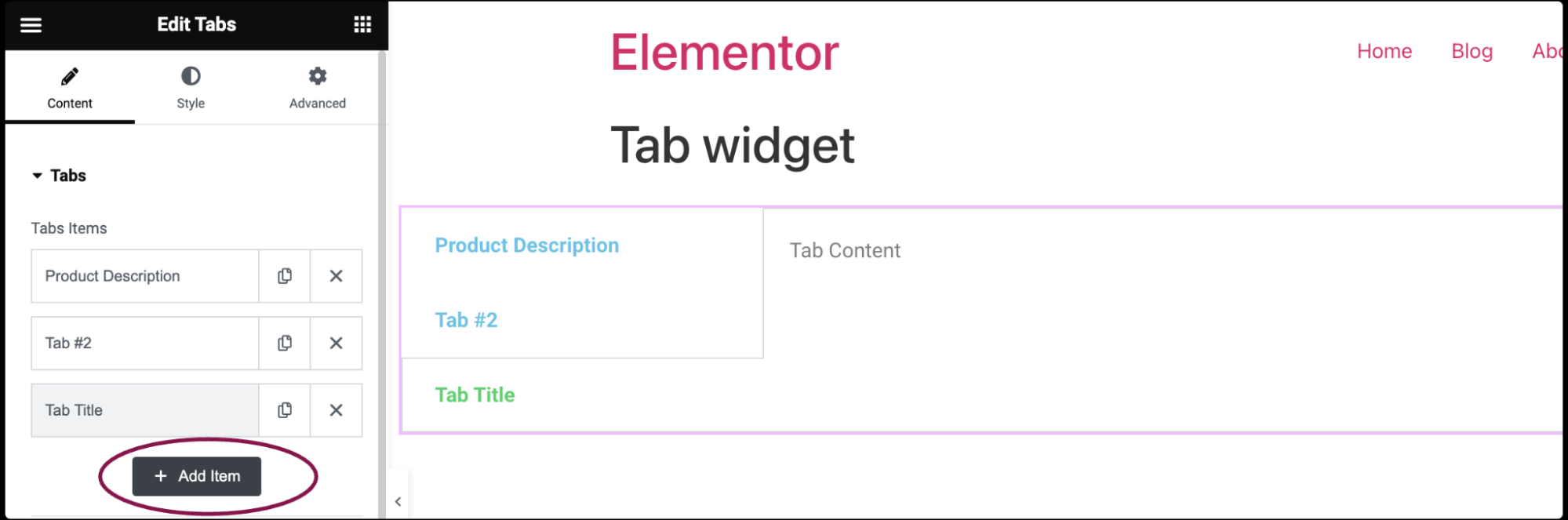
  2. In the Content tab, under the Tabs section, you’ll see Tabs Items. This is where you can add titles and content for each tab. Each tab represents a section of content that users can switch between.
    Tabs widget 1
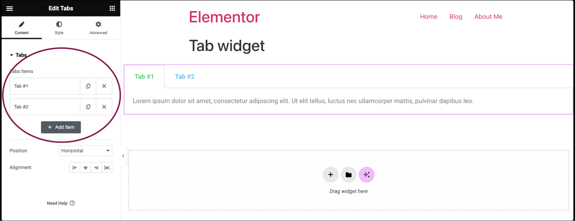
    1. By default, the tabs widget comes with two default items: Tab #1, and Tab #2. You can add content, delete the tab, and add a new one. 
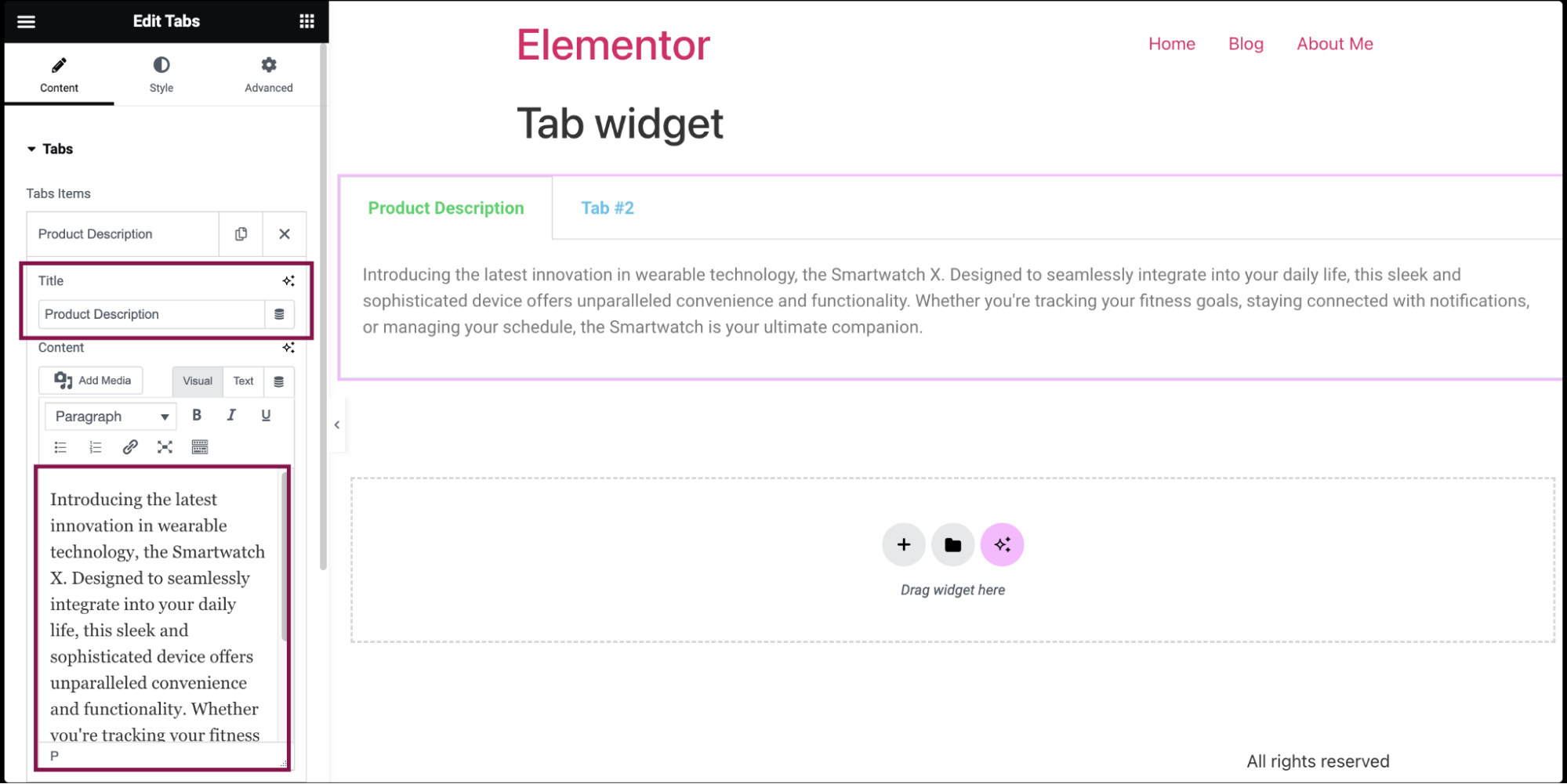
    2. To add content, click on the tab item.
    3. In the Title and Content field, add the title and description for each tab item.
      Tabs widget 6
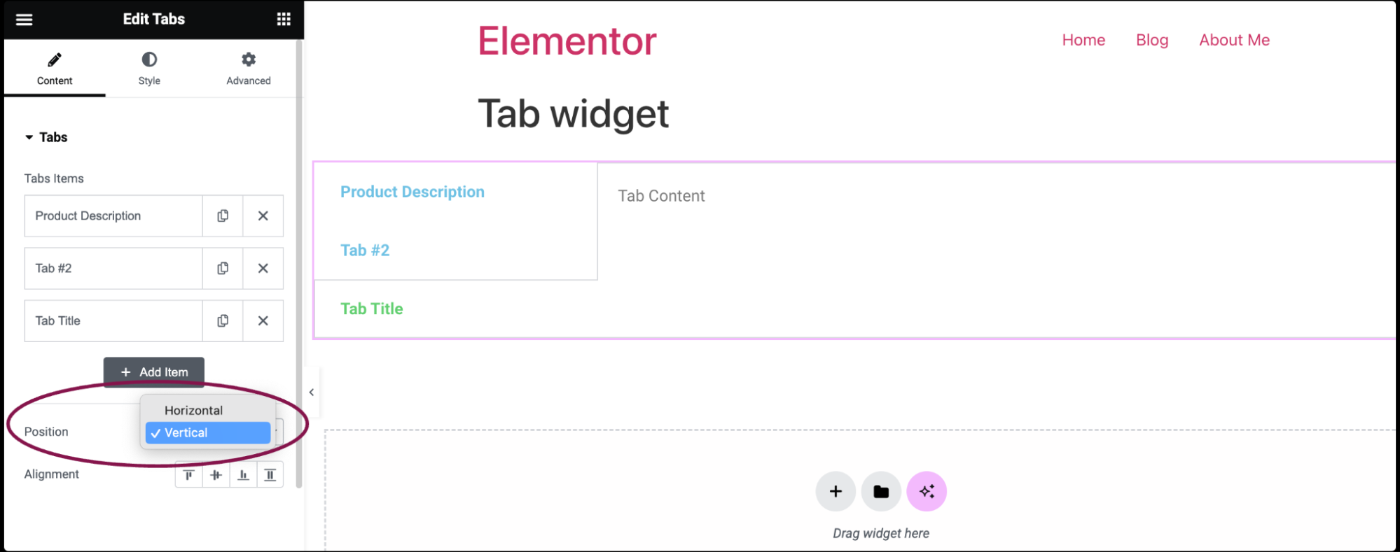
  3. Use the Add Item button to add additional or new tabs.
    Tabs widget 3
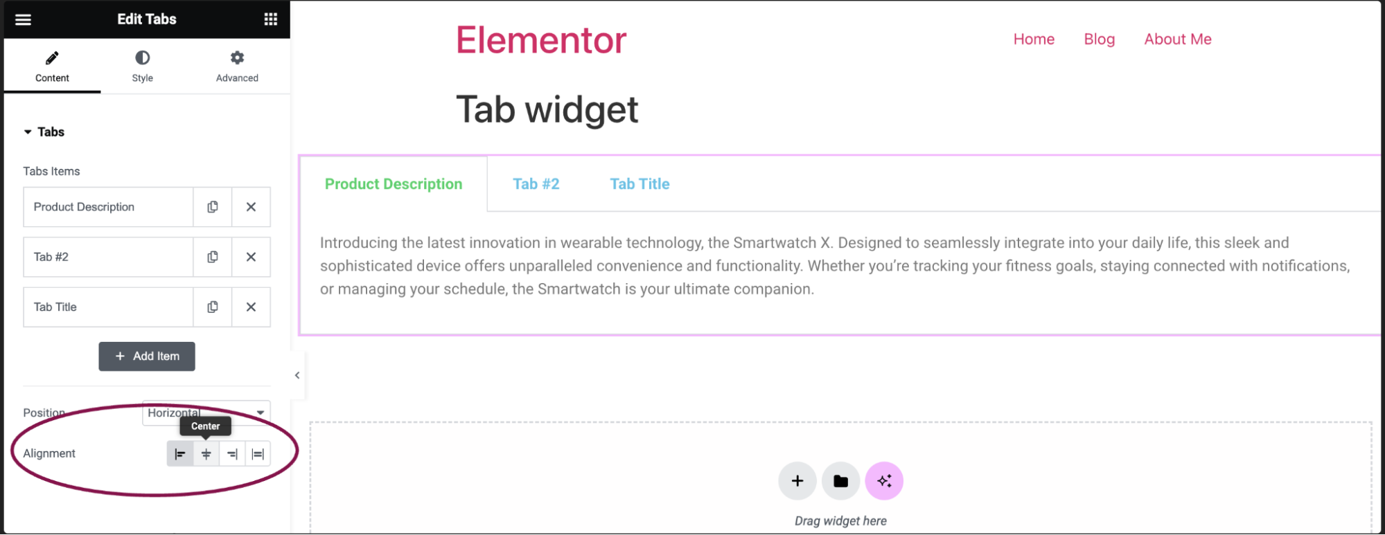
  4. In the Position field, choose the display of the tabs: horizontal or vertical.
    Tabs widget 4
  5. In the Alignment field, choose the tabs’ alignment- whether aligned to the Start, Center, End, or Stretch. 
    Tabs widget 9

Settings for the Tabs Widget

You can customize your widgets using content, style, and other advanced parameters, offering you great flexibility in tailoring them to your needs. Click the tabs below to see all the settings available for this widget.

Content tab

Tabs widget 7 Tabs widget 9

Add content such as titles and content for each tab.

Choose between displaying the tabs horizontally or vertically.

Determines the alignment of the tabs – Start, Center, End, or Stretch.

Style tab

Tabs widget 5
  • Border Width: Set the thickness of the border around the tabs
  • Bodre Color: Choose a color for the border
  • Background Color: Choose a background color for the tabs
  • Color: Choose the color for the title of the tabs
  • Active Color: Choose the color for the title of the tab that is currently selected
  • Typography:  Set the typography options for the titles. For more details, see Typography
  • Text Stroke: Click the 🖋️ icon icon to apply a stroke effect to the title. Learn more about Text Stroke
  • Text Shadow: Click the 🖋️ icon to add a shadow to the title. Learn more about shadows
  • Color: Choose the text color of the content
  • Typography: Set the typography options for the content
  • Text Shadow: Click the 🖋️ icon to add a shadow to the description. Learn more about shadows.

Advanced tab

The Advanced tab provides options to control widget position, adjust spacing, add custom code, and more.

Tabs widget 2

Learn more about the Advanced tab settings.

Have more questions? We’re more than happy to assist.

Link is copied to clipboard!
On this page

Is this article helpful?

Share this article