help center

On this page

Basic Gallery widget

Last Update: January 28, 2024

Add the widget

basic gallery widget icon Basic Gallery widget 145

To access and use a widget:

  1. In Elementor Editor, click +.
    All available widgets are displayed.

  2. Click or drag the widget to the canvas. For more information, see Add elements to a page.

The Basic Gallery widget lets you showcase your pictures beautifully on your website. With this tool, you can easily create, adjust, and style photo galleries, even if you’re not skilled in coding or design.

Common use case

Sarah is making a website for a famous photographer. On the website’s homepage, they use the basic gallery widget to showcase photos neatly. This way, people visiting the site can easily see the best pictures and enjoy them more.

basic widget gallery common use case Basic Gallery widget 147

Additional use cases

  • Display event highlights, speakers, sessions, or moments captured during the event.
  • Share personal experiences, events, or hobbies through photo diaries or visual stories.
  • Display a collection of your work, or projects, in an organized and visually appealing manner.
  • Create galleries for course modules, student projects, or campus events and activities.
  1. Add the Basic Gallery widget to the canvas. For details, see Add elements to a page.
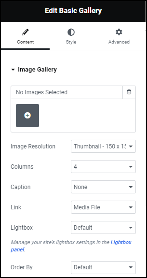
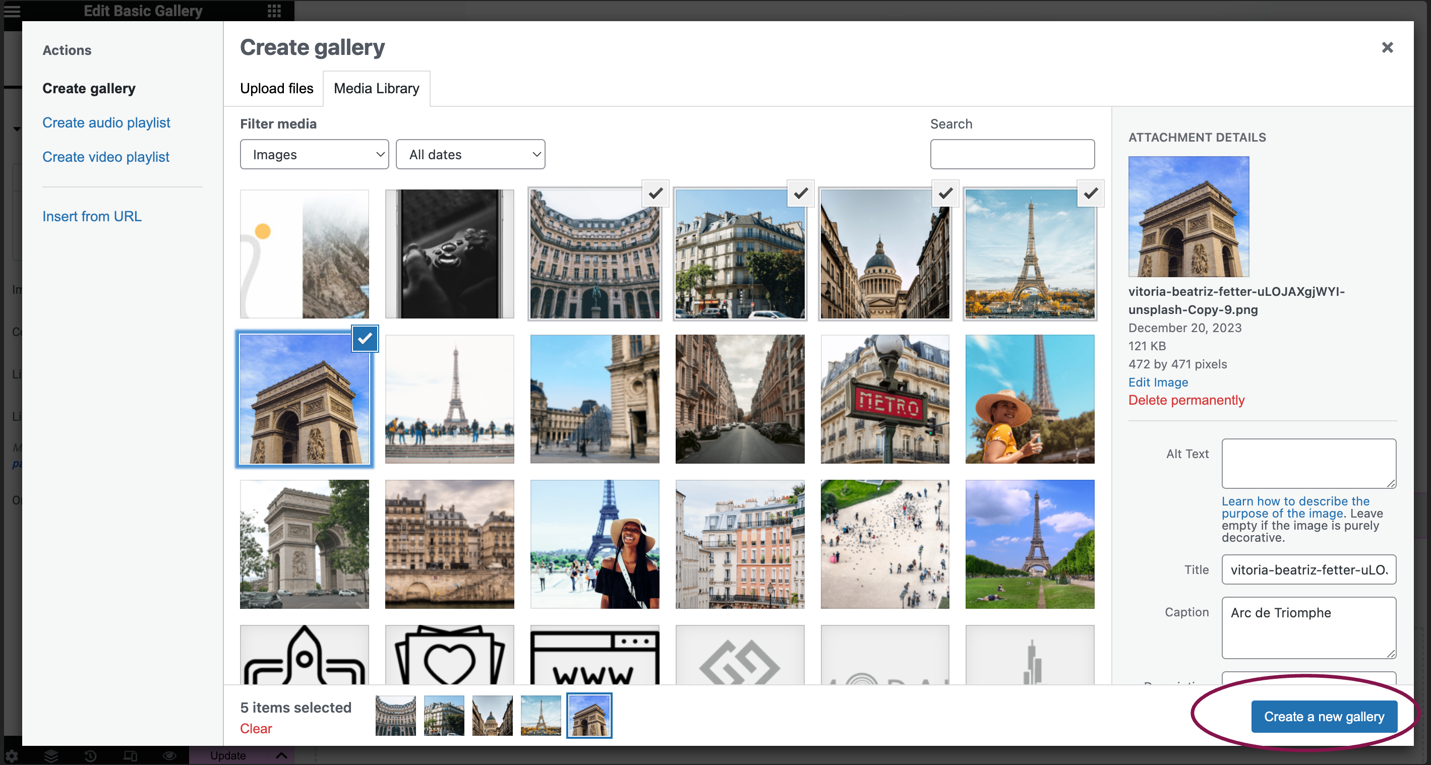
  2. In the Content tab, under the Image Gallery section, click the icon to choose and add your images to the gallery.
    add images to basic gallery Basic Gallery widget 149
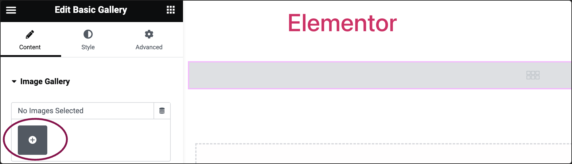
    1. After choosing your images, click on the Create a new gallery button.
      create a new gallery 1 Basic Gallery widget 151
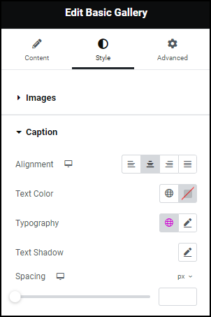
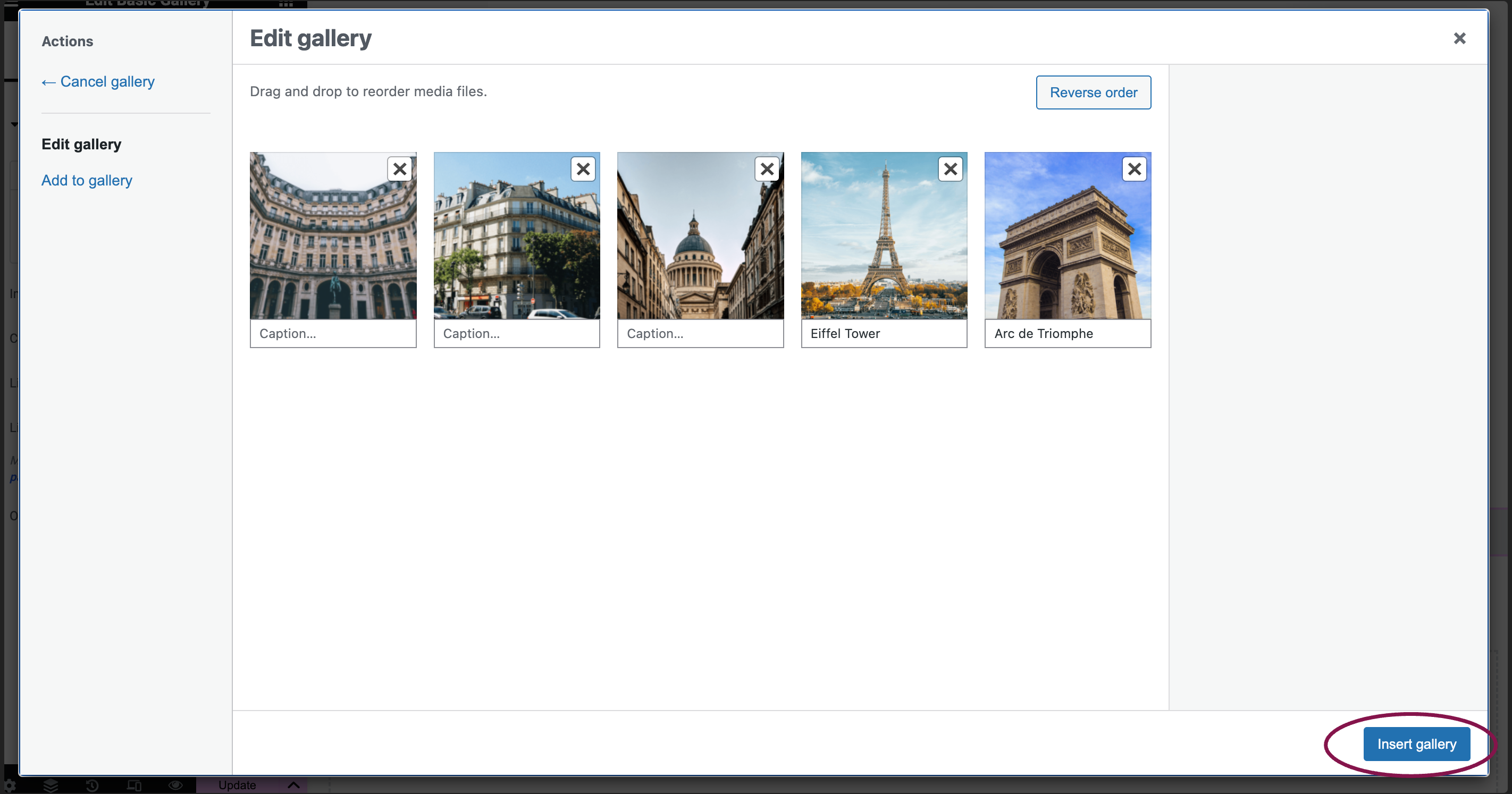
    2. On the next screen, if you want, add captions to your images, and then click Insert gallery.
      insert gallery Basic Gallery widget 153
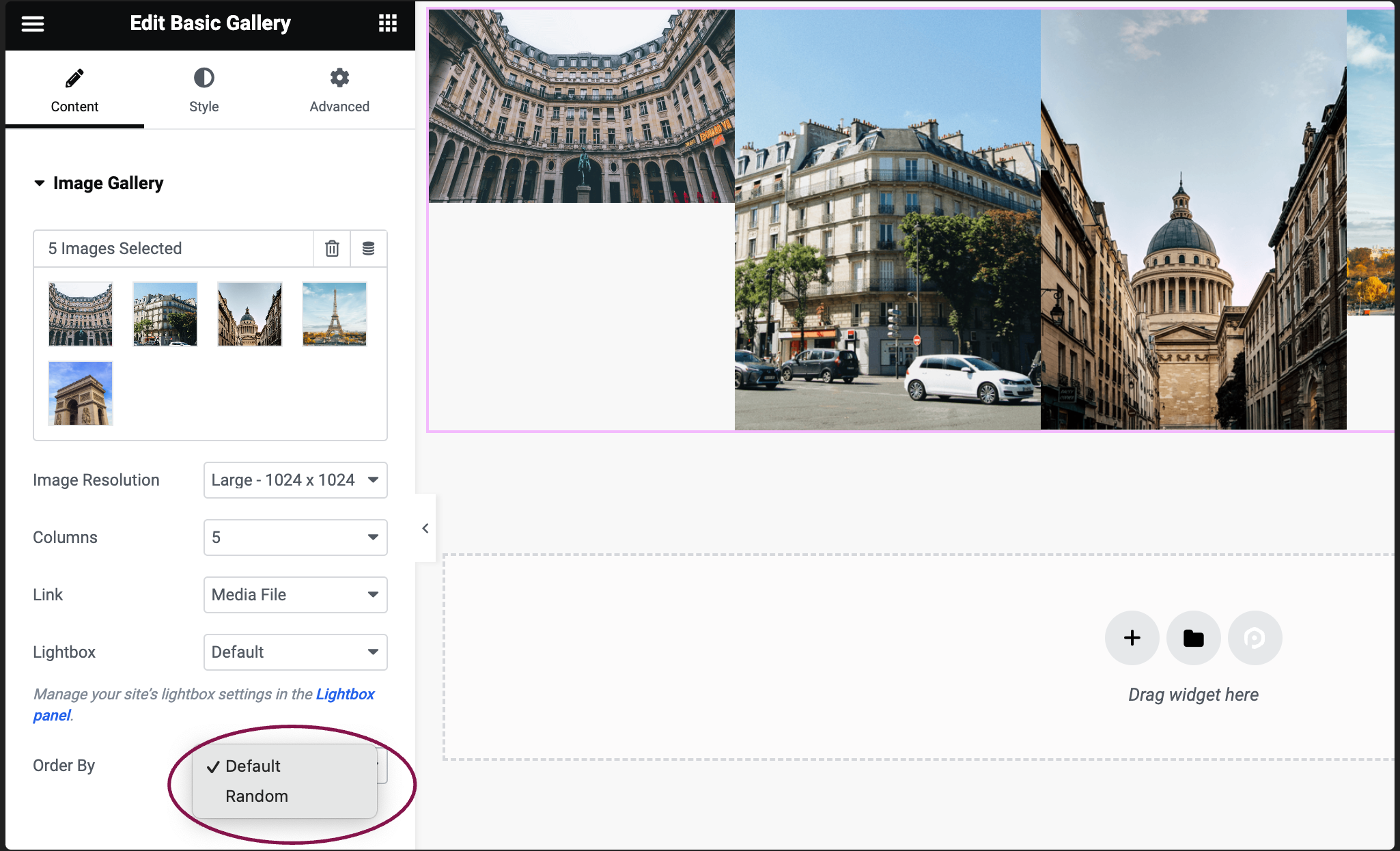
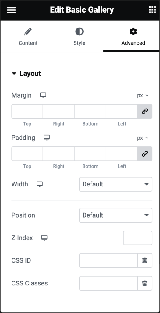
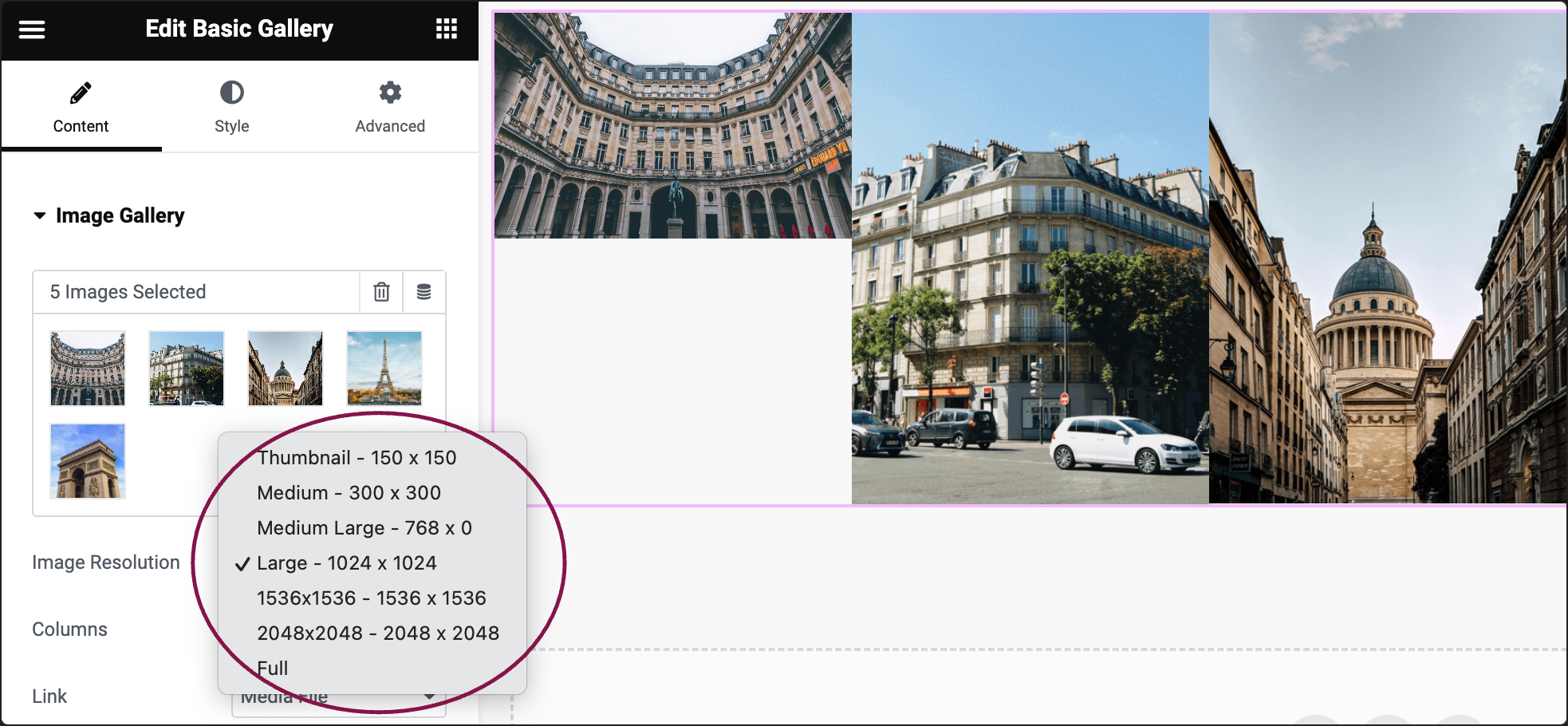
  3. Use the Image Resolution field to set your images’ size: choose from thumbnail, full size, or specify a custom size.
    image resolution 1 Basic Gallery widget 155
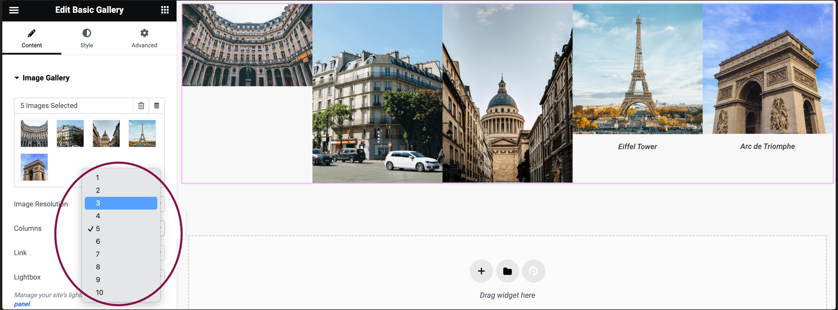
  4. Use the Column field to determine the number of columns for displaying images, ranging from 1 to 10.
    columns Basic Gallery widget 157
  5. Select a link option from the Link field: link images to their Media Files, Attachment Pages, or choose None.
    link options 1 Basic Gallery widget 159
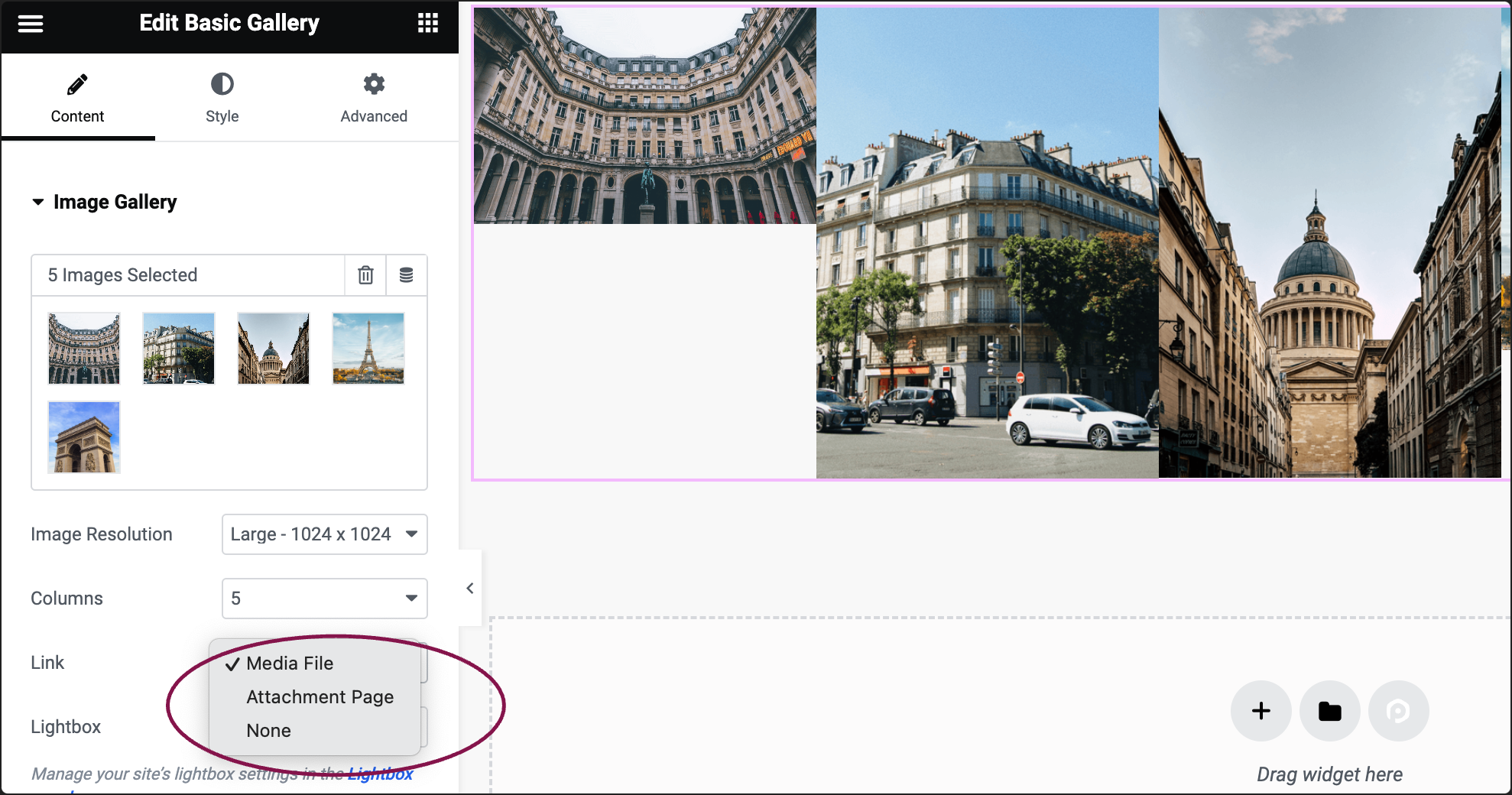
    Note: If you’re using the Lightbox feature, ensure the option Media Files is selected.
  6. Use the Lightbox option to decide whether to show images in a lightbox. Selecting Yes or No will override the default lightbox setting.
    lightbox 1 Basic Gallery widget 161
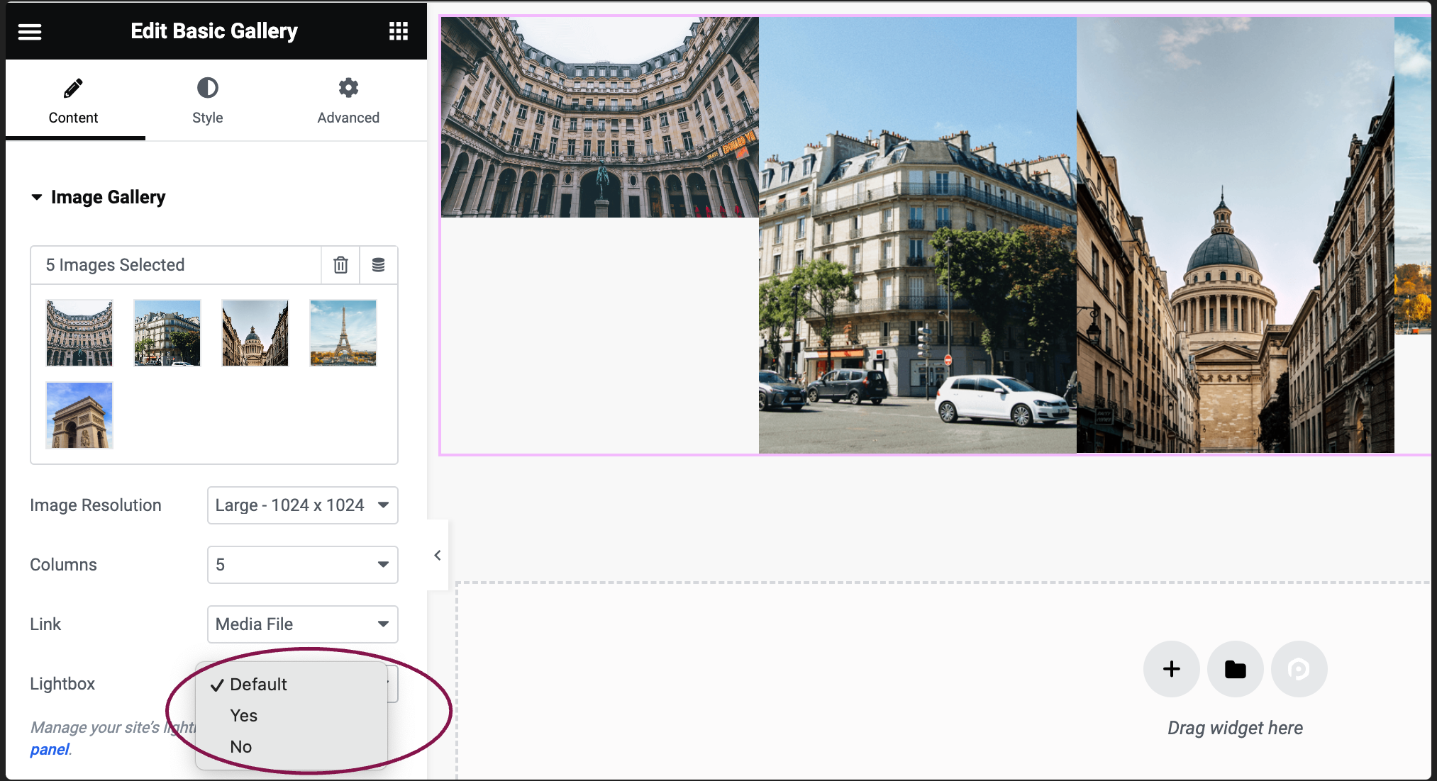
    Note: For images to display in the lightbox, you must link them to Media Files.
  7. In the Order By section, pick either Default or Random to choose how pictures are shown in the gallery.
    order by Basic Gallery widget 163

You can customize your widgets using content, style, and other advanced parameters, offering you great flexibility in tailoring them to your needs. Click the tabs below to see all the settings available for this widget.

Content tab

In the Content tab, you can add, delete, set lightbox preferences, and manage other controls for the images.

Content tab Basic Gallery widget 165

Click the ➕button to add your images.

Choose how big or small the images to be, from thumbnail to full, or define custom size.

Select the number of columns for the images – from 1 to 10.

Use the dropdown to choose:

  • None: No caption is displayed.
  • Attachment Caption: The image will be captioned as it is in the Media Library.


Link the image gallery to their respective Media Files, Attachment Pages, or None. If you’re using Lightbox, choose Media Files.

Allow images to appear in a lightbox. Selecting Yes or No modifies the default lightbox settings.

Note: The lightbox will only work if you link the images to Media Files.


Set if the images should appear in their original order or be shuffled randomly.

Style tab

In the Style tab, you can customize the appearance of your images and captions. You’ll find settings for spacing, color, typography, and other design choices.

stye tab images Basic Gallery widget 167

Adjust the gap between image slides. Choose the default option or set a custom value using the slider.

Choose the border style to use around the images: None, Solid, Double, Dotted, Dashed, or Groove. For more details, see Border type.

To create rounded corners, increase the border radius. For more details, see Border radius tools.

Style tab Caption Basic Gallery widget 169

Choose whether to display or hide captions. If you opt to show them, more customization options will appear.

Set the caption’s position: left, right, center, or justified.

Choose a color for the caption text.

Modify the font, size, and other text attributes for the caption.

Click the 🖋️ icon to add a shadow to the caption. Learn more about shadows.

Use the slider to increase or decrease the distance between the gallery images and captions.

Advanced tab

Control the placement of your widget, insert links, add custom code and more.

advanced tab basic gallery Basic Gallery widget 171

Learn more about the Advanced tab settings.

Have more questions? We’re more than happy to assist.

Link is copied to clipboard!
On this page

Is this article helpful?

Share this article