There are four Default Colors: Primary, Secondary, Text, and Accent. The following examples show where they are typically used.
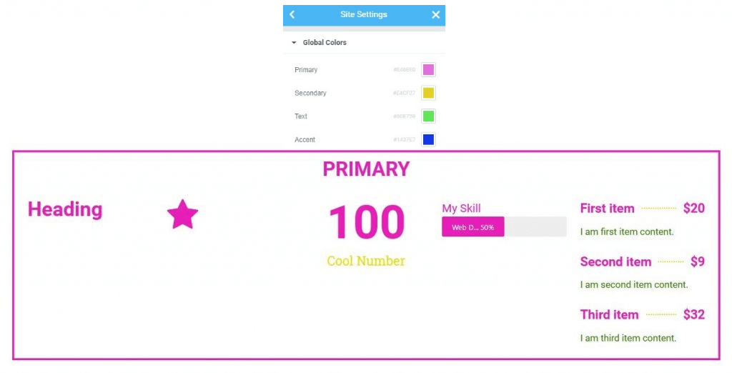
- Primary Colors are used for Headings and Icons.
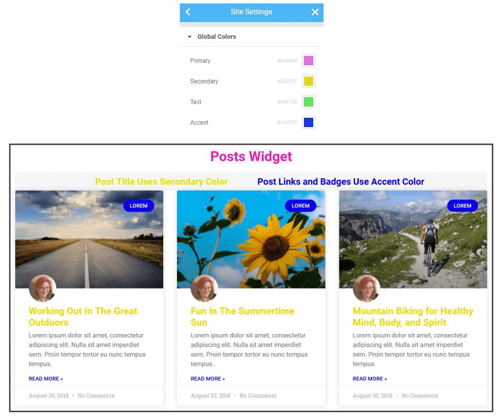
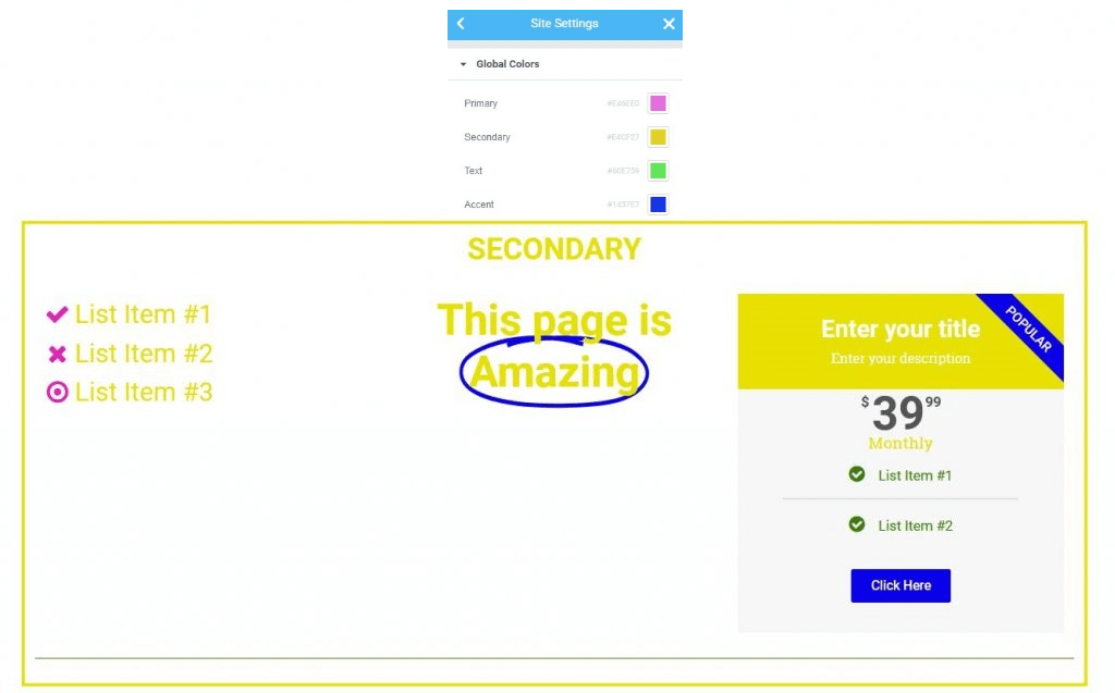
- Secondary Colors are used for List Items, Subheadings, Animated Headings, and Price Table backgrounds.
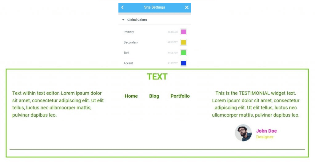
- Text Colors are used for Paragraphs and Menu items
- Accent Colors are used for Links, Button backgrounds, Tab and Accordion headings, and Badges
Each of the colors will be used in various widgets in ways similar to the examples above. Below are some color examples to help visualize the areas in which each color is used.
Primary Color Examples
Secondary Color Examples
Text Color Examples
How Default Colors Are Used In Posts Widget