Create an Accordion with nested elements
- Add the Accordion widget to the canvas. For details, see Add elements to a page.
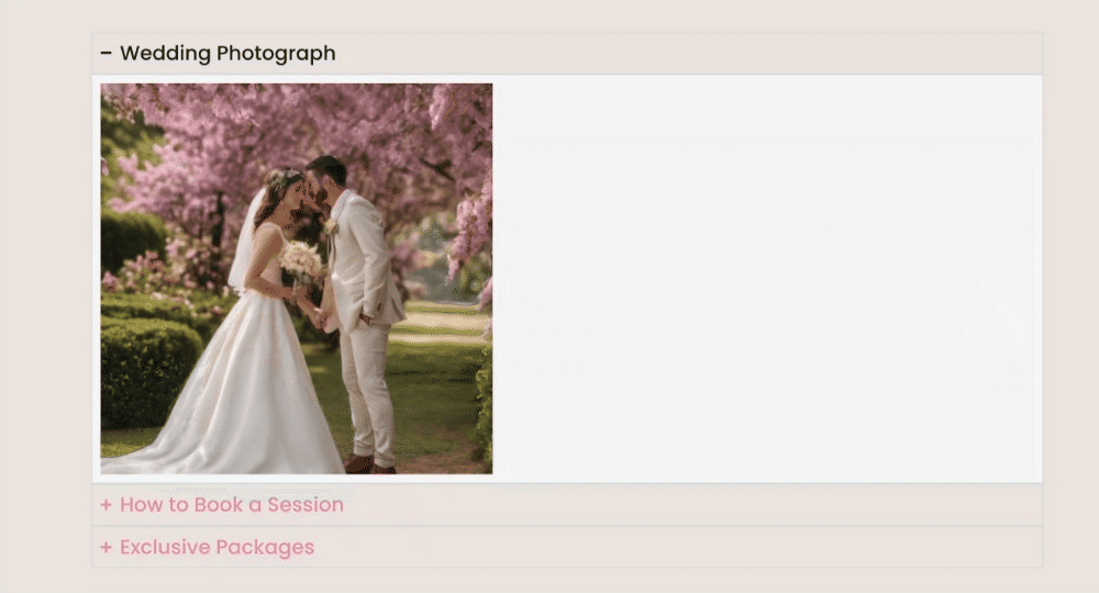
- By default, the Accordion widget appears with Item #1 expanded on the canvas. Every item has a container already built in. You can add and customize elements to the empty container.
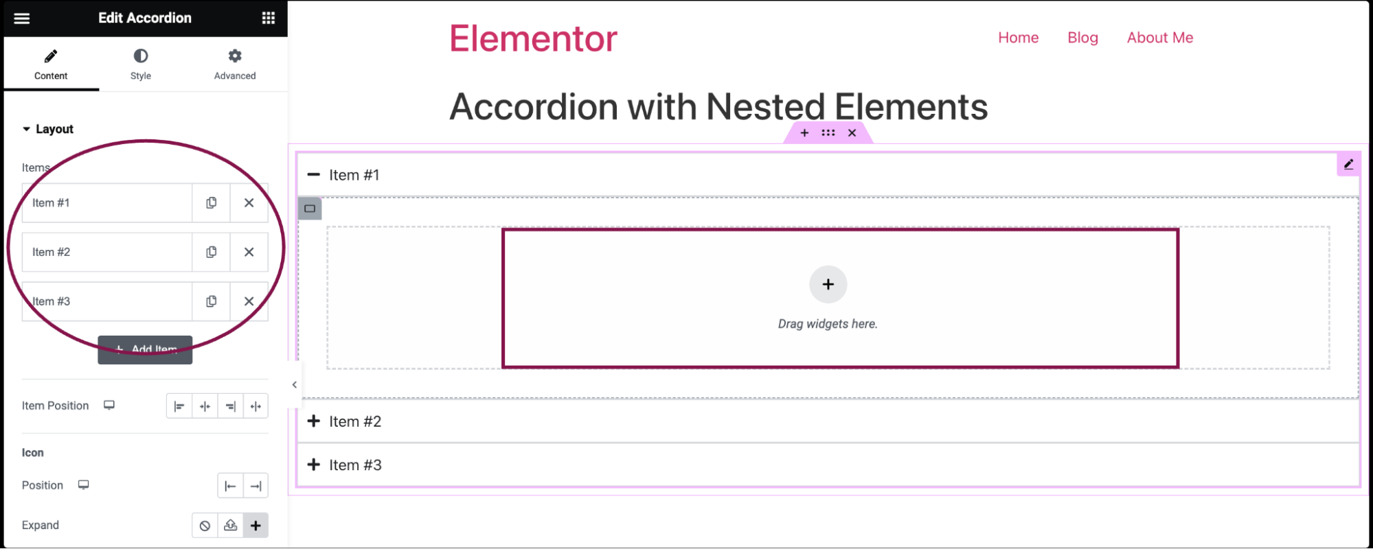
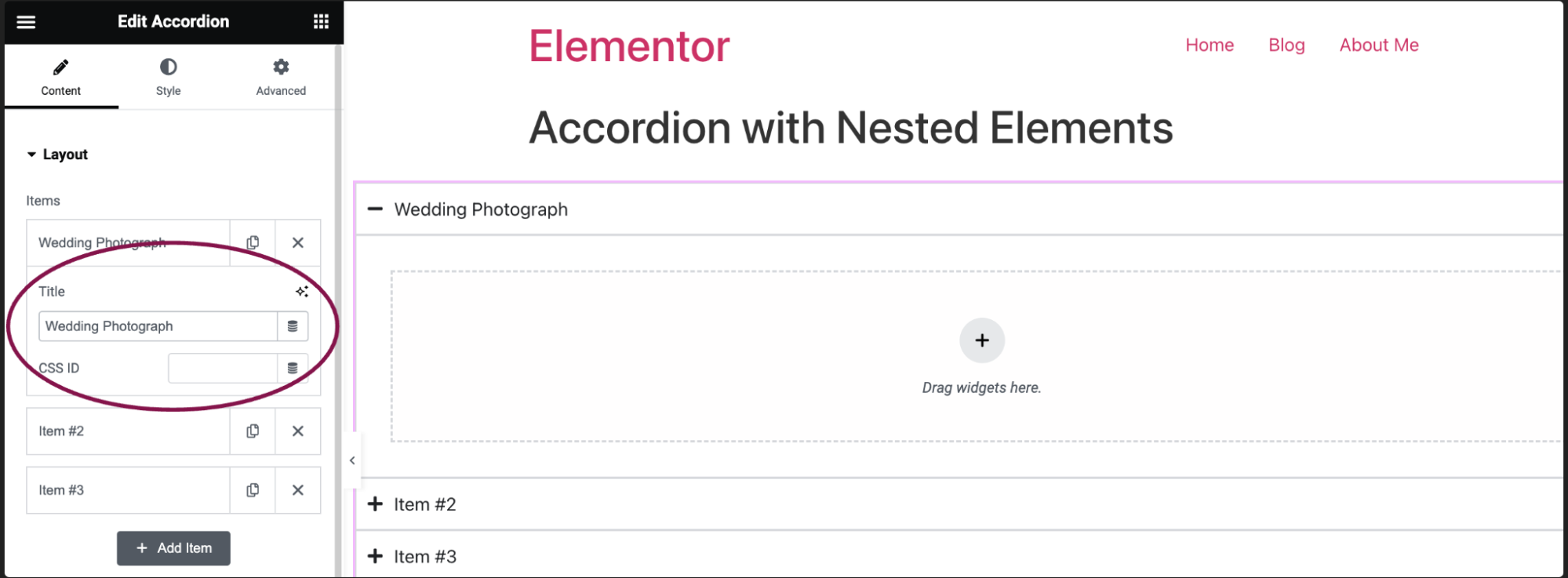
- In the Content tab, under the Layout section, click an item to edit it.
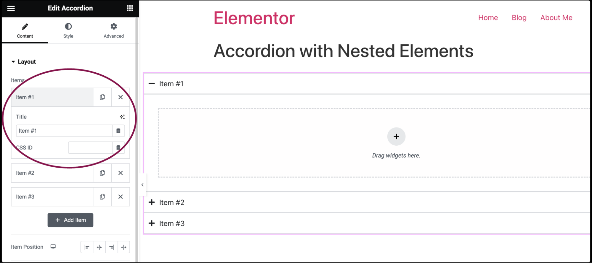
- In the Title field, add the accordion name and give the tab a CSS ID. For more details, see CSS selectors in Elementor.
- Click the Add Item button to add a new tab.
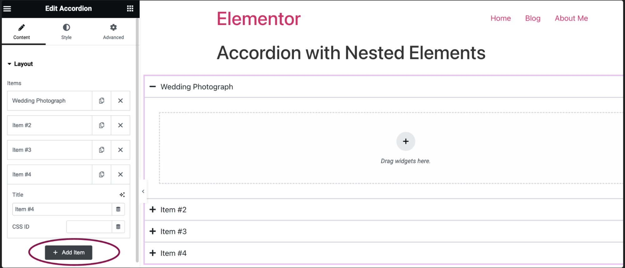
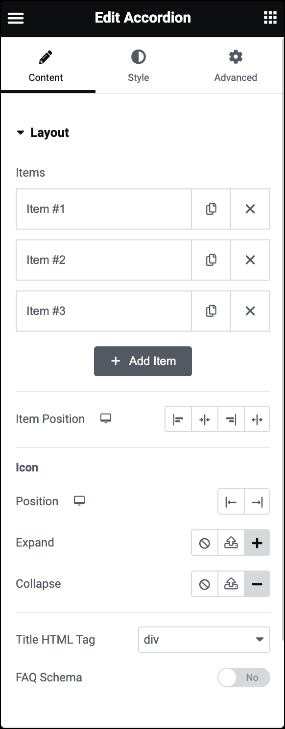
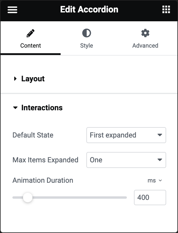
Items
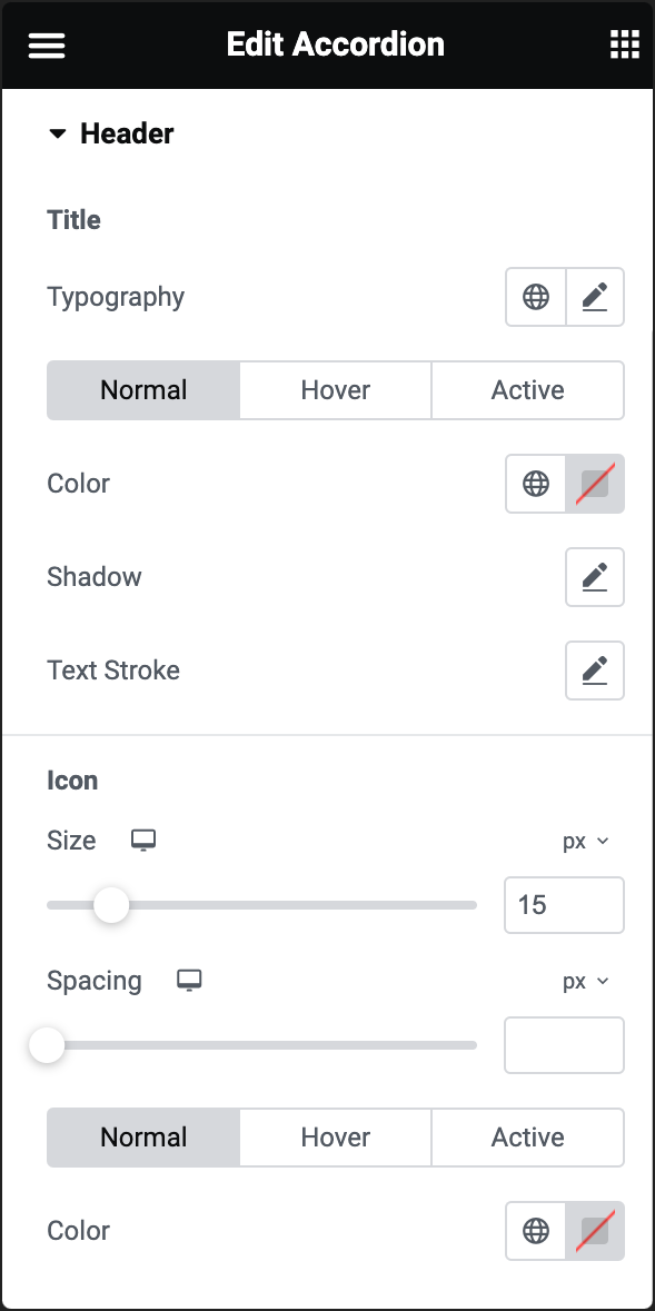
Icon
By default, an icon appears next to the tab’s name. Visitors click this icon to expand and collapse the tab.
You further get icon customization options, such as:
- Position: Determine the icon’s place – on the left or right of the tab name.
- Expand: Provides three options for the icon that opens the tab:
 Opt for no icon by selecting the none option.
 Upload your own SVG file as an icon. For more details, see Enable SVG support.
-
 Pick an icon from the icon library.
- Collapse: Provides three options for the icon that opens the tab:
- Opt for no icon by selecting the none option.
- Upload your own SVG file as an icon. For more details, see Enable SVG support.
- Pick an icon from the icon library.
Title HTML Tag
FAQ Schema