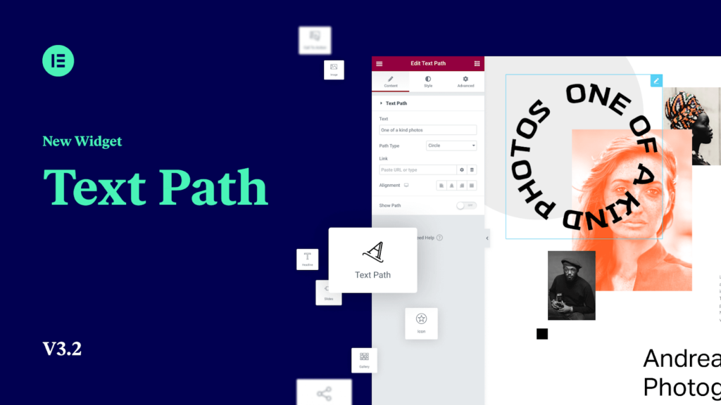
By using the Text Path Widget you can attach your text to any shape! select from a predefined list of shapes or upload your own SVG shape, customize and style it as you want.
Widget Controls
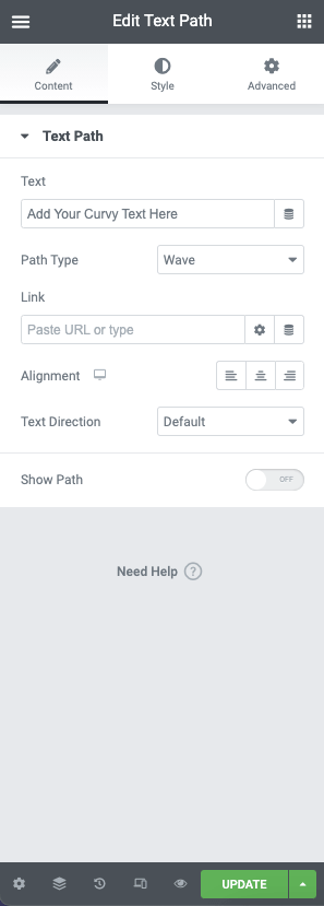
The text path widget features the following controls:
Text – Enter the text you wish to be displayed or use the dynamic options
Path Type – From the dropdown list, choose the path type. You may select from the following options:
– Wave
– Arc
– Circle
– Line
– Oval
– Spiral
– Custom (Upload your own SVG path file)SVG (When Custom is selected) – You may upload a custom path to the media library using .SVG format and apply this to the text path
Link – Add your link URL or chose from the dynamic options
Alignment – Chose the alignment for your text
Text Direction – Choose the orientation of your text Default, RTL, or LTR
Show Path – Toggle this option to show your path
Style Options
Text Path
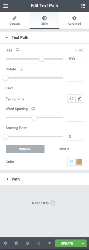
The text path has the following style controls. These control the container of your path:
Size – Set the size of the text path container using px, % , em, rem and vw
Rotate – Set the rotation your container in degrees
Text Options
Typography – Set the font family, sizes, and style, or use the global typography control
Word Spacing – Use the slider to set the word spacing in px, rem and em
Starting Point – Use the slider to set the start point of your text on the path
Color – Choose the color for your text using the color picker or dynamic functions. Colors may be set for Normal and Hover classes.
Path

Control the appearance of the path using the following options. These options can be set for Normal and Hover classes:
Color – Choose the background color of your path using the color picker or global options
Stroke
Color – Choose the background color of your stroke using the color picker or global options
Width – Use the slider to set the stroke width in PX