help center

On this page

Alert widget

Last Update: March 7, 2024

Add the widget

alert widget icon Alert widget 1

To access and use a widget:

  1. In Elementor Editor, click +.
    All available widgets are displayed.

  2. Click or drag the widget to the canvas. For more information, see Add elements to a page.

What is the Alert widget?

The Alert widget allows you to display important messages or notifications on your WordPress website. It is commonly used to draw attention to specific content, convey urgent information, or provide notices to visitors.

With the Alert widget, you can easily create and customize alert messages without any coding skills.

Alert widget 3

Common use case

Kevin is building a website for his small business consultancy. They want to ensure that site visitors are aware of the free e-book they’re offering, providing valuable insights for entrepreneurs. To achieve this, Kevin decides to use the Alert widget.

They add the Alert widget to the top section of the page and write a compelling message to grab attention. Kevin also customizes the appearance of the alert banner to match their brand colors and typography, ensuring a cohesive design with the rest of the website.

alert widget common use case Alert widget 5

Additional use cases 

  • Inform visitors about upcoming events, webinars, or conferences hosted by your organization.
  • Communicate urgent information, such as system outages or critical updates, using the Alert widget.
  • Draw attention to limited-time promotions, discounts, or flash sales on your e-commerce site with a prominent alert.
  • Encourage newsletter subscriptions by creating an alert that offers exclusive deals or content to users who subscribe.
  • Notify users about scheduled maintenance or downtime, ensuring they are informed and understanding of any temporary inconveniences.

Add an Alert widget: Step-by-step

  1. Add the alert widget to the canvas. For details, see Add elements to a page.
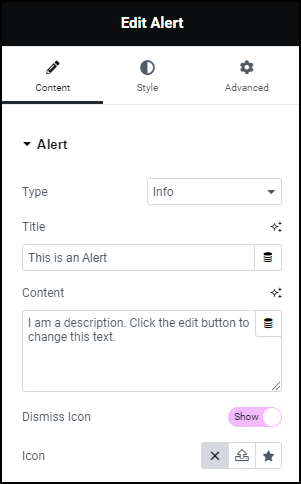
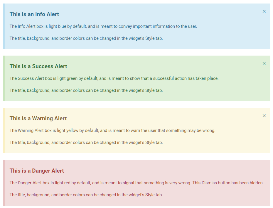
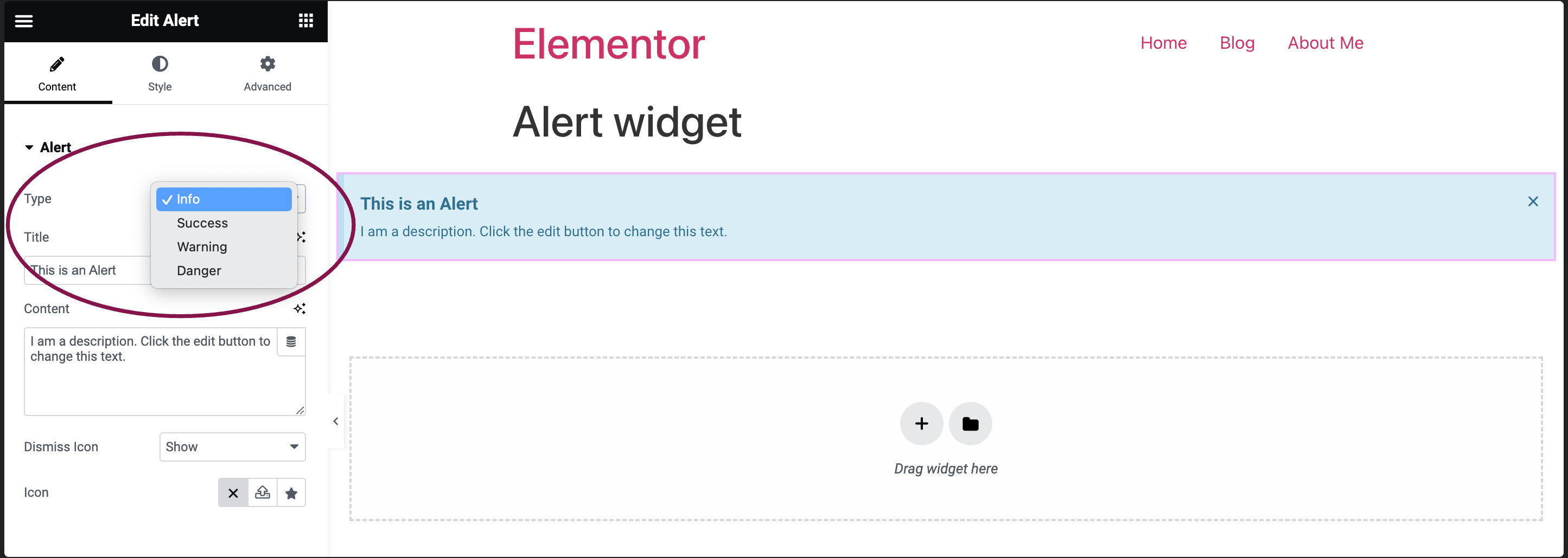
  2. In the Content tab, under the Alert section, choose the pre-styled alert box type that best suits your message – options include Info, Success, Warning, and Danger.
    alert type Alert widget 7
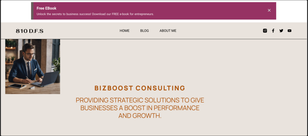
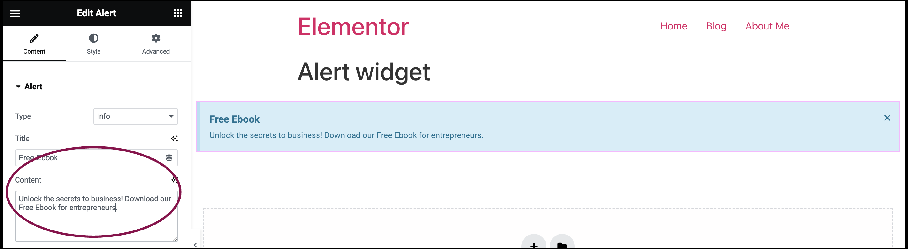
  3. In the Title field, enter the alert box title.
    alert box title Alert widget 9
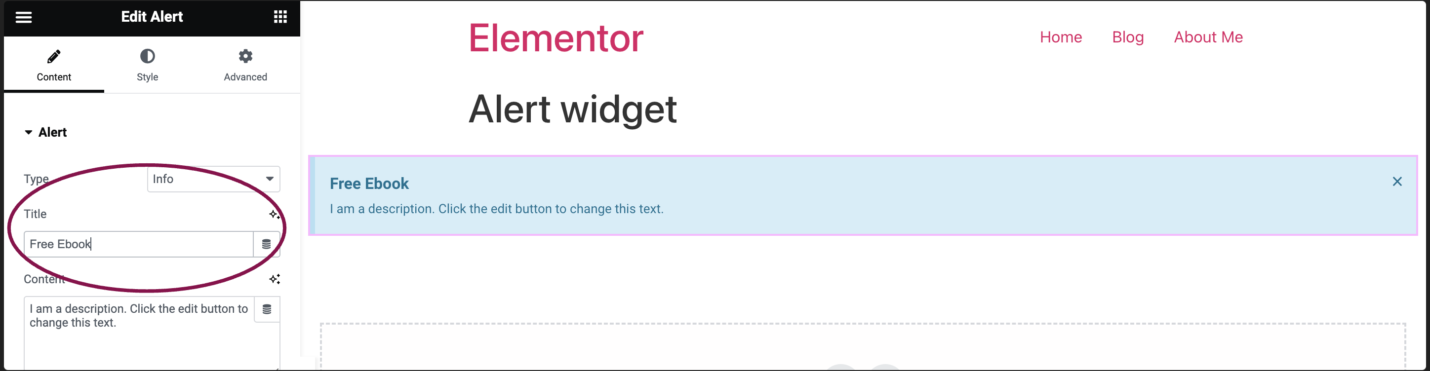
  4. In the Content field, write your alert box detailed description.
    alertbox content Alert widget 11
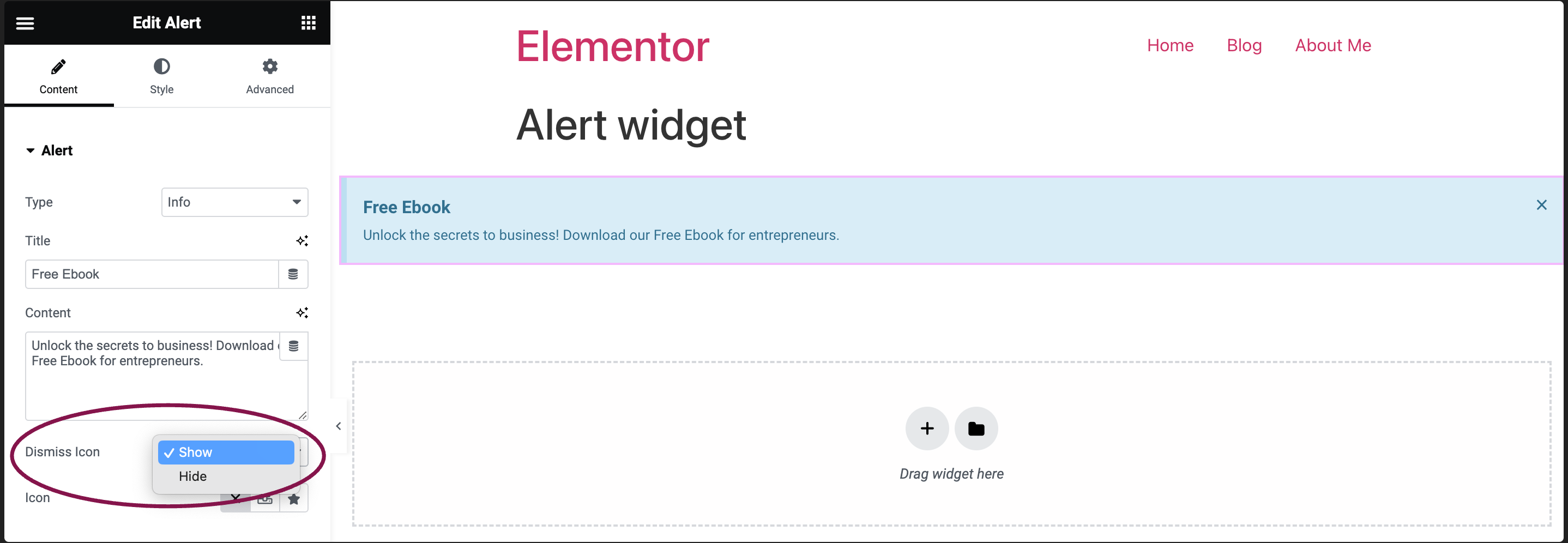
  5. In the Dismiss Icon field, decide whether to include a dismiss button (X) in the upper right corner of the alert. This button allows users to close the alert. You can toggle between Show and Hide to control its visibility. If hidden, users won’t have the option to dismiss the alert.
    dismiss icon Alert widget 13
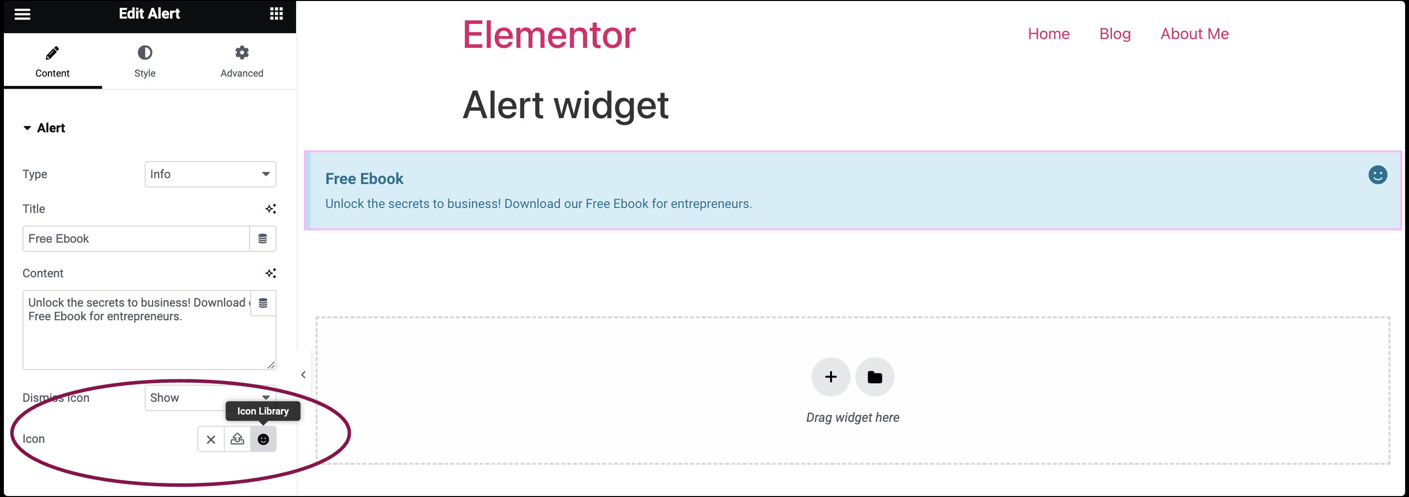
    1. If you choose to display the dismiss button, you can opt for the Default icon, Upload SVG, or select an icon from the Icon Library.
      icon Alert widget 15

Settings for the Alert widget

You can customize your widgets using content, style, and other advanced parameters, offering you great flexibility in tailoring them to your needs. Click the tabs below to see all the settings available for this widget.

Content tab 1 Alert widget 17

Choose the alert type: Info, Success, Warning, or Danger.

Enter your alert box’s title.

Enter your alert box’s description.

Decide whether to show or hide the dismiss button for users to close the alert.

If you choose to display the dismiss button, you can then further select the type of icon for the alert box.

style tab of the alert Alert widget 19
  • Background Color: Pick the background color.
  • Border Color: Choose the color of the left border
  • Left Border Width: Set the width of the left border
  • Text Color: Choose the color of the title text.
  • Typography: Customize the font style of the title. For more details, see Typography.
  • Text Shadow: Click the 🖋️ icon to add a shadow to the title. Learn more about Shadows.


  • Text Color: Select the description text color.
  • Typography: Adjust the font style and size for the description.
  • Text Shadow: Click the 🖋️ icon to add a shadow to the title. Learn more about Shadows.

Normal: How the Dismiss icon appears by default.

Hover: How the Dismiss icon appears when visitors mouse over it. 

Hover mode lets you set a transition duration. This is the length of time it takes for the Dismiss to change its appearance when visitors mouse over it.

  • Size: Resize the icon as needed.
  • Vertical Position: Use the slider to specify the vertical placement of the icon within the alert box. You can choose to align it to the top, middle, or bottom of the box.
  • Horizontal Position: Use the slider to specify the horizontal placement of the icon within the alert box. You can choose to align it to the left, center, or right of the box.
  • Color: Use this option to set the color of the icon.
advanced tab of the alert box Alert widget 21

The Advanced tab provides options to control alert widget position, adjust spacing, add custom code, and
more. To learn more about advanced settings, see Advanced Tab.

Have more questions? We’re more than happy to assist.

Link is copied to clipboard!
On this page

Is this article helpful?

Share this article