
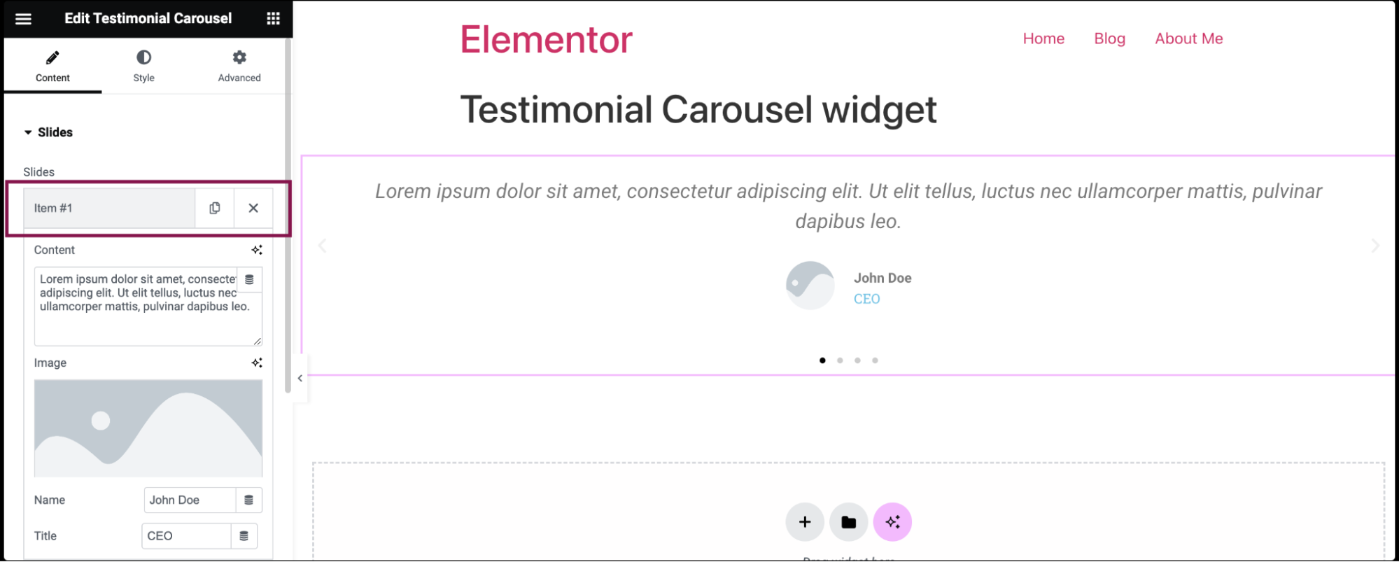
- Add the Testimonial Carousel widget to the canvas. For details, see Add elements to a page.
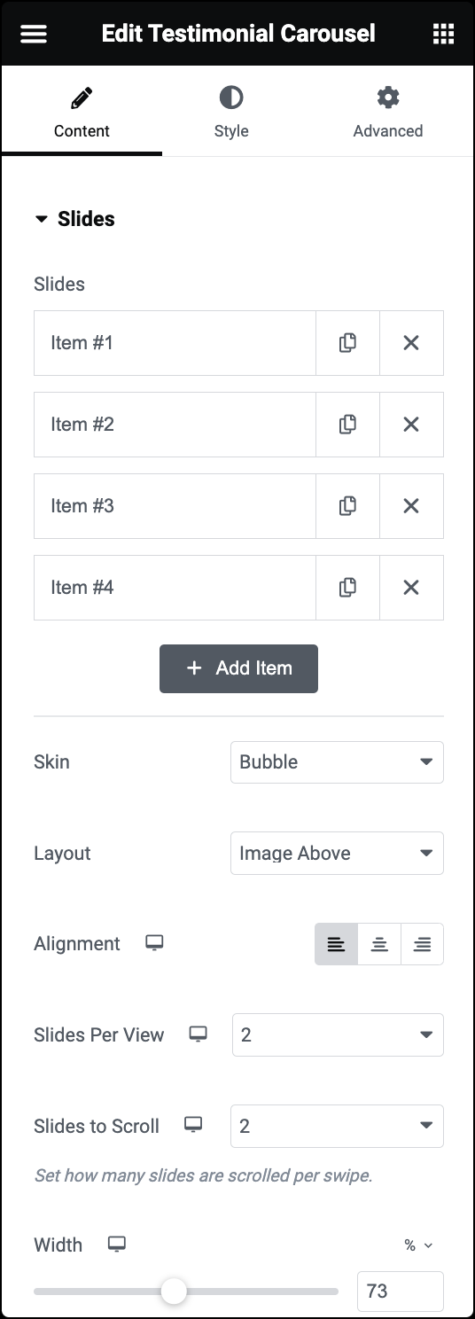
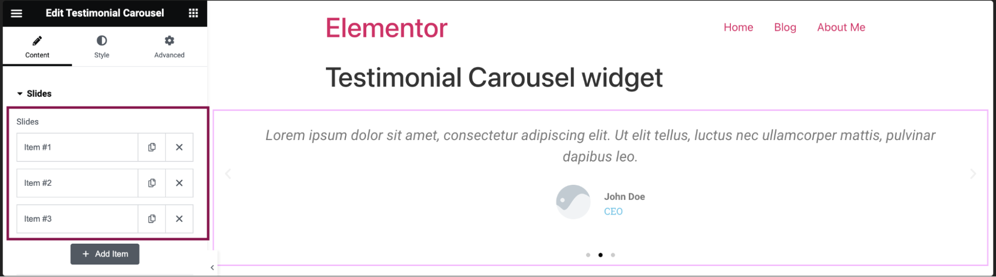
- By default, the testimonial carousel widget comes with three menu items: Item #1, Item #2, and Item 3. You can add/delete or further customize these default menu items.
- To add a new slide, click the Add Item button. You can also create an exact copy of the existing slide by clicking the
 icon
icon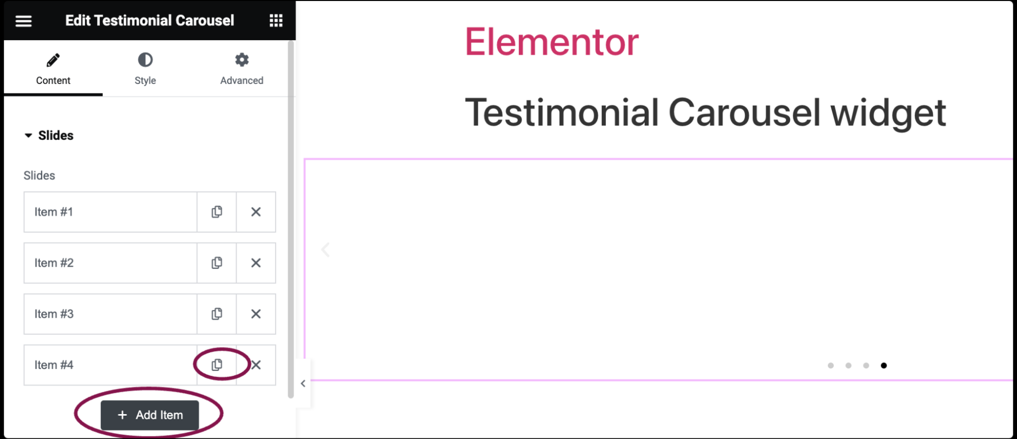
- Click the delete icon
 to delete a slide.
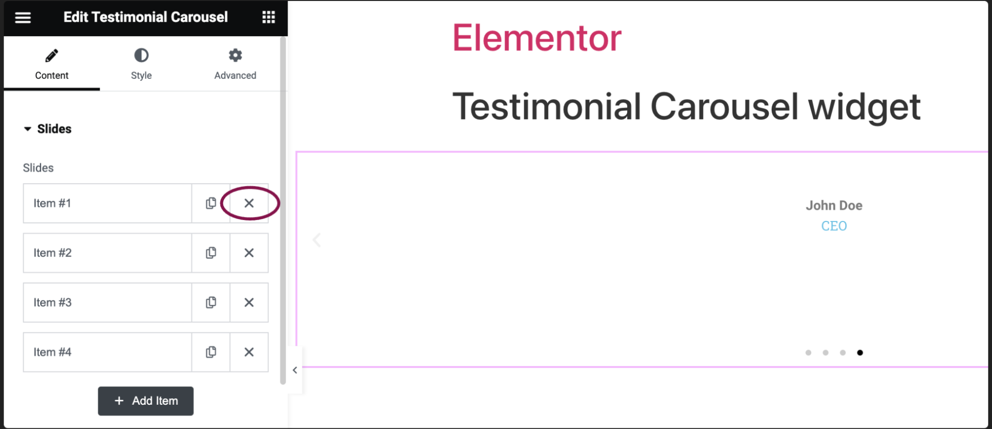
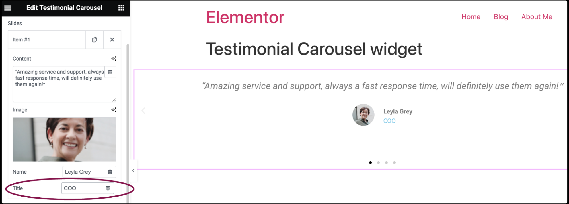
- Click on the individual slide to add content.
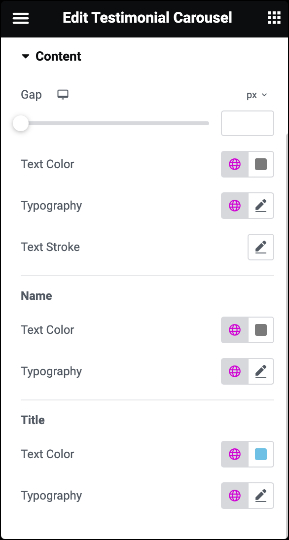
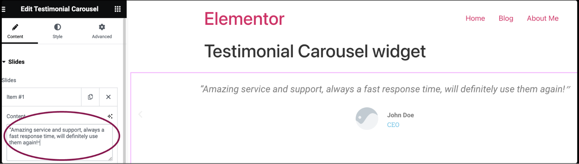
- In the Content field, you can type or paste the text of the testimonial provided by your customer.
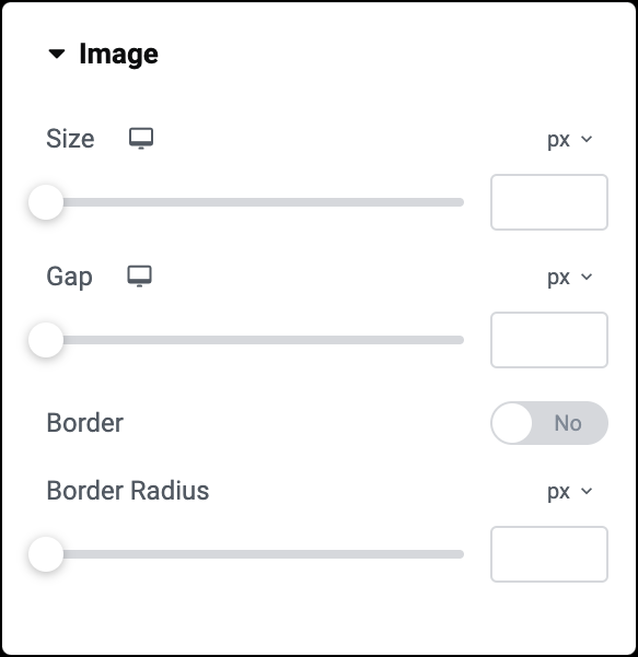
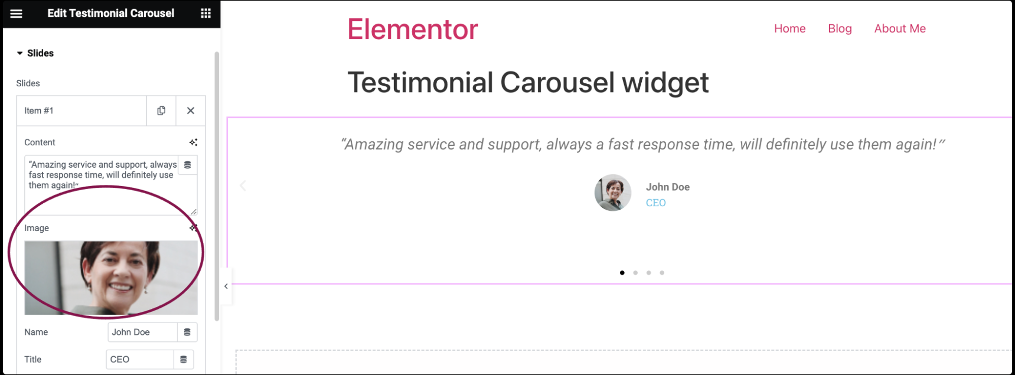
- In the Image field, upload a picture of the customer or choose an image from your media library.
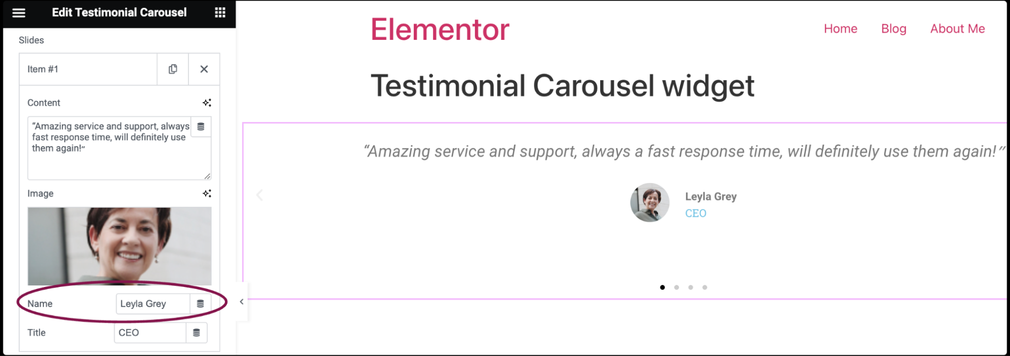
- In the Name field, enter the customer’s name.
- In the Title field, add the customer’s job title, role, or any other relevant information.
- To add a new slide, click the Add Item button. You can also create an exact copy of the existing slide by clicking the
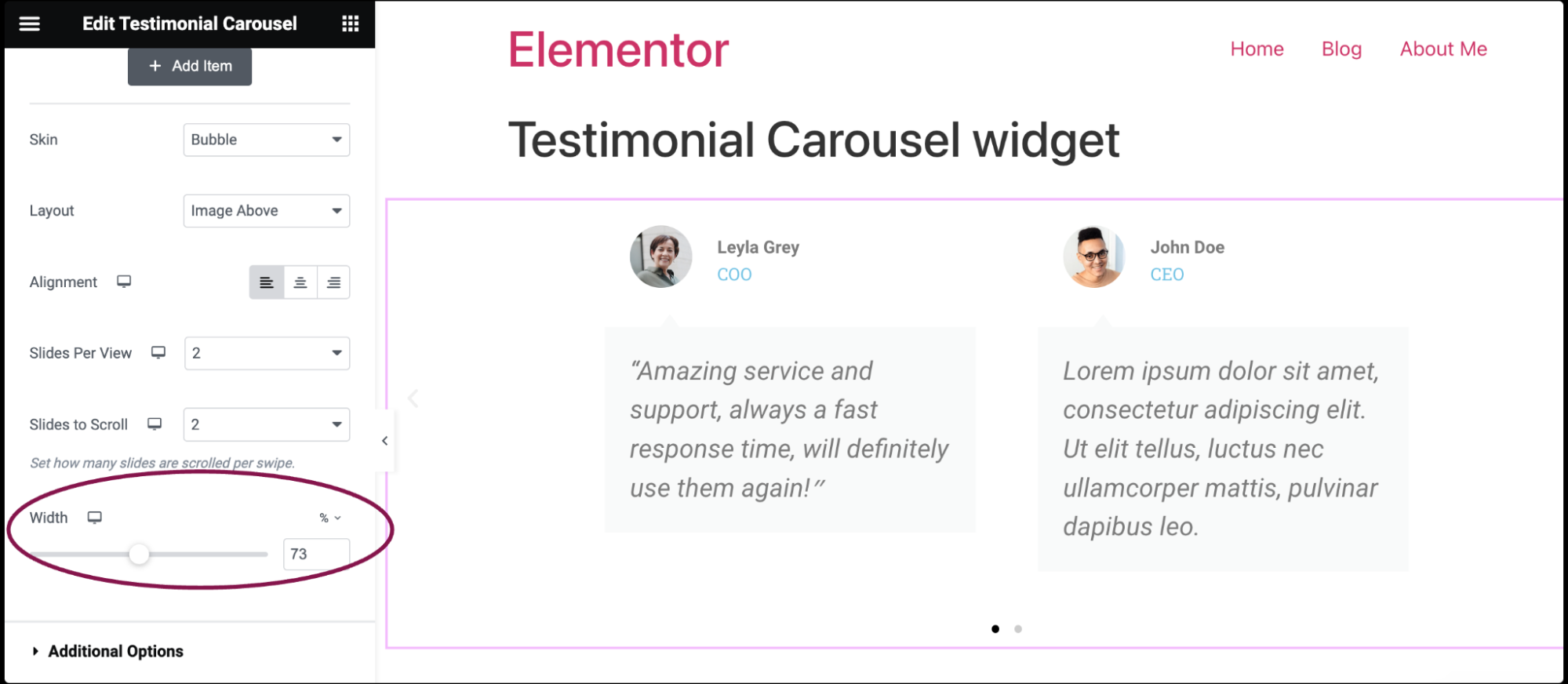
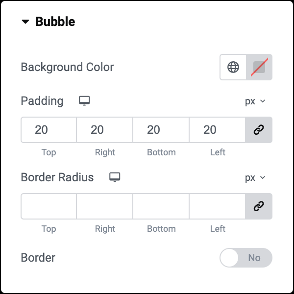
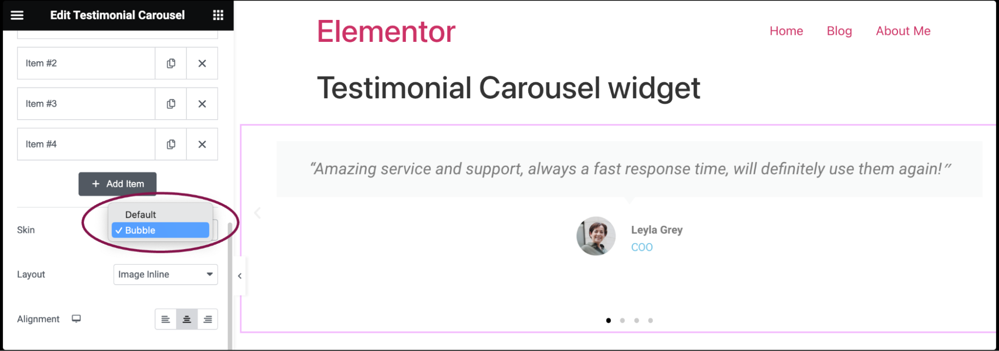
- In the Skin field, select a pre-designed skin, either Default or Bubble.
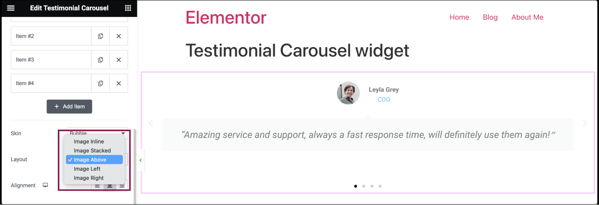
- In the Layout field, choose how your image and text will be arranged within each slide of the carousel. You can choose from layout options such as Image Inline, Image Stacked, Image Above, Image Left, or Image Right.
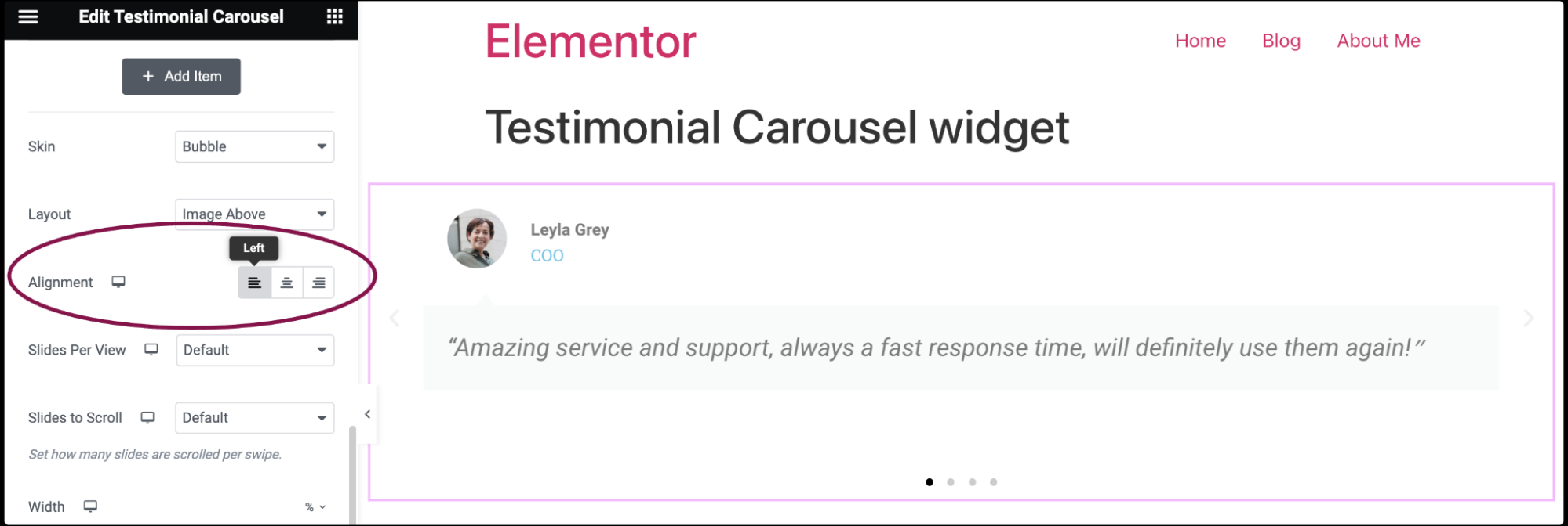
- Use the options from the Alignment field to where the text within each slide will be positioned. You can align it to the left, center, or right of the slide.
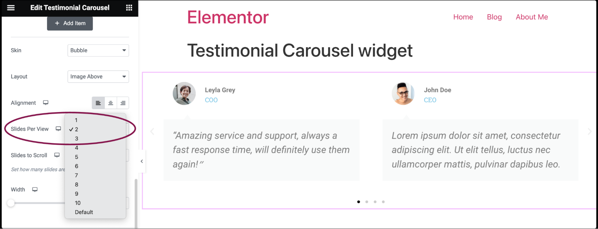
- Use the Slides Per View field to specify how many slides will be visible at one time in the carousel. For example, if you set it to 3, visitors will see three testimonials side by side.
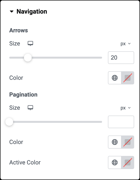
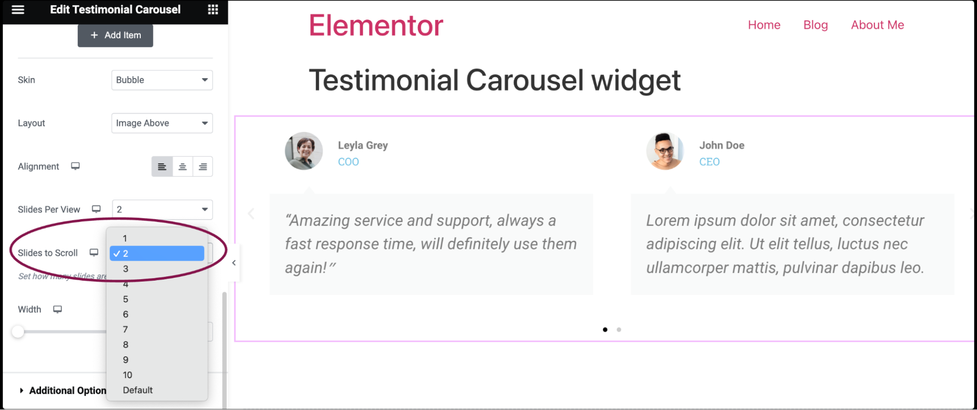
- In the Slides to Scroll field, from the dropdown menu, select the number of slides that will move when visitors click the navigation icon.
- In the Width field, use the slider to define the width of the carousel.