What is a Loop Carousel?
A Loop Carousel is essentially a Loop Grid where the individual entries scroll from side-to-side rather than up and down. Learn about Loop Grids.
What’s different about the Loop Carousel?
As mentioned above, a Loop Carousel moves from side-to-to-side, therefore a number of the controls are different.
Settings for the Loop Carousel widget
The Content tab – Layout
Layout controls how the carousel will appear to your visitors.
Expand the Layout section
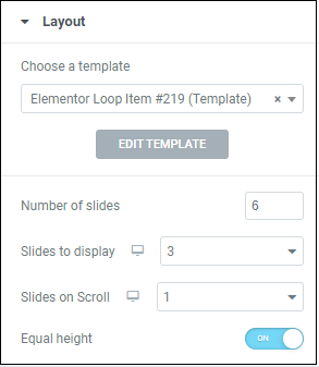
Use the dropdown to select a template you designed or a premade template from the template library. Then click Edit Template. For more details, see What is a Template?
The number of items in the loop.
The number of items a visitor will see on the page.
is determines how many slides will advance when the use clicks the next and previous arrows.
Keeping all items an equal height helps preserve the symmetry of your loop.
The Content tab – Query
Query controls which items will appear in your carousel. See our article on constructing a query for more details.
Configure a query using the below.
Expand the Query section.
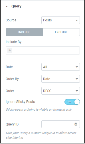
Loop items are not limited to Posts. Use the dropdown to populate your loop with:
- Posts
- Pages
- Landing Pages
- Manual Selection
- Current Query
- Related (items that fall under the same category)
For more details, see Build a query.
Date – You may want to limit your loop to more recent items. Use the dropdown to filter by:
- Past Day
- Past Week
- Past Month
- Past Quarter
- Past Year
- A custom date range
Items placed earlier in the loop are more likely to attract attention. Use the dropdown to order the items by:
- Date
- Title
- Menu Order
- Last Modified
- Number of comments
- Random
Further customize the order in which visitors see your loop items by organizing them in descending or ascending order.
Toggle to No if you want the query to include these fixed position posts. You will only see the effects of this when previewing the page.
You can give this Query an ID number so that you can use it for filtering on the backend.
The Content tab – Settings
Configure settings using the below.
Expand the Settings section.
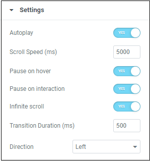
Toggle to determine if items will move automatically or only when the visitor clicks the navigation icon.
If you turn autoplay off, you’ll have options to:
- Have the loop scroll infinitely.
- Determine the transition time between items when scrolling
- Set items to scroll from left-to-right or from right-to-left (this basically changes which navigation is previous and which one is next).
Control how fast your loop will move when set to autoplay – measured in milliseconds..
Pause on Hover lets your users pause the loop to select items that interest them.
Pause on interaction lets your users pause the loop to select items that interest them.
Keep your loop going with infinite scroll.
The time it takes to move from one item to the next – measured in milliseconds.
Sets your items to move from left- to-right or right-to-left.
The Content tab – Navigation
Navigation determines how visitors can scroll through the carousel.
Configure navigation using the below.
Expand the Navigation section.
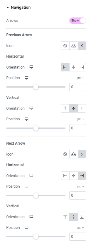
Arrows are the default navigation icon. By clicking the arrows, you manually move to the previous and next slides.
Toggle the button to disable arrows.
Replace the arrow icon used to view the previous slide:
 Select not to display an icon
 Upload an SVG file to use as an icon. See Enable SVG support.
 – Choose an icon from the icon library.
Place the icon at the start, center or end of the Carousel.
Use the slider to place the navigation icon exactly where you want it. For more details, see Units of measurement.
Place the icon at the top, center or middle of the Carousel.
Use the slider to place the navigation icon exactly where you want it.
Replace the arrow icon used to view the previous slide with:
- Decide not to use an icon
- Upload an SVG file to use as an icon. See Enable SVG support.
 – Choose an icon from the icon library.
Use the slider to place the navigation icon exactly where you want it. For more details, see Units of measurement.
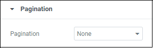
The Content tab – Pagination
Pagination controls how visitors will see where they are within the loop.
Configure pagination using the below.
Expand the Pagination section.
Depending on how many items you choose to display on screen, the items in your loop will be divided into “pages.”
You can choose to help your visitors understand where they are in your loop, by displaying pagination in the form of:
- Dots, with each dot representing a page.
- Fractions – using numbers to show how far they are in the loop.
- Progress – a bar that shows how they are in the loop.
The Style tab – Layout
Layout controls the space around the items in your Loop Carousel.
Configure layout using the below.
Expand the Layout section.
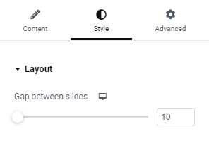
Determine the amount of space between the items in your carousel.
The Style tab – Navigation
Make your navigation icons stand out by increasing their size or emphasize your media by making them smaller.
Configure navigation using the below.
Expand the Navigation section.
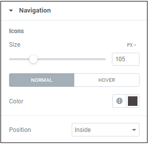
Set the size of the navigation icons. Learn more about units of measurement.
Normal – How the navigation icons will appear by default..
Hover – How the navigation icons will appear when visitors mouseover them.
Set the color of the navigation icons. For more details, see Choose a color or Use global fonts and colors.
Choose Inside to make the navigation icons part of the loop elements, choose Outside to place them outside the elements.
The Style tab – Pagination
Controls the look of the pagination symbols. This will only appear if pagination is turned on in the Content tab. There are three of these menus depending on which pagination style you choose.
Configure pagination using the below.
Expand the Pagination section.
Pagination by dots
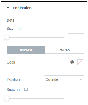
Control the size of the pagination dots. Learn more about units of measurement.
Normal – How the pagination dots will appear by default..
Hover – How the pagination dot will appear when visitors mouseover them.
Change the color of your pagination icons. For more details, see Choose a color or Use global fonts and colors.
Adjust the placement of the pagination dots.
- Choose Inside to make the pagination icons part of the loop carousel.
- Choose Outside to place them outside the carousel. If you choose Outside, you can edit the amount of space between the carousel and the dots.
Increase or decrease the room between the loop items and the pagination dots.
Pagination by fraction
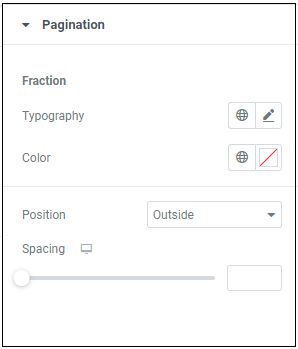
Determine the font of the numbers making up the fraction. For more details, see typography
Determine the color of the numbers making up the fraction. For more details, see Choose a color or Use global fonts and colors.
Adjust the location of the fraction:
- Choose Inside to make the fraction part of the loop carousel.
- Choose Outside to place the fraction outside the carousel. If you choose Outside, you can edit the amount of space between the carousel and the fraction.
Increase or decrease the room between the loop items and the fraction.
Progress bar
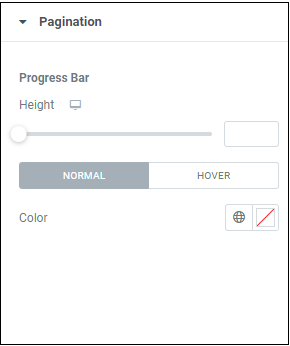
Control the distance between the content of the Loop Carousel and progress bar.
The progress bar can change colors depending on the location of the cursor:
Normal – How the pagination dots will appear by default..
Hover – How the pagination dot will appear when visitors mouseover them.