Want to learn faster? Book a 1-on-1 expert session today.
Add a menu
To add a menu widget:
- Add the Menu widget to the canvas. For details, see Add elements to a page.
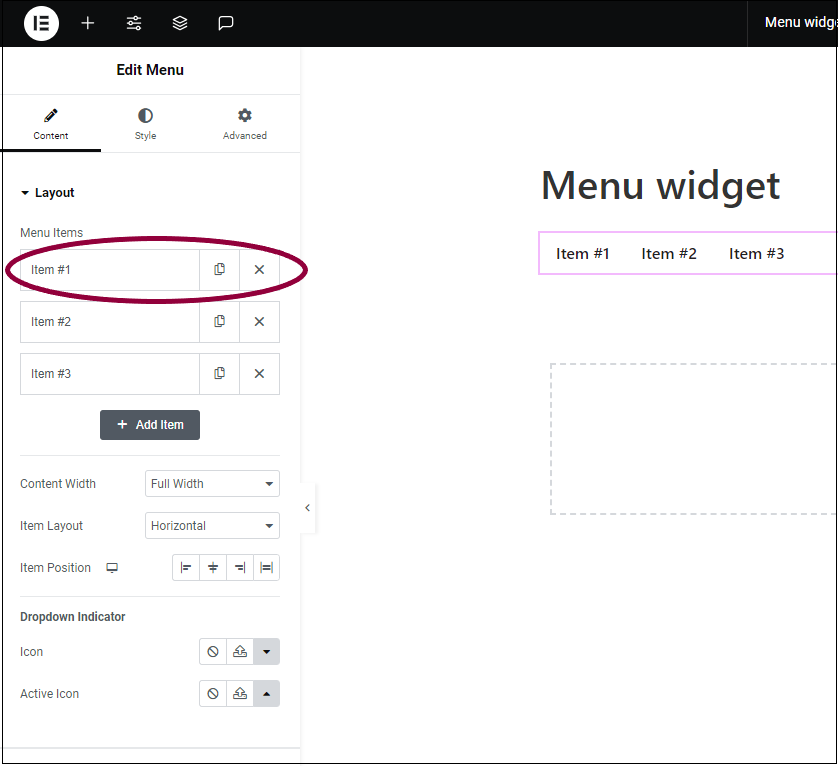
- In the panel, click on the menu item named Item #1.
Clicking the menu item in the panel opens up several options: Title, Link, Dropdown Content, Icon, and CSS ID.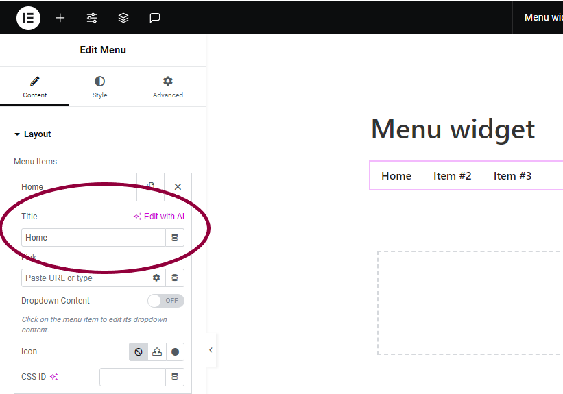
- In the Title field, enter the new name.
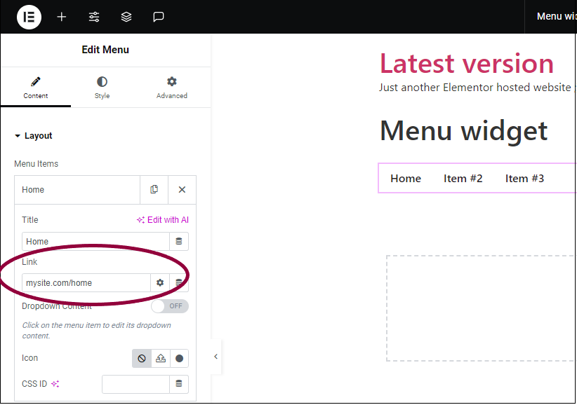
- (Optional) In the Link field, enter a hyperlink to another page or anchor link. For example, if the this menu item is labeled Home, you can link it to the site home page.
- Rename Item #2 and Item #3 to Store and Blog.
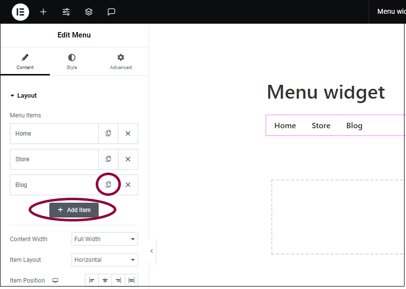
- There are two ways to add a new menu item:
- Click Add Item.
- Click the copy icon
 next to one of the existing tabs. This will create an exact copy of the existing tab.
- Add a new menu item and name it Contact Us.
At this point this example consists of a simple menu with four tabs. However, each of these tabs has the potential to incorporate any of the design elements found in Elementor.
Add design elements
You can create advanced menus that include any elements in the Editor, such as text and images.
To add design elements to a tab:
- Click the menu item to open it.
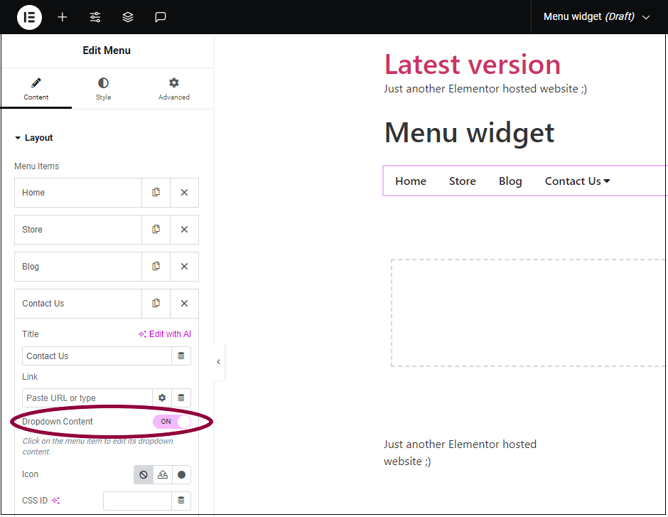
- Toggle the Dropdown Content to On. On the canvas, an arrow icon appears next to the menu item.
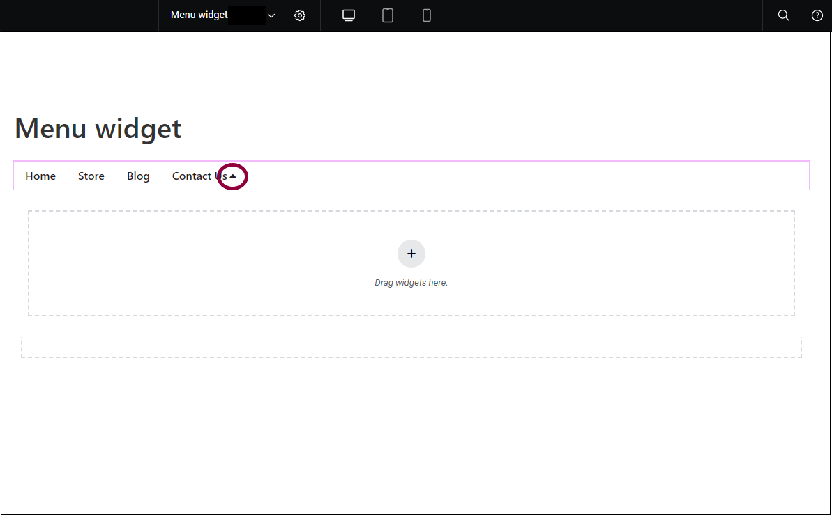
- On the canvas, click the arrow next to the tab name.
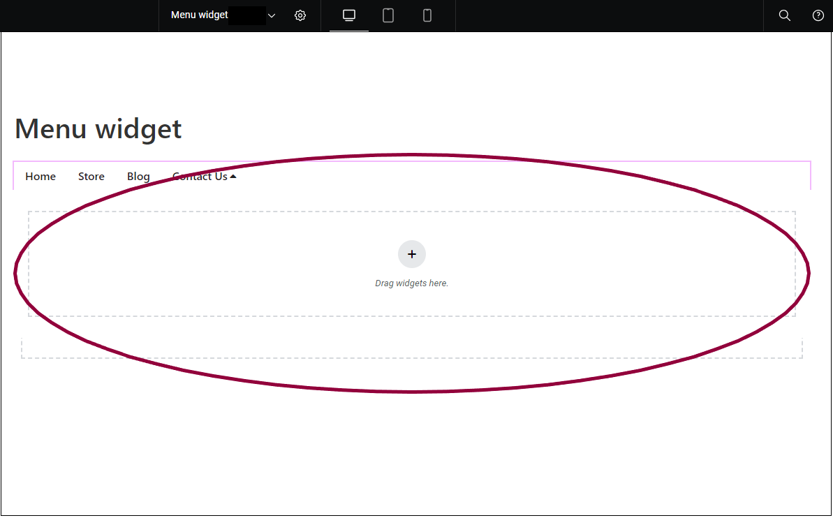
A container appears on the canvas under the menu item. You can now add elements such a Text Editor widget and an Image widget to the container as in the example above. You can even add another Menu widget to create a submenu. These elements are visible when visitors click the menu item. For more details, see Create a mega menu.
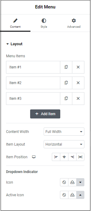
Menu Items
Edit and create menu item. When you click an item, additional options appear, such as Title and Link.
– Duplicate this menu item. Using copy helps maintain consistency in your menu.
 – Delete this menu item.
Open to edit the following fields:
- Title – Name this menu item.
- Link – Direct this menu item to a specific URL. You can give these links custom attributes and make them dynamic. Learn about custom link attributes. Learn more about dynamic content.
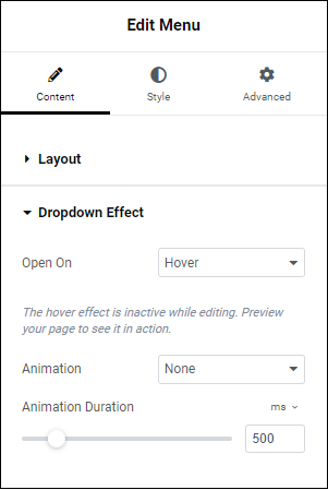
- Dropdown content – Dropdown content appears under menu items when visitors click or hover over them.
- Icon – Places an icon next to the menu item. Learn more about icons.
- CSS ID – allows you to tag individual elements on a page. This way you can link to this specific element.
Add Item
Content Width
Item Layout
Item Position
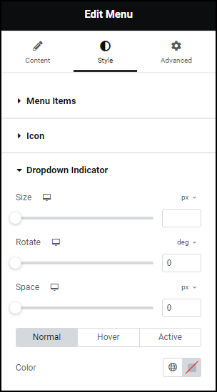
Dropdown Indicator
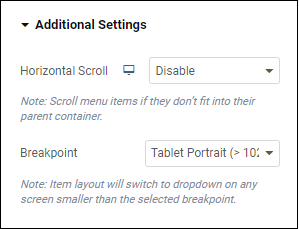
Additional Settings
Horizontal Scroll
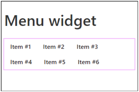
Use the dropdown menu to Disable or Enable horizontal scrolling. Disabling horizontal scrolling means that excess menu items appear as additional rows on your menu.
See the example of a menu with horizontal scroll disabled.
Breakpoint
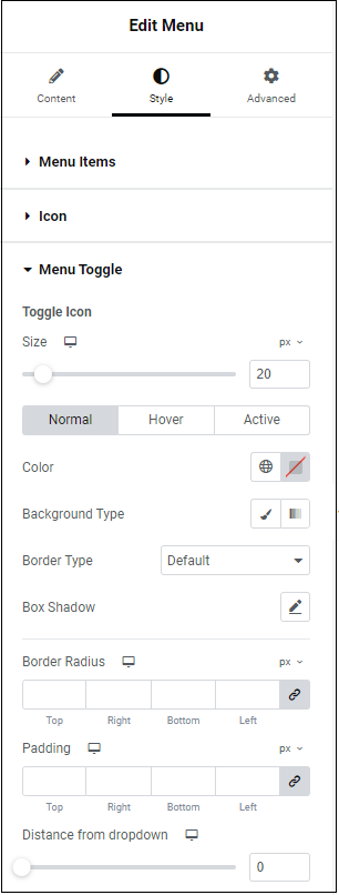
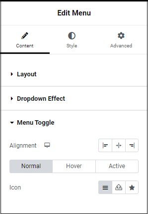
Menu Toggle
Size
Normal
Hover
Active
Color
Background type
Border type
Box shadow
Click the pencil icon  to add shadow to the toggle. Learn more about shadows.
Border Radius
Distance from dropdown
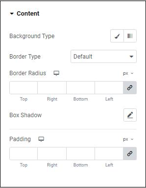
Content
Background type
Border type
Border Radius
Box Shadow
Click the pencil icon to add a shadow to the menu tab’s content. Learn more about shadows.
Padding
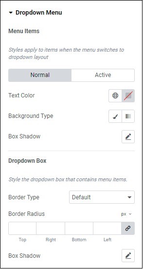
Dropdown menu
Normal
Active
Text color
Background Type
Box Shadow
Click the pencil icon to add a box shadow to the dropdown menu. Learn more about shadows.
Dropdown Box
Border type
Border Radius
Box Shadow