Display products on any page of your site, setting their content and style with the WooCommerce Products widget.
Want to learn faster? Book a 1-on-1 expert session today.
Content
Products
- Columns: Set the exact number of columns to display, from 1 to 12
- Rows: Set the maximum number of rows to display
- Pagination: Select Yes to show Pagination or No to hide it
- Allow Order: Select Yes to give users the option to sort the products by Default, Popularity, Rating, Latest, Price: Low to High, or Price: High to Low
- Show Result Count: Select Yes to show number of results for this archive, or No to hide it
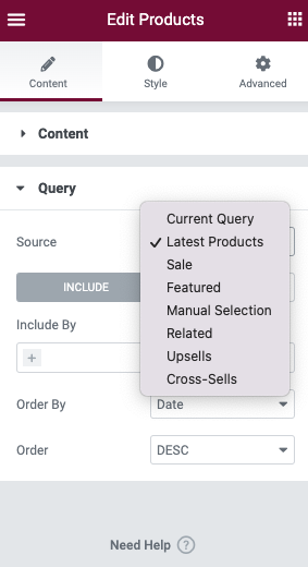
Query
Source: Select source of results, choosing from Current Query, Latest Products, Sale, Featured, Manual Selection, Related, Upsells, or Cross-Sells. Depending upon which source you’ve chosen for the query, you’ll be given options which allow you to filter the results.
Include
- Include By: Term, then use Search and Select to choose which ones to use
- Order By: Set the order in which the products will be displayed. Options include: Title, Price, Popularity, Rating, Random, and Menu Order.
- Order: DESC (descending) or ASC (ascending)
Note: Choosing Related as the Source and Category as the Include By term will display posts related to the category assigned to the current post being displayed. So if the user is viewing a post in the Travel category, for example, the page will show Related posts which are also in the Travel category. If the post currently displayed has multiple categories assigned to it, the Related posts will pull posts from the FIRST category (alphabetically) assigned to the post.
Exclude
- Exclude By: Current Post, Manual Selection, Term, then use Search and Select for Manual, or Term choices
- Order By: Set the order in which the posts will be displayed. Options include: Title, Price, Popularity, Rating, Random, and Menu Order.
- Order: DESC (descending) or ASC (ascending)
Style
Products
- Columns Gap: Set the exact gap between the columns
- Rows Gap: Set the exact gap between the rows
- Alignment: Align the products data to the left, right, or center
Image
- Border Type: Select the type of border, choosing from none, solid, double, dotted, dashed, or grooved
- Border Radius: Set the radius to control corner roundness of the border
- Spacing: Adjust the amount of space between the images and their data
Title
- Color: Choose the product Title color
- Typography: Set the typography options for the Title text
- Spacing: Adjust the amount of space after the Title
Rating
- Star Color: Choose the color of a filled star
- Empty Star Color: Choose the color of an empty star
- Star Size: Set the size of stars
- Spacing: Adjust the amount of space after the Rating Stars
Price
- Color: Choose the color of the product Price
- Typography: Set the typography options for the product Price
Regular price
- Color: Choose the color of the product’s Regular Price
- Typography: Set the typography options for the product’s Regular Price
Button
Normal | Hover
The following options can be set independently for both the normal and hover states.
- Text Color: Choose the color of the product’s Button Text
- Background Color: Choose the background color of the product’s Button
- Border Color: Choose the border color of the product’s Button
- Typography: Set the typography options for the product’s Button Text
- Border Type: Select the type of border, choosing from none, solid, double, dotted, dashed, or grooved
- Border Radius: Control corner roundness of the button’s border
- Text Padding: Set the padding within the button
- Spacing: Adjust the amount of space above the buttons
- Automatically Align Buttons: By toggling this on, the buttons will be aligned to the bottom of the wrapper. This allows for button alignment when product titles wrap to additional lines.

View Cart
- Color: Choose the color of the View Cart text under the buttons
- Typography: Set the typography options for the View Cart text
Box
- Border Width: Control the thickness of the border around the product’s box
- Border Radius: Control corner roundness of the products box
- Padding: Change the padding within the products box
Normal | Hover
The following options can be set independently for both the normal and hover states.
- Box Shadow: Adjust box shadow options
- Background Color: Choose the background color of the products box
- Border Color: Choose the border color of the products box
Sale Flash
- Sale Flash: Show or Hide
- Text Color: Choose the color of the Sale Flash text
- Background Color: Choose the background color of the Sale Flash
- Typography: Set the typography options for the Sale Flash text
- Border Radius: Control the corner roundness of the Sale Flash
- Width: Control the thickness of the border for the Sale Flash
- Height: Set the height of the Sale Flash
- Position: Set the position of the Sale Flash, Left or Right, of the products box
- Distance: Set the distance of the Sale Flash from the top of the products box
Note: The style of this widget is often affected by your theme and plugins. If you experience any such issue, try to switch to a basic theme and deactivate related plugins, or adjust the styling within your theme’s settings.