
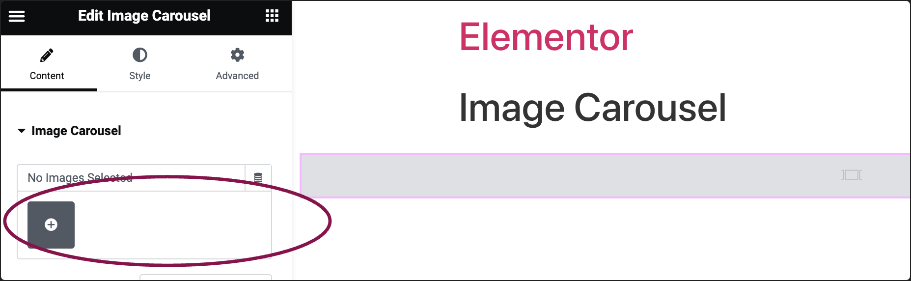
- Add the Image Carousel widget to the canvas. For details, see Add elements to a page.
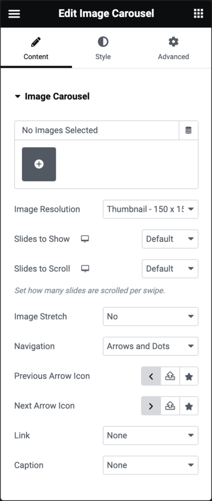
- In the Content tab, under the Image Carousel section, click the ➕ icon to choose and add your images to the carousel.
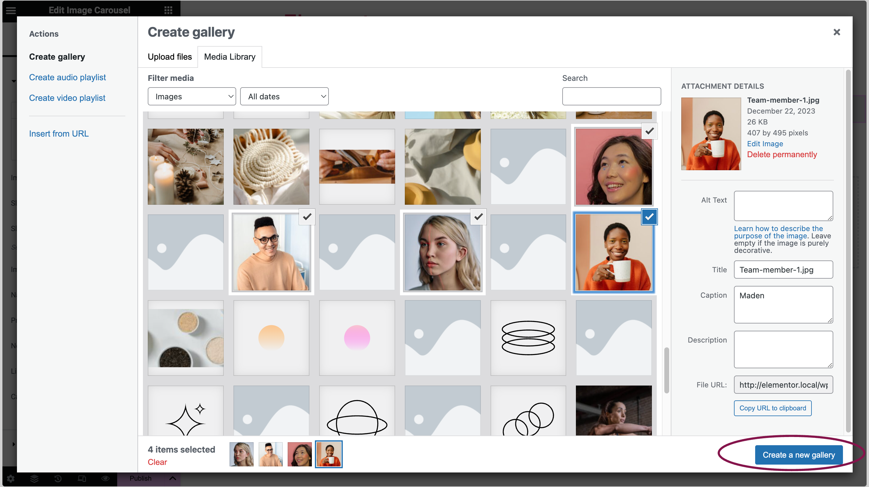
- Select your images, then click on Create a new gallery button.
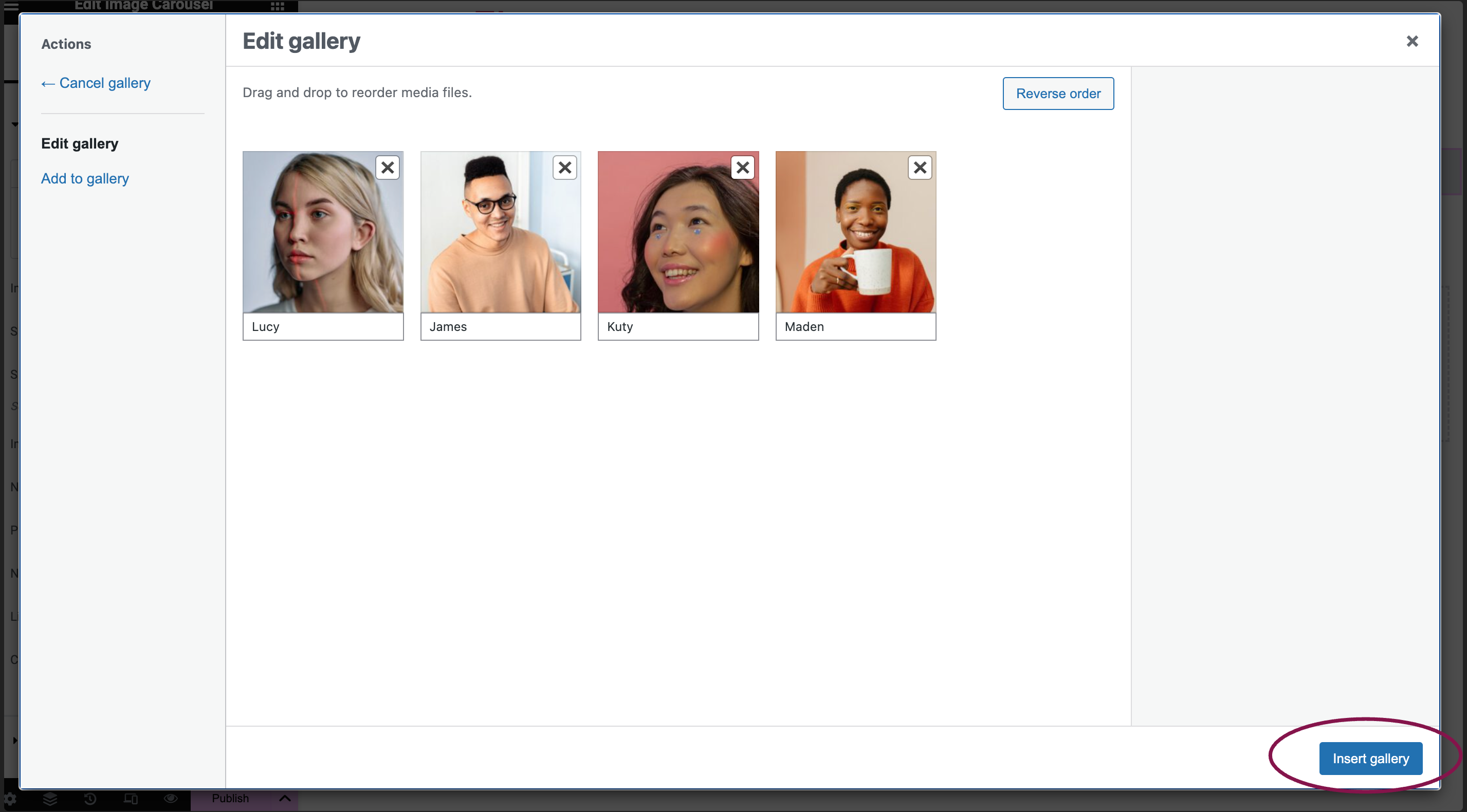
- On the next page, add captions to your images if you’d like, then click the Insert gallery button.
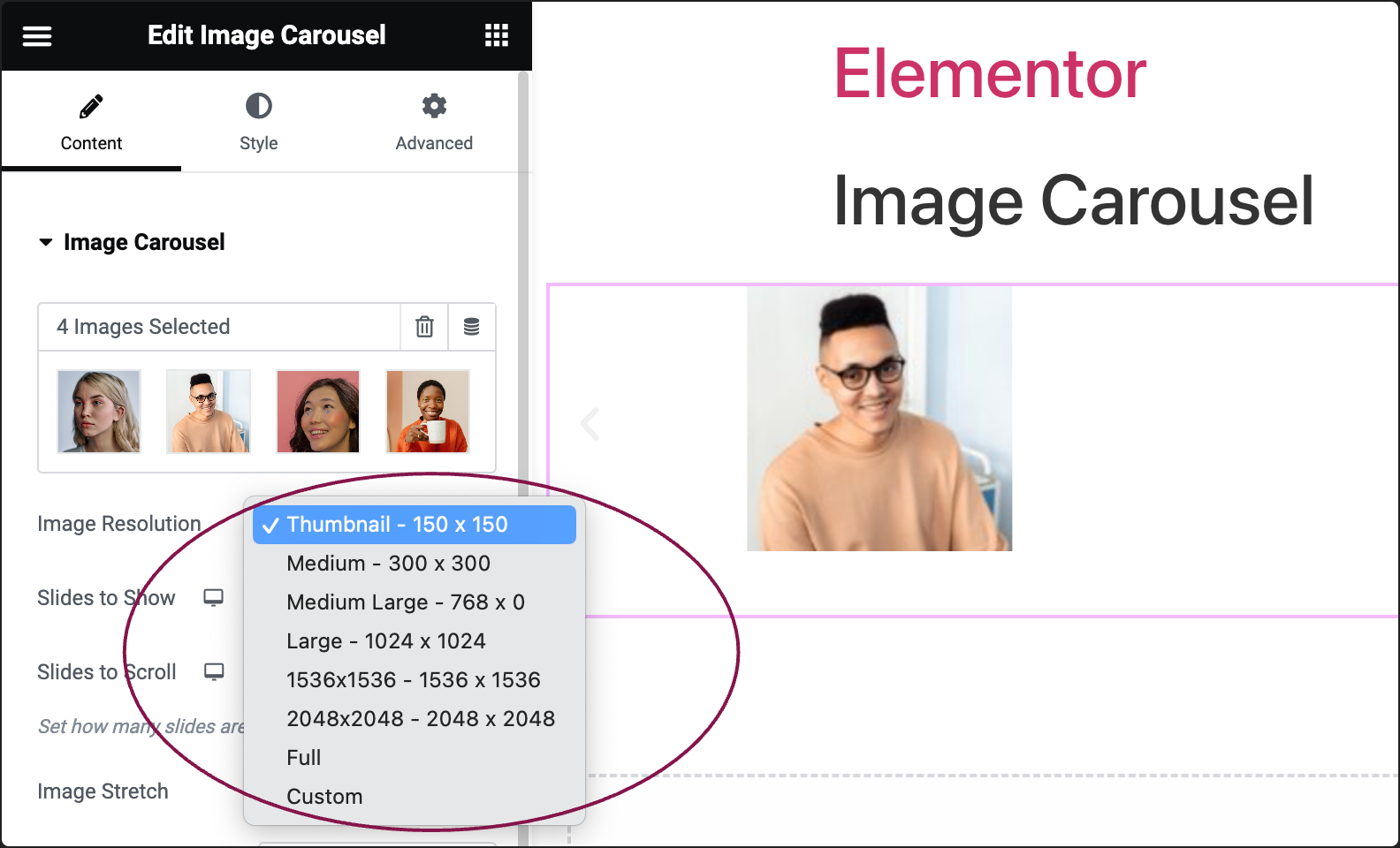
- In the Image Resolution field, adjust the images’ size: choose from thumbnail, full size, or specify a custom size.
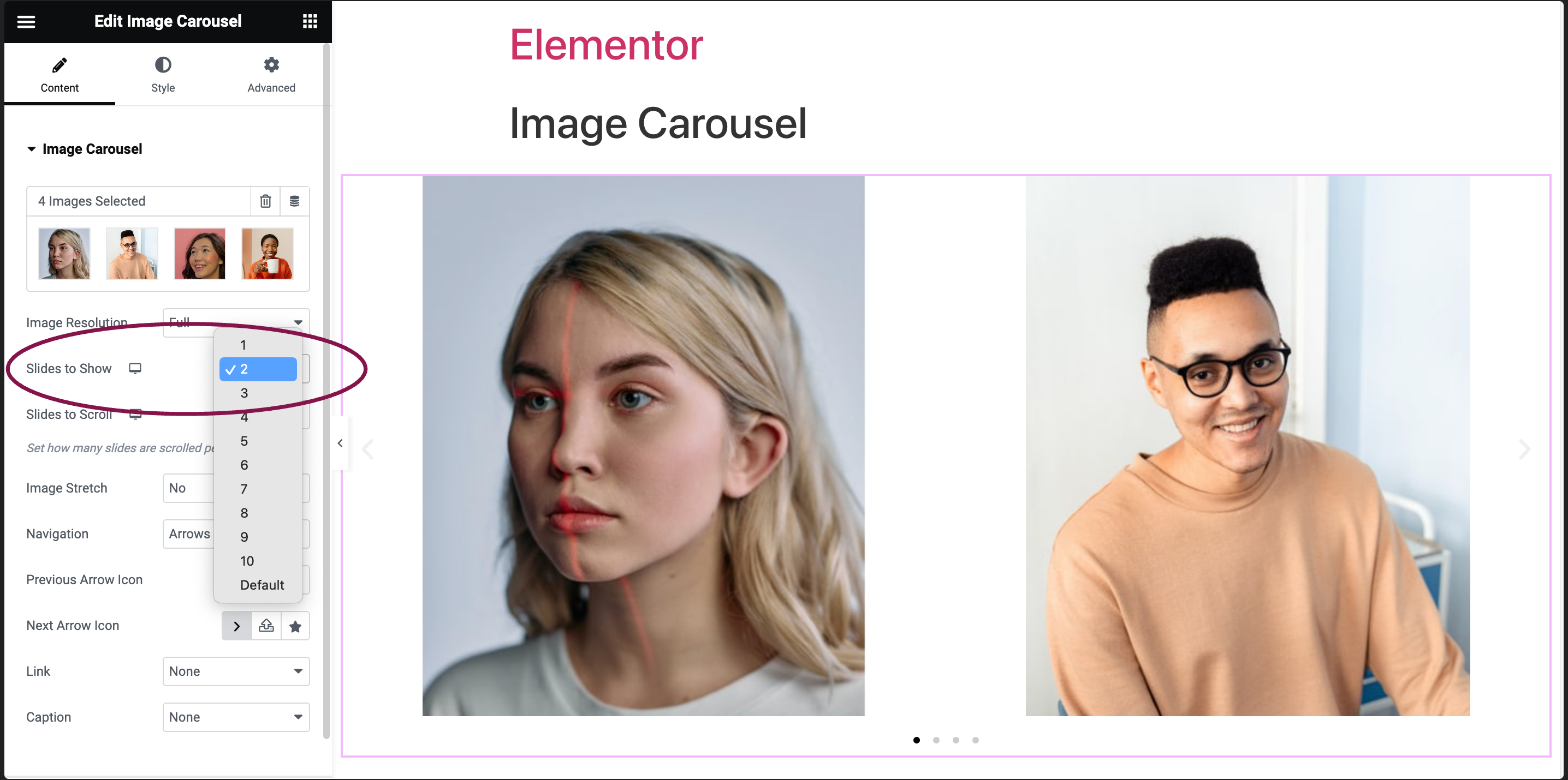
- Use the Slides to Show field to choose how many images will appear at once in the carousel, from 1 to 10.
- In the Slides to Scroll field, choose the number of slides (images) that move (scrolled) with each swipe.

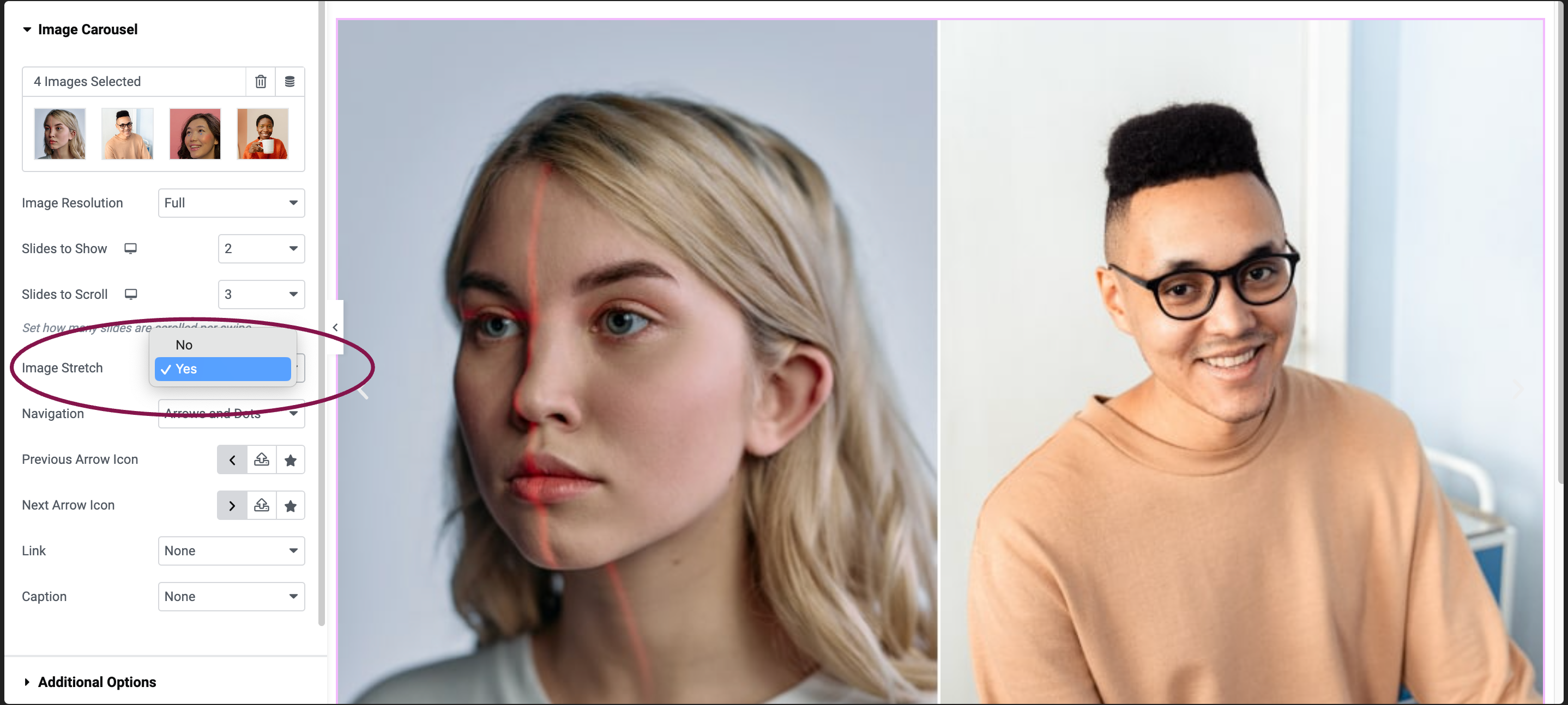
- Use the Image Stretch field to decide if you want images to stretch to fit the carousel.
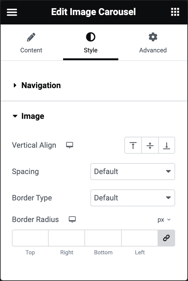
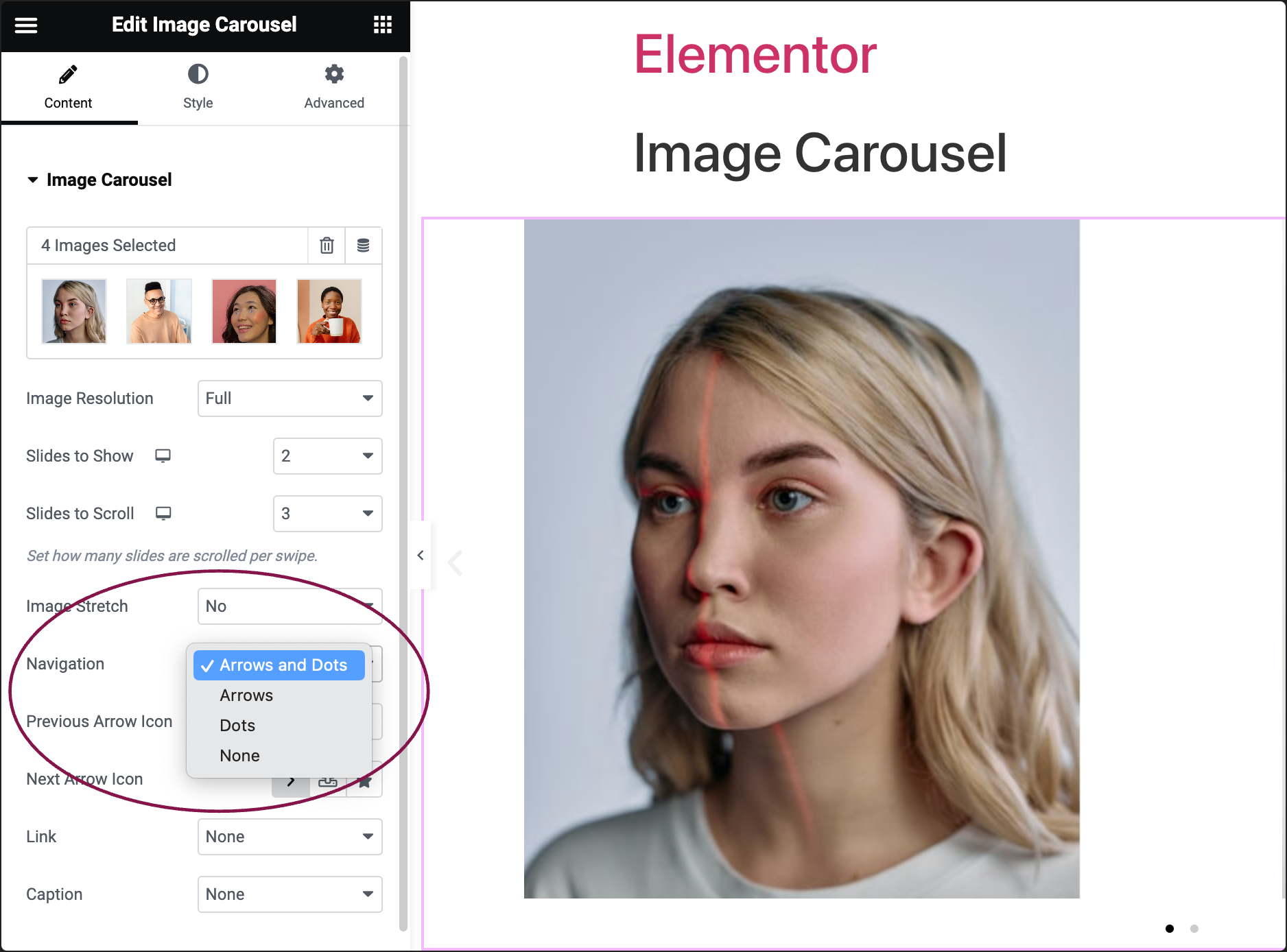
- Use the Navigation field to choose how users can navigate between images: Arrows, Dots, Both, or None.
- If you choose an arrow, you can select Previous Arrow Icon and Next Arrow Icon.
- Click the
 star button to replace the arrow with an icon from the icon library.
 - Click the
 SVG button to replace the arrow with an uploaded SVG image. For more details, see Enable SVG Support in Elementor.
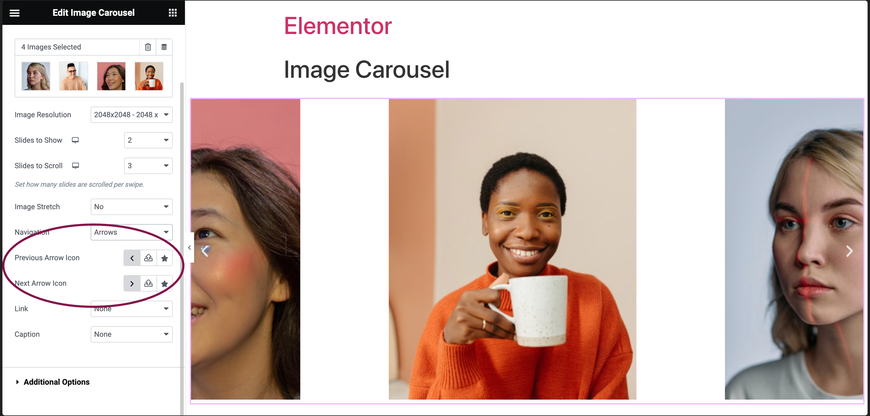
- Click the
- If you choose an arrow, you can select Previous Arrow Icon and Next Arrow Icon.
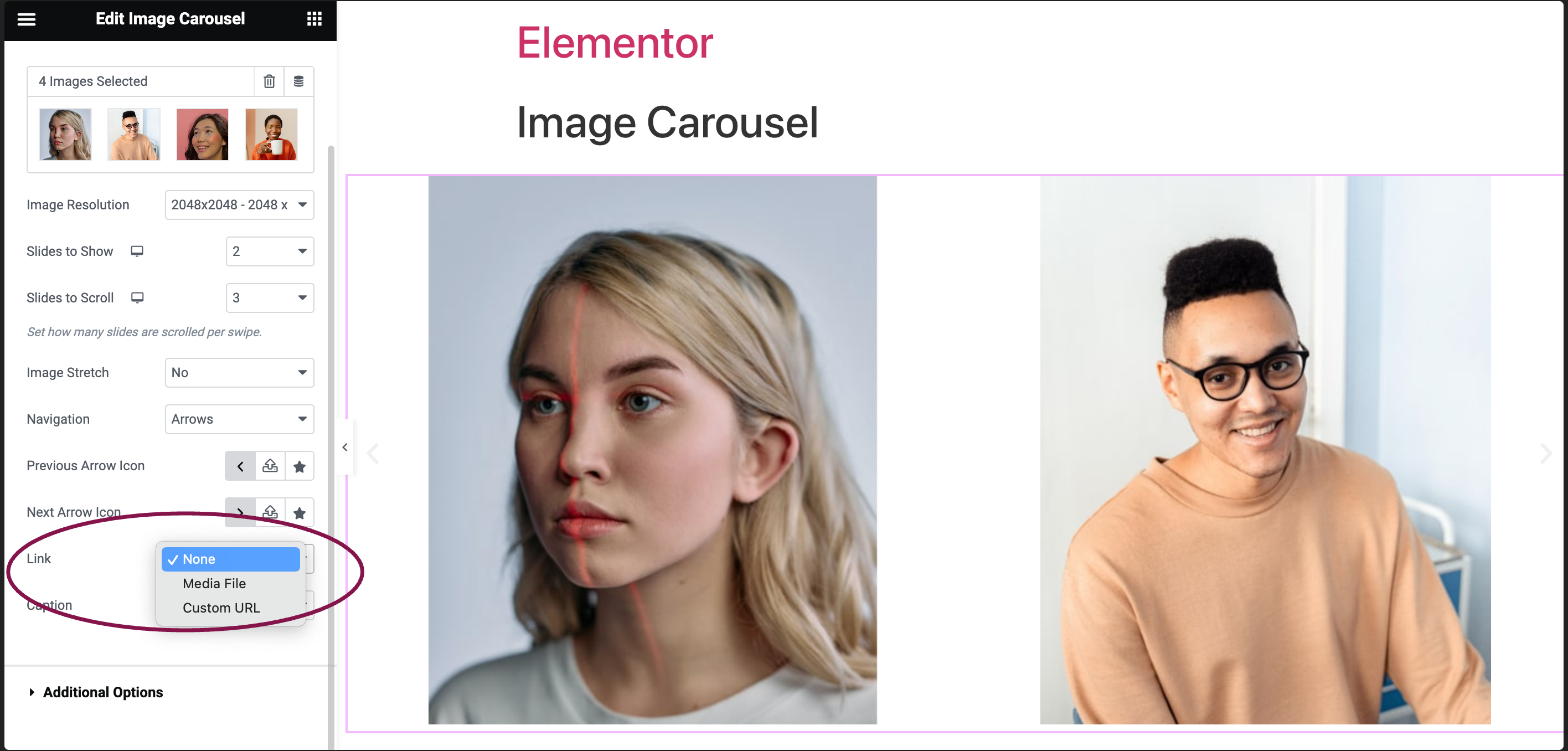
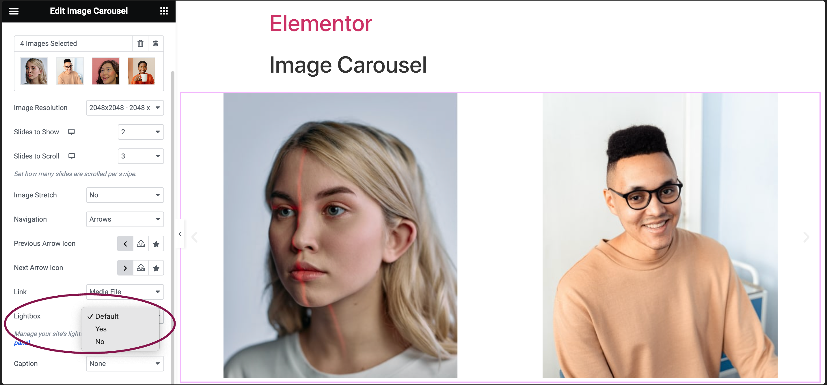
- Use the Link field to link images to their respective Media Files, add Custom URLs, or choose None.
- If you choose Media Files, you get an option to open images in a Lightbox:
- You can choose whether to show images in a lightbox. Selecting Yes or No will override the default lightbox setting.
- You can choose whether to show images in a lightbox. Selecting Yes or No will override the default lightbox setting.
- If you’re adding a Custom URL:
- Click the ⚙️ to set the link to either open in a new window or to add rel=nofollow to the link.
- Use the Custom Attributes option to assign custom attributes to the link element. Use the | (pipe) for key-value separation and commas to separate pairs.

- If you choose Media Files, you get an option to open images in a Lightbox:
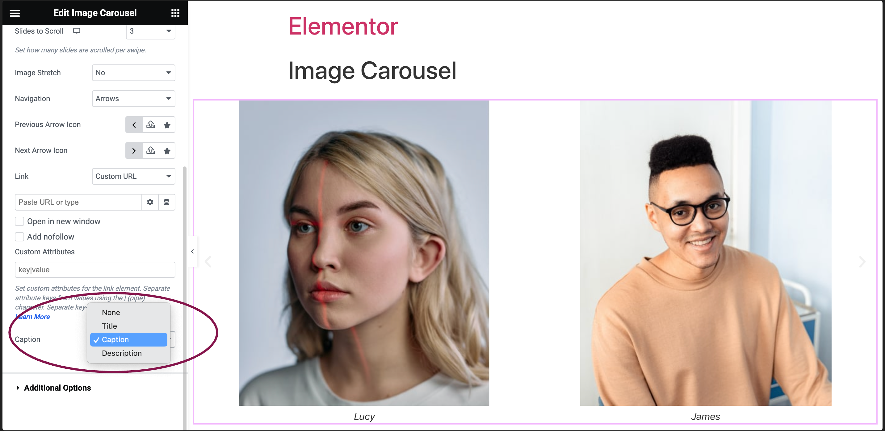
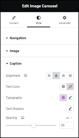
- Use the Caption field to set image captions to None, Title, Caption, or Description.