help center

On this page

Heading widget

Last Update: February 8, 2024

Add the widget

heading widget icon Heading widget 1

To access and use a widget:

  1. In Elementor Editor, click +.
    All available widgets are displayed.

  2. Click or drag the widget to the canvas. For more information, see Add elements to a page.

What is the Heading widget?

Headings or titles are one of the most essential elements of any website. The Heading widget allows you to insert and customize page headings without using any code.

Common use case

Sarah is building a website for a bakery. At the top of the homepage, they added a prominent heading with the text Baking With Love and selected the <h1> HTML tag for SEO benefits. They then customized the typography to make the title stand out, using a warm, inviting font style that aligns with the bakery’s brand identity.

use case elementor heading widget

Additional use cases 

  • Blog post titles and subtitles.
  • Create testimonial headings.
  • Interactive Call-to-Action (CTA) titles.

Add a Heading widget: Step-by-step

  1. Add the heading widget to the canvas. For details, see Add elements to a page.
    add the heading widget
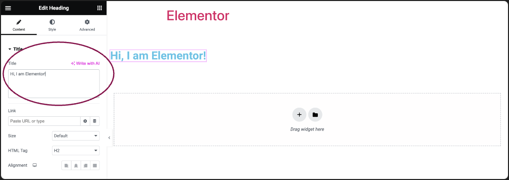
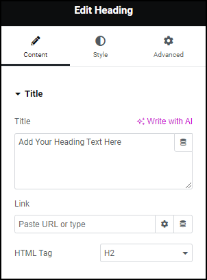
  2. In the Content tab, under Title, add the main text for your heading.
    add heading link
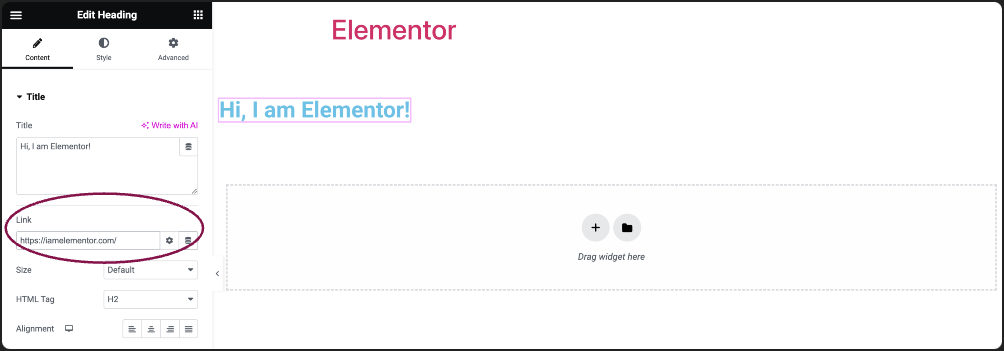
  3. Enter the URL in the Link field to make your heading clickable and direct visitors to a specific webpage.
    heading tag
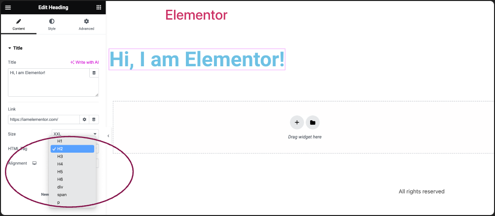
  4. Use the HTML Tag field to define the type of HTML tag for your heading. Choices include H1 to H6, Div, Span, or Paragraph.
    In the Style tab Choose alignment Heading widget 7
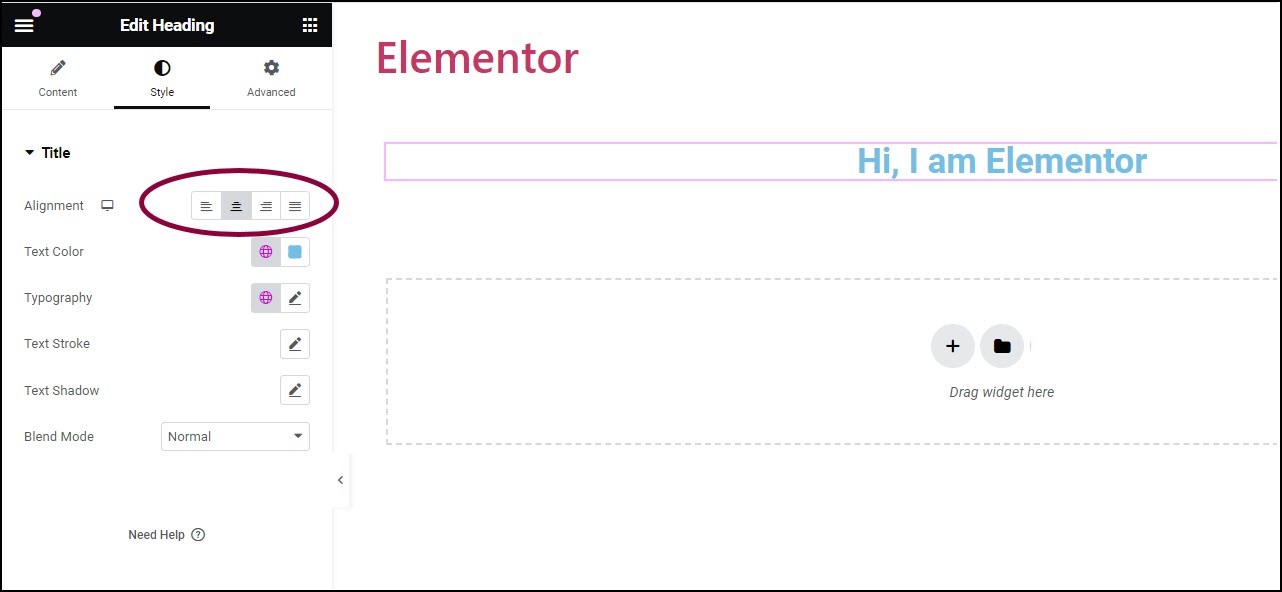
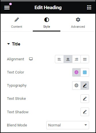
  5. In the Style tab, the Alignment field allows you to choose where your heading appears on the page. Options available are left-aligned, right-aligned, centered, or justified.
    Use typography to set the font size and type Heading widget 9
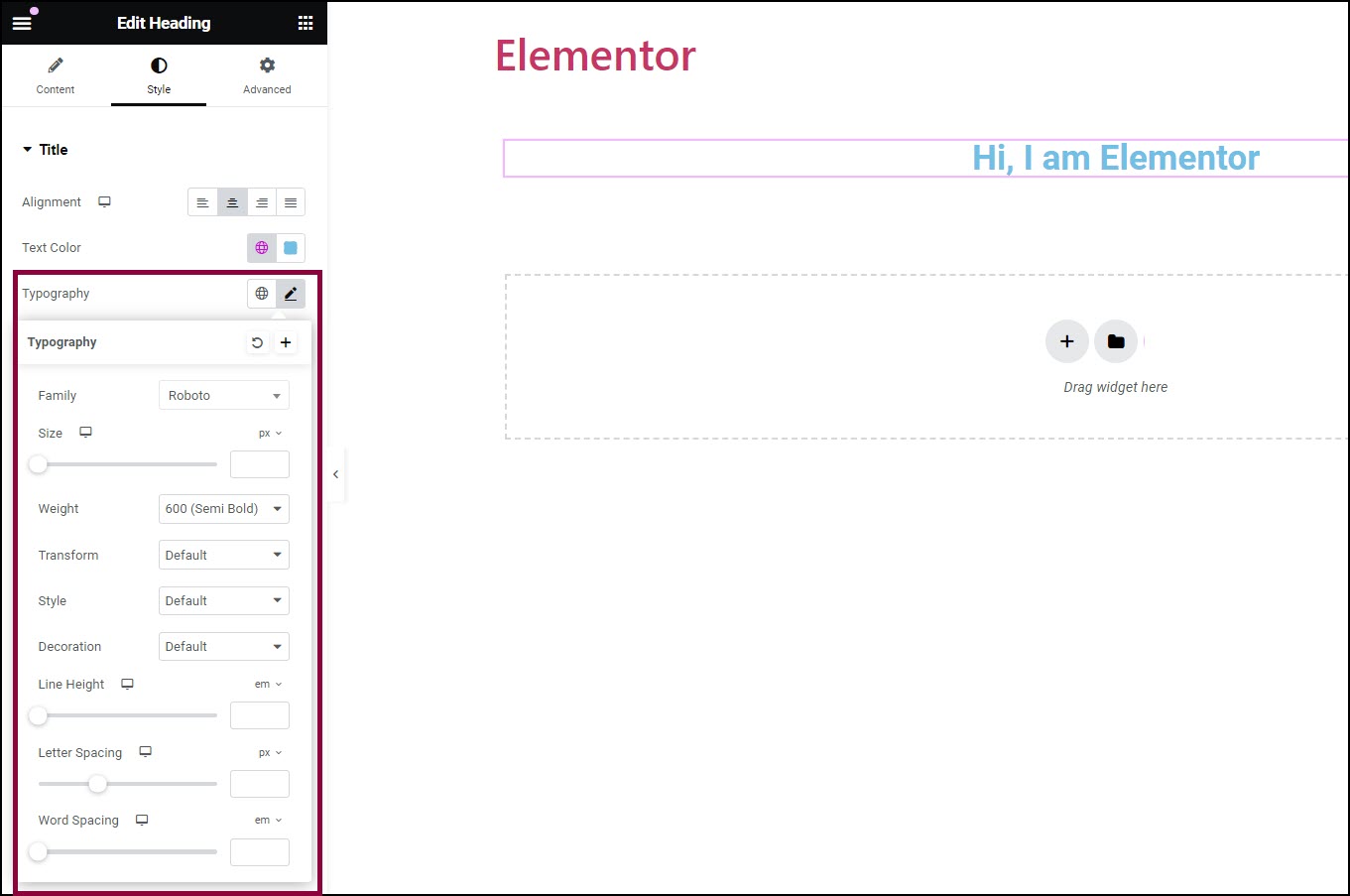
  6. Use the Typography field to configure the size and font type.

Settings for the Heading widget

You can customize your widgets using content, style, and other advanced parameters, offering you great flexibility in tailoring them to your needs. Click the tabs below to see all the settings available for this widget.

Content tab Heading widget 11

Enter the text for your heading.

The link field allows you to connect your heading to a specific webpage by adding a URL.

Choose the HTML tag for your heading. Choices include H1 to H6, Div, Span, or Paragraph.

The style tab Heading widget 13

Position your heading to the left, right, center, or justified.

Pick a color for your heading text.

Customize the font style, size, and other typography settings for your heading. For more details, see Typography.

Click the 🖋️ icon to apply a stroke effect to the title. Learn more about Text Stroke.

Click the 🖋️ icon to add a shadow to the title. Learn more about Shadows.

Apply unique layer effects like Normal, Multiply, Screen, Lighten, and more to your heading.

advanced tab of the heading widget

To learn more about advanced settings, see Advanced Tab.

Have more questions? We’re more than happy to assist.

Link is copied to clipboard!
On this page

Is this article helpful?

Share this article