Theme Style settings are global settings that allow you to set default styling options for various elements, such as Backgrounds, Headings, Buttons, Images, and Form Fields. These settings override the theme styling settings and takes its place, allowing you to use Elementor to set styles for elements not built by Elementor. By default, this will apply styles only to non-Elementor elements, for example, WooCommerce checkout fields, Contact Form 7 labels, 3rd-party headings and much more. If you prefer, you can force these Theme Style settings to also apply to Elementor-built elements as well.
Note: Elementor Pro users can also set Global Custom CSS which lets you apply custom CSS rules to your entire site.
To Apply Theme Styles To Elementor Elements:
In order to apply the Theme Style settings to most of Elementor’s elements and widgets as well, you will need to disable Elementor’s default colors and fonts.
To disable Elementor’s default colors and fonts:
- From WP Admin, navigate to Elementor>Editor>Settings.
- Use the checkboxes to Disable Default Fonts and Disable Default Colors..
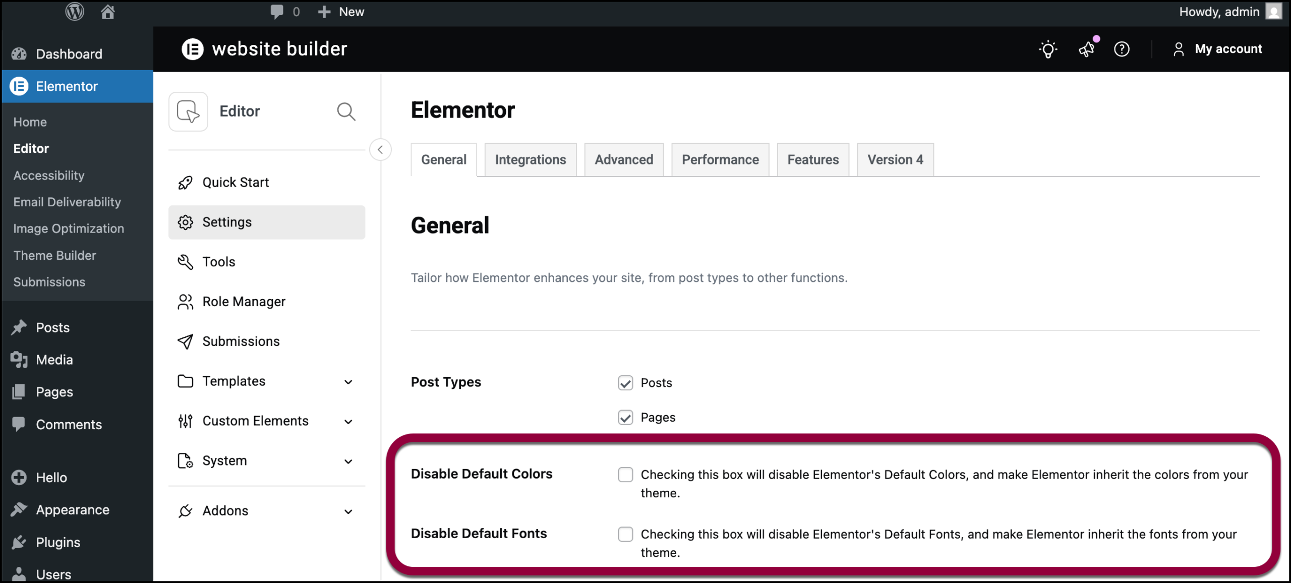
- Use the checkboxes to Disable Default Fonts and Disable Default Colors.
Elementor’s default colors and fonts are disabled, allowing the theme style to override them.
How To Set Theme Styles
You can change the theme’s styles from within the Elementor Editor.
To change the theme style:
- Click the Elementor logo on the top toolbar.

- Select Site Settings from the dropdown menu.

The Site Settings menu appears.NoteYou can also access Site Settings from WP Admin by navigating to Elementor>Editor and clicking Site Settings.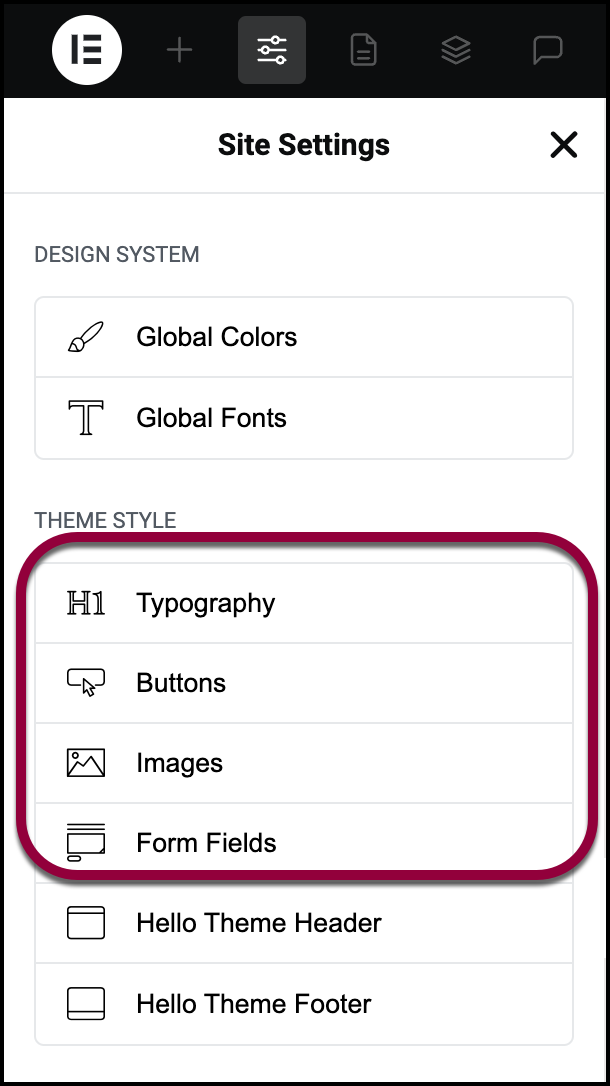
- Click the element style you would like to change:
- Typography
- Buttons
- Images
- Form Fields
Typography Options
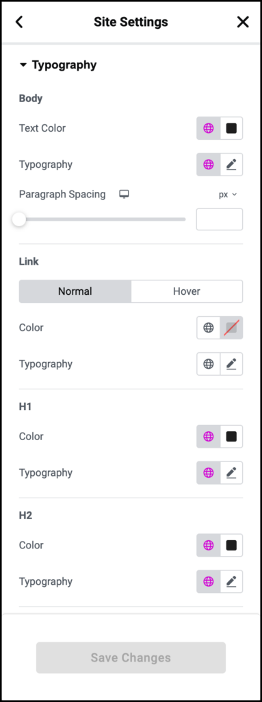
Text Color: Choose the color of the default text
Typography: Change the typography options for the default text
Paragraph Spacing: Set the amount of default spacing after a paragraph (margin-bottom)
Link
Normal | Hover
Color: Choose the default color of links for both normal and hover states
Typography: Change the default typography of links for both normal and hover states
H1-H6
Color: Choose the default color for each Heading (H1, H2, H3, H4, H5, and H6)
Typography: Set the default typography options for each Heading (H1, H2, H3, H4, H5, and H6)
Buttons Options
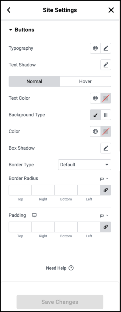
Typography: Change the default typography for buttons
Text Shadow: Set the default text shadow for buttons
Normal | Hover
Text Color: Choose the default color for button text
Background Color: Choose the default background color of buttons
Border Type: Set the default type of border for buttons (None, Solid, Double, Dotted, Dashed, Groove)
Box Shadow: Set the default box shadow options for buttons
Border Radius: Set the default border radius to control corner roundness of buttons
Padding: Change the default button padding settings
Form Fields Options
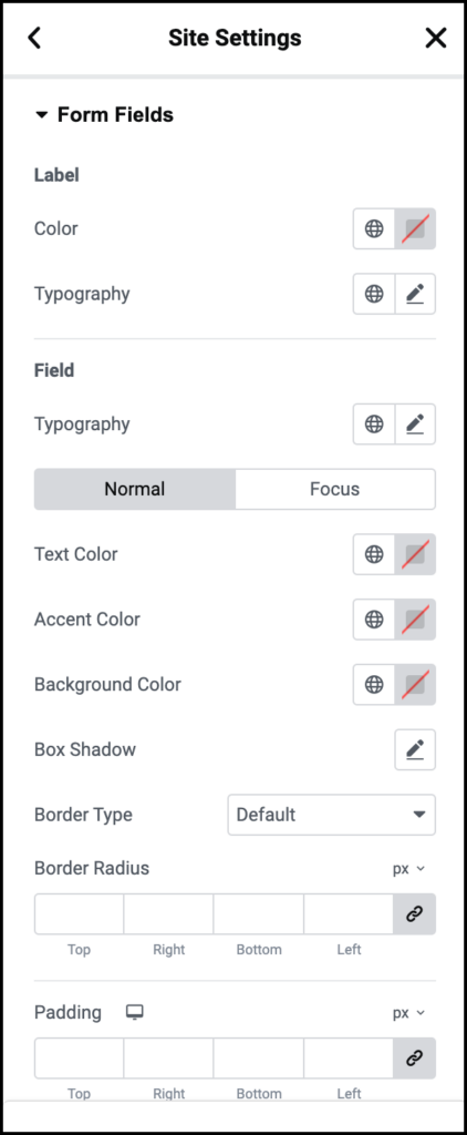
Label
Color: Choose the default text color for the Field Labels
Typography: Set the default typography options for Field Labels
Field
Typography: Set the default typography options for Input Field text
Normal | Focus
Text Color: Choose the default text color for Input Field text
Background Color: Choose the default background color for Input Fields
Border Type: Set the default type of border for Input Fields (None, Solid, Double, Dotted, Dashed, Groove)
Border Radius: Set the default border radius to control corner roundness of Input Fields
Box Shadow: Set the default box shadow options for Input Fields
Transition Duration (ms) (Focus only): Set the default amount of time, in milliseconds, for the Focus Transition to take place.
Padding: Set the default padding options for Input Fields
Images options
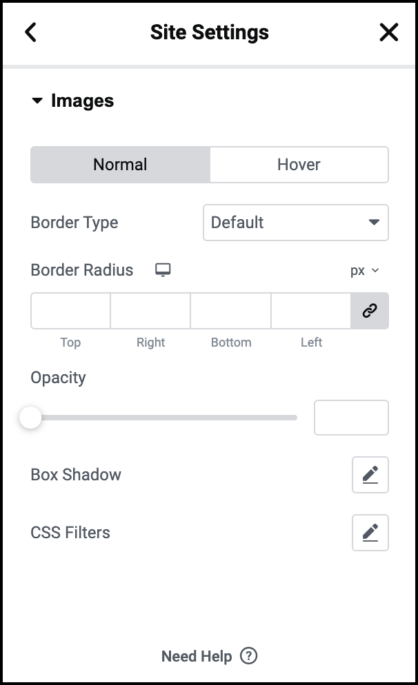
Normal | Hover
Border Type: Set the default type of border for Images (None, Solid, Double, Dotted, Dashed, Groove) in both Normal and Hover modes
Border Radius: Set the default border radius to control corner roundness of Images in both Normal and Hover modes
Opacity: Set the default opacity level of Images in both Normal and Hover modes
Box Shadow: Set the default box shadow options for Images in both Normal and Hover modes
CSS Filters: Set the default CSS Filters: Blur, Brightness, Contrast and Saturation for images in both Normal and Hover modes
Transition Duration (ms) (Hover only): Set the default amount of time, in milliseconds, for the Hover Transition to take place.
Undo / Redo & Draft / Publish
Just like any other Elementor editing you might do, Theme Style works with the Revisions and History controls, so you can undo / redo any changes, and can always revert back to an earlier version of your Theme Style design.
Theme Style also works with Draft and Publish modes, so you can test the changes and save them to draft, without having them affect your live site. Your live site will only get the changes applied when you click the Theme Style’s Publish button.
HTML Elements Affected
Note: Some elements won’t get affected because Elementor doesn’t allow editing them (e.g fieldset, input[type=”reset”] and more)
Background color:
<body>
Buttons:
- button
- input[type=”button”]
- input[type=”submit”]
- .elementor-button
- Paragraph spacing:
- <p>
Links:
- <a>
Headings:
- <h1>
- <h2>
- <h3>
- <h4>
- <h5>
- <h6>
Form:
- label
- input:not([type=”button”]):not([type=”submit”])
- textarea
- .elementor-field-textual
Images:
- <img>
Troubleshooting – All My Theme Styles Disappeared
This happens when the Default Kit is deleted. If you go to Templates > Saved Templates, and then select to view All templates, you will see a new template listed there, called Default Kit. The Theme Styles are stored in this Saved Template. The Default Kit template, if deleted, will automatically recreate itself, but deleting it will remove all settings stored in the Theme Styles, so only delete this template if your goal is to completely reset your Theme Styles.