Introduction
When there are several evenly spaced identical elements in a container there can be issues with responsive design. Elements may not line up as you would like for different screen widths.
Normally, creators would have to customize designs for these differing screen sizes, but with this trick you can drastically cut down the amount of customization needed.
In this article on spacing identical elements in a container, we demonstrate best practices using widgets. But in this case we want to add an extra design element, a divider, which means we won’t be able to use an icon box. Instead we’ll be using nested containers.
Spacing the items in the container
We’ll be using these different properties for this exercise:
- Justify content
- Container width
- Element gap
- Wrap
- Element size
- Manipulating viewport width
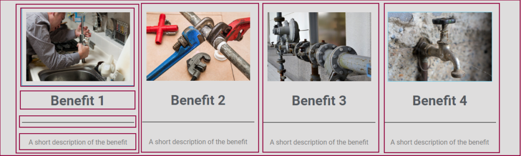
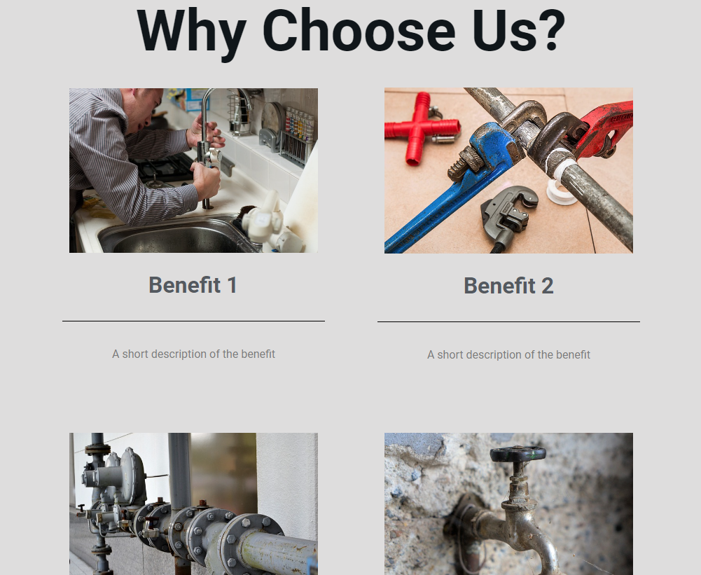
We’ll start, as usual, with the desktop design. Instead of adding four icon box widgets we’ll add four nested containers, each of which contains four nested containers. In addition, instead of using an icon we’ll use an image.
In this article we’ll refer to the largest container as the outer container and the four containers inside the outer container as the middle containers. The containers actually holding the content will be referred to as the interior containers.
Note: Building the page with these nested containers should not lower the page speed.
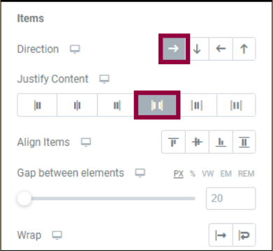
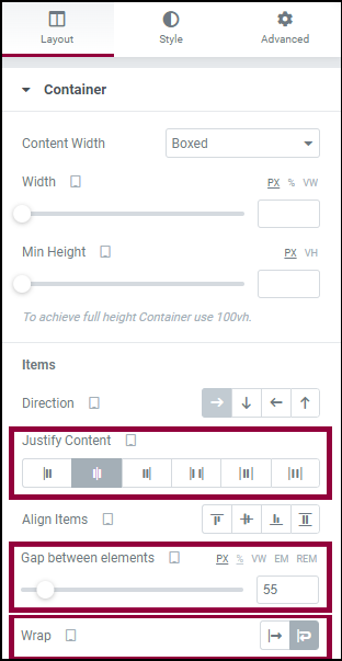
- In the Layout tab of the outermost container, we’ll set the elements so they display in a row with Justify Content set to space between, which will create even space between the middle containers.
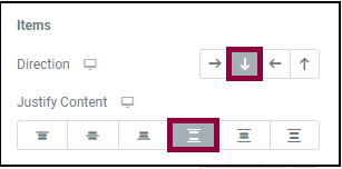
- In the Layout tab of the middle containers, we’ll set the elements so they display in a column with Justify Content set to space between, which will create even space between the containers.
- Now we’ll add an element gap that will ensure the elements maintain space between each other. In theory, setting Justify Content to Space Between will maintain this space, there are edge cases where this doesn’t work. So we’ll set Element Gap to 5% (this will vary with your design but will generally range from 1-9%).
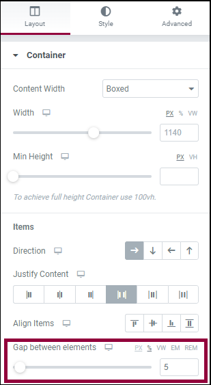
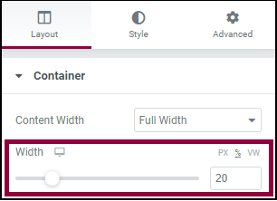
- Next we’ll define the middle containers’ width. In this exercise, setting a specific width isn’t strictly necessary because all the containers are identical, but this is a rare circumstance in real web design. So we’ll go to the Advanced tab and set a custom width of 20% for each middle container.
Pro tip: To save time, after editing the first widge, right-click on the upper-right corner of the container. Then select Copy from the dropdown. Right-click on the upper-right corner of another container and select Paste Style from the dropdown. The second container will copy the settings, such as container width, from the first container.
Now we’re ready to customize the design for responsive mode.
- Enter responsive mode.
- Select tablet.
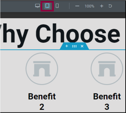
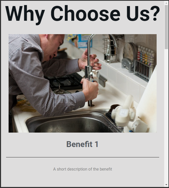
- While we can see all four elements on the screen, a two column design would probably look better on a tablet. In order to divide the middle containers into two columns we’ll set the outer container to Wrap.
- Set Justify Content to Center. This will prevent the elements from spreading out too much on widescreen tablets.
- Switch the Gap between elements to PX (pixels) and change the setting to 55px. We’ve found that in tablets and mobile devices pixels work best with Gap between elements.
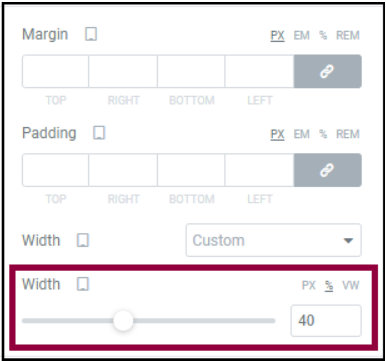
- Set the width for each middle container to 40% (when dividing into columns, we usually choose a percentage that adds up to a little less than 100%).
- Enter responsive mode.
- Select Mobile.

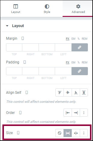
- Go to the Advanced tab of the middle containers and set the size to Grow. This will ensure that these containers will take up optimal space no matter what the width of the visitor’s mobile device.
- Use the viewport handles to check the layout and make any necessary adjustments to the elements.
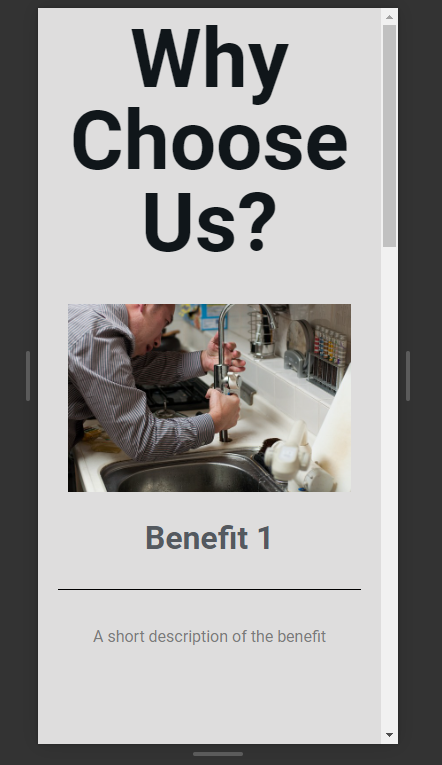
In most cases the layout should work for mobile devices, even wide screen mobile devices. This will save creators from having to design for additional custom breakpoints.
Next steps
For more insights, check out our article on learning about Flexbox Containers. To get the most out of Elementor, check out the Knowledge hub for helpful learning resources.