Introduction
When there are several evenly spaced identical elements in a container there can be issues with responsive design. Elements may not line up as you would like for different screen widths.
Normally, creators would have to customize designs for these differing screen sizes, but with this trick you can drastically cut down the amount of customization needed.
Using this method, you’ll only need to customize one mobile breakpoint instead of several, in most cases.
Spacing the items in the container
We’ll be using four different properties for this exercise:
- Justify content
- Widget width
- Element gap
- Manipulating viewport width
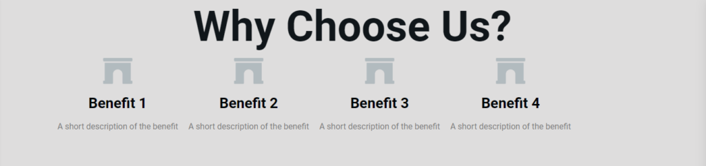
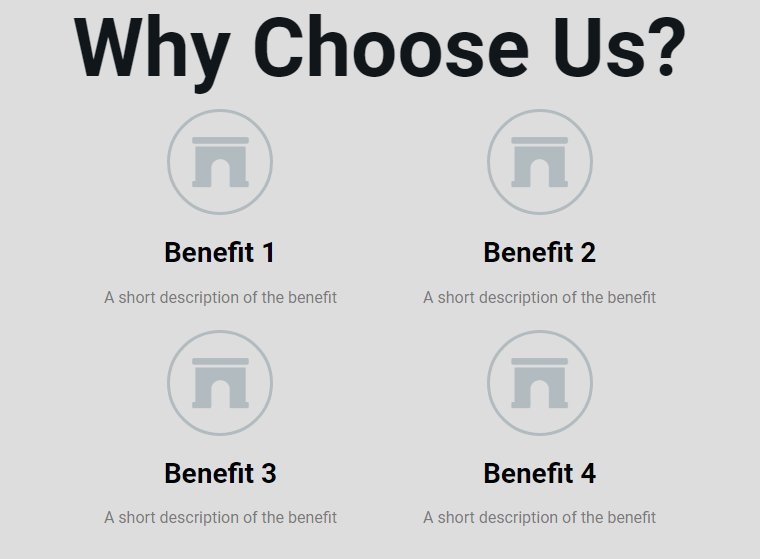
We’ll start, as usual, with the desktop design. We’ll be working with a container and four nested elements. In this case, we’re using icon box widgets but it could also be nested containers.
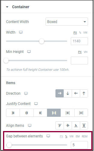
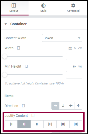
- In the Layout tab of the container, we’ll set the elements so they display in a row with Justify Content set to space between, which will create even space between the widgets.
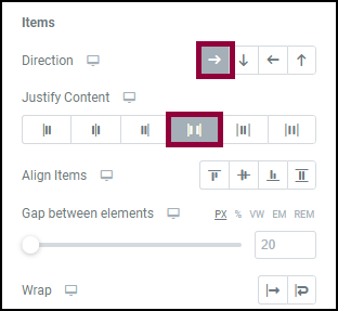
Set the Direction to row and Justify Content to space between. - Next we’ll define the widgets’ width in the Advanced tab. In this exercise, setting a widget width isn’t strictly necessary because all the widgets are identical, but this is a rare circumstance in real web design. So we’ll go to the Advanced tab and set a custom width of 15% for each widget. (Pro tip: To save time, after editing the first widget, right-click on the upper-right corner of the widget. Then select Copy from the dropdown. Right-click on the upper-right corner of another widget and select Paste Style from the dropdown. The second widget will copy the settings, such as widget width, from the first widget.)
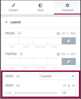
Set the width to 15%. - Go back to the Layout tab and add an element gap that will ensure the elements maintain space between each other. In theory, setting Justify Content to Space Between will maintain this space, there are edge cases where this doesn’t work. So we’ll set Element Gap to 5% (this will vary with your design but will generally range from 1-9%).
Now we’re ready to customize the design for responsive mode.
- Enter responsive mode
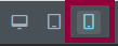
Click this icon to enter responsive mode. - Select tablet
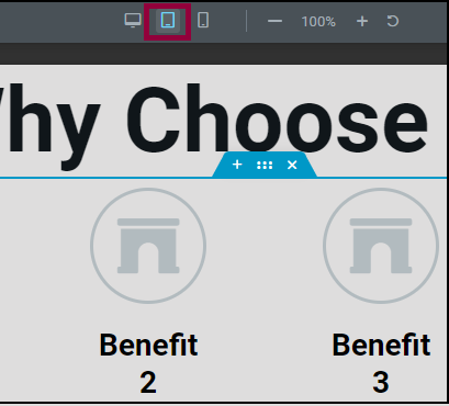
Select the tablet icon to view the page as it would appear on a tablet. - While we can see all four elements on the screen, a two column design would probably look better on a tablet. In order to divide these widgets into two columns we’ll set the column width for each widget to 40% (when dividing into columns, we usually choose a percentage that adds up to a little less than 100%). This is done in the Advanced tab of each individual widget. (Note: The elements may not yet appear in two columns. We’ll adjust the Wrap setting later which will produce the column break.)
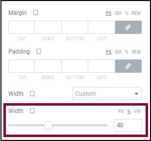
Set the widget widths’ so they add up to a little less than 100% - Select the container
- Open the Layout tab and set Justify Content to Center. This will prevent the elements from spreading out too much on widescreen tablets.
Switch Justify Content to Center. - Switch the Gap between elements to PX (pixels) and change the setting to 55px. We’ve found that in tablets and mobile devices pixels work best with Gap between elements.
- Turn Wrap on. To help ensure that the elements will now appear in two columns.
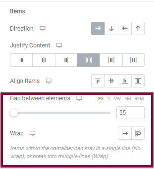
Turning on wrap will ensure the elements appear in two columns - Enter responsive mode
- Select Mobile
- Adjust the Gap between elements to 70px (this value will vary somewhat depending on your design)
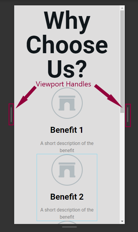
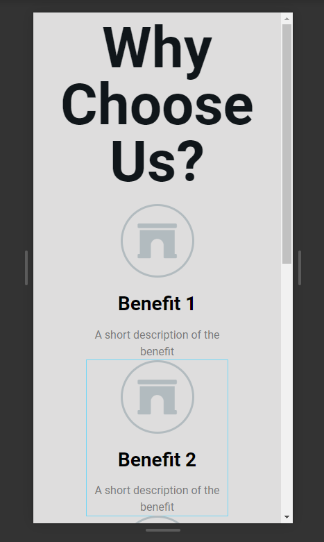
- Use the viewport handles to check the layout and make any necessary adjustments to the elements.
In most cases the layout should work for mobile devices, even wide screen mobile devices. This will save creators from having to design for additional custom breakpoints.
Next steps
Learn how to space identical elements in a container using nested containers.
For more insights, check out our article on learning about Flexbox Containers.
To get the most out of Elementor, check out the Knowledge hub for helpful learning resources.