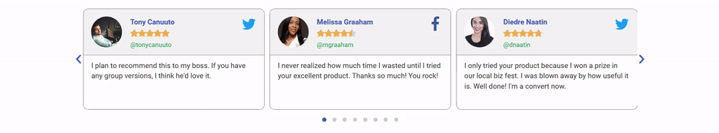
The Reviews widget displays a sliding carousel of user reviews.
Content
Slides
Items
Shows a list of all the items in the slide. You can drag and drop them to change their order. Click on the Add Item button to add another item to the list.
In addition to adding your content manually, the options below also use Dynamic Tags. These tags allow you to retrieve WordPress data, or from plugin sources such as Advanced Custom Fields, or WooCommerce products. Items that have the ability to use dynamic data will have the “stack” icon beside the fields input.
- Image: Upload or choose the reviewer’s image
- Name: Enter the reviewer’s name
- Title: Enter the reviewer’s job title
- Rating: Assign a numerical rating, from 0.0 to 5.0
- Icon: Choose the type of icon to use, either Font Awesome or Unicode
- Link: Link the review to a URL
- Review: Enter the text of the review
Tip: Quickly duplicate or delete items by clicking an item’s Duplicate or Delete icon 
- Slides Per View: Select the number of slides to show at one time, from 1 to 10
- Slides to Scroll: Select how many slides to scroll per swipe, from 1 to 10
- Width: Set the width of the carousel, in percentage or pixels
Additional Options:
- Arrows: Show or hide the navigation arrows
- Pagination: Select the carousel pagination style, either None, Dots, Fraction, or Progress
- Transition Duration: Set the time between slide movement, in milliseconds
- Autoplay: Slide to YES to have the carousel slide automatically
- Autoplay Speed: Set the speed at which the carousel will slide, in milliseconds
- Infinite Loop: Set to YES to have the carousel continue sliding, infinitely
- Pause on Interaction: Set to YES to have the autoplay pause when the carousel is hovered over with a mouse or clicked
- Image Resolution: Set the size of the image, from thumbnail to full, or enter a custom size
- Lazy Load: Toggle to enable lazy loading of the images.
Style
Slides
- Space Between: Control the space between review items
- Background Color: Choose the background color of the review card
- Border Size: Set the thickness of the border around the review card. Size can be in PX, EM or REM. For more details about units of measurement, see Units of measurement.
- Border Radius: Set the border radius to control corner roundness
- Border Color: Choose a color for the border
- Padding: Set the padding within the border of the review card’s box
Header
- Background Color: Choose the background color of the review card’s header
- Gap: Control the space between the Header and the Review text
- Separator: Choose to show or hide the separator line between the header and the review text
- Color: Choose the color of the separator line
- Size: Set the height of the separator line. Size can be in PX, EM or REM. For more details about units of measurement, see Units of measurement.
Text
Name / Title / Review
- Color: Choose the color of the Name/Title/Review
- Typography: Change the typography options for the Name/Title/Review
Image
- Image Resolution: Adjust the size of the reviewer’s image. Size can be in PX, EM or REM. For more details about units of measurement, see Units of measurement.
- Image Gap: Control the space between the image and the reviewer’s profile information
- Border Radius: Set the border radius to control corner roundness
Icon
- Color: Set the color of the social icon. Choose either the Official Color of the social network, or set a custom color of your choice
- Size: Adjust the size of the social icon. Size can be in PX, EM or REM. For more details about units of measurement, see Units of measurement.
Rating
- Icon: Choose the type of icon to use, either Font Awesome or Unicode
- Unmarked Style: Choose Solid or Outline for unmarked icons
- Size: Set the size of the rating stars. Size can be in PX, EM or REM. For more details about units of measurement, see Units of measurement.
- Spacing: Adjust the amount of space between each star
- Color: Choose the color of the rating stars
- Unmarked Color: Choose the color of the unmarked portion of the stars
Navigation
Arrows / Pagination
- Size: Adjust the size of the navigation arrows. Size can be in PX, EM or REM. For more details about units of measurement, see Units of measurement.
- Color: Choose the color of the navigation arrows
Note: Autoplay is affected by Google’s Autoplay policy on Chrome browsers.