Introduction
Containers have additional options in the Advanced tab to increase design flexibility.
For hands-on experience with arranging elements in a container, check out our container playground.
Layout Settings
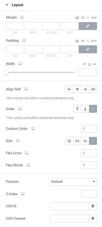
Margin
The margin controls the amount of space “outside” the element. The value may be set in PX, EM, %, and REM. You may click the chain icon to unlink the values if you need to set these individually.
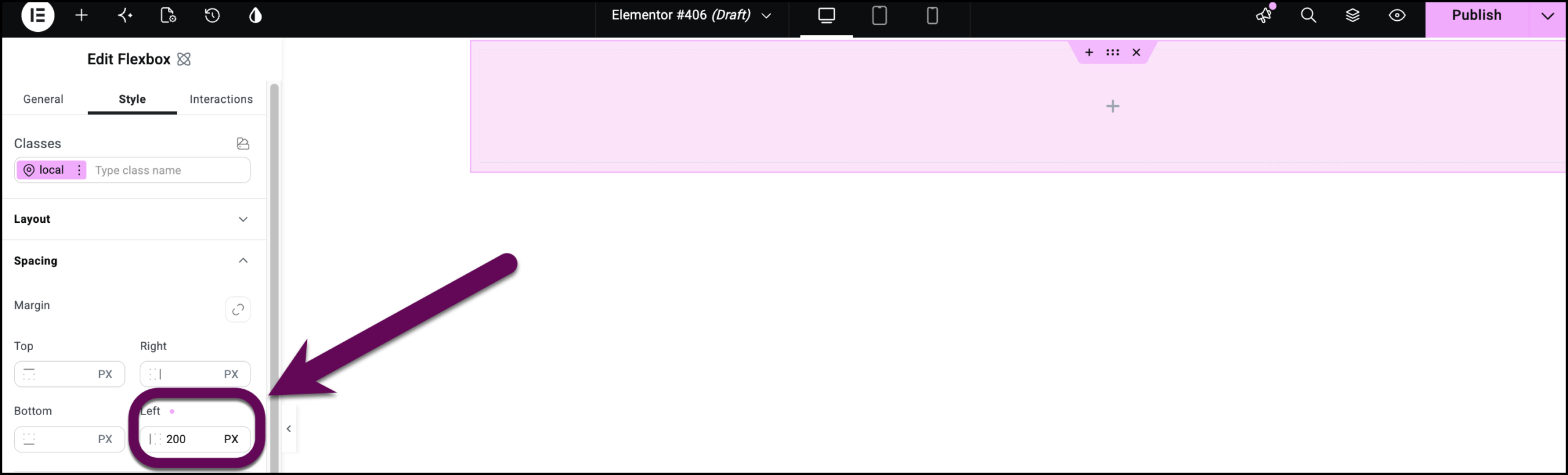
If you need to use a left/right margin, you can do it within the child container.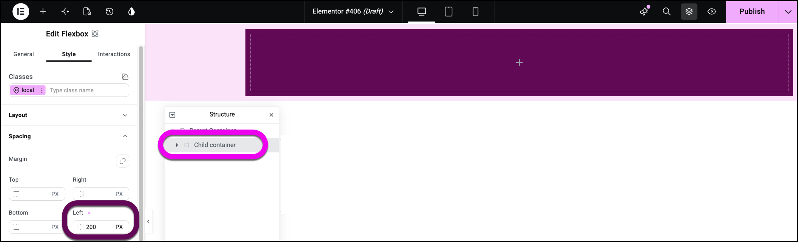
Padding
The padding controls the amount of space “inside” the element. The value may be set in PX, EM, %, and REM. You may click the chain icon to unlink the values if you need to set these individually.
Tip: Learn more about paddings and margins in this helpful guide.
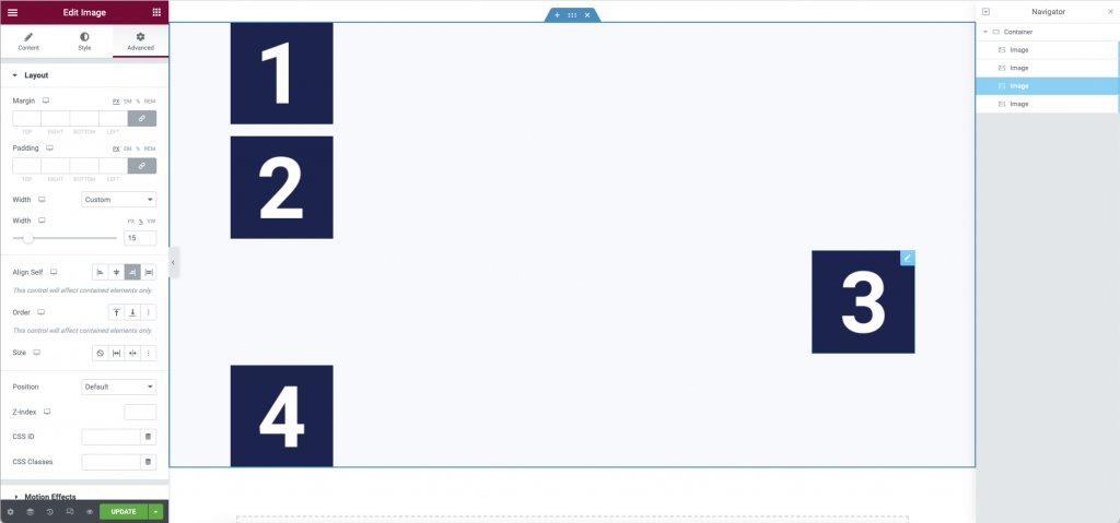
Width (Widgets Only)
The Width property controls the amount of horizontal space that an element uses in the container. Select the width of the element, choosing from Full Width (100%), Inline (auto), or Custom.
Width (Value): This is only available if Custom is chosen. Use the slider to adjust the Width of the element within the container. The value may be set by adjusting the slider, or by entering a value in the field in PX, %, or VW. This is an important property and may be combined with the Wrap property to better optimize your design.
Note: The Inline (auto) feature does not work with Containers. Instead, the Direction property of the Container is used.
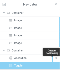
Tip: If the Width property is set using Full Width, Inline or Custom rather than the Default, a blue indicator will be shown in the Structure window. By hovering over these indicators, it will allow you to identify items that use custom positioning or CSS.
Align Self
- The align-self property specifies the alignment for the selected item inside the flexible container. This property will override the flexible container’s align-items property.
- flex-start: The element is positioned at the beginning of the container
- center: The element is positioned at the center of the container
- flex-end: The element is positioned at the end of the container
- stretch: The element is positioned to fit the container
Order
The order is primarily used in combination with the responsive breakpoints. This allows you to order/reorder the elements based on the viewport. (Example: You wish to rearrange three or more elements in mobile view) You may choose between:
- Start
- End
- Custom – If custom is selected the following options will appear:
- Custom Order – Enter value
Learn more about the Order property here.
Size
The flex grow/shrink property specifies how the item will behave relative to the rest of the flexible items inside the same container. You may select between:
- None
- Grow
- Shrink
- Custom – If this option is enabled, the following options will appear:
- Custom Flex Grow – Enter value
- Custom Flex Shrink – Enter value
Learn more about the Size property here.
Position
This option allows you to select absolute or fixed positioning for your element. If using the absolute or fixed positioning, you may manually enter the numeric X and Y positions in the Horizontal and Vertical Offset scales.
- Default Position – The element is in its natural state, positioned merely by the natural flow of the page. This is the default position of all elements.
- Absolute Position – The element is positioned absolutely to its first positioned parent.
- Fixed Position – Set your widget to have a fixed position and place it in a custom position. The element will stay fixed in that position as the page is scrolled. The element is positioned relative to the user’s viewport.
Tip: Confused between Sticky and Fixed? Sticky is a scrolling effect which is relative to the section it’s placed in. Fixed position, however, is relative to the user viewport.
Note: Absolute positioning is not the recommended method for building web page layouts. Having said that, it does come in handy in many situations where you want to position the various page elements more freely.
Z Index
The Z-Index property specifies the stack order of elements. An element with greater stack order will always be in front of an element with a lower stack order (i.e. an element with a Z-index of 10 will be on top of (in front of) an element with a Z-index of 5.
CSS ID
Set a CSS ID for your section. These are used to trigger events or provide anchor links. It is important that you do not add the “#” before the CSS ID in the field.
CSS Classes
Set CSS Classes for your section. These are used when defining CSS rules for your design. It is important that you do not add the “.” before the class in the field.
Example: A class of pink-link could be applied to any element that you have defined in your Custom CSS as .pink-link a {color:#f876f8}.
Next steps
Now that you’ve familiarized yourself with the container’s Advanced tab settings, learn how to save time by saving and reusing container templates.
To get the most out of Elementor, check out the Knowledge hub for helpful learning resources.