Available in Elementor (Free), CSS Grid brings advanced row-and-column layout capabilities directly into the Atomic Editor. It gives you precise control over element placement and sizing, allowing you to build complex compositions – like galleries, card sections, and feature grids – entirely within the atomic system.
Because it integrates natively with Elementor’s Classes and Variables, you can maintain a consistent design system without any extra setup.
Activating CSS Grid
To use CSS Grid, ensure the Atomic Editor framework is active on your site:
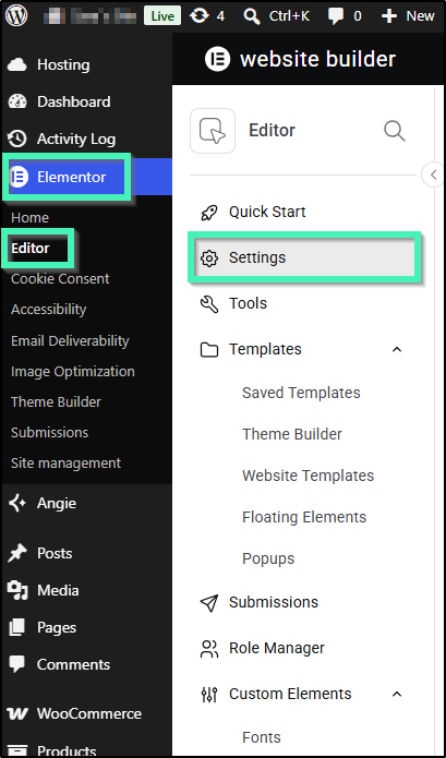
Navigate to Elementor > Editor > Settings.
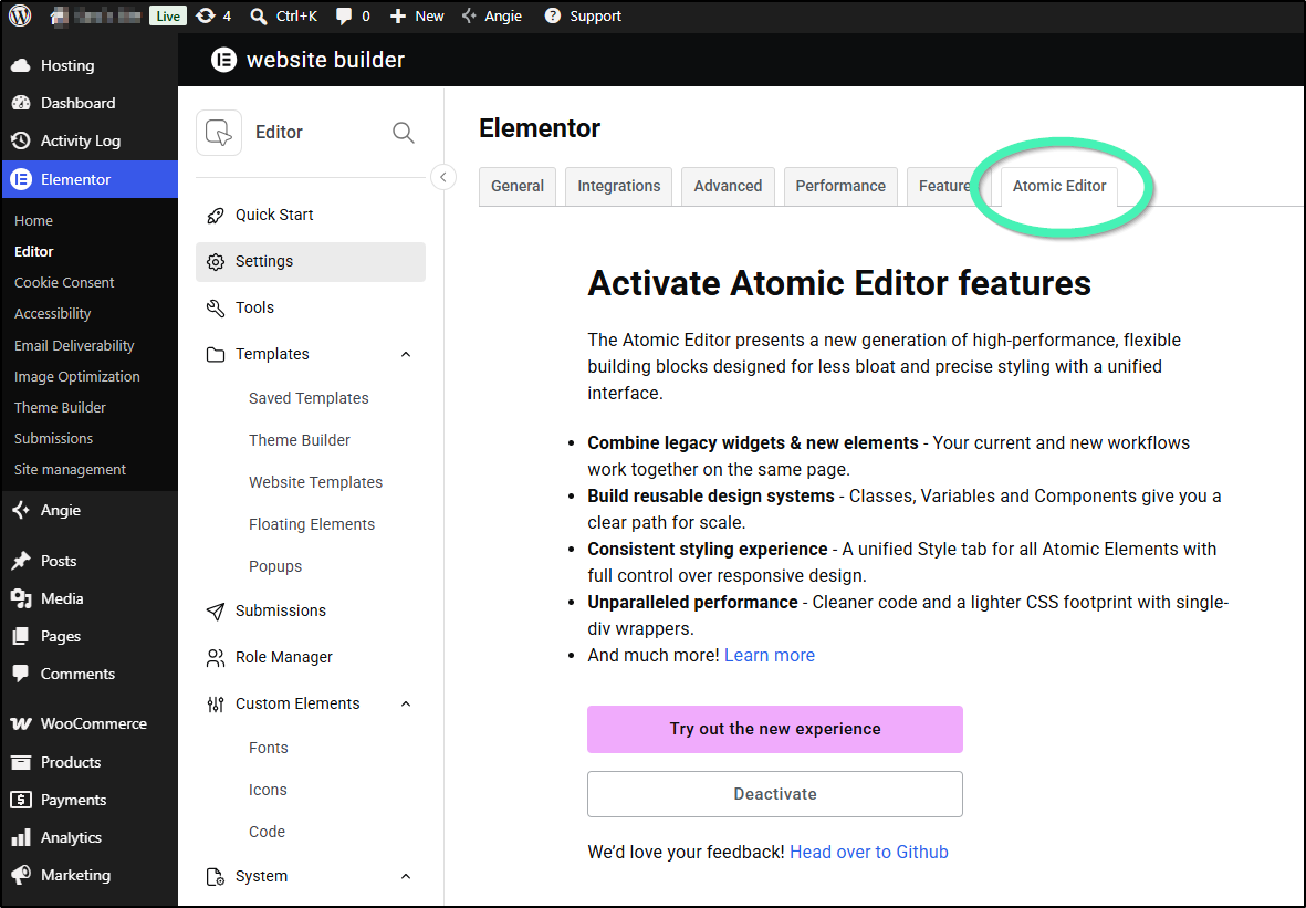
Locate the Atomic Editor card.
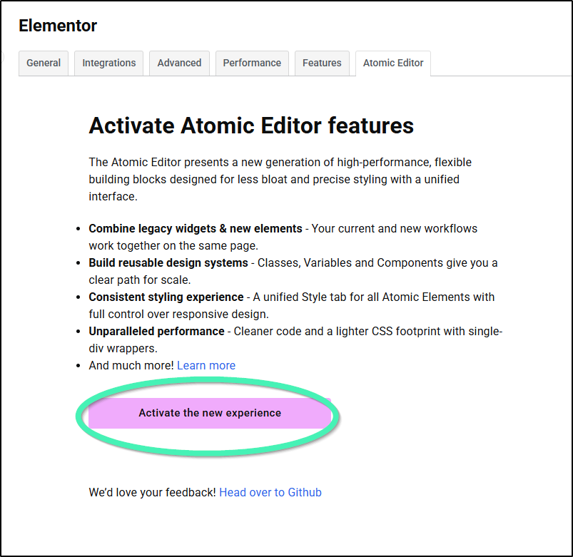
Click the Activate the new experience button.
Core Settings and Controls
Layout Panel Controls
When a Grid container is selected, the Layout panel provides native controls to define explicit column and row tracks. You can use any standard CSS unit, including fr (fractional space) to create fluid layouts.
Grid Child Controls
When an element is dropped inside a Grid container, it gains specialized Grid Child properties located in its Style panel:
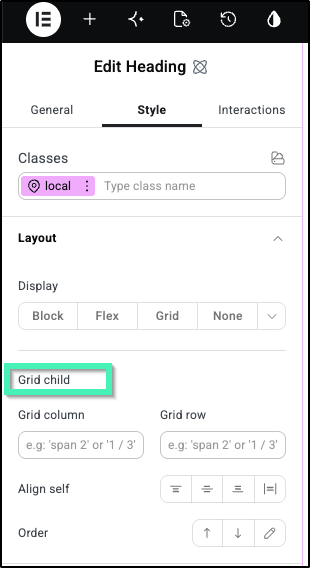
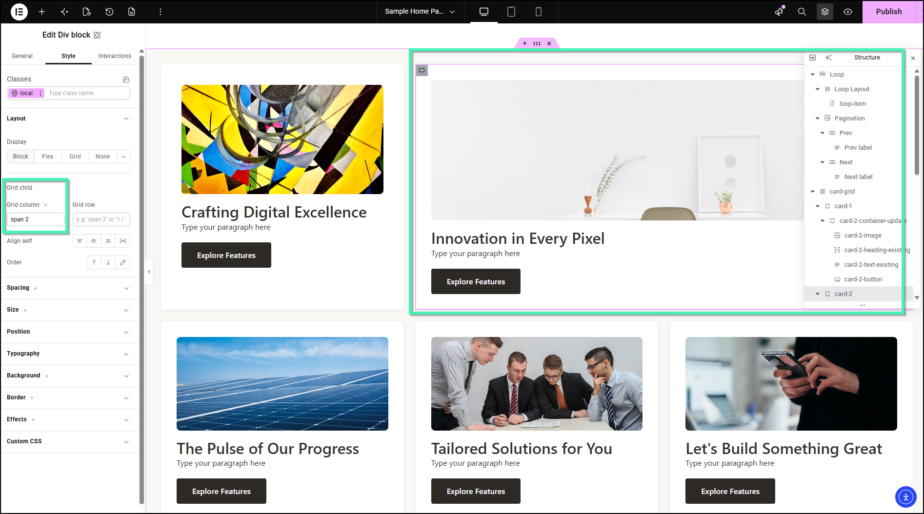
Grid Column / Grid Row: Allows a single element to span across multiple tracks (e.g., making a featured post take up 2 columns).
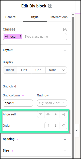
Align Self & Order: Overrides default positioning to control vertical alignment and source-order arrangement independently.
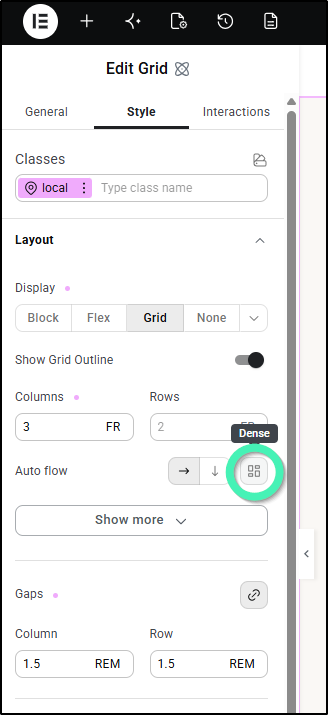
Dense Auto-placement: An advanced algorithm that automatically shifts smaller elements to fill empty cells left behind by larger, spanned elements, eliminating layout gaps.
How to Configure and Use CSS Grid?
To build a responsive product gallery:
Open the Elementor Editor on a new page or an existing one.
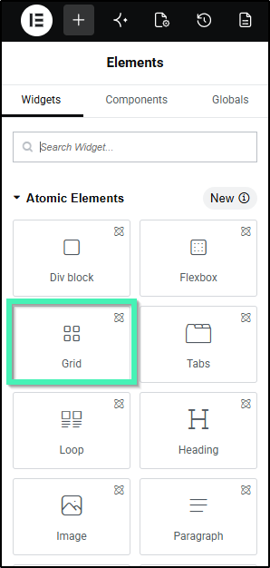
Drag the Grid element from the Elements panel onto the canvas.
Add several child elements (such as Image, Heading, Paragraph, or Button) inside the Grid element.
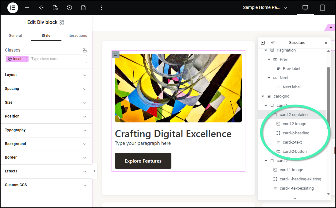
Select the parent Grid element and open the Layout panel.
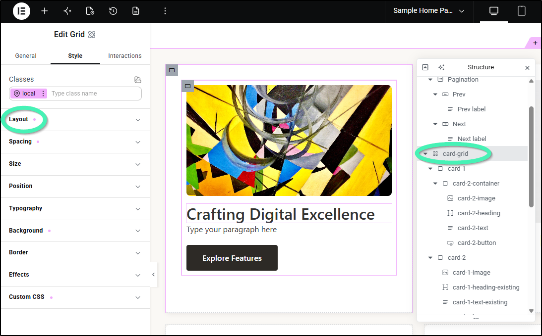
Configure the Grid columns, rows, gaps, and auto-flow settings to define your gallery structure. You can use any CSS unit, including fr for fractional space.
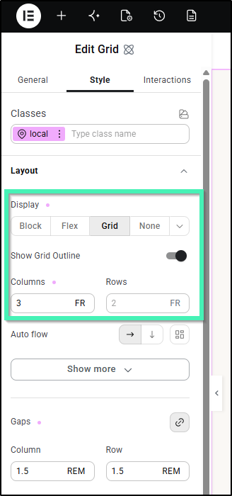
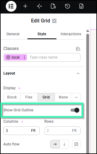
Toggle Show Grid Outline to On to visualize the grid lines directly on the canvas. This outline is an editor-only visual aid and will not appear on the frontend.
Select a child element within the grid and adjust its Column Span and Row Span settings in the Grid Child settings to make it stretch across multiple tracks.
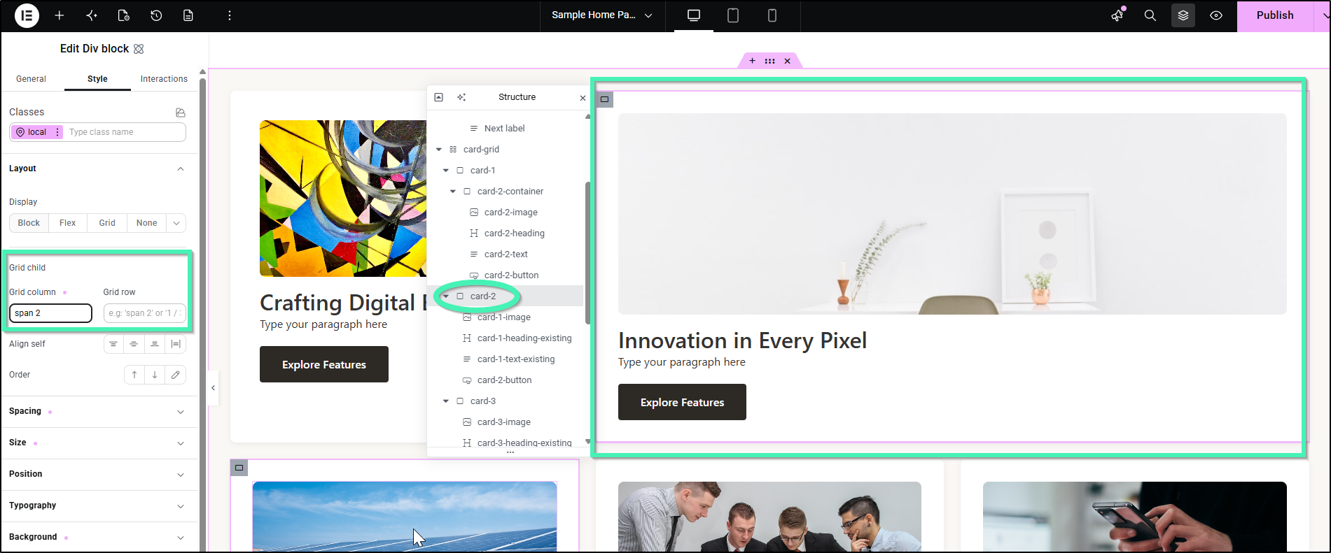
Turn on Dense auto-placement in the parent Grid settings to confirm the layout fills empty spaces left by spanned elements.
Apply existing Classes and Variables to the Grid element and its child elements to maintain design consistency.
Save your page and validate the layout in the Elementor Editor and on the frontend.
Troubleshooting & Editor Performance
Working with complex layouts involving hundreds of nested containers can sometimes impact browser performance. Elementor introduces targeted in-editor performance enhancements specifically optimized for rendering deep, nested CSS Grid layouts seamlessly.
FAQ
Can I convert an existing Flexbox Container to a Grid?
Yes, you can select an existing Atomic Flex container and switch its layout to Grid in the Layout panel.
What is “Dense auto-placement” in CSS Grid?
Dense auto-placement is a setting that, when enabled, allows the grid algorithm to actively fill empty cells left behind by spanned elements, helping to maintain a tight grid layout without manual reordering.