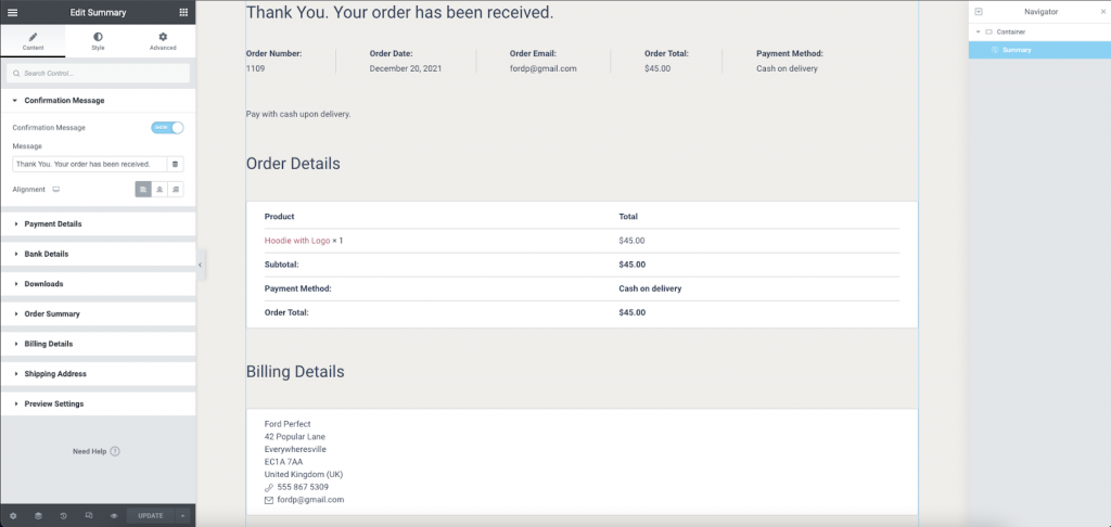
The purchase summary widget is used to create and customize the order confirmation page of WooCommerce.
Steps To Use
- Create a new page and give it a title (example: Thank You For Your Order)
- Publish the page
- Edit the page with Elementor
- Drag the Summary widget to the content area
- Configure the settings and style the sections as desired
- Publish the changes
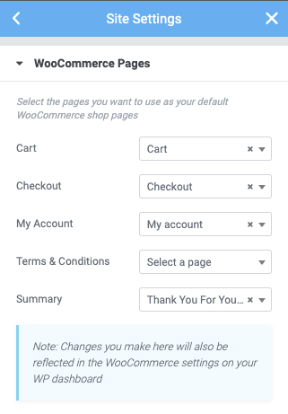
- Assign the page to be used as the WooCommerce Summary Page in Site Settings.
Controls
Content
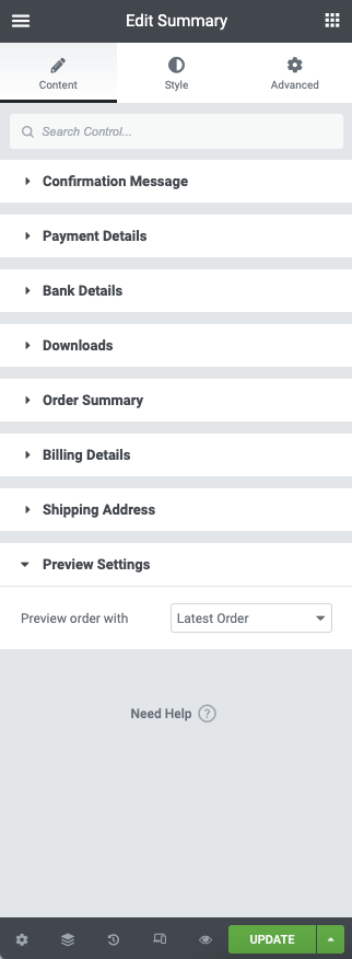
Confirmation Message
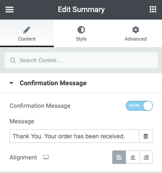
- Confirmation Message: Use the toggle selector to show/hide the message
- Message: Enter a message to be displayed in the field provided
- Alignment: Use the icons to select between left, center, or right alignment values. The responsive icon can be selected to set different values based on the breakpoint.
Payment Details
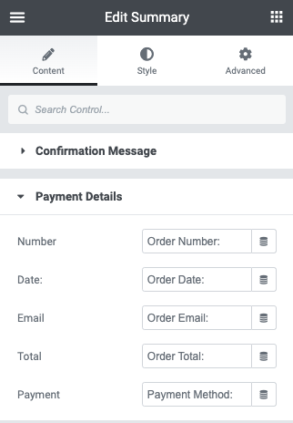
In the following fields, enter a value or select from the dynamic functions to set the desired name of the payment detail columns:
- Number
- Date
- Total
- Payment
Bank Details
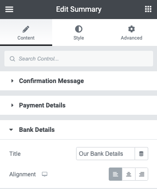
- Title: Enter text you wish to appear in the field or use the dynamic functions.
- Alignment: Use the icons to select between left, center, or right alignment values. The responsive icon can be selected to set different values based on the breakpoint.
Downloads
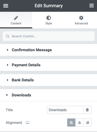
- Title: Enter text you wish to appear in the field or use the dynamic functions.
- Alignment: Use the icons to select between left, center, or right alignment values. The responsive icon can be selected to set different values based on the breakpoint.
Order Summary
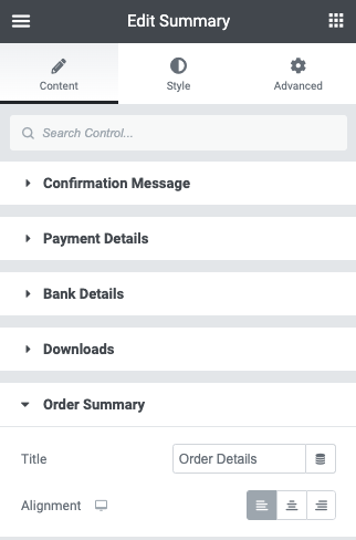
- Title: Enter text you wish to appear in the field or use the dynamic functions.
- Alignment: Use the icons to select between left, center, or right alignment values. The responsive icon can be selected to set different values based on the breakpoint.
Billing Details
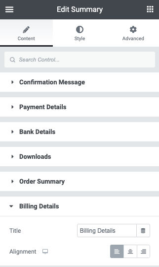
- Title: Enter text you wish to appear in the field or use the dynamic functions.
- Alignment: Use the icons to select between left, center, or right alignment values. The responsive icon can be selected to set different values based on the breakpoint.
Shipping Address
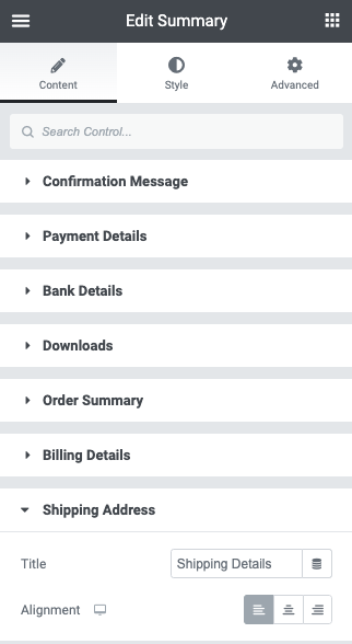
- Title: Enter text you wish to appear in the field or use the dynamic functions.
- Alignment: Use the icons to select between left, center, or right alignment values. The responsive icon can be selected to set different values based on the breakpoint.
Preview Settings
This allows you to choose a preview in order to style the section properly.
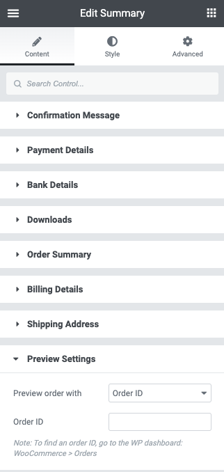
- Preview order with: From the dropdown menu choose between latest order, or order ID
- Order ID: If order ID is selected enter the ID of the order you wish to preview in the field
Note: To find an order ID, go to the WP dashboard: WooCommerce > Orders
Style
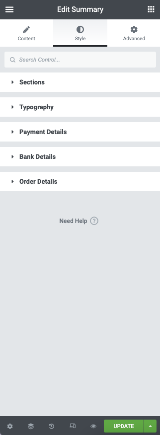
Sections
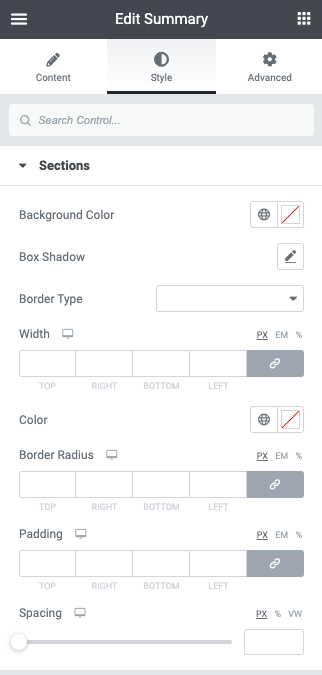
- Background Color: From the color picker, choose the background color for your sections. This color will apply to all sections. You may apply a different background color to a section(s) in the Customize options shown below
- Box Shadow: Click the pencil icon to set the color and shadow options
- Border type: From the dropdown menu select between solid, double, dotted, dashed, or grooved
- Width (border): Enter a chosen value in the fields based on px, em, or %
- Color (border): From the color picker, choose the background color for your border
- Border Radius: Enter a chosen value in the fields based on px, em, or %
- Padding: Enter a chosen value in the fields based on px, em, or %
- Spacing: Enter a chosen value in the fields based on px, em, or %
Typography
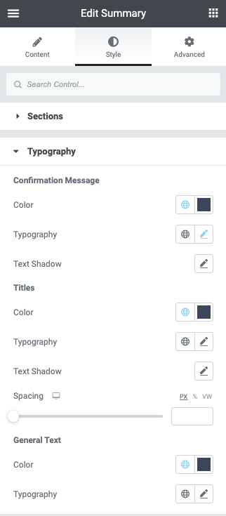
Confirmation Message
- Color: From the color picker, choose the color for your confirmation message text
- Typography: From the pencil icon, click to open the font option panel to choose the family, weight, transform, style, decoration, line height, and letter spacing options
- Text Shadow: Click the pencil icon to open the shadow properties options.
Titles
- Color: From the color picker, choose the color for your title.
- Typography: From the pencil icon, click to open the font option panel to choose the family, weight, transform, style, decoration, line height, and letter spacing options
- Text Shadow: Click the pencil icon to open the shadow properties options.
- Spacing: Use the slider to increase or decrease the spacing between components.
General Text
- Color: From the color picker, choose the color for your text.
- Typography: From the pencil icon, click to open the font option panel to choose the family, weight, transform, style, decoration, line height, and letter spacing options
Payment Details
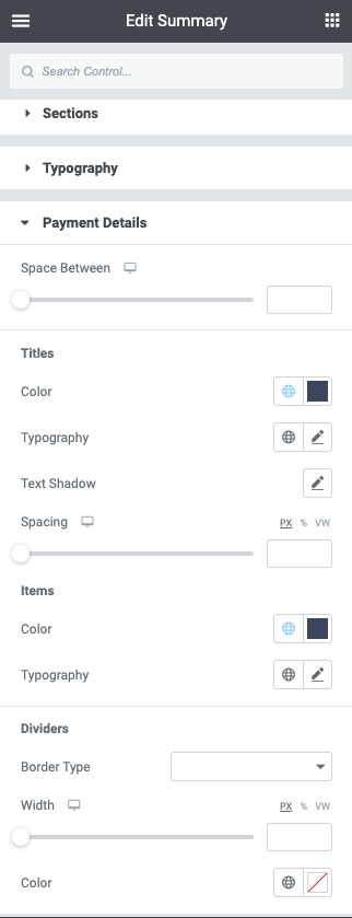
Space Between: Use the slider to increase or decrease the spacing between components.
Titles
- Color: From the color picker, choose the color for your titles
- Typography: From the pencil icon, click to open the font option panel to choose the family, weight, transform, style, decoration, line height, and letter spacing options
- Text Shadow: Click the pencil icon to open the shadow properties options.
- Spacing: Use the slider to increase or decrease the spacing between components.
Items
- Color: From the color picker, choose the color for your items.
- Typography: From the pencil icon, click to open the font option panel to choose the family, weight, transform, style, decoration, line height, and letter spacing options
Dividers
- Border type: From the dropdown menu select between solid, double, dotted, dashed, or grooved
- Width: Use the slider or manual enter a value in the field (PX, EM, VW)
- Color: From the color picker, choose the color for your Dividers
Bank Details
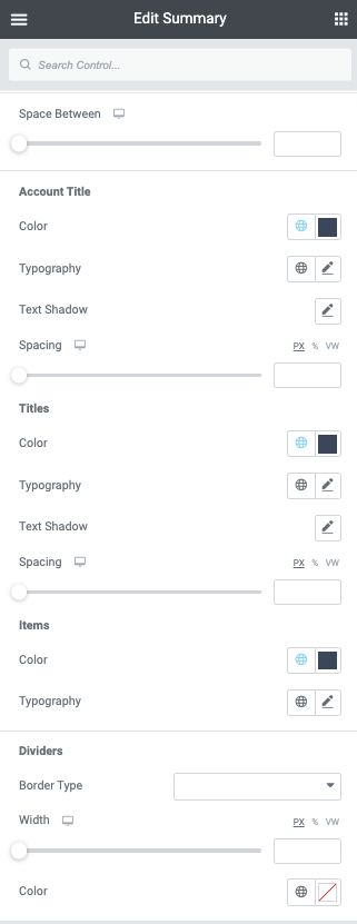
Space Between: Use the slider to increase or decrease the spacing between components.
Account Title
- Color: From the color picker, choose the color for your title.
- Typography: From the pencil icon, click to open the font option panel to choose the family, weight, transform, style, decoration, line height, and letter spacing options
- Text Shadow: Click the pencil icon to open the shadow properties options.
- Spacing: Use the slider to increase or decrease the spacing between components.
Titles
- Color: From the color picker, choose the color for your titles.
- Typography: From the pencil icon, click to open the font option panel to choose the family, weight, transform, style, decoration, line height, and letter spacing options
- Text Shadow: Click the pencil icon to open the shadow properties options.
- Spacing: Use the slider to increase or decrease the spacing between components.
Items
- Color: From the color picker, choose the color for your titles. This color will apply to all titles. You may apply a different color to a title(s) in the Customize options shown below
- Typography: From the pencil icon, click to open the font option panel to choose the family, weight, transform, style, decoration, line height, and letter spacing options
Dividers
- Border type: From the dropdown menu select between solid, double, dotted, dashed, or grooved
- Width: Use the slider or manual enter a value in the field (PX, EM, VW)
- Color: From the color picker, choose the color for your Dividers
Order Details
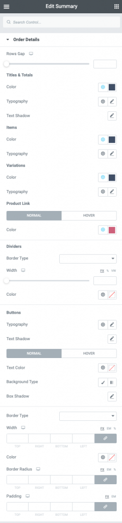
Rows Gap: Use the slider to increase or decrease the spacing between the rows.
Titles and Totals
- Color: From the color picker, choose the color for your titles.
- Typography: From the pencil icon, click to open the font option panel to choose the family, weight, transform, style, decoration, line height, and letter spacing options
- Text Shadow: Click the pencil icon to open the shadow properties options.
Items
- Color: From the color picker, choose the color for your items.
- Typography: From the pencil icon, click to open the font option panel to choose the family, weight, transform, style, decoration, line height, and letter spacing options
Variations
- Color: From the color picker, choose the color for your variations.
- Typography: From the pencil icon, click to open the font option panel to choose the family, weight, transform, style, decoration, line height, and letter spacing options
Buttons
- Typography: From the pencil icon, click to open the font option panel to choose the family, weight, transform, style, decoration, line height, and letter spacing options
- Color (Text): From the color picker, choose the color for your button text.
- Background Type: Use the icons to choose between a solid or gradient background
- Color (background): From the color picker, select the color(s) for the button
- Image: Click to select or upload an image to the media library to use as the background image of your button
- Box Shadow: Click the pencil icon to open the shadow properties options.
Borders
- Border type: From the dropdown menu select between solid, double, dotted, dashed, or grooved
- Width (border): Enter a chosen value in the fields based on px, em, or %
- Color (border): From the color picker, choose the background color for your border
- Border Radius: Enter a chosen value in the fields based on px, em, or %
- Padding: Enter a chosen value in the fields based on px, em, or %
Advanced
Global Advanced tab options are available for this widget.
Assigning Page To WooCommerce
Once you have completed your order summary page, you need to assign it to be used by Woocomerce. This can be done by navigating to Site Settings > WooCommerce Pages. From the selectors, assign your new page to the Summary field.