Using the Elementor WooCommerce Cart Widget, you may customize your cart layout. You may edit the section titles, labels, and placeholders of the form fields. You may also style the layout, typography, and color options as a whole, or customize even further by section.
When publishing, you will be prompted with the option to automatically set your new page as the default cart page rather than needing to go through the WooCommerce settings.
Need professional help? Consult with an expert before making changes.
Content
General
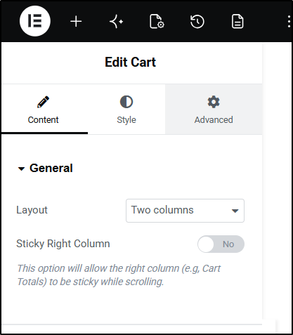
- Layout: From the dropdown menu, select between one column, or two column layout
- Sticky Right Column: If two column layout is used, use the toggle control enable / disable sticky option for the right column
- Offset: If sticky option is enabled, enter a value in PX to offset the top margin of the sticky effect
Order Summary
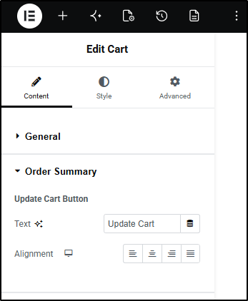
Update Cart Button
- Text: Enter the desired text in the field or using the dynamic options
Coupon
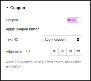
Show/Hide Coupon: You may use the toggle if you wish to hide the coupon field from the cart page.
Apply Coupon Button
- Text: Enter the desired text in the field or using the dynamic options
- Alignment: Select the desired icon from left, center, right, or justified options for your button
Totals
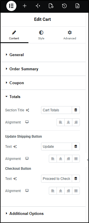
Title
- Section Title: Enter the desired text in the field or using the dynamic options
- Alignment: Using the icons, select between left, center, or right alignment
Update Shipping Button
- Text: Enter the desired text in the field or using the dynamic options
Checkout Button
- Text: Enter the desired text in the field or using the dynamic options
- Alignment: Using the icons, select between left, center, right, or justified alignment
Additional Options
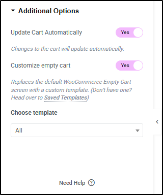
- Update Cart Automatically: Use the toggle control to enable or disable AJAX loading of the cart totals.
Customize Empty Cart
You may further customize your visitors shopping experience by replacing the default WooCommerce empty cart notification. Adding suggested products and other calls to action can increase your revenue.
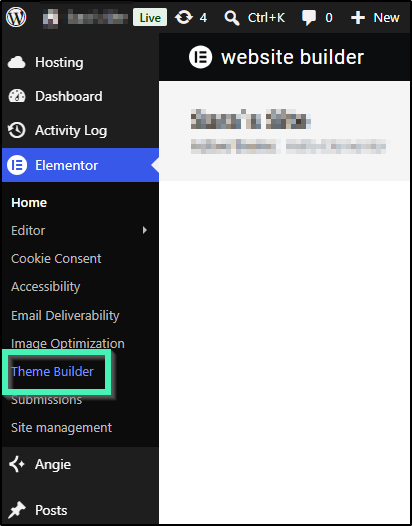
- Navigate to Elementor > Theme Builder and create a new template for your empty cart.
You may use any of the available widgets to create your own custom style. Click the Publish or Update button to save it. - Return to your WooCommerce Cart page. In your Cart Widget > Content > Additional Options, toggle the Customize empty cart option
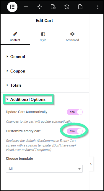
- You may then click the Choose template field and enter the name of your created template. If there are no products in your cart, it will then be displayed rather than the default notice.
Style
Sections
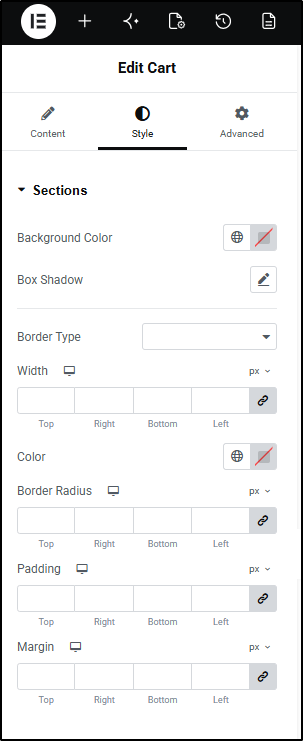
- Background Color: From the color picker, choose the background color for your sections. This color will apply to all sections. You may apply a different background color to a section(s) in the Customize options shown below
- Box Shadow: Click the pencil icon to set the color and shadow options
- Border type: From the dropdown menu select between solid, double, dotted, dashed, or grooved
- Width (border): Enter a chosen value in the fields based on px, em, or %
- Color (border): From the color picker, choose the background color for your border
- Border Radius: Enter a chosen value in the fields based on px, em, or %
- Padding: Enter a chosen value in the fields based on px, em, or %
- Margin: Enter a chosen value in the fields based on px, em, or %
Typography
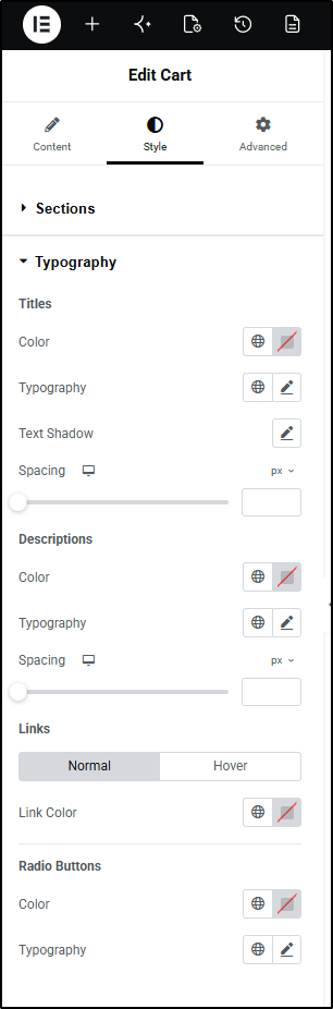
Titles
- Color: From the color picker, choose the color for your titles. This color will apply to all titles. You may apply a different color to a title(s) in the Customize options shown below
- Typography: From the pencil icon, click to open the font option panel to choose the family, weight, transform, style, decoration, line height, and letter spacing options
- Text Shadow (Titles Only): Click the pencil icon to open the shadow properties options.
- Spacing: Use the slider to increase or decrease the spacing between components.
Descriptions
- Color: From the color picker, choose the color for your titles. This color will apply to all titles. You may apply a different color to a title(s) in the Customize options shown below
- Typography: From the pencil icon, click to open the font option panel to choose the family, weight, transform, style, decoration, line height, and letter spacing options
- Spacing: Use the slider to increase or decrease the spacing between components.
Links
Choose the appearance of the link options on normal and hover states
- Link Color: From the color picker, choose the color for your links. This color will apply to all links. You may apply a different color to a link(s) in the Customize options shown below
Radio Buttons
- Color: From the color picker, choose the color for your titles. This color will apply to all titles. You may apply a different color to a title(s) in the Customize options shown below
- Typography: From the pencil icon, click to open the font option panel to choose the family, weight, transform, style, decoration, line height, and letter spacing options
Forms
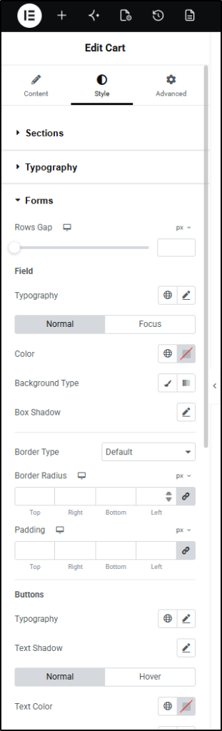
Layout
- Column Gap: Use the slider or enter the value in the field in PX
- Rows Gap: Use the slider or enter the value in the field in PX
Labels
- Color: From the color picker, choose the color for your labels. This color will apply to all labels.
- Typography: From the pencil icon, click to open the font option panel to choose the family, weight, transform, style, decoration, line height, and letter spacing options
- Spacing: Use the slider to increase or decrease the spacing between components.
Fields
- Typography: From the pencil icon, click to open the font option panel to choose the family, weight, transform, style, decoration, line height, and letter spacing options
- Color (Text): From the color picker, choose the color for your field text. This color will apply to all field text.
- Background Type: Use the icons to choose between a solid or gradient background
- Color (background): From the color picker, select the color(s) for the field
- Image: Click to select or upload an image to the media library to use as the background image of your field
- Box Shadow: Click the pencil icon to open the shadow properties options.
Borders (Fields)
- Border type: From the dropdown menu select between solid, double, dotted, dashed, or grooved
- Width (border): Enter a chosen value in the fields based on px, em, or %
- Color (border): From the color picker, choose the background color for your border
- Border Radius: Enter a chosen value in the fields based on px, em, or %
- Padding: Enter a chosen value in the fields based on px, em, or %
Button
- Typography: From the pencil icon, click to open the font option panel to choose the family, weight, transform, style, decoration, line height, and letter spacing options
- Color (Text): From the color picker, choose the color for your field text. This color will apply to all field text. You may apply a custom color to a sections field text in the Customize options shown below
- Background Type: Use the icons to choose between a solid or gradient background
- Color (background): From the color picker, select the color(s) for the field
- Image: Click to select or upload an image to the media library to use as the background image of your field
- Box Shadow: Click the pencil icon to open the shadow properties options.
Borders (Button)
- Border type: From the dropdown menu select between solid, double, dotted, dashed, or grooved
- Width (border): Enter a chosen value in the fields based on px, em, or %
- Color (border): From the color picker, choose the background color for your border
- Border Radius: Enter a chosen value in the fields based on px, em, or %
- Padding: Enter a chosen value in the fields based on px, em, or %
Order Summary
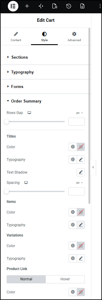
Layout
- Rows Gap: Use the slider or enter the value in the field in PX
Items
- Color: From the color picker, choose the color for your Items
- Typography: From the pencil icon, click to open the font option panel to choose the family, weight, transform, style, decoration, line height, and letter spacing options
Variations
- Color: From the color picker, choose the color for your Variations
- Typography: From the pencil icon, click to open the font option panel to choose the family, weight, transform, style, decoration, line height, and letter spacing options
Product Links
Choose the appearance of the link options on normal and hover states
- Link Color: From the color picker, choose the color for your links. This color will apply to all links. You may apply a different color to a link(s) in the Customize options shown below
Dividers
- Color: From the color picker, choose the color for your Dividers
- Weight: Use the slider or manual enter a value in the field (PX, EM)
Quantity Borders
- Color: From the color picker, choose the color for your Dividers
- Weight: Use the slider or manual enter a value in the field (PX, EM)
Remove Icon
Choose the appearance of the link options on normal and hover states
- Color: From the color picker, choose the color for the icon.
Totals
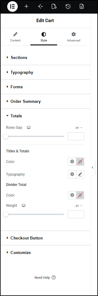
Layout
- Rows Gap: Use the slider or enter the value in the field in PX
Titles & Totals
- Color: From the color picker, choose the color for your Titles & Totals
- Typography: From the pencil icon, click to open the font option panel to choose the family, weight, transform, style, decoration, line height, and letter spacing options
Checkout Button
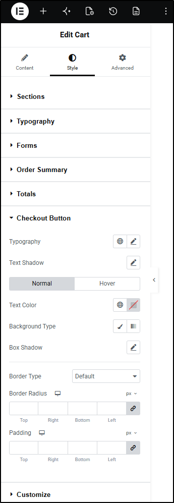
- Typography: From the pencil icon, click to open the font option panel to choose the family, weight, transform, style, decoration, line height, and letter spacing options
- Text Shadow: Click the pencil icon to open the shadow properties options
- Text Color: From the color picker, choose the color for your button text.
- Background Type: Use the icons to choose between a solid or gradient background
- Color (background): From the color picker, select the color(s) for the field
- Image: Click to select or upload an image to the media library to use as the background image of your field
- Box Shadow: Click the pencil icon to open the shadow properties options.
- Border type: From the dropdown menu select between solid, double, dotted, dashed, or grooved
- Width (border): Enter a chosen value in the fields based on px, em, or %
- Color (border): From the color picker, choose the background color for your border
- Border Radius: Enter a chosen value in the fields based on px, em, or %
- Padding: Enter a chosen value in the fields based on px, em, or %
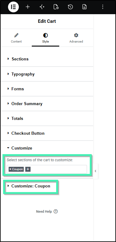
Customize
The customize option allows you to style a section(s) independently of the other sections. Click the + icon to add or remove actions from the customizer. Additional styling options per section will appear below the customizer.
Advanced
Global Advanced tab options are available for this widget.