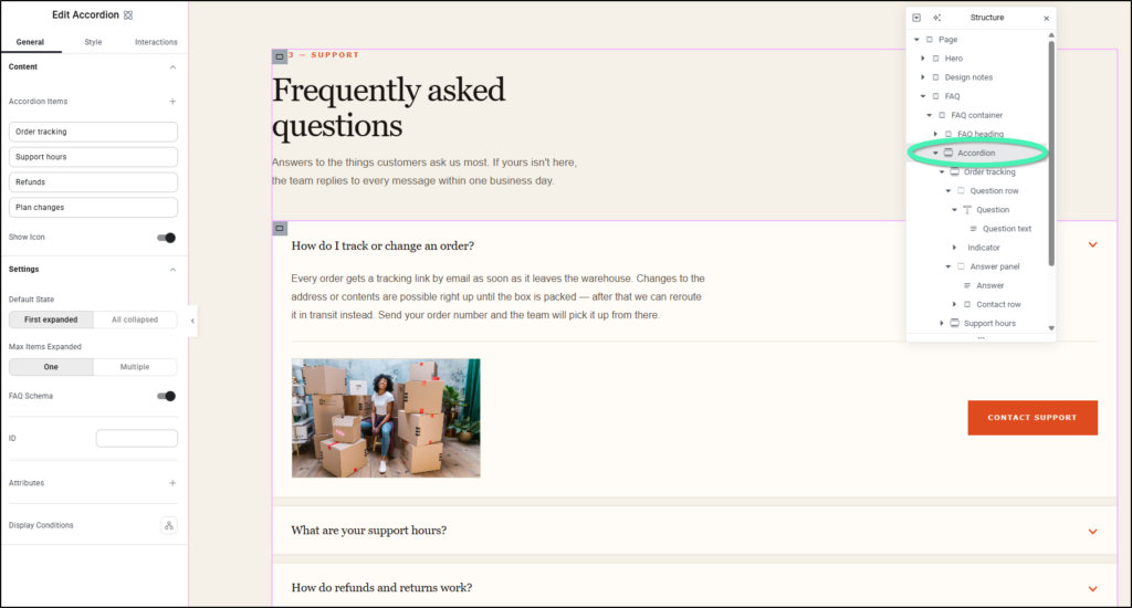
To create expandable content sections in Elementor, drag the native Accordion element from the Atomic Editor panel onto your canvas. Each Accordion item features customizable header controls and a nested container where you can place any Atomic element, adjust expansion rules (Default State and Max Items Expanded), enable AI-optimized FAQ schema, and reorder items seamlessly.
What is the Accordion element in the Atomic Editor?
Unlike classic widgets, native Atomic Accordion items feature open canvas containers that support multi-level recursive nesting – allowing you to place Accordions directly inside other Accordions.
When dropped directly onto an open canvas area outside an existing container, Elementor automatically wraps the Accordion inside a parent Flexbox container for easy repositioning across your layout.
How do you add an Accordion element to your page?
Example Scenario: You want to add a clean, structured FAQ section to your service landing page.
Requirements: Elementor Core and Pro version 4.3.0 or higher on WordPress 6.8+.
- Open the Elementor Editor for the page or template you want to edit.
- In the left panel, navigate to Atomic Elements and search for Accordion.
- Drag and drop the Accordion element directly onto your canvas.
(If dropped directly onto the canvas outside an existing container, notice that Elementor automatically wraps the Accordion inside a Flexbox container.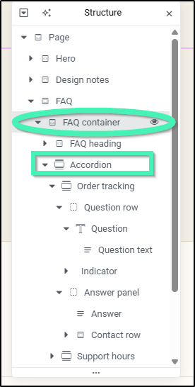
How do you manage Accordion items and nest content?
Example Scenario: You are setting up business hours and contact details inside your FAQ Accordion.
- Select the Accordion element on your canvas to open its side panel.
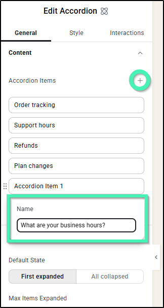
- In the Content tab, click Add Item to create additional accordion rows.
- Select an item to expand its header settings and enter your title (e.g., “What are your business hours?”).
- To add content, click the Accordion item header on the canvas to open its nested container.
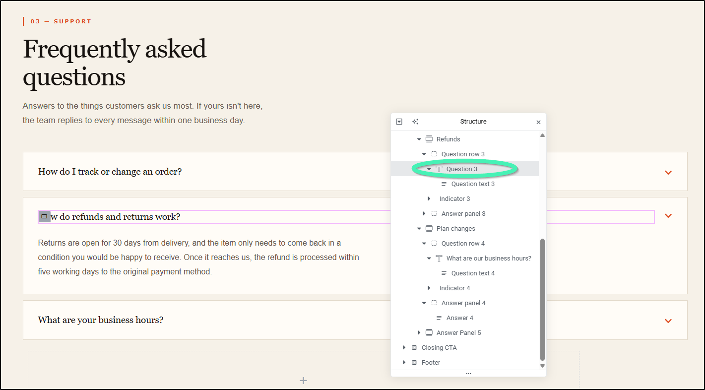
- Drag any Atomic element – such as paragraph text (“Our business hours are Monday to Friday, 9 AM to 5 PM.”), images, buttons, or multi-column flex containers – directly into the item container.
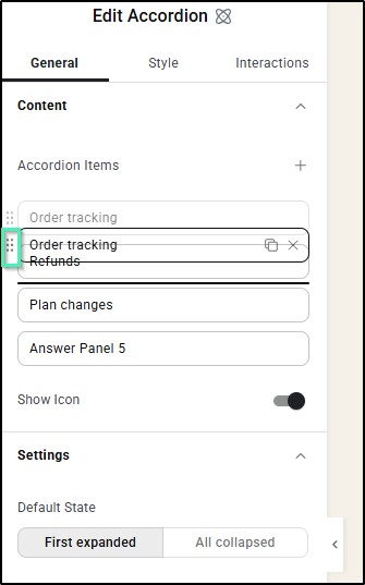
- Reorder items by dragging them up or down within the Items list in the side panel (or via the Structure panel on the canvas).
How do you configure expansion settings, appearance, and FAQ schema?
Example Scenario: You want to style the Accordion to match your brand colors while optimizing content for AI crawlers.
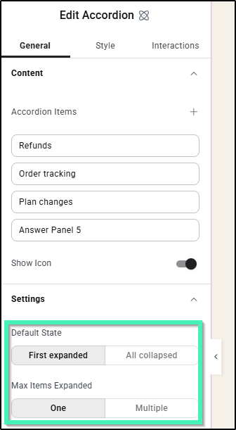
- Configure Expansion Modes: Under Default State, choose First Expanded (top item open on page load) or All Collapsed (all items closed initially). Under Max Items Expanded, select One (opening an item closes others) or Multiple (allows multiple open items simultaneously).
- Style Typography and Colors: Select the Style tab to customize overall container background colors, borders, item title typography, and content spacing.
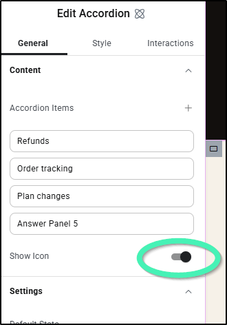
- Configure Header Icons: Toggle Show Icon to On and then customize toggle icons, icon alignment, and active colors.
- Enable AI/LLM FAQ Schema: Toggle Enable FAQ Schema to On.
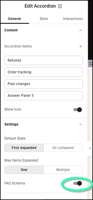
Important Note: The built-in FAQ schema is specifically structured to expose content hierarchy to AI crawlers, LLMs, and Markdown engines – it is not intended for Google Search rich snippets.
What technical rules apply to Accordion icons and DOM markup?
Keep these automated behaviors in mind when designing Accordion headers:
- SVG Auto-Rotation: Placing an SVG icon inside the Accordion header automatically rotates it 180° when the item expands. In version 4.3, this rotation trigger is permanent and cannot be disabled in settings. Non-SVG elements placed in the header will not rotate.
- DOM-Level Icon Removal: When you disable or hide an item’s toggle icon, Elementor strips the icon markup completely from the page DOM. It is not hidden visually using CSS (display: none).
FAQs
- Can I nest any Elementor element inside an Accordion item?
Yes. Each item contains an open container that supports any Atomic element, including buttons, forms, images, and other nested Accordions. - What happens if I drop the Accordion element at the root of the canvas?
It automatically wraps inside a parent Flexbox container so you can move, drag, or space it like any standard modular element. - Does hiding the toggle icon leave extra code on my page?
No. Disabling the icon completely removes the icon element from the HTML DOM.