The Border Radius tool allows you to smooth sharp edges or create custom shapes (like pills or circles) by rounding the corners of an element.
Where to Find Border Radius Settings
- Select the Element: Click on any widget, container, or section in the Elementor Editor.
- Open Border Settings: In the widget’s panel, go to the Style tab and click to expand the Border section.
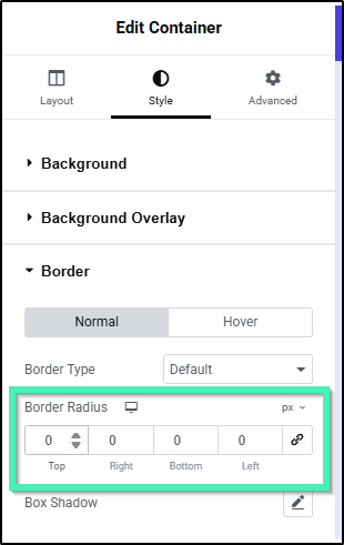
Note: You do not need to select a Border Type (such as Solid or Dashed) to use Border Radius. Leaving Border Type as Default or None still rounds background colors, background images, and container boundaries.
How to Set Border Radius Values
- Select Your Units: Choose your preferred unit of measurement above the input fields:
PX(Pixels): Fixed absolute measurement for precise, uniform rounding.%(Percentage): Relative to element dimensions (ideal for creating circular or oval shapes).EM/REM: Relative to font size for responsive, scalable design.VW: Relative to the viewport width.Custom: Enter custom CSS units or global CSS variables.
Learn more about these measurement methods.
- Configure Radius Values:
- Uniform Corners (Linked): Keep the Link Values Together icon (🔗) highlighted. Enter a value in any box to update all four corners (Top, Right, Bottom, Left) simultaneously.
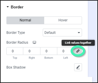
- Individual Corners (Unlinked): Click the Link Values Together icon (🔗) to unlink the fields. Enter custom values for each corner independently to build asymmetrical shapes.
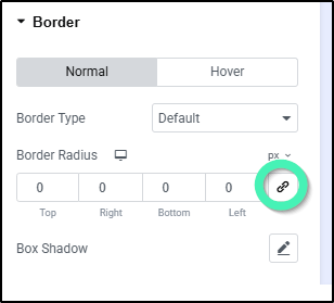
- Uniform Corners (Linked): Keep the Link Values Together icon (🔗) highlighted. Enter a value in any box to update all four corners (Top, Right, Bottom, Left) simultaneously.
Examples & Design Tips
- Perfect Circles: Ensure your element has equal width and height, then set Border Radius to
50%across all corners. - Pill-Shaped Buttons: Set a large pixel value (e.g.,
999px) across all four corners. - Asymmetrical Cards: Unlink the fields (🔗) and set rounding on only two opposite corners (e.g., Top Left:
20px, Bottom Right:20px, Top Right:0px, Bottom Left:0px).